搜尋套件、儲存庫與 APP 分類

google_nav_bar 封面
套件詳情v5.0.7

google_nav_bar

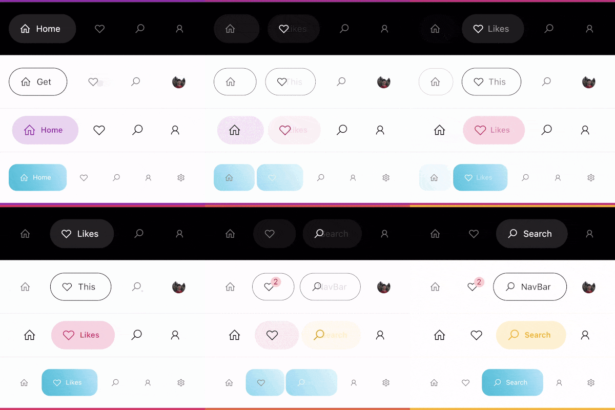
一個現代的 Google 風格導航列,可用作底端導航欄或標籤欄,設計嚴格遵循 Dribbble 上 Cuberto 的 UI/UX 風格。

AndroidiOSWebmacOSWindowsLinux
近 30 天下載
3.4萬
喜歡數
1690
Pub 分數
140

安裝套件

flutter pub add google_nav_bar

套件介紹

根據套件公開資料產生的選型評估,僅供參考。

一個現代且視覺上吸引人的導航列,靈感來自 Google 的設計語言以及 Dribbble 上的 Cuberto UI/UX 概念。它可作為底部導航列或標籤列使用,具備平滑動畫、可自訂顏色與響應式版面。專為 Flutter 打造,支援 Android、iOS、Web、macOS、Windows 與 Linux 多個平台。此套件強調乾淨美學與直覺的使用者互動,非常適合需要精緻導航體驗的應用程式。

適用情境

  • 行動應用程式底部導航
  • Web 應用程式標籤式介面
  • 跨平台 Flutter 應用
  • 現代UI設計實現
  • 可自定義的導航欄

主要特色

  • 谷歌啟發的設計
  • 流暢的動畫
  • 多平台支援
  • 可自定義的顏色和圖示
  • 響應式佈局
  • 與 Flutter 的輕鬆整合

適合對象

  • 尋求 Material Design 美學的開發者
  • 需要優雅底部導航的應用
  • 注重設計的 Flutter 項目
  • UI/UX 愛好者
  • 快速原型設計

使用建議

  • 僅限導航使用情境
  • 需要手動管理圖示
  • 可能需要額外的樣式來處理複雜佈局
  • 不適合用於頂級導航欄
  • 依賴外部設計的一致性

原始 README

以下為關聯原始碼儲存庫的 README 原文快照,最新內容請造訪原始碼儲存庫。

google_nav_bar


A modern google style nav bar for flutter.

google_nav_bar

GoogleNavBar is a Flutter widget designed by Aurelien Salomon and developed by sooxt98.

Getting Started

Add this to your package's pubspec.yaml file:

...
dependencies:
  google_nav_bar: ^5.0.7
  

Now in your Dart code, you can use:

import 'package:google_nav_bar/google_nav_bar.dart';

Usage

Style your tab globally with GNav's attribute, if you wish to style tab separately, use GButton's attribute

GNav(
  rippleColor: Colors.grey[800], // tab button ripple color when pressed
  hoverColor: Colors.grey[700], // tab button hover color
  haptic: true, // haptic feedback
  tabBorderRadius: 15, 
  tabActiveBorder: Border.all(color: Colors.black, width: 1), // tab button border
  tabBorder: Border.all(color: Colors.grey, width: 1), // tab button border
  tabShadow: [BoxShadow(color: Colors.grey.withOpacity(0.5), blurRadius: 8)], // tab button shadow
  curve: Curves.easeOutExpo, // tab animation curves
  duration: Duration(milliseconds: 900), // tab animation duration
  gap: 8, // the tab button gap between icon and text 
  color: Colors.grey[800], // unselected icon color
  activeColor: Colors.purple, // selected icon and text color
  iconSize: 24, // tab button icon size
  tabBackgroundColor: Colors.purple.withOpacity(0.1), // selected tab background color
  padding: EdgeInsets.symmetric(horizontal: 20, vertical: 5), // navigation bar padding
  tabs: [
    GButton(
      icon: LineIcons.home,
      text: 'Home',
    ),
    GButton(
      icon: LineIcons.heart_o,
      text: 'Likes',
    ),
    GButton(
      icon: LineIcons.search,
      text: 'Search',
    ),
    GButton(
      icon: LineIcons.user,
      text: 'Profile',
    )
  ]
)

View the example folder

There are 4 different use case included in the /example directory, go try it out!

所屬分類

原始碼儲存庫

使用此套件的專案