搜尋套件、儲存庫與 APP 分類

group_button 封面
套件詳情v5.3.4

group_button

Flutter 自訂組件,用於建立一組按鈕。包含單選按鈕和複選框按鈕。

AndroidiOSWebmacOSWindowsLinux
近 30 天下載
26.9萬
喜歡數
622
Pub 分數
160

安裝套件

flutter pub add group_button

套件介紹

根據套件公開資料產生的選型評估,僅供參考。

一個 Flutter 自定義組件,可建立分組按鈕,支援單選與複選方塊樣式。它簡化了以乾淨、可重用格式實作互斥或多重選擇選項的過程。非常適合表單、過濾器和設定介面,使用者需從一組選項中選擇一個或多個選項。此套件相容於所有主要平台,並能順暢整合至現有的 Flutter 專案中。

適用情境

  • 具有群組選擇的表單輸入
  • UI 中的篩選選項
  • 使用者偏好設定
  • 多選或單選按鈕群組
  • 動態表單建構器

主要特色

  • 支援單選按鈕和複選框按鈕類型
  • 與 Flutter 的輕鬆整合
  • 跨平台相容性
  • 可自訂樣式
  • 用於組選擇的內建狀態管理
  • 適用於所有裝置的響應式設計

適合對象

  • 開發互動式表單的開發者
  • 需要分組按鈕元件的UI設計師
  • 需要篩選或偏好選擇的應用程式
  • 針對多個平台的專案

使用建議

  • 需要手動處理選擇回調
  • 有限的內建驗證
  • 樣式可能需要額外的自訂
  • 不適合沒有額外邏輯的複雜動態群組

原始 README

以下為關聯原始碼儲存庫的 README 原文快照,最新內容請造訪原始碼儲存庫。

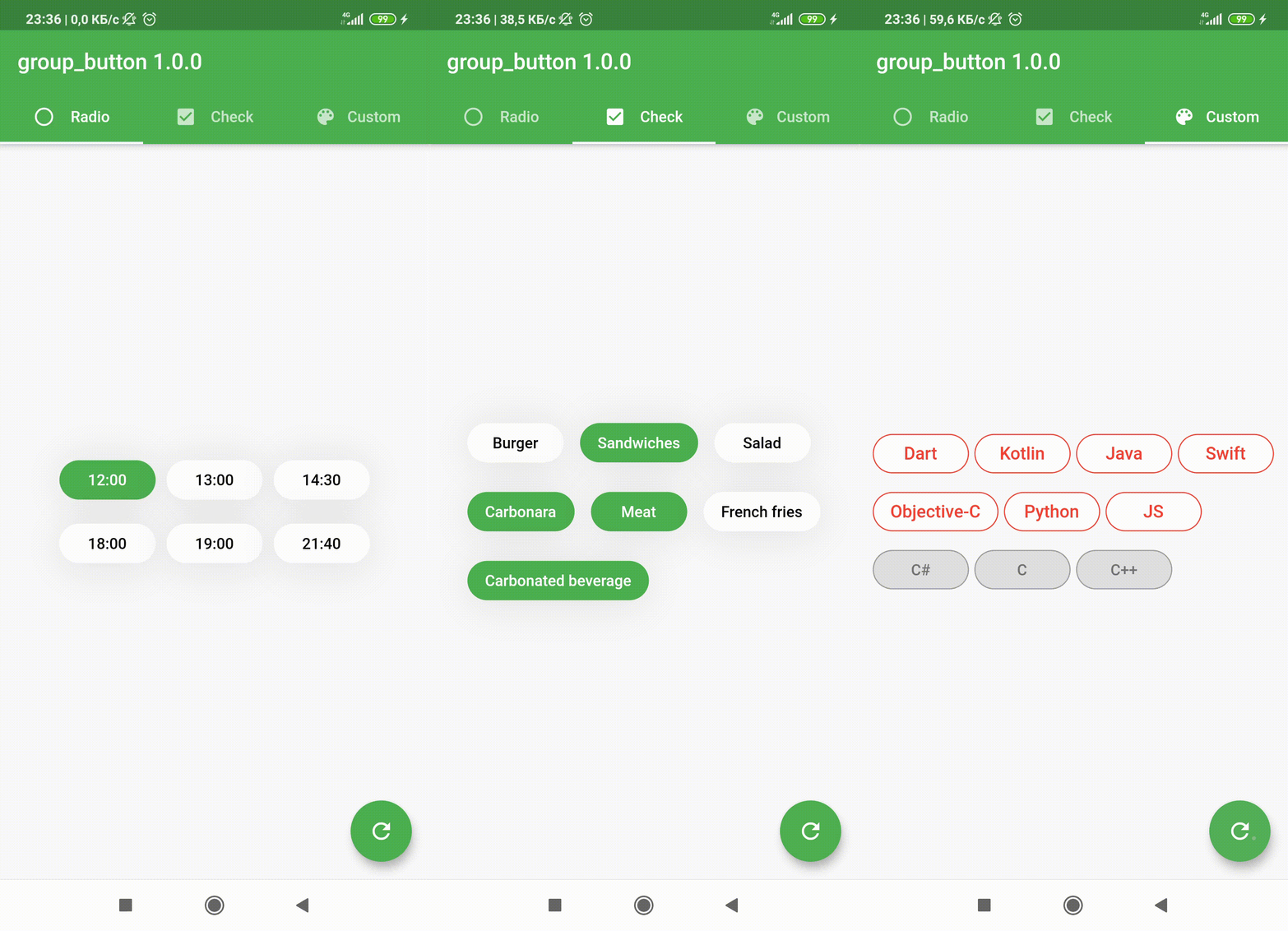
Flutter widget to create a group of buttons fast 🚀

Included Radio and CheckBox buttons models with custom groping types 🤤
Show some ❤️ and star the repo to support the project!

Pub License: MIT Repository views Pub

Pub likes Pub popularity Pub points


GroupButtonController GroupButtonBuilder GroupButtonOptions

Getting Started

Follow these steps to use this package

Add dependency
dependencies:
  group_button: ^5.4.0
Add import package
import 'package:group_button/group_button.dart';
Easy to use

Simple example of use GroupButton
Put this code in your project at an screen and learn how it works 😊

GroupButton(
    isRadio: false,
    onSelected: (index, isSelected) => print('$index button is selected'),
    buttons: ["12:00", "13:00", "14:30", "18:00", "19:00", "21:40"],
)
Controller

Starting from version 4.1.0
You can control your Group Button using the controller

final controller = GroupButtonController();

Column(
  children: [
    GroupButton.checkbox(
      controller: controller,
      buttons: ['12:00', '13:00', '14:00'],
      onSelected: (i, selected) => debugPrint('Button #$i $selected'),
    ),
    TextButton(
      onPressed: () => controller.selectIndex(1),
      child: const Text('Select 1 button'),
    )
  ],
),
Generic button value

In new 5.0.0 version you can set custom buttons value type
It can be int, DateTime, double or YourCustomClass
Button text will be result of .toString() model method in common button display case

GroupButton<DateTime>(
  buttons: [DateTime(2022, 4, 9), DateTime(2022, 4, 10)],
)
Button builders

Also you can use generic button values with cutsom buttonBuilder
In order to turn values into any widget

GroupButton<DateTime>(
  buttons: [DateTime(2022, 4, 9), DateTime(2022, 4, 10)],
  buttonBuilder: (selected, date, context) {
    return Text('${date.year}-${date.month}-${date.day}');
  },
),

In this package, there are four different possibilities for customizing your buttons through builders

  • 1 buttonBuilder It will build a fully custom button based on the value parameter
  • 2 buttonIndexedBuilder same as buttonBuilder. But based on button index.
  • 3 buttonTextBuilder It will replace the text of your button, which is constructed based on the style parameters passed in GroupButtonOptions. The appearance of the button remains the same, but the text is changed. Based on button value.
  • 4 buttonIndexedTextBuilder same as buttonTextBuilder. But based on button index.
Fully Customize

In order to customize your buttons inside GroupButton you can use GroupButtonOptions

GroupButtonOptions(
  selectedShadow: const [],
  selectedTextStyle: TextStyle(
    fontSize: 20,
    color: Colors.pink[900],
  ),
  selectedColor: Colors.pink[100],
  unselectedShadow: const [],
  unselectedColor: Colors.amber[100],
  unselectedTextStyle: TextStyle(
    fontSize: 20,
    color: Colors.amber[900],
  ),
  selectedBorderColor: Colors.pink[900],
  unselectedBorderColor: Colors.amber[900],
  borderRadius: BorderRadius.circular(100),
  spacing: 10,
  runSpacing: 10,
  groupingType: GroupingType.wrap,
  direction: Axis.horizontal,
  buttonHeight: 60,
  buttonWidth: 60,
  mainGroupAlignment: MainGroupAlignment.start,
  crossGroupAlignment: CrossGroupAlignment.start,
  groupRunAlignment: GroupRunAlignment.start,
  textAlign: TextAlign.center,
  textPadding: EdgeInsets.zero,
  alignment: Alignment.center,
  elevation: 0,
),

Examples

You can check more examples of using this package here


Thanks to all contributors of this package


For help getting started with 😍 Flutter, view online documentation, which offers tutorials, samples, guidance on mobile development, and a full API reference.

所屬分類

原始碼儲存庫

使用此套件的專案