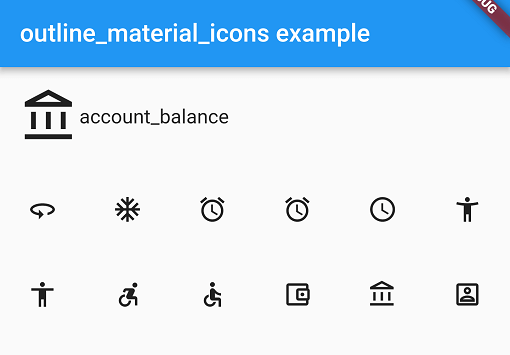
一個 Flutter 套件,提供 Google 的 Material Design 圖示的外框變體,呈現乾淨、極簡的美學風格。這些圖示屬於更新後的 Material Design 系統,非常適合強調簡潔與清晰度的現代使用者介面。此套件可透過 pub 容易地整合,支援所有主要平台,並確保應用程式間圖示的一致性。對於希望將其應用設計與目前的 Material Design 指南對齊的開發者而言,特別實用。
適用情境
現代應用程式介面
極簡用戶介面設計
跨平台應用
Material Design 3 相容性
一致的圖示樣式
主要特色
輪廓風格的 Material Design 圖標
支援所有 Flutter 平台
透過 pub 實現輕鬆整合
來自來源的常規更新
輕量且高效
適合對象
使用 Material Design 3 的使用者介面設計師
針對多平台的開發者
需要一致圖示集的應用程式
遵循現代設計趨勢的專案
使用建議
需要互聯網以取得初始發佈內容
僅限谷歌的輪廓圖示集
單個圖示沒有自訂選項
依賴上游 GitHub 倉庫
不適用於自訂圖示需求
原始 README
以下為關聯原始碼儲存庫的 README 原文快照,最新內容請造訪原始碼儲存庫。
outline_material_icons
This package provides the 'outline' theme of icons on the Material Design website, which is not available in Flutter or as a .ttf font file.
These icons were downloaded in September 2018, they may be updated in the future.
Usage
Add the package to pubspec.yaml and use the OMIcons class.
Browse available icons using the example app or the Material Design icons website above.
There is a Map<String, int> of snake_case icon names to codepoints if you want to list all the icons. See the example app code for how. Using the OMIcons class directly is preferable in most cases.
Changes and omissions
All 'partly filled' icons are removed due to single colour restriction for .ttf fonts. This includes partly-filled battery icons and not-full-strength wifi/reception icons.
Icons with an underline have had the line made solid: border_color, format_color_fill and format_color_text.
These icons were renamed to avoid Dart errors/clashes: 360 -> icon360, class -> classIcon, sync -> syncIcon
Getting Started
For help getting started with Flutter, view our online documentation.
For help on editing package code, view the documentation.