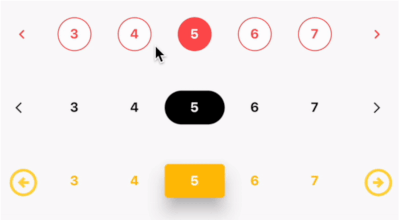
pagination_flutter
Getting started
Installation
dependencies:
  pagination_flutter: ^0.0.8
import 'package:pagination_flutter/pagination_flutter.dart';
Preview
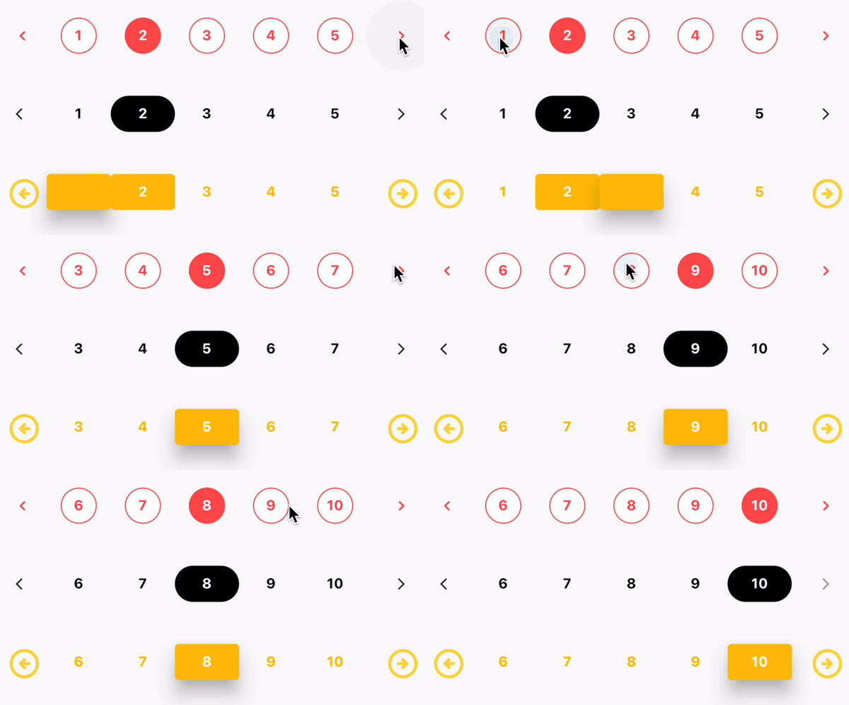
Usage
class _MyHomePageState extends State<MyHomePage> {
  int selectedPage = 1;

  setSelectedPage(int index) {
    setState(() {
      selectedPage = index;
    });
  }

  @override
  Widget build(BuildContext context) {
    return Scaffold(
      appBar: AppBar(
        title: const Text("Flutter Pagination"),
      ),
      body: Center(
        child: Column(
          mainAxisAlignment: MainAxisAlignment.center,
          children: [
            Pagination(
              numOfPages: 10,
              selectedPage: selectedPage,
              pagesVisible: 3,
              onPageChanged: (page) {
                setState(() {
                  selectedPage = page;
                });
              },
              nextIcon: const Icon(
                Icons.arrow_forward_ios,
                color: Colors.blue,
                size: 14,
              ),
              previousIcon: const Icon(
                Icons.arrow_back_ios,
                color: Colors.blue,
                size: 14,
              ),
              activeTextStyle: const TextStyle(
                color: Colors.white,
                fontSize: 14,
                fontWeight: FontWeight.w700,
              ),
              activeBtnStyle: ButtonStyle(
                backgroundColor: MaterialStateProperty.all(Colors.blue),
                shape: MaterialStateProperty.all(
                  RoundedRectangleBorder(
                    borderRadius: BorderRadius.circular(38),
                  ),
                ),
              ),
              inactiveBtnStyle: ButtonStyle(
                shape: MaterialStateProperty.all(RoundedRectangleBorder(
                  borderRadius: BorderRadius.circular(38),
                )),
              ),
              inactiveTextStyle: const TextStyle(
                fontSize: 14,
                fontWeight: FontWeight.w700,
              ),
            ),
          ],
        ),
      ),
    );
  }
}
Additional information
Properties
| Name |
Type |
Default |
Description |
| numOfPages |
int |
0 |
Number of pages to be displayed |
| selectedPage |
int |
0 |
The currently selected page |
| pagesVisible |
int |
0 |
Number of pages to be visible |
| onPageChanged |
Function |
null |
Function to be called when a page is selected |
| nextIcon |
Widget |
null |
Widget to be displayed as the next icon |
| previousIcon |
Widget |
null |
Widget to be displayed as the previous icon |
| activeTextStyle |
TextStyle |
null |
TextStyle for the active page |
| activeBtnStyle |
ButtonStyle |
null |
ButtonStyle for the active page |
| inactiveBtnStyle |
ButtonStyle |
null |
ButtonStyle for the inactive pages |
| inactiveTextStyle |
TextStyle |
null |
TextStyle for the inactive pages |
| spacing |
double |
0 |
Spacing between the pages |
License
MIT
Author
Varun V
Issues
If you find any issues, please report them here