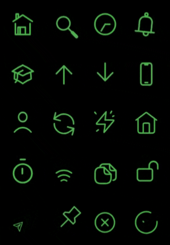
rive_animated_icon 套件提供一組使用 Rive 建構的可自訂動畫圖示,可在多個平台實現流暢的互動式動畫。專為尋求動態視覺元素的開發者設計,此套件可無縫整合至 Flutter 應用程式中,輕鬆自訂大小、顏色與動畫狀態。適用於透過引人入勝的微互動提升使用者介面,該套件支援 Android、iOS、Web、macOS、Windows 與 Linux。它利用 Rive 的輕量級動畫引擎,以高性能量產視覺效果,同時不犧牲應用程式的回應能力。
適用情境
透過動畫圖示增強使用者介面
在應用程式中添加微互動
創建引人入勝的加載指示器
依主題自訂圖示動畫
透過動態效果提升使用者回饋
整合動畫按鈕
主要特色
Rive 驅動的動畫
可自定大小與顏色
支援多個平台
與 Flutter 的輕鬆整合
預建構的動畫圖示集
響應式動畫控制
適合對象
尋求動畫 UI 元素的 Flutter 開發人員
需要互動式圖示的應用程式
設計師與開發人員協作
針對跨平台部署的專案
使用 Rive 進行動畫的團隊
使用建議
需要熟悉 Rive 動畫
Rive 資源帶來的額外套件大小
對低階裝置可能產生的效能影響
僅限 Rive 相容的動畫格式
需要適當的資源管理
可能需要自定碼來處理複雜互動
原始 README
以下為關聯原始碼儲存庫的 README 原文快照,最新內容請造訪原始碼儲存庫。
RiveAnimatedIcons - 50+ Icons Available! 🚀
This package provides rive animated icons that can be customized to suit your preference. It includes the riveIcon type, onTap, color and other parameters to give you a level of control.
This parameter is used to define the icon type from the RiveIcon enum
Optional parameters
width:
This parameter is used to set the icon width
height:
This parameter is used to set the icon height
color:
This parameter is used to set icon color
loopAnimation:
When this parameter is set to true the icon's animation will be on loop
onTap:
This callback is set by the user to perform actions onTap
onHover:
This callback is set by the user to perform actions onHover
splashColor:
This parameter is used to set icon splash color
strokeWidth:
This parameter is used to set icon stroke width
splashFactory:
This parameter is used to set icon splashFactory
mouseCursor:
This parameter is used to set icon mouseCursor when hovered
enableAbsorbPointer:
When this parameter is set to true it disables all interactive features of the icon
Animated Icon stroke width sample ⬇️
Best practices 🙌
If a Rive animation is set to loop and is scrolled off-screen, you can disable the loop to stop the animation and conserve resources while it's not visible. Similarly, you can re-enable the loop when the animation comes back into view.