搜尋套件、儲存庫與 APP 分類

rounded_loading_button 封面
套件詳情v2.1.0

rounded_loading_button

Flutter 的一個簡單動畫載入按鈕小部件實作

近 30 天下載
876
喜歡數
539
Pub 分數
60

安裝套件

flutter pub add rounded_loading_button

套件介紹

根據套件公開資料產生的選型評估,僅供參考。

一個 Flutter 套件,提供動畫加載按鈕元件,可實現從標準按鈕到帶有圓形進度指示器的加載狀態之間的平滑過渡。它設計簡潔,易於整合,讓開發者能在非同步操作期間增強使用者反饋。該按鈕支援自訂顏色、大小與動畫持續時間,非常適合表單、登入畫面以及任何需要使用者確認的操作。以乾淨的 Dart 程式碼建構,能順暢融入現代 Flutter 應用程式。

適用情境

  • 表單提交
  • 登入或註冊流程
  • API 呼叫觸發
  • 使用者動作確認
  • 載入狀態反饋

主要特色

  • 動畫加載過渡
  • 可自訂的顏色和大小
  • 圓形進度指示器
  • 簡單的 API 結合
  • 流暢的動畫

適合對象

  • 初學者 Flutter 開發者
  • 以UI為主的應用程式
  • 互動式表單
  • 行動應用程式介面
  • 快速原型設計

使用建議

  • 有限的平台特定自訂
  • 無內建錯誤狀態
  • 需要手動處理非同步邏輯
  • 不適合複雜的按鈕行為
  • 依賴外部動畫時間

原始 README

以下為關聯原始碼儲存庫的 README 原文快照,最新內容請造訪原始碼儲存庫。

rounded_loading_button

pub package build codecov style: effective dart License: MIT Awesome Flutter

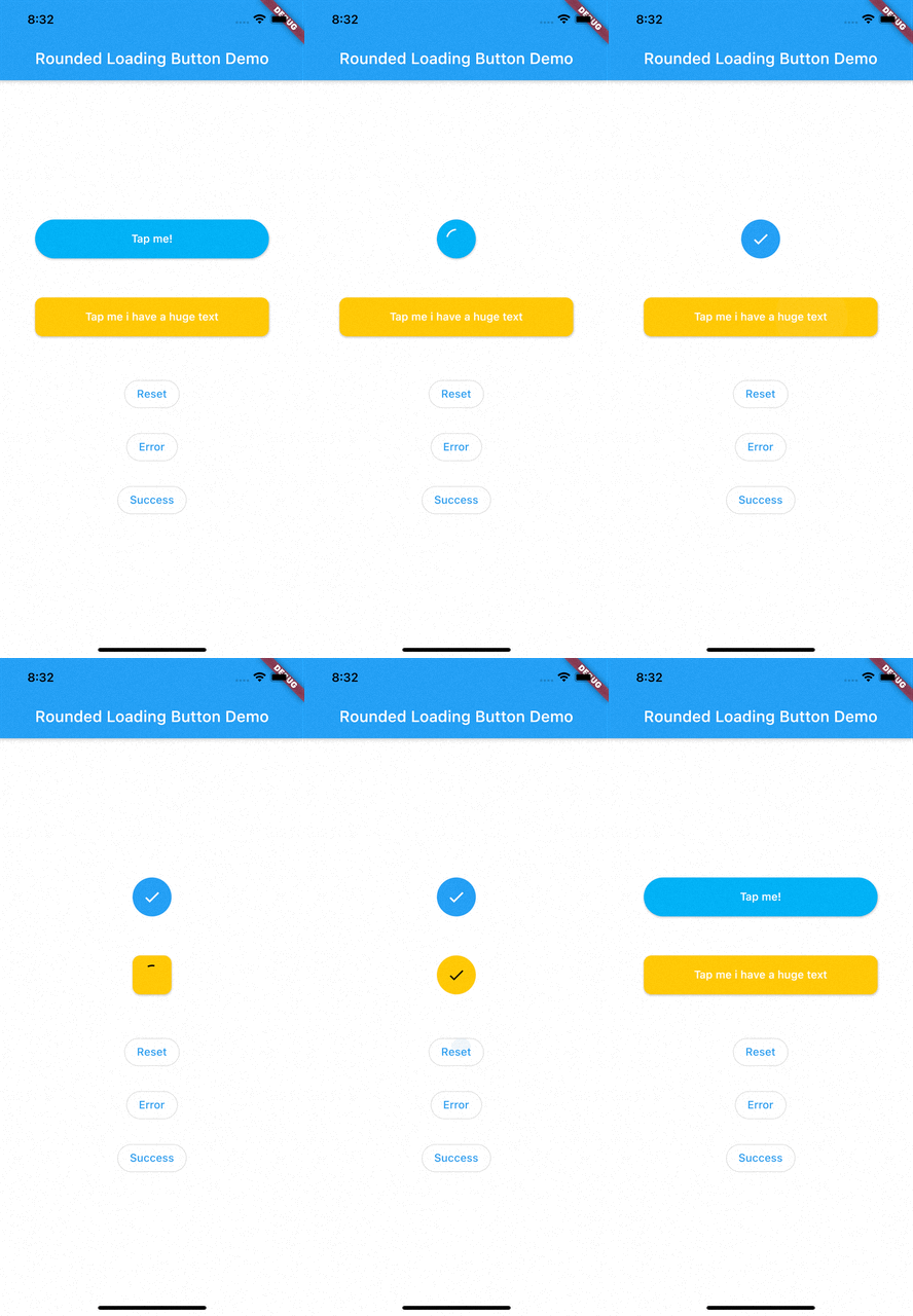
RoundedLoadingButton is a Flutter package with a simple implementation of an animated loading button, complete with success and error animations.

Installation

Add this to your pubspec.yaml:

dependencies:
    rounded_loading_button: ^2.0.8

Usage

Import
import 'package:rounded_loading_button/rounded_loading_button.dart';
Simple Implementation
final RoundedLoadingButtonController _btnController = RoundedLoadingButtonController();

void _doSomething() async {
    Timer(Duration(seconds: 3), () {
        _btnController.success();
    });
}

RoundedLoadingButton(
    child: Text('Tap me!', style: TextStyle(color: Colors.white)),
    controller: _btnController,
    onPressed: _doSomething,
)

The Rounded Loading Button has many configurable properties, including:

  • duration - The duration of the button animation
  • loaderSize - The size of the CircularProgressIndicator
  • animateOnTap - Whether to trigger the loading animation on the tap event
  • resetAfterDuration - Reset the animation after specified duration, defaults to 15 seconds
  • errorColor - The color of the button when it is in the error state
  • successColor - The color of the button when it is in the success state
  • successIcon - The icon for the success state
  • failedIcon - The icon for the failed state

Contributions

All contributions are welcome!

所屬分類

依賴

依賴清單 1 項

原始碼儲存庫

使用此套件的專案