Buscar pacotes, repositórios e categorias de apps

Capa de flutter_datetime_picker_plus
Detalhes do pacotev3.0.1

flutter_datetime_picker_plus

Um seletor de data e hora para o flutter, você pode escolher data/hora/data e hora em inglês, holandês e chinês, e também pode personalizar seu próprio conteúdo do seletor

AndroidiOSWebmacOSWindowsLinux
Downloads em 30 dias
52,7 mil
Curtidas
171
Pontos Pub
140

Instalar pacote

flutter pub add flutter_datetime_picker_plus

Visão geral do pacote

Orientação gerada a partir de informações públicas. Apenas para referência.

Um seletor de data e hora personalizável para Flutter que suporta a seleção de datas, horários ou ambos em inglês, holandês e chinês. Oferece interfaces localizadas e permite aos desenvolvedores adaptar o conteúdo do seletor conforme as necessidades específicas do aplicativo. Compatível com Android, iOS, Web, macOS, Windows e Linux, fornece uma experiência do usuário semelhante em todas as plataformas. O pacote foi projetado para facilitar a integração e oferecer flexibilidade na personalização da interface.

Casos de uso

  • Campos de formulário que exigem seleção de data/hora
  • Aplicações multilíngues
  • Seletor de data/hora personalizável
  • entrada de data/hora multiplataforma
  • Interfaces de calendário amigáveis ao usuário
  • Experiências de aplicativos localizados

Principais recursos

  • Suporta seleção de data, hora e combinada
  • Disponível em inglês, holandês e chinês
  • Interface do usuário altamente personalizável
  • Compatibilidade multiplataforma
  • Integração fácil por meio do pub.dev
  • Localization-ready

Indicado para

  • Desenvolvedores de aplicativos multilíngues
  • Aplicativos que precisam de entradas flexíveis de data/hora
  • Projetos que exigem consistência em toda a plataforma
  • Equipes que desejam seletores personalizáveis
  • design de formulário centrado no usuário
  • Aplicativos móveis e web internacionalizados

Considerações

  • Requer configuração manual para idiomas não suportados
  • A personalização pode aumentar a complexidade
  • Limitado a locais pré-definidos, a menos que estendido
  • Impacto no desempenho com personalizações pesadas
  • Pode ser necessário estilização adicional para aparência consistente
  • Dependente da compatibilidade com a versão do Flutter

README original

Snapshot do README original do repositório-fonte vinculado. Consulte o repositório para o conteúdo mais recente.

Flutter Datetime Picker Plus

Forked from (Pub) flutter_datetime_picker as it had issues with dart 3.0/Flutter 3.10.

This package only works on Flutter >=3.10.0. If you need an older version, please use the original package.

(Pub) flutter_datetime_picker_plus

Documentation

A flutter date time picker inspired by flutter-cupertino-date-picker

you can choose date / time / date&time in multiple languages:

  • Albanian(sq)
  • Arabic(ar)
  • Armenian(hy)
  • Azerbaijani(az)
  • Basque(eu)
  • Bengali(bn)
  • Bosnian(bs)
  • Bulgarian(bg)
  • Catalan(cat)
  • Chinese(zh)
  • Chinese, Traditional(tw)
  • Croatian(hr)
  • Czech(cs)
  • Danish(da)
  • Dutch(nl)
  • English(en)
  • Finnish(fi)
  • French(fr)
  • German(de)
  • Greek(gr, el)
  • Hebrew(he)
  • Hindi(hi)
  • Indonesian(id)
  • Italian(it)
  • Japanese(jp)
  • Kazakh(kk)
  • Khmer(kh)
  • Korean(ko)
  • Mongolian(mn)
  • Norwegian(no)
  • Persian(fa)
  • Polish(pl)
  • Portuguese(pt)
  • Russian(ru)
  • Serbian(sr)
  • Slovak(sk)
  • Slovenian(si, sl)
  • Spanish(es)
  • Swedish(sv)
  • Tamil(ta)
  • Thai(th)
  • Turkish(tr)
  • Ukrainian(uk)
  • Vietnamese(vi)

and you can also custom your own picker content

Date picker Time picker Date Time picker

International:

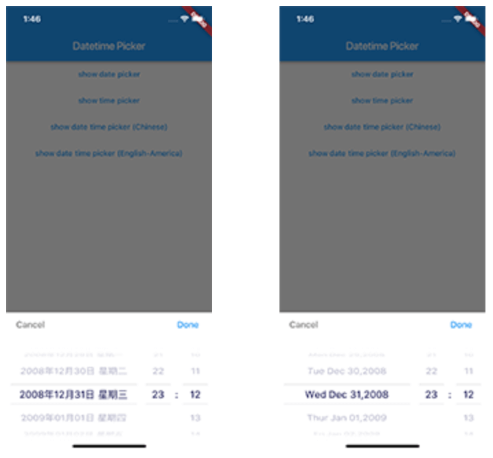
Date Time picker (Chinese) Date Time picker (America) Date Time picker (Dutch) Date Time picker (Russian)

Demo App

main page

Usage

TextButton(
    onPressed: () {
        DatePicker.showDatePicker(context,
                              showTitleActions: true,
                              minTime: DateTime(2018, 3, 5),
                              maxTime: DateTime(2019, 6, 7), onChanged: (date) {
                            print('change $date');
                          }, onConfirm: (date) {
                            print('confirm $date');
                          }, currentTime: DateTime.now(), locale: LocaleType.zh);
    },
    child: Text(
        'show date time picker (Chinese)',
        style: TextStyle(color: Colors.blue),
    ));

Customize

If you want to customize your own style of date time picker, there is a class called CommonPickerModel, every type of date time picker is extended from this class, you can refer to other picker model (eg. DatePickerModel), and write your custom one, then pass this model to showPicker method, so that your own date time picker will appear, it’s easy, and will perfectly meet your demand

How to customize your own picker model:

class CustomPicker extends CommonPickerModel {
  String digits(int value, int length) {
    return '$value'.padLeft(length, "0");
  }

  CustomPicker({DateTime currentTime, LocaleType locale}) : super(locale: locale) {
    this.currentTime = currentTime ?? DateTime.now();
    this.setLeftIndex(this.currentTime.hour);
    this.setMiddleIndex(this.currentTime.minute);
    this.setRightIndex(this.currentTime.second);
  }

  @override
  String leftStringAtIndex(int index) {
    if (index >= 0 && index < 24) {
      return this.digits(index, 2);
    } else {
      return null;
    }
  }

  @override
  String middleStringAtIndex(int index) {
    if (index >= 0 && index < 60) {
      return this.digits(index, 2);
    } else {
      return null;
    }
  }

  @override
  String rightStringAtIndex(int index) {
    if (index >= 0 && index < 60) {
      return this.digits(index, 2);
    } else {
      return null;
    }
  }

  @override
  String leftDivider() {
    return "|";
  }

  @override
  String rightDivider() {
    return "|";
  }

  @override
  List<int> layoutProportions() {
    return [1, 2, 1];
  }

  @override
  DateTime finalTime() {
    return currentTime.isUtc
        ? DateTime.utc(currentTime.year, currentTime.month, currentTime.day,
            this.currentLeftIndex(), this.currentMiddleIndex(), this.currentRightIndex())
        : DateTime(currentTime.year, currentTime.month, currentTime.day, this.currentLeftIndex(),
            this.currentMiddleIndex(), this.currentRightIndex());
  }
}
Custom title bar

By default every picker shows a Cancel/Done bar above the wheels. Pass a titleActionsBuilder to any DatePicker.show* method to replace it with your own widget. The builder receives onCancel / onConfirm callbacks (which dismiss the picker the same way the default buttons do) and the currently selected DateTime:

DatePicker.showDatePicker(
  context,
  titleActionsBuilder: (context, onCancel, onConfirm, currentTime) {
    return Row(
      mainAxisAlignment: MainAxisAlignment.spaceBetween,
      children: [
        TextButton(onPressed: onCancel, child: const Text('Close')),
        Text('${currentTime.year}-${currentTime.month}-${currentTime.day}'),
        TextButton(onPressed: onConfirm, child: const Text('Pick')),
      ],
    );
  },
);

The bar is laid out within the theme's titleHeight, so keep your widget within that height (or raise titleHeight via a custom DatePickerTheme). The builder is only used when showTitleActions is true (the default).

Getting Started

For help getting started with Flutter, view our online documentation.

For help on editing package code, view the documentation.

Categorias

Dependências

Lista de dependências 2 itens

Repositório-fonte

Projetos que usam este pacote