Buscar pacotes, repositórios e categorias de apps

Capa de flutter_expandable_fab
Detalhes do pacotev3.0.0

flutter_expandable_fab

O FAB (Floating Action Button) de disco de velocidade que pode animar a exibição e ocultação de vários botões de ação.

AndroidiOSWebmacOSWindowsLinux
Downloads em 30 dias
31,7 mil
Curtidas
448
Pontos Pub
160

Instalar pacote

flutter pub add flutter_expandable_fab

Visão geral do pacote

Orientação gerada a partir de informações públicas. Apenas para referência.

Um pacote Flutter que fornece um botão flutuante de ação (FAB) com um dial de velocidade animado, permitindo que os usuários expandam e coloquem múltiplos botões de ação com transições suaves. Ele melhora a interatividade da IU ao oferecer uma maneira compacta e baseada em gestos para acessar várias ações a partir de um único FAB. O pacote é compatível com todas as principais plataformas e foi projetado para navegação intuitiva em aplicativos móveis e web. Animações e posicionamentos personalizáveis tornam-no adequado para interfaces modernas e dinâmicas.

Casos de uso

  • Navegação inferior com múltiplas ações
  • Menus de ação contextual
  • Interface do usuário aprimorada para aplicativos móveis
  • Acesso rápido a funções comuns
  • elementos de design interativos na web
  • Fluxos de trabalho otimizados em aplicativos de produtividade

Principais recursos

  • Animações suaves de expansão/colapso
  • Posições personalizáveis de botões
  • Suporte para múltiplos itens de ação
  • Compatibilidade multiplataforma
  • Integração fácil com a interface existente
  • Duração e curva de animação configuráveis

Indicado para

  • Desenvolvedores construindo aplicativos móveis interativos
  • Designers procurando soluções dinâmicas FAB
  • Equipes usando Flutter para projetos multiplataforma
  • Aplicativos que exigem painéis de ação contextuais
  • Desenvolvimento de aplicativos focado em UX
  • Projetos que enfatizam interações baseadas em gestos

Considerações

  • Pode afetar o desempenho com muitos botões de ação
  • Requer planejamento cuidadoso do layout
  • O comportamento da animação pode variar entre plataformas
  • Não é ideal para cenários simples de uma única ação
  • Necessita de teste em todas as plataformas-alvo
  • Personalização limitada além da estilização básica

README original

Snapshot do README original do repositório-fonte vinculado. Consulte o repositório para o conteúdo mais recente.

flutter_expandable_fab

pub package

English, 日本語

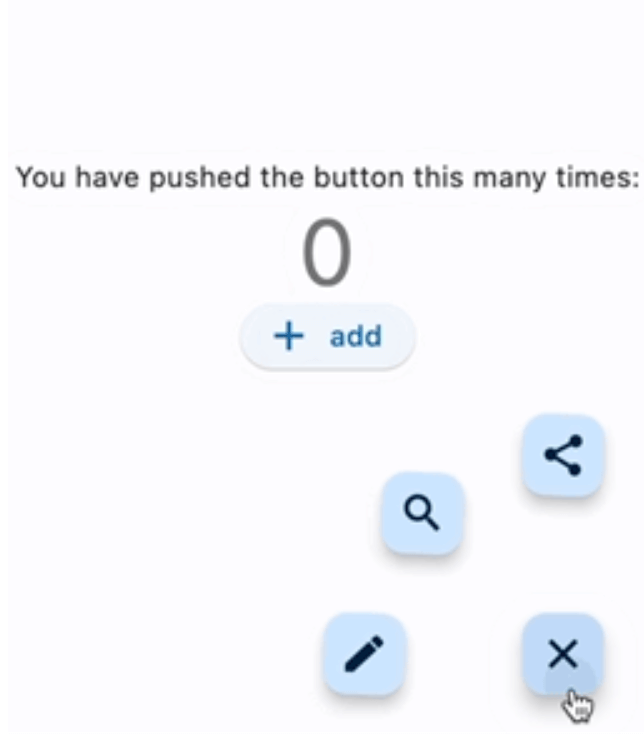
flutter_expandable_fab is a speed dial FAB (Floating Action Button) that can animate the display and hiding of multiple action buttons.
It can be configured to display vertically, horizontally, or in a fan-shaped manner, on either side. It allows for fine-grained customization.

Migration from 1.x to 2.x

In version 2.x, I have made changes to enable free customization of the open/close buttons by setting builders.

Code before migration:
ExpandableFab(
  child: const Icon(Icons.account_box),
  foregroundColor: Colors.amber,
  backgroundColor: Colors.green,
  closeButtonStyle: const ExpandableFabCloseButtonStyle(
    child: Icon(Icons.abc),
    foregroundColor: Colors.deepOrangeAccent,
    backgroundColor: Colors.lightGreen,
  )
  expandedFabSize: ExpandedFabSize.small,
  collapsedFabSize: ExpandableFabSize.regular,
  expandedFabShape: const CircleBorder(),
  collapsedFabShape: const CircleBorder(),
)
Code after migration:
ExpandableFab(
  openButtonBuilder: RotateFloatingActionButtonBuilder(
    child: const Icon(Icons.account_box),
    fabSize: ExpandableFabSize.regular,
    foregroundColor: Colors.amber,
    backgroundColor: Colors.green,
    shape: const CircleBorder(),
  ),
  closeButtonBuilder: DefaultFloatingActionButtonBuilder(
    child: const Icon(Icons.close),
    fabSize: ExpandableFabSize.small,
    foregroundColor: Colors.deepOrangeAccent,
    backgroundColor: Colors.lightGreen,
    shape: const CircleBorder(),
  ),
)

Showcase

Fan style & Blur overlay
Vertical style & Color overlay
Horizontal style & Custom buttons
Center Fan style
floatingActionButton: ExpandableFab(
  type: ExpandableFabType.fan,
  pos: ExpandableFabPos.center,
  fanAngle: 180,

Getting started

import 'package:flutter_expandable_fab/flutter_expandable_fab.dart';

Scaffold(
  floatingActionButtonLocation: ExpandableFab.location,
  floatingActionButton: ExpandableFab(
    children: [
      FloatingActionButton.small(
        heroTag: null,
        child: const Icon(Icons.edit),
        onPressed: () {},
      ),
      FloatingActionButton.small(
        heroTag: null,
        child: const Icon(Icons.search),
        onPressed: () {},
      ),
    ],
  ),
),

Open/Close programmatically

class _FirstPageState extends State<FirstPage> {
  final _key = GlobalKey<ExpandableFabState>();

  @override
  Widget build(BuildContext context) {
    return Scaffold(
      floatingActionButtonLocation: ExpandableFab.location,
      floatingActionButton: ExpandableFab(
        key: _key,
        children: [
          FloatingActionButton.small(
            child: const Icon(Icons.edit),
            onPressed: () {
              final state = _key.currentState;
              if (state != null) {
                debugPrint('isOpen:${state.isOpen}');
                state.toggle();
              }
            },
          ),
        ],
      ),
    );
  }
}

Customize

You can customize the open/close buttons with your preferred Widget using FloatingActionButtonBuilder. By using DefaultFloatingActionButtonBuilder, you can easily set up the FloatingActionButton. RotateFloatingActionButtonBuilder provides a FloatingActionButton with a rotating animation. Also, the items specified in children don't necessarily have to be FloatingActionButton; you can set any Widget freely.

ExpandableFab(
  openButtonBuilder: RotateFloatingActionButtonBuilder(
    child: const Icon(Icons.account_box),
    fabSize: ExpandableFabSize.regular,
    foregroundColor: Colors.amber,
    backgroundColor: Colors.green,
    shape: const CircleBorder(),
  ),
  closeButtonBuilder: FloatingActionButtonBuilder(
    size: 56,
    builder: (BuildContext context, void Function()? onPressed,
        Animation<double> progress) {
      return IconButton(
        onPressed: onPressed,
        icon: const Icon(
          Icons.check_circle_outline,
          size: 40,
        ),
      );
    },
  ),
  children: [
    FloatingActionButton.large(
      heroTag: null,
      child: const Icon(Icons.edit),
      onPressed: () {},
    ),
    IconButton(
      onPressed: () {
        final state = _key.currentState;
        if (state != null) {
          debugPrint('isOpen:${state.isOpen}');
          state.toggle();
        }
      },
      icon: const Icon(
        Icons.share,
        size: 30,
      ),
    ),
  ],
)

Since children is an array of widgets, you can place any widget you like, not limited to FloatingActionButton.
You can also create buttons with labels as shown below.

floatingActionButton: ExpandableFab(
  key: _key,
  type: ExpandableFabType.up,
  childrenAnimation: ExpandableFabAnimation.none,
  distance: 70,
  overlayStyle: ExpandableFabOverlayStyle(
    color: Colors.white.withOpacity(0.9),
  ),
  children: const [
    Row(
      children: [
        Text('Remind'),
        SizedBox(width: 20),
        FloatingActionButton.small(
          heroTag: null,
          onPressed: null,
          child: Icon(Icons.notifications),
        ),
      ],
    ),
    Row(
      children: [
        Text('Email'),
        SizedBox(width: 20),
        FloatingActionButton.small(
          heroTag: null,
          onPressed: null,
          child: Icon(Icons.email),
        ),
      ],
    ),
    Row(
      children: [
        Text('Star'),
        SizedBox(width: 20),
        FloatingActionButton.small(
          heroTag: null,
          onPressed: null,
          child: Icon(Icons.star),
        ),
      ],
    ),
    FloatingActionButton.small(
      heroTag: null,
      onPressed: null,
      child: Icon(Icons.add),
    ),
  ],
),

Properties

ExpandableFab
Property Description Default
distance Distance from children 100
duration Animation duration 250ms
fanAngle Angle of opening when fan type 90
initialOpen Open at initial display false
type The type of behavior of this widget fan
pos Position for displaying the widget right
closeButtonBuilder Builder for the close button
openButtonBuilder Builder for the open button
childrenOffset For positioning of children widgets
childrenAnimation Types of animations for Children rotate
children The widgets below this widget in the tree
onOpen Will be called before opening the menu
afterOpen Will be called after opening the menu
onClose Will be called before the menu closes
afterClose Will be called after the menu closes
overlayStyle Provides the style for overlay. No overlay when null.
openCloseStackAlignment Defines how [openButtonBuilder] and [closeButtonBuilder] are aligned in a [Stack] Alignment.center
FloatingActionButtonBuilder
Property Description Default
builder Callback to build the Widget
size Size of the Widget
DefaultFloatingActionButtonBuilder
Property Description Default
fabSize Size of the button regular
foregroundColor Foreground color of the button
backgroundColor Background color of the button
shape Shape of the close button
heroTag Tag to apply to the [Hero] widget of the button
child Child widget of the button
RotateFloatingActionButtonBuilder
Property Description Default
angle Angle of rotation (in radians) math.pi / 2
... Same as DefaultFloatingActionButtonBuilder

Thanks

I referred to the code from this article: https://docs.flutter.dev/cookbook/effects/expandable-fab

Categorias

Dependências

Lista de dependências 1 itens

Repositório-fonte

Projetos que usam este pacote