Orientação gerada a partir de informações públicas. Apenas para referência.
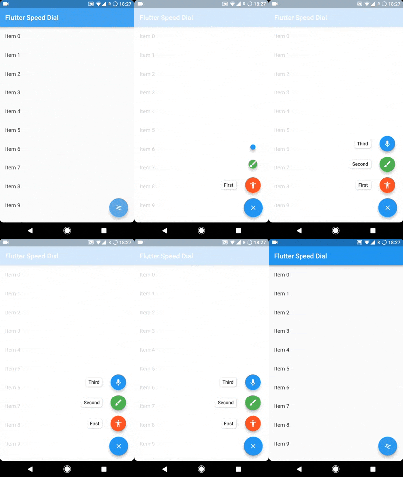
Um plugin Flutter que implementa um Speed Dial de Design Material dinâmico e visualmente atraente. Ele suporta ícones animados, rótulos, posicionamento multi-direcional de filhos e transições suaves. Ideal para melhorar a navegação em aplicativos com espaço limitado, oferece uma maneira intuitiva de acessar várias ações a partir de um único botão flutuante. O plugin é compatível com todas as principais plataformas, incluindo Android, iOS, Web, macOS, Windows e Linux.
Casos de uso
Melhorando a navegação do aplicativo móvel
Fornecendo acesso rápido a múltiplas ações
Melhorando a eficiência da interface em layouts compactos
Adicionando elementos interativos em painéis
Criando interfaces modernas e amigáveis ao gesto
Principais recursos
Transições de ícone animado
Suporte de rótulo para ações secundárias
Posicionamento multi-direcional de filhos
Comportamento de discagem rápida personalizável
Compatibilidade multiplataforma
Animações suaves de abertura e fechamento
Indicado para
Desenvolvedores de aplicativos móveis
Designers de UI/UX em busca de componentes do Material Design
Aplicativos que exigem menus de ação compactos
Desenvolvedores direcionados a múltiplas plataformas
Projetos usando as diretrizes do Material Design
Considerações
Pode afetar o desempenho com muitos filhos
Requer planejamento cuidadoso de layout
Personalização limitada além das opções embutidas
Não ideal para interações aninhadas complexas
Mais adequado para conjuntos simples e focados de ações
README original
Snapshot do README original do repositório-fonte vinculado. Consulte o repositório para o conteúdo mais recente.
To sustain the development of this library we need someone who can help this library either through code or by donating it. Donation will help us to live up in the world of unmaintained open source packages and to dedicate more time in improving this to live up to the mark. We will also add the name of the contributors or the donaters in the README section.
To donate directly you can use below link, don't forget to leave a message there:
Or become a Github sponser by clicking on the Sponser button in this repository.
Usage
The SpeedDial widget is built to be placed in the Scaffold.floatingActionButton argument, replacing the FloatingActionButton widget.
You can set its position using Scaffold.floatingActionButtonLocation argument.
It can also be used with Scaffold.bottomNavigationBar and Snackbar.
Null safety is available from version 3.0.5( It is also backward compatible, meaning you can use it with non null safe code too )
Labels
SpeedDial can take any Widget as labelSpeedDial will use Extended FloatingActionButton property if label is specified. It also have activeLabel property by which you can specify the label which is shown when SpeedDial is open. It also comes with its labelTransitionBuilder which defaults to fade transition.
Also Every child's button have label property which accepts String which can be styled by using labelStyle. If you want to specify a widget then you can use labelWidget.
If the label parameter is not provided, then the label will be not rendered.
Types of child for SpeedDial (Ordered by their priority)
Animated Icon using animatedIcon property
SpeedDial's AnimatedIcon has two specific parameters:
animatedIcon takes an AnimatedIconData widget
animatedIconTheme takes IconThemeData
Widget using child & activeChild property
SpeedDial's Widget has two specific parameters:
child takes a widget and is the default placeholder if dial is not open.
activeChild takes a widget and is the child's Widget which is used when dial is open, not required.
IconData using icon & activeIcon property
SpeedDial's IconData has three specific parameters:
icon takes a IconData and is the default placeholder if dial is not open.
activeIcon takes a IconData and is the child's IconData which is used when dial is open, not required.
iconTheme takes its IconThemeData which includes color and size.
The package will handle the animation by itself.
Handle spacing
There are various properties for SpeedDial by which you can adjust the spacing:
spacing - This parameter handles the space b/w speed dial and its children.
spaceBetweenChildren - As the name suggests, this is used to adjust the space b/w every child element
childPadding - This will adjust the padding of children speed dial button, this will help you to control the size of the children button more effectively.
childMargin - This will help you to adjust the margin b/w children speed dial button and its label.
Close on WillPop
Closes automatically on back button press, if dial is open.
If you don't want this behaviour then simply change the value of closeDialOnPop to false.