Buscar pacotes, repositórios e categorias de apps

Capa de percent_indicator
Detalhes do pacotev4.2.5

percent_indicator

Biblioteca que permite exibir widgets de progresso com base em porcentagem, podendo ser circular ou linear, além de permitir personalização conforme suas necessidades.

AndroidiOSWebmacOSWindowsLinux
Downloads em 30 dias
722 mil
Curtidas
2,8 mil
Pontos Pub
140

Instalar pacote

flutter pub add percent_indicator

Visão geral do pacote

Orientação gerada a partir de informações públicas. Apenas para referência.

O pacote percent_indicator fornece widgets personalizáveis de progresso para aplicativos Flutter, com suporte a designs circulares e lineares. Permite que desenvolvedores representem visualmente o progresso com base em valores percentuais, com opções extensas de personalização para cores, espessuras de traço e rótulos. Ideal para indicadores de carregamento, exibição de conclusão de tarefas ou qualquer cenário que exija feedback visual intuitivo sobre o progresso. A biblioteca é leve e compatível com todas as principais plataformas, incluindo móvel, web e desktop.

Casos de uso

  • Exibindo porcentagens de conclusão da tarefa
  • Mostrando progresso de carregamento em aplicativos
  • Criando barras de progresso personalizadas
  • Visualização de conclusão de formulário
  • Melhorar o feedback do usuário durante as operações

Principais recursos

  • Tipos de progressão circular e linear
  • Aparência altamente personalizável
  • Suporte para rótulos e texto
  • Design responsivo em plataformas
  • Integração fácil com widgets do Flutter
  • Cores e larguras de traço configuráveis

Indicado para

  • Desenvolvedores de aplicativos que precisam de visualização de progresso
  • Designers que desejam componentes de interface flexíveis
  • Projetos que exigem consistência entre plataformas
  • Aplicativos educacionais ou produtividade
  • Formulários e assistentes interativos

Considerações

  • Requer manipulação manual das atualizações de porcentagem
  • A personalização pode aumentar a complexidade do código
  • Impacto no desempenho com muitas instâncias
  • Animações internas limitadas
  • Não adequado para visualização de dados complexos

README original

Snapshot do README original do repositório-fonte vinculado. Consulte o repositório para o conteúdo mais recente.

Percent Indicator

pub package

Circular, Linear and Multi-segment linear percent indicators

drawing drawing

Features

  • Circle percent indicator
  • Linear percent indicator
  • Multi-segment linear indicator
  • Toggle animation
  • Custom duration of the animation
  • Progress based on a percentage value
  • Progress and background color
  • Custom size
  • Left , right or center child for Linear percent indicator
  • Top, bottom or center child for Circular percent indicator
  • Progress Color using gradients

Getting started

You should ensure that you add the router as a dependency in your flutter project.

dependencies:
  percent_indicator: ^4.2.5

You should then run flutter packages upgrade or update your packages in IntelliJ.

Example Project

There is a example project in the example folder. Check it out. Otherwise, keep reading to get up and running.

Usage

Need to include the import the package to the dart file where it will be used, use the below command,

import 'package:percent_indicator/percent_indicator.dart';

Circular percent indicator

Basic Widget

new CircularPercentIndicator(
                  radius: 60.0,
                  lineWidth: 5.0,
                  percent: 1.0,
                  center: new Text("100%"),
                  progressColor: Colors.green,
                )

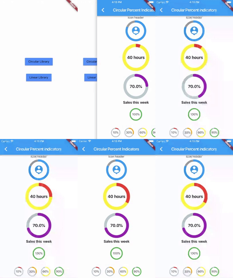
Complete example

  @override
  Widget build(BuildContext context) {
    return Scaffold(
      appBar: new AppBar(
        title: new Text("Circular Percent Indicators"),
      ),
          body: Center(
        child: ListView(
            children: <Widget>[
              new CircularPercentIndicator(
                radius: 100.0,
                lineWidth: 10.0,
                percent: 0.8,
                header: new Text("Icon header"),
                center: new Icon(
                  Icons.person_pin,
                  size: 50.0,
                  color: Colors.blue,
                ),
                backgroundColor: Colors.grey,
                progressColor: Colors.blue,
              ),
              new CircularPercentIndicator(
                radius: 130.0,
                animation: true,
                animationDuration: 1200,
                lineWidth: 15.0,
                percent: 0.4,
                center: new Text(
                  "40 hours",
                  style:
                      new TextStyle(fontWeight: FontWeight.bold, fontSize: 20.0),
                ),
                circularStrokeCap: CircularStrokeCap.butt,
                backgroundColor: Colors.yellow,
                progressColor: Colors.red,
              ),
              new CircularPercentIndicator(
                radius: 120.0,
                lineWidth: 13.0,
                animation: true,
                percent: 0.7,
                center: new Text(
                  "70.0%",
                  style:
                      new TextStyle(fontWeight: FontWeight.bold, fontSize: 20.0),
                ),
                footer: new Text(
                  "Sales this week",
                  style:
                      new TextStyle(fontWeight: FontWeight.bold, fontSize: 17.0),
                ),
                circularStrokeCap: CircularStrokeCap.round,
                progressColor: Colors.purple,
              ),
              Padding(
                padding: EdgeInsets.all(15.0),
                child: new CircularPercentIndicator(
                  radius: 60.0,
                  lineWidth: 5.0,
                  percent: 1.0,
                  center: new Text("100%"),
                  progressColor: Colors.green,
                ),
              ),
              Container(
                padding: EdgeInsets.all(15.0),
                child: new Row(
                  mainAxisAlignment: MainAxisAlignment.center,
                  children: <Widget>[
                    new CircularPercentIndicator(
                      radius: 45.0,
                      lineWidth: 4.0,
                      percent: 0.10,
                      center: new Text("10%"),
                      progressColor: Colors.red,
                    ),
                    new Padding(
                      padding: EdgeInsets.symmetric(horizontal: 10.0),
                    ),
                    new CircularPercentIndicator(
                      radius: 45.0,
                      lineWidth: 4.0,
                      percent: 0.30,
                      center: new Text("30%"),
                      progressColor: Colors.orange,
                    ),
                    new Padding(
                      padding: EdgeInsets.symmetric(horizontal: 10.0),
                    ),
                    new CircularPercentIndicator(
                      radius: 45.0,
                      lineWidth: 4.0,
                      percent: 0.60,
                      center: new Text("60%"),
                      progressColor: Colors.yellow,
                    ),
                    new Padding(
                      padding: EdgeInsets.symmetric(horizontal: 10.0),
                    ),
                    new CircularPercentIndicator(
                      radius: 45.0,
                      lineWidth: 4.0,
                      percent: 0.90,
                      center: new Text("90%"),
                      progressColor: Colors.green,
                    )
                  ],
                ),
              )
            ]),
      ),
    );
  }

Linear percent indicator

Basic Widget

new LinearPercentIndicator(
                width: 140.0,
                lineHeight: 14.0,
                percent: 0.5,
                backgroundColor: Colors.grey,
                progressColor: Colors.blue,
              ),

Complete example

@override
  Widget build(BuildContext context) {
    return Scaffold(
      appBar: new AppBar(
        title: new Text("Linear Percent Indicators"),
      ),
      body: Center(
        child: Column(
          mainAxisAlignment: MainAxisAlignment.center,
          children: <Widget>[
            Padding(
              padding: EdgeInsets.all(15.0),
              child: new LinearPercentIndicator(
                width: 140.0,
                lineHeight: 14.0,
                percent: 0.5,
                center: Text(
                  "50.0%",
                  style: new TextStyle(fontSize: 12.0),
                ),
                trailing: Icon(Icons.mood),
                linearStrokeCap: LinearStrokeCap.roundAll,
                backgroundColor: Colors.grey,
                progressColor: Colors.blue,
              ),
            ),
            Padding(
              padding: EdgeInsets.all(15.0),
              child: new LinearPercentIndicator(
                width: 170.0,
                animation: true,
                animationDuration: 1000,
                lineHeight: 20.0,
                leading: new Text("left content"),
                trailing: new Text("right content"),
                percent: 0.2,
                center: Text("20.0%"),
                linearStrokeCap: LinearStrokeCap.butt,
                progressColor: Colors.red,
              ),
            ),
            Padding(
              padding: EdgeInsets.all(15.0),
              child: new LinearPercentIndicator(
                width: MediaQuery.of(context).size.width - 50,
                animation: true,
                lineHeight: 20.0,
                animationDuration: 2000,
                percent: 0.9,
                center: Text("90.0%"),
                linearStrokeCap: LinearStrokeCap.roundAll,
                progressColor: Colors.greenAccent,
              ),
            ),
            Padding(
              padding: EdgeInsets.all(15.0),
              child: new LinearPercentIndicator(
                width: MediaQuery.of(context).size.width - 50,
                animation: true,
                lineHeight: 20.0,
                animationDuration: 2500,
                percent: 0.8,
                center: Text("80.0%"),
                linearStrokeCap: LinearStrokeCap.roundAll,
                progressColor: Colors.green,
              ),
            ),
            Padding(
              padding: EdgeInsets.all(15.0),
              child: Column(
                children: <Widget>[
                  new LinearPercentIndicator(
                    width: 100.0,
                    lineHeight: 8.0,
                    percent: 0.2,
                    progressColor: Colors.red,
                  ),
                  new LinearPercentIndicator(
                    width: 100.0,
                    lineHeight: 8.0,
                    percent: 0.5,
                    progressColor: Colors.orange,
                  ),
                  new LinearPercentIndicator(
                    width: 100.0,
                    lineHeight: 8.0,
                    percent: 0.9,
                    progressColor: Colors.blue,
                  )
                ],
              ),
            ),
          ],
        ),
      ),
    );
  }

Multi-segment linear indicator

Basic Widget

new MultiSegmentLinearIndicator(
                width: MediaQuery.of(context).size.width - 64,
                lineHeight: 30.0,
                segments: [
                  SegmentLinearIndicator(
                    percent: 0.25,
                    color: Color(0xFF4285F4),
                    enableStripes: true,
                  ),
                  SegmentLinearIndicator(
                    percent: 0.4,
                    color: Color(0xFF6DD5F6),
                  ),
                  SegmentLinearIndicator(
                    percent: 0.35,
                    color: Color(0xFFEFEFEF),
                  ),
                ],
                barRadius: Radius.circular(10.0),
                animation: true,
                animationDuration: 1000,
                curve: Curves.easeInOut,
                animateFromLastPercent: true,
                onAnimationEnd: () {
                  ScaffoldMessenger.of(context).showSnackBar(
                    const SnackBar(
                      content: Text('Animation completed!'),
                      duration: Duration(seconds: 1),
                    ),
                  );
                },
              ),

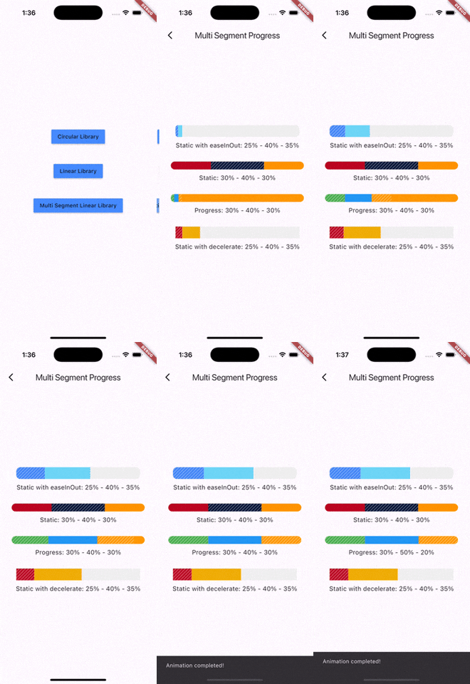
Complete example

@override
  Widget build(BuildContext context) {
    return Scaffold(
      appBar: AppBar(
        title: Text('Multi Segment Progress'),
      ),
      body: Center(
        child: Padding(
          padding: const EdgeInsets.all(20.0),
          child: Column(
            mainAxisAlignment: MainAxisAlignment.center,
            children: [
              MultiSegmentLinearIndicator(
                width: MediaQuery.of(context).size.width - 64,
                lineHeight: 30.0,
                segments: [
                  SegmentLinearIndicator(
                    percent: 0.25,
                    color: Color(0xFF4285F4),
                    enableStripes: true,
                  ),
                  SegmentLinearIndicator(
                    percent: 0.4,
                    color: Color(0xFF6DD5F6),
                  ),
                  SegmentLinearIndicator(
                    percent: 0.35,
                    color: Color(0xFFEFEFEF),
                  ),
                ],
                barRadius: Radius.circular(10.0),
                animation: true,
                animationDuration: 1000,
                curve: Curves.easeInOut,
                animateFromLastPercent: true,
                onAnimationEnd: () {
                  ScaffoldMessenger.of(context).showSnackBar(
                    const SnackBar(
                      content: Text('Animation completed!'),
                      duration: Duration(seconds: 1),
                    ),
                  );
                },
              ),
              SizedBox(height: 10),
              Text(
                'Static with easeInOut: 25% - 40% - 35%',
                style: TextStyle(fontSize: 16),
              ),
              SizedBox(height: 30),
              MultiSegmentLinearIndicator(
                width: MediaQuery.of(context).size.width - 40,
                lineHeight: 20.0,
                segments: [
                  SegmentLinearIndicator(
                    percent: 0.3,
                    color: Color(0xFFBA0521),
                  ),
                  SegmentLinearIndicator(
                    percent: 0.4,
                    color: Color(0xFF071437),
                    enableStripes: true,
                  ),
                  SegmentLinearIndicator(
                    percent: 0.3,
                    color: Color(0xFFFF9205),
                  ),
                ],
                barRadius: Radius.circular(20),
              ),
              SizedBox(height: 10),
              Text(
                'Static: 30% - 40% - 30%',
                style: TextStyle(fontSize: 16),
              ),
              SizedBox(height: 30),
              MultiSegmentLinearIndicator(
                width: MediaQuery.of(context).size.width - 40,
                lineHeight: 20.0,
                segments: [
                  SegmentLinearIndicator(
                    percent: firstSegment,
                    color: Colors.green,
                    enableStripes: true,
                  ),
                  SegmentLinearIndicator(
                    percent: secondSegment,
                    color: Colors.blue,
                    enableStripes: true,
                  ),
                  SegmentLinearIndicator(
                    percent: thirdSegment,
                    color: Colors.orange,
                  ),
                ],
                animation: true,
                animateFromLastPercent: true,
                animationDuration: 1000,
                curve: Curves.easeInOut,
                barRadius: Radius.circular(10),
              ),
              SizedBox(height: 10),
              Text(
                'Progress: ${(firstSegment * 100).toInt()}% - ${(secondSegment * 100).toInt()}% - ${(thirdSegment * 100).toInt()}%',
                style: TextStyle(fontSize: 16),
              ),
              SizedBox(height: 30),
              MultiSegmentLinearIndicator(
                width: MediaQuery.of(context).size.width - 64,
                lineHeight: 30.0,
                segments: [
                  SegmentLinearIndicator(
                    percent: 0.15,
                    color: Color(0xFFBA0521),
                    enableStripes: true,
                  ),
                  SegmentLinearIndicator(
                      percent: 0.4, color: Color(0xFFAEFAB00)),
                  SegmentLinearIndicator(
                      percent: 0.45, color: Color(0xFFEFEFEF)),
                ],
                animation: true,
                animationDuration: 1000,
                curve: Curves.decelerate,
                animateFromLastPercent: true,
              ),
              SizedBox(height: 10),
              Text(
                'Static with decelerate: 25% - 40% - 35%',
                style: TextStyle(fontSize: 16),
              ),
              SizedBox(height: 30),
            ],
          ),
        ),
      ),
    );
  }

You can follow me on twitter @diegoveloper

Categorias

Repositório-fonte

Projetos que usam este pacote