搜尋套件、儲存庫與 APP 分類

badges 封面
套件詳情v4.0.1

badges

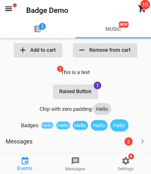
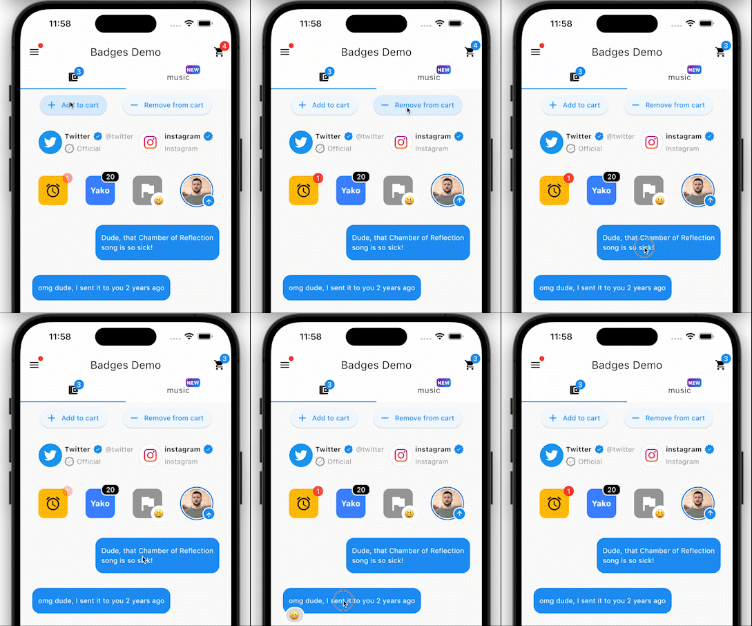
一個用於建立徽章的套件。徽章可用於任何組件的額外標記,例如在購物車中顯示項目數量。

AndroidiOSWebmacOSWindowsLinux
近 30 天下載
41.8萬
喜歡數
3760
Pub 分數
160

安裝套件

flutter pub add badges

套件介紹

根據套件公開資料產生的選型評估,僅供參考。

badges 套件提供了一種簡單的方式,可在 Flutter 應用中的任何元件上新增裝飾性徽章。這些徽章可顯示數字、標籤或圖示,常被用於強調通知、購物車數量或狀態指示器。此套件設計以易用為導向,支援多種自訂選項,例如位置、形狀、顏色和大小。該套件相容於所有主要平台,包括 Android、iOS、Web、macOS、Windows 和 Linux,非常適合需要一致視覺反饋的跨平台應用。

適用情境

  • 在購物車中顯示項目數量
  • 突出顯示未讀訊息或通知
  • 指示產品可用性或狀態
  • 向使用者介面元素添加視覺標記
  • 顯示進度或完成程度

主要特色

  • 與任何小部件的輕鬆整合
  • 可自定義徽章內容和樣式
  • 支援多個位置(左上、右上等)
  • 跨平台相容性
  • 輕量且高效
  • 可設定的顏色和形狀

適合對象

  • 需要購物車計數器的電子商務應用
  • 用於通知的訊息或社群媒體應用程式
  • 儀表板小部件帶狀態指示器
  • 需要視覺反饋的使用者操作介面
  • 尋求輕量級徽章解決方案的開發者

使用建議

  • 可能需要仔細定位以避免與其他UI元素重疊
  • 有限的內建動畫(可能需要外部動畫套件)
  • 不適用於複雜的互動式徽章
  • 最適合簡單的數值或基於標籤的指標
  • 性能影響可忽略不計,但應在大型清單中進行測試

原始 README

以下為關聯原始碼儲存庫的 README 原文快照,最新內容請造訪原始碼儲存庫。

Pub Version popularity likes building style: flutter lints Package of the week

Installing:

In your pubspec.yaml

dependencies:
  badges: ^3.2.0

Attention! In Flutter 3.7 the Badge widget was introduced in the Material library, so to escape the ambiguous imports you need to import the package like this:

Option 1: namespace prefix

import 'package:badges/badges.dart' as badges;

and then use the "badges.Badge" widget instead of the "Badge" widget. The same for all the classes from this package.

Option 2: hide Flutter's Material Badge widget

import 'package:badges/badges.dart';
import 'package:flutter/material.dart' hide Badge;


Basic Usage:

    badges.Badge(
      badgeContent: Text('3'),
      child: Icon(Icons.settings),
    )

Advanced usage

    badges.Badge(
      position: badges.BadgePosition.topEnd(top: -10, end: -12),
      showBadge: true,
      ignorePointer: false,
      onTap: () {},
      badgeContent:
          Icon(Icons.check, color: Colors.white, size: 10),
      badgeAnimation: badges.BadgeAnimation.rotation(
        animationDuration: Duration(seconds: 1),
        colorChangeAnimationDuration: Duration(seconds: 1),
        loopAnimation: false,
        curve: Curves.fastOutSlowIn,
        colorChangeAnimationCurve: Curves.easeInCubic,
      ),
      badgeStyle: badges.BadgeStyle(
        shape: badges.BadgeShape.square,
        badgeColor: Colors.blue,
        padding: EdgeInsets.all(5),
        borderRadius: BorderRadius.circular(4),
        borderSide: BorderSide(color: Colors.white, width: 2),
        borderGradient: badges.BadgeGradient.linear(
            colors: [Colors.red, Colors.black]),
        badgeGradient: badges.BadgeGradient.linear(
            colors: [Colors.blue, Colors.yellow],
            begin: Alignment.topCenter,
            end: Alignment.bottomCenter,
        ),
        elevation: 0,
      ),
      child: Text('Badge'),
    ),


Animations:

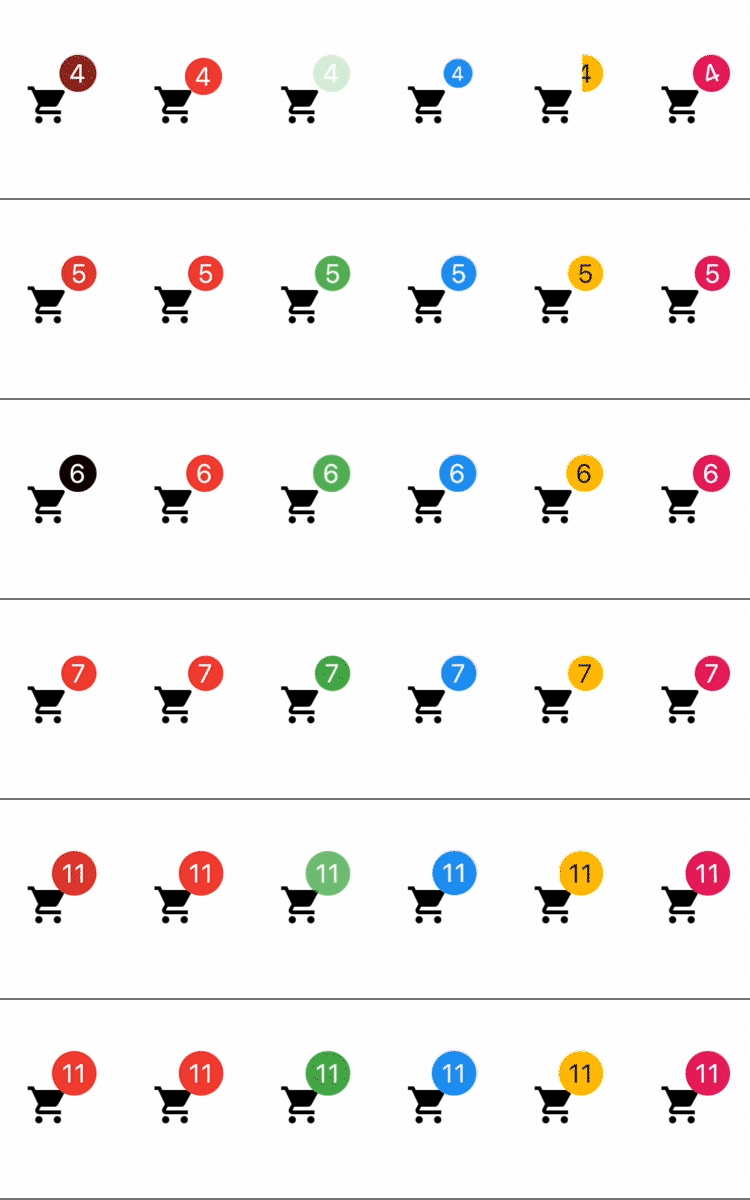
From left to right:
1) Color change animation 2) BadgeAnimation.slide 3) BadgeAnimation.fade 4) BadgeAnimation.scale 5) BadgeAnimation.size 6) BadgeAnimation.rotation
Also, loop animation is available, this will loop the animation until you stop it.


Shapes:

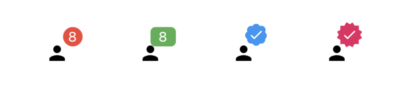
From left to right:
1) BadgeShape.circle 2) BadgeShape.square 3) BadgeShape.twitter 4) BadgeShape.instagram


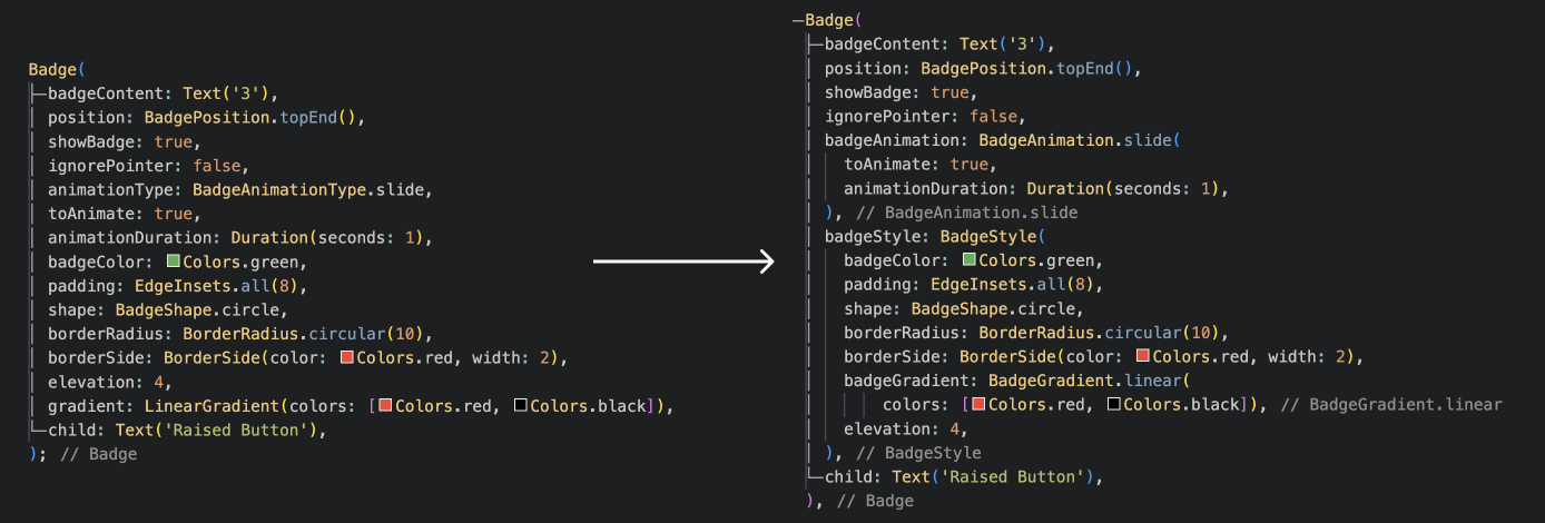
Migration from Badges 2:

Check out other Yako packages:

Badges

Settings UI

Status Alert

Full Screen Menu

Diagonal decoration

Yako Yheme Switch

and more to come!

所屬分類

依賴

依賴清單 1 項

原始碼儲存庫

使用此套件的專案

所在榜單