搜尋套件、儲存庫與 APP 分類

dashboard 封面
套件詳情v0.0.4

dashboard

動態儀表板元件,讓您的使用者可以建立自己的版面配置。支援調整大小、移動、間接調整大小/移動與自動重新佈局。

AndroidiOSWebmacOSWindowsLinux
近 30 天下載
1530
喜歡數
230
Pub 分數
150

安裝套件

flutter pub add dashboard

套件介紹

根據套件公開資料產生的選型評估,僅供參考。

儀表板套件提供了一個動態且使用者可設定的小工具,用於建立可自訂的佈局。使用者可自由調整小工具的大小、移動與重新排列,支援間接調整大小與自動重新佈局。非常適合需要互動式自訂的儀表板,可在所有主要平台(包含 Android、iOS、Web、macOS、Windows 與 Linux)上運作。此套件專為尋求彈性、響應式介面的開發者設計,能即時適應使用者偏好。

適用情境

  • 可自訂的分析儀表板
  • 使用者定義的佈局介面
  • 互動式管理面板
  • 即時數據可視化
  • 響應式基於網格的應用程式

主要特色

  • 拖曳式元件重新定位
  • 可調整大小的元件,支援自動重新佈局
  • 間接調整大小/移動支援
  • 跨平台相容性
  • 動態佈局持久化
  • 可設定的網格系統

適合對象

  • 開發互動式儀表板的開發者
  • 需要使用者自定義介面的應用程式
  • 具有動態內容網格的專案
  • 專注於使用者體驗彈性的前端團隊
  • 需要響應式版面的 Web 與行動應用程式

使用建議

  • 可能需要對大量小部件進行效能優化
  • 初始設定包括配置網格和小部件約束
  • 內建樣式選項有限,僅限基本佈局
  • 最適合中大型互動式介面
  • 在拖動操作期間需要仔細處理狀態管理

原始 README

以下為關聯原始碼儲存庫的 README 原文快照,最新內容請造訪原始碼儲存庫。

Dynamic dashboard widget that allows your users to create their own layouts. Rezise, move, indirect resize/move, auto re-layout are supported.

Features

Try online demo

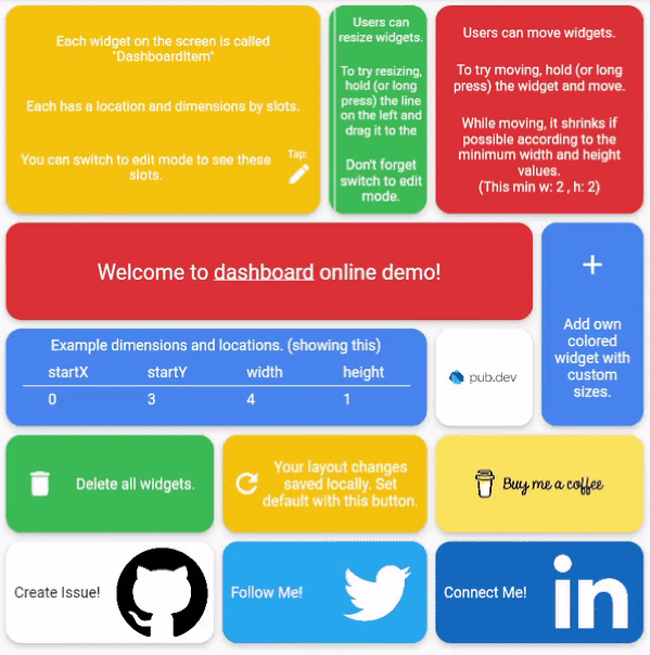
Dashboard can be thought of as a dynamic grid. Your users can create their own layouts, add new widgets or remove widgets.

Layout divides the screen into horizontal slots according to the entered value. The aspect ratio of the slots also determine their height. Widgets called DashboardItem are placed in these slots. This layout can be changed later.

Resize

Dashboard Items can be resized both by long pressing on mobile and by holding and moving on desktop/browser.

Move

Dashboard Item locations can be changed by long pressing on mobile or by holding and pulling on desktop/browser.

Slots Changes

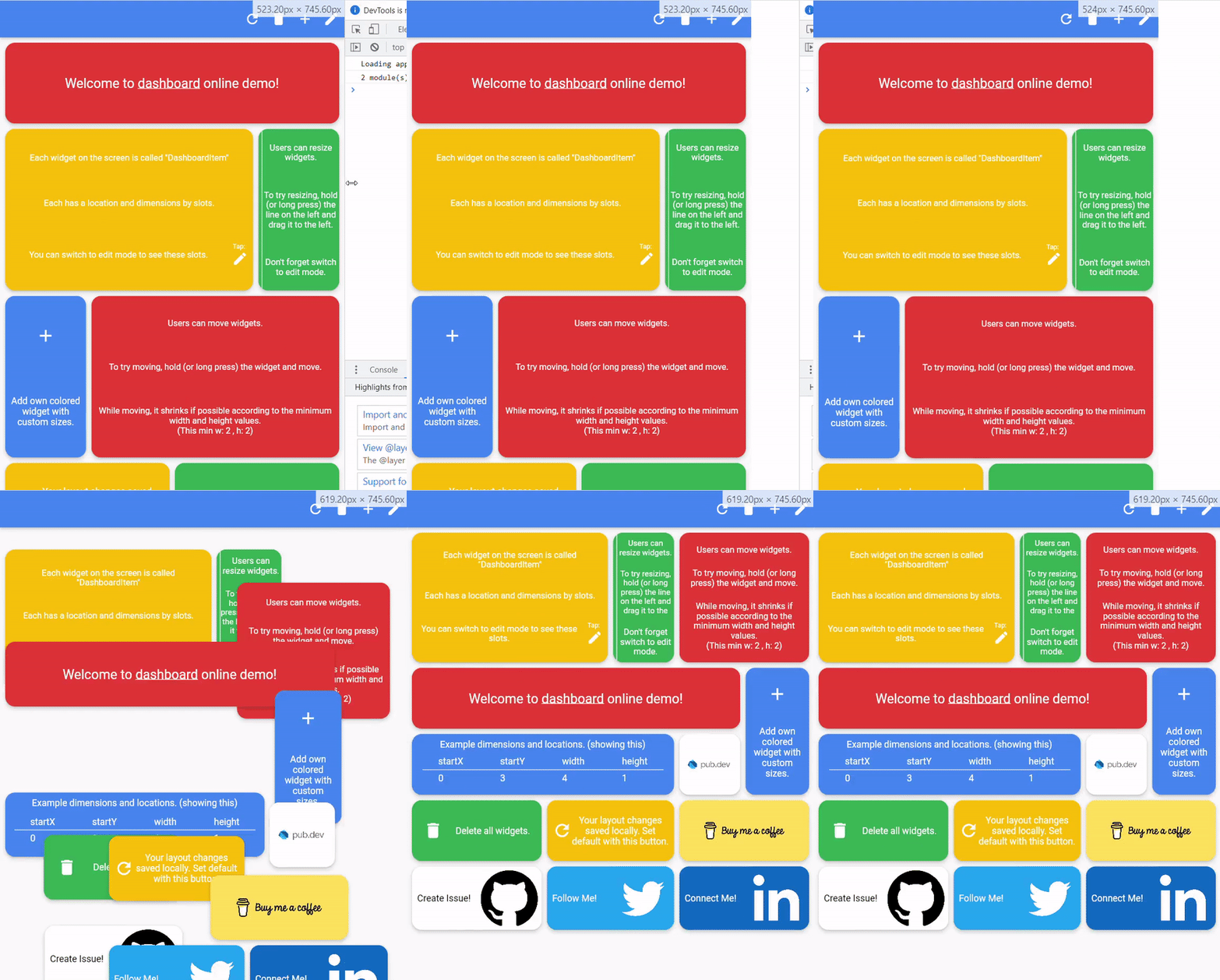
With dynamic slot count, you can re-layout window size changes.

>

Storage Delegate

The layout information of the users can be stored in the database or on the local disk.

Define your storage delegate.

class MyItemStorage extends DashboardItemStorageDelegate {  

  @override  
  FutureOr<List<DashboardItem>> getAllItems(int slotCount) {  
    // return items from db.
  }  
  
  @override  
  FutureOr<void> onItemsUpdated(  
      List<DashboardItem> items, int slotCount) {
      // save new layouts to db.
  }
  //[...]
}

And use it.

DashboardItemController.withDelegate(
    itemStorageDelegate: MyItemsStorage())

Getting started

Define Dashboard
Dashboard(  
  dashboardItemController: itemController,  
  itemBuilder: (item) {
	//return widget
  },  
);
Define Items

Items can come from the database, or can be defined as fixed.

Fixed:

DashboardItemController(items: [
  DashboardItem(width: 2, height: 3, identifier: "id_1"),  
  DashboardItem(  
      startX: 3, startY: 4, width: 3, height: 1, identifier: "id_2"),  
]);

Or with delegate:

DashboardItemController<ADashboardItemImp>.withDelegate(  
    itemStorageDelegate: MyItemStorage())

See example

Define Builder

The Builder is invoked with a DashboardItem and returns a widget.

Dashboard(  
  dashboardItemController: itemController,  
  itemBuilder: (item) {
	return Text(item.identifier);
  },  
);

Parameters

Item Style

Each item is wrapped with a Material widget. You can enter the parameters of the Material widget with item style.

All is optional.

ItemStyle(  
  color: Colors.red,  
  borderRadius: BorderRadius.circular(10),  
  shape: const RoundedRectangleBorder(),  
  shadowColor: Colors.black,  
  animationDuration: const Duration(milliseconds: 200),  
  borderOnForeground: false,  
  clipBehavior: Clip.antiAliasWithSaveLayer,  
  elevation: 10,  
  textStyle: const TextStyle(color: Colors.black),  
  type: MaterialType.card  
);
Slide

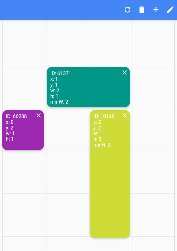
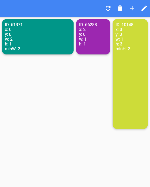
Slide to top items initially. Auto relayout places items to top as possible.

slideToTop: true

Before:

>

After:

>

Shrink

Shrink items when re-layout or editing is possible.

Edit Mode Settings

See code comments for edit mode settings parameters.

All is optional.

    EditModeSettings(

        // animation settings
        curve: Curves.easeInOutCirc,
        duration: const Duration(milliseconds: 200),
        
        // fill editing item actual size
        fillEditingBackground: true,

        // space that can be held to resize
        resizeCursorSide: 20,
        
        // draw lines for slots
        paintBackgroundLines: true,
        
        // shrink items when editing if possible and necessary
        shrinkOnMove: true,
        
        // long press to edit
        longPressEnabled: true,
        
        // pan to edit
        panEnabled: true,
        
        backgroundStyle: const EditModeBackgroundStyle(
            fillColor: Colors.red,
            lineWidth: 1.5,
            lineColor: Colors.black,
            
            // line by vertical space
            dualLineHorizontal: true,

            // line by horizontal space
            dualLineVertical: true));
Storage Delegate

See example

Additional

"Buy Me A Coffee"

TODO

  • [ ] Define and fix animation bugs.
  • [ ] Check performance improvements.
  • [ ] Write tests.
  • [ ] Add more documentation.
  • [ ] Add more example.
  • [ ] Create Youtube video.

所屬分類

原始碼儲存庫

使用此套件的專案