搜尋套件、儲存庫與 APP 分類

decorated_icon 封面
套件詳情v1.2.1

decorated_icon

一個輕量級、高效能的圖示組件,支援陰影效果清單。

AndroidiOSWebmacOSWindowsLinux
近 30 天下載
2790
喜歡數
80
Pub 分數
150

安裝套件

flutter pub add decorated_icon

套件介紹

根據套件公開資料產生的選型評估,僅供參考。

DecoratedIcon 是一個輕量且高效能的 Flutter 小工具,專門用於顯示帶有可自訂陰影效果的圖示。它透過允許開發者套用多重陰影來擴展標準 Icon 小工具,進而增強視覺深度與設計彈性。非常適合在不帶來效能負擔的情況下創造視覺吸引力強的 UI 元件,支援所有主要平台,包括 Android、iOS、Web、macOS、Windows 和 Linux。該套件可透過 pub add 輕鬆整合,並以乾淨、簡潔的程式碼維護。適用於需要具備細微或戲劇性陰影效果之樣式圖示的應用程式。

適用情境

  • 添加帶陰影的樣式圖標
  • 建立視覺豐富的 UI 元件
  • 增強應用程式介面中的圖示外觀
  • 設計自定義按鈕圖示
  • 改進儀表板中的視覺層次

主要特色

  • 支援多種陰影效果
  • 輕量且高效
  • 透過 pub add 輕鬆整合
  • 跨平台相容性
  • 擴展標準 Icon 小部件
  • 可自訂的陰影屬性

適合對象

  • 尋求視覺魅力的UI設計師
  • 開發現代應用程式介面的開發者
  • 需要細微圖示增強的專案
  • 具有高視覺設計標準的應用程式
  • 重視效能與簡潔性的團隊

使用建議

  • 僅限陰影效果
  • 無內建動畫支援
  • 需要手動設定陰影
  • 不適用於複雜的圖示轉換
  • 最佳搭配簡單的圖示主題使用

原始 README

以下為關聯原始碼儲存庫的 README 原文快照,最新內容請造訪原始碼儲存庫。

pub package

Decorated Icon

The best-performing shadowed icon widget for Flutter!

DecoratedIcon is a super lightweight Icon that supports shadow decorations.

No complicated hacks or multiple widgets, just List<Shadow> shadows like a TextStyle!

This widget is able to achieve the most efficient implementation of an icon with a shadow because it is uses a single Text widget to display the icon and apply the shadows.

It even supports debugging and Semantics.

One thing to keep in mind when using multiple shadows is the order of stacking by Flutter: the first shadow in the list will be painted at the bottom. (Similar to how the Stack widget draws its children.)

Also note that due to Flutter's current limitation, achieving an "outer glow" effect is not currently possible. You can read more here.

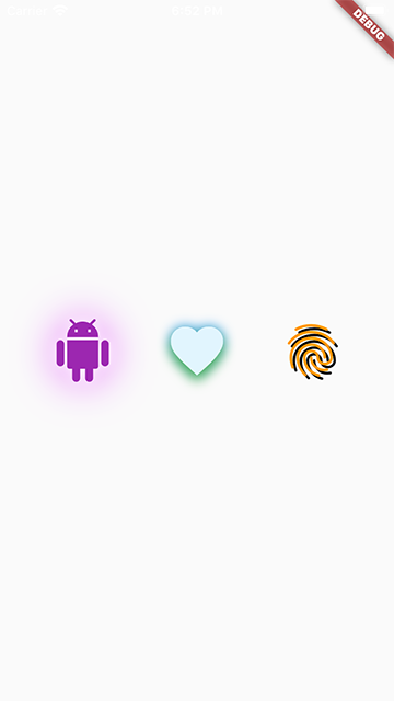
Usage

To use this package, add decorated_icon as a dependency in your pubspec.yaml file.

Example

snapshot

Import the library.

import 'package:decorated_icon/decorated_icon.dart';

Then use DecoratedIcon as you would an Icon:

final decoratedIcons = Row(
  mainAxisAlignment: MainAxisAlignment.spaceEvenly,
  children: const [
    DecoratedIcon(
      Icons.android,
      color: Colors.purple,
      size: 60.0,
      shadows: [
        BoxShadow(
          blurRadius: 42.0,
          color: Colors.purpleAccent,
        ),
        BoxShadow(
          blurRadius: 12.0,
          color: Colors.white,
        ),
      ],
    ),
    DecoratedIcon(
      Icons.favorite,
      color: Colors.lightBlue.shade50,
      size: 60.0,
      shadows: [
        BoxShadow(
          blurRadius: 12.0,
          color: Colors.blue,
        ),
        BoxShadow(
          blurRadius: 12.0,
          color: Colors.green,
          offset: Offset(0, 6.0),
        ),
      ],
    ),
    DecoratedIcon(
      Icons.fingerprint,
      color: Colors.orange,
      size: 60.0,
      shadows: [
        BoxShadow(
          color: Colors.black,
          offset: Offset(3.0, 3.0),
        ),
      ],
    ),
  ],
);

所屬分類

原始碼儲存庫

使用此套件的專案