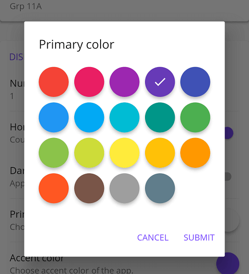
一個 Flutter 套件,提供具有可自訂選項的 Material 風格色彩選擇器,適用於 Flutter 應用程式。它讓使用者能從視覺上吸引人的、Material 設計的介面中選擇顏色,支援跨多個平台整合,包括 Android、iOS、Web、macOS、Windows 和 Linux。此選擇器透過各種自訂設定提供彈性,適合需要直覺式色彩選擇的應用程式。它依據 Flutter 的 Material 設計原則建構,以確保一致的使用者介面體驗。
適用情境
應用主題中的顏色選擇
自定義 UI 元素顏色
設計工具整合
使用者偏好設定
互動式配色方案
原型配色方案
主要特色
材質設計美學
跨平台相容性
可自定外觀
與 Flutter 的輕鬆整合
支援顏色色塊
響應式使用者介面
適合對象
UI/UX 開發人員
應用設計師
主題自定義工具
互動式原型設計
顏色敏感的應用程式
使用建議
限制為材質設計風格
需要手動處理顏色狀態
無內建色彩歷史
可能需要為非 Material 主題添加額外的樣式
依賴 Flutter 的 Material 庫
未針對複雜色彩模型進行優化
原始 README
以下為關聯原始碼儲存庫的 README 原文快照,最新內容請造訪原始碼儲存庫。
Flutter Material Color Picker
Material Color picker is a Flutter widget, that can be customizable.
By default, it's Material Colors, but you can define your own colors.
You can also use CircleColor widget to display color in your app.
Example, you can set the color picker in a dialog and display the selected color in a ListTile, for settings.
How to use it
These examples use a static color for 'selectedColor', but you can use a variable (state)
MaterialColorPicker(
    onColorChange: (Color color) {
        // Handle color changes
    },
    onMainColorChange: (ColorSwatch color) {
        // Handle main color changes
    },
    selectedColor: Colors.red
)
Disallow Shades
MaterialColorPicker(
    allowShades: false, // default true
    onMainColorChange: (ColorSwatch color) {
        // Handle main color changes
    },
    selectedColor: Colors.red
)
If allowShades is set to false then only main colors will be shown and allowed to be selected.
onColorChange will not be called, use onMainColorChange instead.
Custom colors
In this example, custom colors are a list of Material Colors (class who extend of ColorSwatch).
But you can create your own list of ColorSwatch.
There is two step, first choose the main color, and when you press it, you have to choose a shade of the main color.
By default it's all Material Colors, but you can define custom colors, a list of ColorSwatch.
Example of usages
You can insert the color picker into a Dialog
Display color
You can use CircleColor widget, to display the selected color into your settings for example.