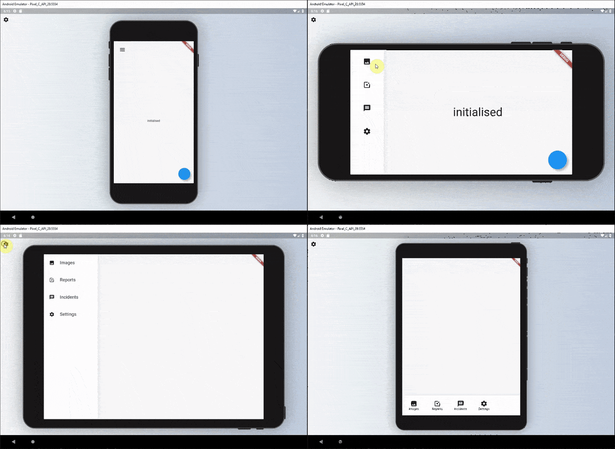
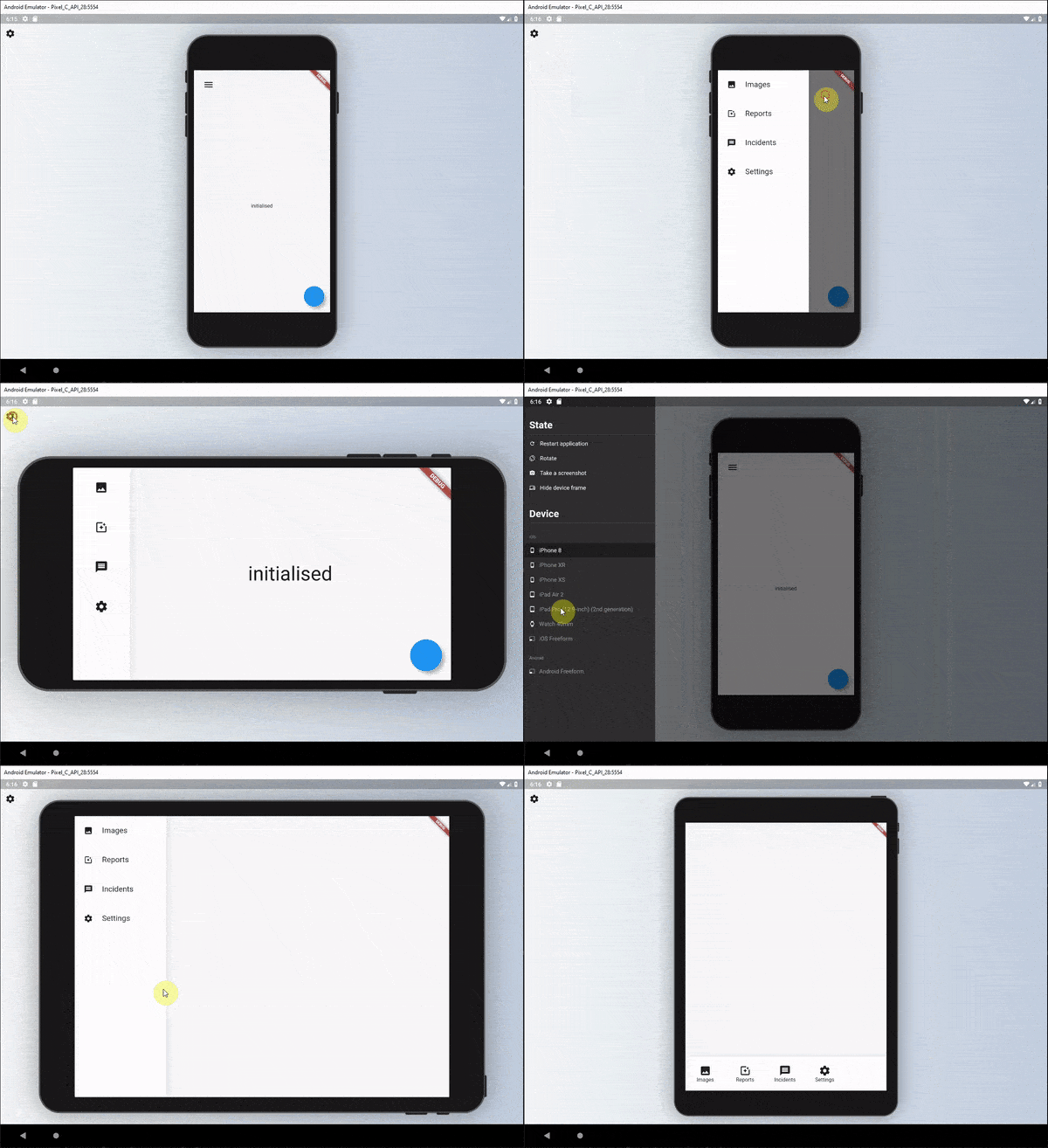
ResponsiveBuilder 是一個 Flutter 套件,透過提供可輕鬆根據螢幕尺寸和裝置類型調整佈局的元件,簡化建立響應式使用者介面的過程。它讓開發者能夠為不同斷點定義不同的 UI 結構,確保在 Android、iOS、Web、macOS、Windows 和 Linux 上都能獲得最佳顯示效果。該套件透過基於裝置特徵(如寬度、高度和方向)的直覺條件渲染,增強了響應式程式碼的可讀性和可維護性。它非常適合建立自適應設計,而無需複雜的邏輯或樣板程式碼。
適用情境
為多種螢幕尺寸建構自適應版面
建立響應式儀表板
設計跨平台應用程式並保持一致的使用者介面
為移動設備和桌面設備實現不同的使用者介面
優化內容版面以適應平板電腦和大螢幕
主要特色
基於斷点的響應式設計
支援所有主要平台
簡潔、易讀的響應式邏輯語法
內建裝置類型偵測
與現有 Flutter 專案的輕鬆整合
適合對象
開發跨平台 Flutter 應用的開發者
優先考慮跨裝置的UI一致性
適用於網頁和行動裝置的自適應版面專案
專注於響應式設計的前端開發人員
同時面向行動和桌面用戶的App
使用建議
可能需要在不同類型的設備上進行額外測試
不適合沒有自定義邏輯的高動態版面
最佳搭配清晰的斷點定義使用
性能影響可忽略不計,但取決於複雜性
需要理解響應式設計原則
原始 README
以下為關聯原始碼儲存庫的 README 原文快照,最新內容請造訪原始碼儲存庫。
Responsive Builder 💻➡️🖥➡️📱➡️⌚️
The responsive builder package contains widgets that allows you to create a readable responsive UI. The package is inspired by the Responsive UI Flutter series created by FilledStacks.
It aims to provide you with widgets that make it easy to build different UI's along two different Axis. Orientation x ScreenType. This means you can have a separate layout for Mobile - Landscape, Mobile - Portrait, Tablet - Landscape and Tablet-Portrait.
If you follow along with the series you will have a complete understanding of how it's built and how to use it. Part 2 goes over how we build the example included in this project.
Installation
Add responsive_builder as dependency to your pubspec file.
responsive_builder:
Usage
This package provides a widget called ResponsiveBuilder that provides you with a builder function that returns the current SizingInformation. The SizingInformation includes the DeviceScreenType, screenSize and localWidgetSize. This can be used for fine grained responsive control from a view level down to per widget responsive level.
Responsive Builder
The ResponsiveBuilder is used as any other builder widget.
// import the packageimport'package:responsive_builder/responsive_builder.dart';
// Use the widgetResponsiveBuilder(
builder: (context, sizingInformation) {
// Check the sizing information here and return your UIif (sizingInformation.deviceScreenType == DeviceScreenType.desktop) {
returnContainer(color:Colors.blue);
}
if (sizingInformation.deviceScreenType == DeviceScreenType.tablet) {
returnContainer(color:Colors.red);
}
if (sizingInformation.deviceScreenType == DeviceScreenType.watch) {
returnContainer(color:Colors.yellow);
}
returnContainer(color:Colors.purple);
},
},
);
}
This will return different colour containers depending on which device it's being shown on. A simple way to test this is to either run your code on Flutter web and resize the window or add the device_preview package and view on different devices.
Orientation Layout Builder
This widget can be seen as a duplicate of the OrientationBuilder that comes with Flutter, but the point of this library is to help you produce a readable responsive UI code base. As mentioned in the follow along tutorial I didn't want responsive code riddled with conditionals around orientation, MediaQuery or Renderbox sizes. That's why I created this builder.
The usage is easy. Provide a builder function that returns a UI for each of the orientations.
// import the packageimport'package:responsive_builder/responsive_builder.dart';
// Return a widget function per orientationOrientationLayoutBuilder(
portrait: (context) => Container(color: Colors.green),
landscape: (context) => Container(color: Colors.pink),
),
This will return a different coloured container when you swap orientations for your device. In a more readable manner than checking the orientation with a conditional.
Sometimes you want your app to stay in a certain orientation. use mode property in OrientationLayoutBuilder to enforce this.
This widget is similar to the Orientation Layout Builder in that it takes in Widgets that are named and displayed for different screen types.
// import the packageimport'package:responsive_builder/responsive_builder.dart';
// Construct and pass in a widget per screen typeScreenTypeLayout(
mobile: Container(color:Colors.blue)
tablet: Container(color: Colors.yellow),
desktop: Container(color: Colors.red),
watch: Container(color: Colors.purple),
);
If you don't want to build all the widgets at once, you can use the widget builder. A widget for the right type of screen will be created only when needed.
// Construct and pass in a widget builder per screen typeScreenTypeLayout.builder(
mobile: (BuildContext context) => Container(color:Colors.blue),
tablet: (BuildContext context) => Container(color:Colors.yellow),
desktop: (BuildContext context) => Container(color:Colors.red),
watch: (BuildContext context) => Container(color:Colors.purple),
);
Custom Screen Breakpoints
If you wish to define your own custom break points you can do so by supplying either the ScreenTypeLayout or ResponsiveBuilder widgets with a breakpoints argument.
To get a more in depth run through of this package I would highly recommend watching this tutorial where I show you how it was built and how to use it.
Global Screen Breakpoints
If you want to set the breakpoints for the responsive builders once you can call the line below before the app starts, or wherever you see fit.
This will then reflect the screen types based on what you have set here. You can then still pass in custom break points per ScreenTypeLayout if you wish that will override these values for that specific ScreenTypeLayout builder.
Screen Type specific values
Sometimes you don't want to write an entire new UI just to change one value. Say for instance you want your padding on mobile to be 10, on the tablet 30 and desktop 60. Instead of re-writing UI you can use the getValueForScreenType function. This is a generic function that will return your value based on the screen type you're on. Take this example below.
It will return the value you give it for the DeviceScreen you're viewing the app on. For instance you want to hide a widget on mobile and not on tablet?
That will return true on tablet devices and false on mobile.
Responsive Sizing
In addition to providing specific layouts per device type there's also the requirement to size items based on the screen width or height. To use this functionality we added some responsive extensions. To use this wrap your Material or Cupertino App with the ResponsiveApp widget.
This is required to use the following functionality.
Responsive Sizing
To use the responsive sizing all you need to do is the following.
import'package:responsive_builder/responsive_builder.dart';
SizedBox(height: 30.screenHeight); // Or sh for shorthandText('respond to width', style: TextStyle(fontSize: 10.sw));
Use the number you want as the percentage and call the screenHeight or screenWidth extension. These also have shorthand extensions sh and sw.
Contribution
Fork it!
Create your feature branch: git checkout -b my-new-feature
Commit your changes: git commit -am 'Add some feature'
Push to the branch: git push origin my-new-feature