搜尋套件、儲存庫與 APP 分類

smooth_page_indicator 封面
套件詳情v3.0.0

smooth_page_indicator

可自定義的動畫頁面指示器,帶有一組內建效果。

AndroidiOSWebmacOSWindowsLinux
近 30 天下載
60.7萬
喜歡數
4130
Pub 分數
160

安裝套件

flutter pub add smooth_page_indicator

套件介紹

根據套件公開資料產生的選型評估,僅供參考。

Smooth Page Indicator 是一個可自定義的、帶有動畫效果的 Flutter 頁面指示器,支援多種內建視覺效果。它可無縫整合至 PageView 小部件中,為使用者提供在可滾動頁面清單中的目前位置直觀反饋。該套件提供平滑過渡與動態樣式選項,讓開發者能根據應用設計語言客製化外觀與行為。支援所有主要平台,確保在行動裝置、網頁或桌面端皆能提供一致的使用者體驗。

適用情境

  • 顯示入職流程中的進度
  • 增強圖像滑塊的使用者體驗
  • 可視化多步驟表單中的步驟
  • 在標籤之間進行動畫導航
  • 建立吸引人的教學畫面

主要特色

  • 內建動畫效果
  • 可客製化的顏色和尺寸
  • 支援多種頁面檢視類型
  • 跨平台響應式設計
  • 與 PageView 的輕鬆整合
  • 可擴展的效果系統

適合對象

  • 入門畫面
  • 圖像畫廊
  • 多步驟向導
  • 互動式教程
  • 行動和網路應用

使用建議

  • 可能影響許多指標的效能
  • 需要仔細調整以適應複雜動畫
  • 有限的自訂,不擴展代碼
  • 不適合靜態、非動畫指示器
  • 最適合與中等頁數一起使用

原始 README

以下為關聯原始碼儲存庫的 README 原文快照,最新內容請造訪原始碼儲存庫。

smooth_page_indicator

MIT License stars pub version Buy Me A Coffee

Introduction

Page indicators are a crucial part of any app that involves multiple pages. They help users to
understand the number of pages and their current position. SmoothPageIndicator is a Flutter
package that provides a set of animated page indicators with a variety of effects.

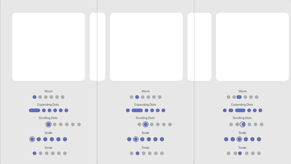
Effects

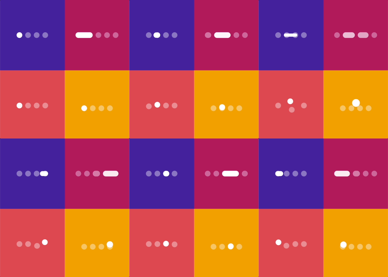
SmoothPageIndicator comes with a set of built-in effects that you can use to animate the active dot,
you can also customize each effect to your liking.

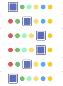
for more specific customization, try the CustomizableEffect which allows for more customization.

Effect Preview
Worm
Worm style = WormStyle.thin [v1.0.0]
Expanding Dots
Jumping dot
Jumping dot with vertical offset [v1.0.0]
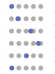
Scrolling Dots
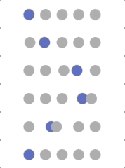
Slide
Scale
Swap
Swap type = SwapType.yRotation [v1.0.0]
Color Transition [0.1.2]
Customizable demo-1 [v1.0.0]
Customizable demo-2 [v1.0.0]
Customizable demo-3 [v1.0.0]
Customizable demo-4 [v1.0.0]

Usage

SmoothPageIndicator uses the PageController's scroll offset to animate the active dot.

SmoothPageIndicator(    
   controller: controller,  // PageController    
   count:  6,    
   effect:  WormEffect(),  // your preferred effect    
   onDotClicked: (index){    
  }
)    
   

Usage without a PageController

Unlike SmoothPageIndicator, AnimatedSmoothIndicator is self animated and all it needs is the
active index.

AnimatedSmoothIndicator(    
   activeIndex: yourActiveIndex,    
   count: 6,    
   effect: WormEffect(), 
)    

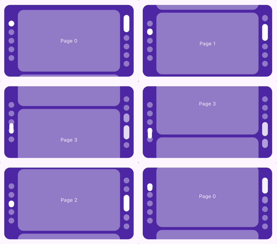
Vertical layout support

Smooth page indicator supports both horizontal and vertical layouts.

SmoothPageIndicator(    
   controller: controller,  // PageController    
   count:  6,    
   axisDirection: Axis.vertical,    
   effect:  WormEffect(), 
)    

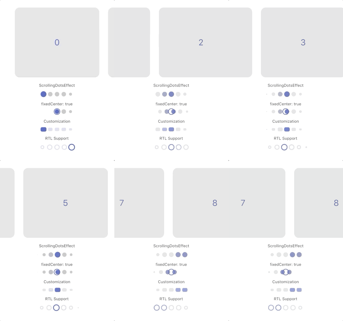
Scrolling dots effect

Smooth page indicator comes with a shipped it scrolling dots effect, (similar to the one used in instagram), it's useful when you have a large number of pages.

Customization

Each effect comes with its own set of properties that you can customize to your liking.
for example, you can customize direction, width, height, radius, spacing, paint style, color and more... of SlideEffect like follows:

  SmoothPageIndicator(    
   controller: controller,    
   count:  6,    
   axisDirection: Axis.vertical,    
   effect:  SlideEffect(    
      spacing:  8.0,    
      radius:  4.0,    
      dotWidth:  24.0,    
      dotHeight:  16.0,    
      paintStyle:  PaintingStyle.stroke,    
      strokeWidth:  1.5,    
      dotColor:  Colors.grey,    
      activeDotColor:  Colors.indigo    
  ), 
)    
   

Default Colors

By default, indicators use these fallback colors:

  • activeDotColor: Color(0xFF3F51B5)
  • dotColor: Color(0xFF9E9E9E)

These colors do not come from the app's ThemeData. Override them for a subtree with SmoothPageIndicatorTheme, or set dotColor and activeDotColor directly on an effect.

SmoothPageIndicatorTheme

SmoothPageIndicatorTheme is an InheritedTheme that configures default settings for descendant SmoothPageIndicator and AnimatedSmoothIndicator widgets. Wrap the subtree that should share the configuration:

MaterialApp(
  home: SmoothPageIndicatorTheme(
    effect: ExpandingDotsEffect(), // default effect when none is specified
    defaultColors: DefaultIndicatorColors(
      active: Colors.blue,
      inactive: Colors.grey,
    ),
    child: MyHomePage(),
  ),
)
  • defaultColors: Applies to all descendant indicator effects unless dotColor or activeDotColor is set on the effect.
  • effect: The default effect when an indicator does not specify one. If omitted, WormEffect is used.

This provides consistent indicator styling without relying on or modifying the app theme.

Support the Library

You can support the library by liking it on pub, staring in on Github and reporting any bugs you
encounter.

所屬分類

原始碼儲存庫

使用此套件的專案

所在榜單