
 v0.0.4
floating_bottom_bar
This package provides sliding animation to floating action button located at the center and bottom tab button.
115Likes 44930-day downloads150Pub points
AndroidiOSWebmacOSWindowsLinux
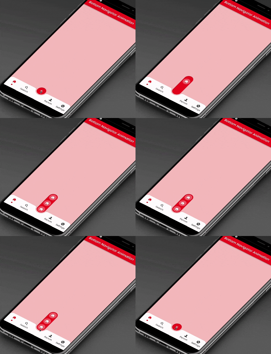
This package will animate a floating action button at the center and icons at the bottomNavigationBar using AnimatedContainer and SlideTransition respectively.

{"sdk":"flutter"}^2.0.9{"sdk":"flutter"}^3.0.1English project snapshot. Visit GitHub for the latest content.
This package will animate a floating action button at the center and icons at the bottomNavigationBar using AnimatedContainer and SlideTransition respectively.
Floating Bottom Bar
    bottomNavigationBar: AnimatedBottomNavigationBar(
      barColor: Colors.white,
      controller: FloatingBottomBarController(initialIndex: 1),
      bottomBar: [
        BottomBarItem(
          icon: const Icon(Icons.home, size: example.Dimens.iconNormal),
          iconSelected: const Icon(Icons.home,
              color: example.AppColors.cherryRed,
              size: example.Dimens.iconNormal),
          title: example.Strings.home,
          dotColor: example.AppColors.cherryRed,
          onTap: (value) {
            setState(() {
              index = value;
            });
            log('Home $value');
          },
        ),
        BottomBarItem(
          icon:
              const Icon(Icons.photo, size: example.Dimens.iconNormal),
          iconSelected: const Icon(Icons.photo,
              color: example.AppColors.cherryRed,
              size: example.Dimens.iconNormal),
          title: example.Strings.search,
          dotColor: example.AppColors.cherryRed,
          onTap: (value) {
            setState(() {
              index = value;
            });
            log('Search $value');
          },
        ),
        BottomBarItem(
          icon:
              const Icon(Icons.person, size: example.Dimens.iconNormal),
          iconSelected: const Icon(Icons.person,
              color: example.AppColors.cherryRed,
              size: example.Dimens.iconNormal),
          title: example.Strings.person,
          dotColor: example.AppColors.cherryRed,
          onTap: (value) {
            setState(() {
              index = value;
            });
            log('Profile $value');
          },
        ),
        BottomBarItem(
          icon: const Icon(Icons.settings,
              size: example.Dimens.iconNormal),
          iconSelected: const Icon(Icons.settings,
              color: example.AppColors.cherryRed,
              size: example.Dimens.iconNormal),
          title: example.Strings.settings,
          dotColor: example.AppColors.cherryRed,
          onTap: (value) {
            setState(() {
              index = value;
            });
            log('Settings $value');
          },
        ),
      ],
      bottomBarCenterModel: BottomBarCenterModel(
        centerBackgroundColor: example.AppColors.cherryRed,
        centerIcon: const FloatingCenterButton(
          child: Icon(
            Icons.add,
            color: AppColors.white,
          ),
        ),
        centerIconChild: [
          FloatingCenterButtonChild(
            child: const Icon(
              Icons.home,
              color: AppColors.white,
            ),
            onTap: () => log('Item1'),
          ),
          FloatingCenterButtonChild(
            child: const Icon(
              Icons.access_alarm,
              color: AppColors.white,
            ),
            onTap: () => log('Item2'),
          ),
          FloatingCenterButtonChild(
            child: const Icon(
              Icons.ac_unit_outlined,
              color: AppColors.white,
            ),
            onTap: () => log('Item3'),
          ),
        ],
      ),
    ),
This property takes List as a parameter which are use to show the icons in the bottomNavigationBar.
BottomBarCenterModel class is model class for bottom menu. It takes icon, iconSelected, title, titleStyle as parameters.
FloatingBottomBarController is used to give the initial index to the bottom bar to have the pre selected item form the bottom bar.
Contribution towards our repository is always welcome, we request contributors to create a pull request to the develop branch only.
It would be great for us if the reporter can share the below things to understand the root cause of the issue.
Animated Segment is MIT-licensed.
We’d be really happy if you send us links to your projects where you use our component. Just send an email to sales@mindinventory.com And do let us know if you have any questions or suggestion regarding our work.