연결된 소스 저장소의 README 원문 스냅샷입니다. 최신 내용은 저장소에서 확인하세요.
Alphabet Navigation



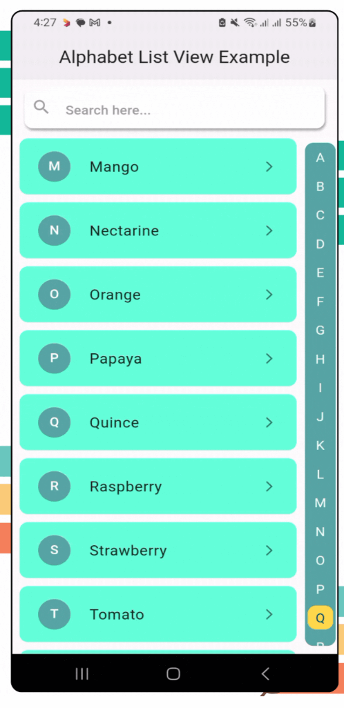
alphabet_navigation is a Flutter package that provides a dynamic, scrollable list view with an alphabetical index. It’s perfect for apps that need a quick and intuitive way to navigate long lists by alphabet.
Features
- [x] A vertical alphabetical navigation bar for quick access to sections.
- [x] Smooth scrolling to the desired section when an alphabet is selected.
- [x] Fully customizable list items and navigation styles.
- [x] Built-in search bar for filtering items dynamically.
- [x] Search field is optional & can be customized.
- [x] Dynamic list height is optional & can be customized.
- [x] Alphabetic list direction is configurable.
- [x] Allow users to easily configure colors, fonts, and styles.
- [x] Lightweight and easy to integrate into any Flutter project.
- [x] Compatible with all platforms.
- [x] Clear documentation.
Demo

Installation
To use the alphabet_navigation package, follow these steps:
Run this on your project terminal:
flutter pub add alphabet_navigation
or manually configure pubspec.yml file
-
Add the package to your pubspec.yaml file:
dependencies:
  alphabet_navigation: ^2.1.0 // replace with latest version
-
Run the following command to get the package:
flutter pub get
Usage
Here’s how you can use the AlphabetNavigation widget in your app:
Example 1:
AlphabetNavigation(
stringList: stringList,
dynamicList: dynamicList,
dynamicListHeight: 80,
showSearchField: true,
circleSelectedLetter: true,
itemBuilder: (context, index, searchFilterList) {},
)
Example 2:
AlphabetNavigation(
stringList: stringList,
dynamicList: dynamicList,
searchFieldHintText: "Search here...",
searchFieldTextStyle: TextStyle(
color: Colors.blue.shade800,
fontWeight: FontWeight.w500,
fontSize: 16,
),
searchFieldHintTextStyle: TextStyle(
color: Colors.grey.shade300,
fontWeight: FontWeight.w500,
fontSize: 16,
),
searchFieldIcon: Icon(Icons.search, color: Colors.blue.shade800,),
searchFieldEndIconColor: Colors.blue.shade800,
listDirection: ListDirection.left,
showSearchField: true,
circleSelectedLetter: true,
itemBuilder: (context, index, searchFilterList) {},
)
Example 3:
AlphabetNavigation(
stringList: stringList,
dynamicList: dynamicList,
showSearchField: true,
alphabetListBackgroundColor: Colors.tealAccent,
selectedColor: Colors.white70,
unselectedColor: Colors.black38,
circleSelectedLetter: true,
circleSelectedBackgroundColor: Colors.blue,
itemBuilder: (context, index, searchFilterList) {},
)
Example 4:
AlphabetNavigation(
stringList: stringList,
dynamicList: dynamicList,
showSearchField: false,
circleSelectedLetter: false,
itemBuilder: (context, index, searchFilterList) {},
)
Example 4:
AlphabetNavigation(
stringList: stringList,
dynamicList: dynamicList,
circleSelectedLetter: false,
itemBuilder: (context, index, searchFilterList) {},
)
Example 5:
AlphabetNavigation(
stringList: stringList,
dynamicList: dynamicList,
circleSelectedLetter: false,
alphabetListBackgroundColor: Colors.transparent,
selectedColor: Colors.blue,
unselectedColor: Colors.grey.shade600,
itemBuilder: (context, index, searchFilterList) {},
)
Example 6:
AlphabetNavigation(
stringList: stringList,
dynamicList: dynamicList,
showSearchField: true,
circleSelectedLetter: true,
circleBorderRadius: 50.0,
scrollAnimationCurve: Curves.easeInCubic,
itemBuilder: (context, index, searchFilterList) {},
)
| Example 1 |
Example 2 |
Example 3 |
 |
 |
 |
| Example 4 |
Example 5 |
Example 6 |
 |
 |
 |
Parameters
| Parameter |
Type |
Description |
stringList |
List<String> |
List of strings for alphabetical grouping. |
dynamicList |
List<dynamic> |
Data list to be displayed. |
dynamicListHeight |
double |
Dynamic list height. |
listDirection |
ListDirection |
Direction of the list. |
showSearchField |
bool |
Toggle for search field. |
searchFieldTextStyle |
TextStyle |
Search field text style. |
searchFieldHintText |
String |
Search field hint text. |
searchFieldHintTextStyle |
TextStyle |
Search field hint style. |
searchFieldIcon |
Icon |
Search field icon. |
searchFieldBackgroundColor |
Color |
Search field background color. |
searchFieldEndIconColor |
Color |
Search field icon color. |
alphabetListBackgroundColor |
Color |
Alphabet list background color. |
selectedColor |
Color |
Selected alphabet color |
unselectedColor |
Color |
Unselected alphabet color |
circleSelectedLetter |
bool |
Is circle apply for the selected letter. |
circleSelectedBackgroundColor |
Color |
Circle background color for the selected letter. |
circleBorderRadius |
double |
Border radius for the selected letter circle |
scrollAnimationCurve |
Curve |
Scroll animation curve. |
itemBuilder |
Function(BuildContext, int, dynamic) |
Function to build list items dynamically. |
Future Plans
Here are some planned features for future releases:
- Accessibility Improvements: Enhanced support for voice-over and screen readers.
- Horizontal Navigation: Add support for horizontal alphabetical navigation.
- Custom Alphabet Set: Support for custom navigation sets like ['A', 'B', 'C', '1', '2', '3'].
- Multi-Language Support: Enable alphabetical navigation for other languages.
Contributing
We welcome contributions from the community! If you encounter any issues or have feature suggestions, feel free to open an issue or submit a pull request on our GitHub repository.
Additional information
License
This project is licensed under the MIT License - see the LICENSE file for details.
CONTRIBUTORS

Akash Das
Happy Coding 👨💻