패키지, 저장소 및 앱 카테고리 검색

animated_cross_fade_plus 표지
패키지 상세v0.0.4

animated_cross_fade_plus

여러 자식 요소와 사용자 정의 애니메이션을 지원하는 AnimatedCrossFade 의 향상된 버전을 제공하는 Flutter 패키지입니다.

AndroidiOSWebmacOSWindowsLinux
30일 다운로드
61
좋아요
7
Pub 점수
160

패키지 설치

flutter pub add animated_cross_fade_plus

패키지 개요

공개 정보를 바탕으로 생성한 선택 가이드입니다.

AnimatedCrossFadePlus는 Flutter의 AnimatedCrossFade를 다중 자식 요소를 지원하고 사용자 정의 가능한 애니메이션을 제공함으로써 향상시켰습니다. 두 개 이상의 위젯 간에 부드러운 전환을 가능하게 하여 복잡한 상태 변화를 가진 동적 UI에 적합합니다. 패키지는 페이드 지속 시간, 곡선 및 정렬과 같은 유연한 구성 옵션을 통해 핵심 기능을 확장하여 플랫폼 간에 부드럽고 반응성 있는 시각 효과를 보장합니다. 봐라플레이트 코드 없이 고급 전환 제어를 원하는 개발자를 위한 것입니다.

사용 사례

  • 다중 위젯 상태 전이
  • 동적 UI 콘텐츠 교체
  • 사용자 정의 가능한 페이드 애니메이션
  • 복잡한 화면 전환
  • 인터랙티브 앱 인터페이스
  • 부드러운 테마 또는 모드 전환

주요 기능

  • 여러 자식 요소 지원
  • 사용자 정의 가능한 애니메이션 곡선
  • 사용자 정의 가능한 페이드 지속 시간
  • 유연한 정렬 옵션
  • 크로스 플랫폼 호환성
  • 최소한의 설정 필요

적합한 대상

  • 다중 상태 전이가 필요한 개발자
  • 유연한 애니메이션에 집중하는 UI 디자이너
  • 동적 콘텐츠 전환을 지원하는 앱
  • 재사용 가능한 전환 구성 요소가 필요한 프로젝트
  • 인터랙티브 대시보드 또는 워즈드를 구축하는 팀

고려 사항

  • 많은 자식이 있을 경우 복잡성이 증가할 수 있습니다
  • 애니메이션 매개변수를 신중하게 조정해야 합니다
  • 간단한 일대일 전환에 적합하지 않습니다
  • 중량 위젯 사용 시 성능 영향
  • 기본 사용법 외에 문서가 제한적
  • 경량 또는 최적화된 자식 위젯과 함께 사용하는 것이 가장 좋습니다

원본 README

연결된 소스 저장소의 README 원문 스냅샷입니다. 최신 내용은 저장소에서 확인하세요.

Animated Cross Fade Plus

A powerful Flutter package that enhances the traditional AnimatedCrossFade widget with support for multiple children, auto-play capabilities, and smooth transitions.

pub package github likes license

Demo

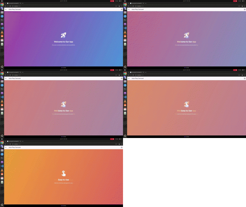
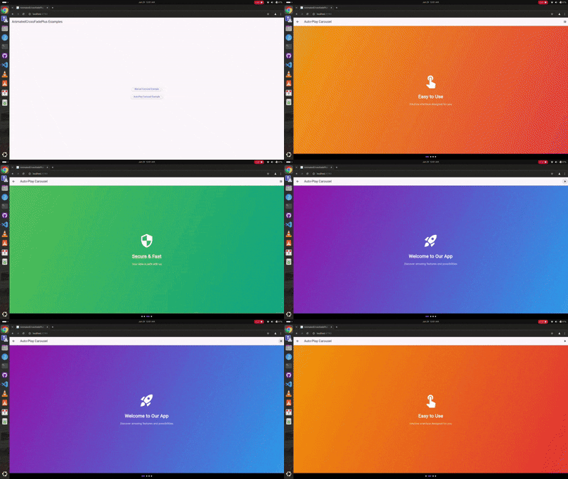
Auto-Play Carousel

Auto-play Demo

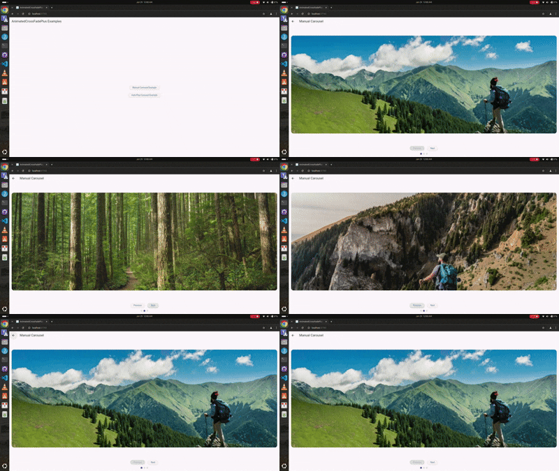
Manual Navigation

Manual Navigation Demo

Youtube Video

🎥 Check out the tutorial video on my YouTube channel to see it in action! Youtube video

Features 🚀

  • ✨ Support for unlimited children (not just two like AnimatedCrossFade)
  • 🎮 Manual navigation controls
  • 🎯 Auto-play functionality
  • 🎨 Multiple transition types (fade, slide, scale, slideAndFade)
  • 📱 Separate enter and exit animations
  • 🎭 Customizable transition configurations
  • 🔄 Built-in play/pause controls
  • 📍 Progress indicators

Installation 💻

Add this to your package's pubspec.yaml file:

dependencies:
  animated_cross_fade_plus: ^0.0.4

Usage 🎯

Basic Auto-Play Carousel
class AutoPlayExample extends StatefulWidget {
  @override
  _AutoPlayExampleState createState() => _AutoPlayExampleState();
}

class _AutoPlayExampleState extends State<AutoPlayExample> {
  final List<SlideContent> _slides = [
    SlideContent(
      title: 'Welcome',
      gradient: [Colors.purple, Colors.blue],
      icon: Icons.rocket_launch,
    ),
    SlideContent(
      title: 'Easy to Use',
      gradient: [Colors.orange, Colors.red],
      icon: Icons.touch_app,
    ),
  ];

  @override
  Widget build(BuildContext context) {
    return AnimatedCrossFadePlus(
      children: _slides.map((slide) => _buildSlide(slide)).toList(),
      transitionType: CrossFadeTransitionType.scale,
      enterConfig: const TransitionConfig(
        curve: Curves.easeInOutCubic,
        duration: Duration(milliseconds: 1000),
      ),
      exitConfig: const TransitionConfig(
        curve: Curves.easeInOutCubic,
        duration: Duration(milliseconds: 1000),
      ),
      autoPlay: true,
      autoPlayDuration: const Duration(seconds: 3),
    );
  }
}
Manual Navigation Carousel
class ManualExample extends StatefulWidget {
  @override
  _ManualExampleState createState() => _ManualExampleState();
}

class _ManualExampleState extends State<ManualExample> {
  final GlobalKey<AnimatedCrossFadePlusState> _key = GlobalKey();
  int _currentIndex = 0;

  @override
  Widget build(BuildContext context) {
    return Column(
      children: [
        AnimatedCrossFadePlus(
          key: _key,
          children: _items.map((item) => _buildItem(item)).toList(),
          transitionType: CrossFadeTransitionType.slideAndFade,
          enterConfig: const TransitionConfig(
            curve: Curves.easeInOutCubic,
            duration: Duration(milliseconds: 800),
            direction: AxisDirection.left,
          ),
          exitConfig: const TransitionConfig(
            curve: Curves.easeInOutCubic,
            duration: Duration(milliseconds: 800),
            direction: AxisDirection.right,
          ),
          onIndexChanged: (index) => setState(() => _currentIndex = index),
        ),
        Row(
          children: [
            ElevatedButton(
              onPressed: () => _key.currentState?.animateToIndex((_currentIndex - 1) % _items.length),
              child: Text('Previous'),
            ),
            ElevatedButton(
              onPressed: () => _key.currentState?.animateToIndex((_currentIndex + 1) % _items.length),
              child: Text('Next'),
            ),
          ],
        ),
      ],
    );
  }
}

Parameters ⚙️

Parameter Type Description
children List List of widgets to animate between
transitionType CrossFadeTransitionType Type of transition animation
enterConfig TransitionConfig Configuration for entering widget animation
exitConfig TransitionConfig Configuration for exiting widget animation
initialIndex int Starting index
autoPlay bool Enable/disable auto-play
autoPlayDuration Duration? Time between auto-play transitions
alignment AlignmentGeometry Alignment of children
constraints BoxConstraints? Optional size constraints
clipChildren bool Whether to clip children during animation
onIndexChanged Function(int)? Callback when index changes

Transition Types 🎭

enum CrossFadeTransitionType {
  fade,           // Simple fade transition
  slide,          // Slide animation
  scale,          // Scale animation
  slideAndFade,   // Combined slide and fade
}

TransitionConfig Properties 🛠️

class TransitionConfig {
  final Curve curve;              // Animation curve
  final Duration duration;        // Animation duration
  final AxisDirection direction;  // Slide direction (for slide transitions)

  const TransitionConfig({
    this.curve = Curves.linear,
    this.duration = const Duration(milliseconds: 300),
    this.direction = AxisDirection.right,
  });
}

Controller Methods 🎮

final GlobalKey<AnimatedCrossFadePlusState> _key = GlobalKey();

// Navigation
_key.currentState?.animateToIndex(2);   // Navigate to specific index

// Auto-play control is handled through the autoPlay property
// Toggle by updating the widget's autoPlay value

Complete Examples 📱

Check out the example folder for complete implementation examples:

  • Auto-play carousel with scale transitions
  • Manual navigation with slide and fade transitions
  • Progress indicators
  • Play/pause controls

Contributing 🤝

Contributions are welcome! Please feel free to submit issues and pull requests.

  1. Fork it
  2. Create your feature branch (git checkout -b feature/amazing)
  3. Commit changes (git commit -am 'Add amazing feature')
  4. Push to branch (git push origin feature/amazing)
  5. Open a Pull Request

License 📄

This project is licensed under the MIT License - see the LICENSE file for details.

Maintainers 👥

카테고리

소스 저장소

이 패키지를 사용하는 프로젝트

아직 데이터가 없습니다.