패키지, 저장소 및 앱 카테고리 검색

패키지 상세v1.0.5

animated_cursor

사용자 인터페이스 상호작용을 향상시키기 위해 설계된 애니메이티드 커서

AndroidiOSWebmacOSWindowsLinux
30일 다운로드
75
좋아요
33
Pub 점수
160

패키지 설치

flutter pub add animated_cursor

패키지 개요

공개 정보를 바탕으로 생성한 선택 가이드입니다.

Animated Cursor는 여러 플랫폼에서 사용자 인터페이스 상호작용을 향상시키기 위해 사용자 정의 가능한 애니메이션 커서를 제공하는 Flutter 패키지입니다. 개발자는 트레일, 형태 또는 애니메이션과 같은 동적 커서 효과를 만들 수 있어 시각적 피드백과 참여도를 높일 수 있습니다. 데스크톱(Windows, Linux, macOS) 및 모바일(Android, iOS) 플랫폼을 지원하며, 몰입형 UI 경험에 적합합니다. pub add를 통해 간단하게 통합할 수 있으며, 복잡한 설정 없이 부드럽고 성능이 우수한 커서 애니메이션을 가능하게 합니다. 게임, 창의적인 앱 또는 인터랙티브 대시보드에 이상적입니다.

사용 사례

  • 인터랙티브 UI
  • 게임 개발
  • 창의적 응용 프로그램
  • 대시보드 인터페이스
  • 시각 피드백 시스템

주요 기능

  • 사용자 정의 가능한 커서 애니메이션
  • 크로스 플랫폼 지원
  • 부드러운 성능
  • 간편한 통합
  • 트레일 효과
  • 반응형 디자인

적합한 대상

  • UI/UX 디자이너
  • 게임 개발자
  • 인터랙티브 앱 제작자
  • 데스크톱 애플리케이션 빌더
  • 크리에이티브 코딩 프로젝트

고려 사항

  • 저사양 기기에서의 성능
  • 웹에서의 사용자 정의가 제한적
  • 플랫폼별 테스트가 필요합니다
  • 모든 접근성 요구 사항에 부합하지 않을 수 있습니다
  • 최소한의 디자인에서의 잠재적 과도한 사용

원본 README

연결된 소스 저장소의 README 원문 스냅샷입니다. 최신 내용은 저장소에서 확인하세요.

Alt Text

View on GitHub View on GitHub View on Linkedin View on Github

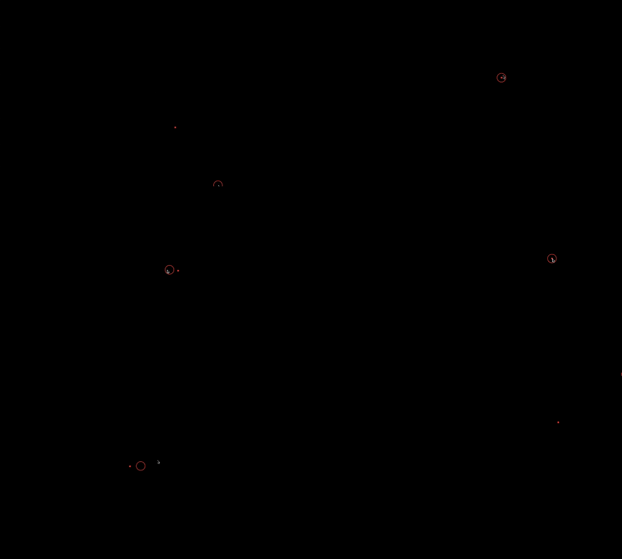
Preview

Alt Text

Animated Cursor Package

Welcome to the Animated Cursor package for Flutter! This package provides a customizable animated cursor widget that you can easily integrate into your Flutter projects.

Installing

Add dependency to pubspec.yaml To use the latest version of animated_cursor, add the following line to your pubspec.yamlfile:

dependencies:
  animated_cursor: ^1.0.5

Install it You can install packages from the command line: with Flutter:

$ flutter pub get

Import the package

import 'package:animated_cursor/animated_cursor.dart';

Usage

AnimatedCursor
(
circleColor: Colors.red,
dotColor: Colors.red,
backgroundColor: Colors.black,
borderWidth: 2,
child: Container(color: Colors.black)
);

Properties of Animated Cursor:

Name Type Default Behaviour Description
child Widget The child widget beneath the animated cursor.
cursor MouseCursor? SystemMouseCursors.basic The cursor to be displayed when the mouse is over the child widget
circleColor Color? Color(0xFF4CAF50) Color of the animated circle.
dotColor Color? Color(0xFF4CAF50) Color of the animated dot.
backgroundColor Color? Colors.transparent Background color of the cursor.
circleDuration Duration? 100 Duration of the animated circle's appearance.
dotDuration Duration? 350 Duration of the animated dot's appearance.
borderWidth double? 1 Width of the cursor's border.
shape CursorShape? BoxShape.circle Shape of the cursor (Circle or Rectangle).
borderRadius BorderRadius? 100 Border radius for the cursor (applicable when shape is set to Rectangle).

Example

import 'package:animated_cursor/animated_cursor.dart';

void main() {
  runApp(MyApp());
}

class MyApp extends StatelessWidget {
  const MyApp({super.key});

  @override
  Widget build(BuildContext context) {
    return MaterialApp(
      title: 'Animated Cursor',
      debugShowCheckedModeBanner: false,
      theme: ThemeData(
        primarySwatch: Colors.red,
      ),
      home: AnimatedCursor(
        // cursor: SystemMouseCursors.alias,
        circleColor: Colors.red,
        dotColor: Colors.red,
        backgroundColor: Colors.black,
        borderWidth: 1,
        child: Container(color: Colors.black),
      ),
    );
  }
}

Additional Information

👍 If you appreciate our solution's value and positive impact on your project,✨ show your support with a thumbs up! 🌟 Your feedback fuels our commitment to excellence.💫 Thank you for choosing us!

-Darshak Desai

카테고리

의존성

의존성 목록 1 개

소스 저장소

이 패키지를 사용하는 프로젝트

아직 데이터가 없습니다.