패키지, 저장소 및 앱 카테고리 검색

blurry_modal_progress_hud 표지
패키지 상세v1.1.1

blurry_modal_progress_hud

modal_progress_hud와 마찬가지로 이는 모달 프로그레스 HUD(모달 프로그레스 인디케이터, HUD = 헤드업 디스플레이)를 활성화하기 위한 간단한 위젯 래퍼입니다

AndroidiOSWebmacOSWindowsLinux
30일 다운로드
514
좋아요
42
Pub 점수
150

패키지 설치

flutter pub add blurry_modal_progress_hud

패키지 개요

공개 정보를 바탕으로 생성한 선택 가이드입니다.

BlurryModalProgressHud는 ModalProgressHud와 유사하지만 시각적 매력이 향상된 모달 진행 표시기를 뒷배경이 흐려진 상태로 표시하는 Flutter 위젯입니다. 위젯 트리를 감싸고 하위 콘텐츠를 가리며 비동기 작업 중 사용자에게 피드백을 제공하는 로딩 오버레이를 표시합니다. 블러 효과는 현대적이고 반투명한 외관을 만들어 UI를 향상시킵니다. 여러 플랫폼에서 로딩 상태 시 사용자 경험을 개선하는 데 이상적입니다.

사용 사례

  • 데이터 가져오기 중 로딩 표시기 표시
  • 비동기 처리를 통한 폼에서의 사용자 경험 향상
  • 네트워크 요청의 진행 상황 표시
  • 모바일 앱에서 시각적으로 매력적인 오버레이 만들기
  • 장시간 실행 작업 중 인터페이스 명확성 향상

주요 기능

  • 현대적인 미학을 위한 흐린 배경
  • 간단한 래퍼 통합
  • 크로스 플랫폼 지원 (Android, iOS, Web, macOS, Windows, Linux)
  • 사용자 정의 가능한 로딩 표시기
  • 경량이며 구현하기 쉬움

적합한 대상

  • 정교한 로딩 UI를 찾는 개발자
  • 미묘하지만 효과적인 로딩 피드백이 필요한 앱
  • Material Design 3 스타일의 시각적 요소를 목표로 하는 프로젝트
  • 비동기 작업 중 사용자 경험을 우선시하는 팀
  • Flutter 초보자가 진행률 표시기 탐색 중

고려 사항

  • 블러 렌더링으로 인해 저사양 기기에서 성능에 영향을 미칠 수 있습니다
  • 가독성을 위해 색 대비를 신중하게 고려해야 합니다
  • 고대비 접근성 요구 사항에 적합하지 않습니다
  • 블러 및 기본 스타일 외에 사용자 지정이 제한적
  • 플랫폼 전용 렌더링 기능에 의존합니다

원본 README

연결된 소스 저장소의 README 원문 스냅샷입니다. 최신 내용은 저장소에서 확인하세요.

blurry_modal_progress_hud

This is a clone and upgrade of modal_progress_hud

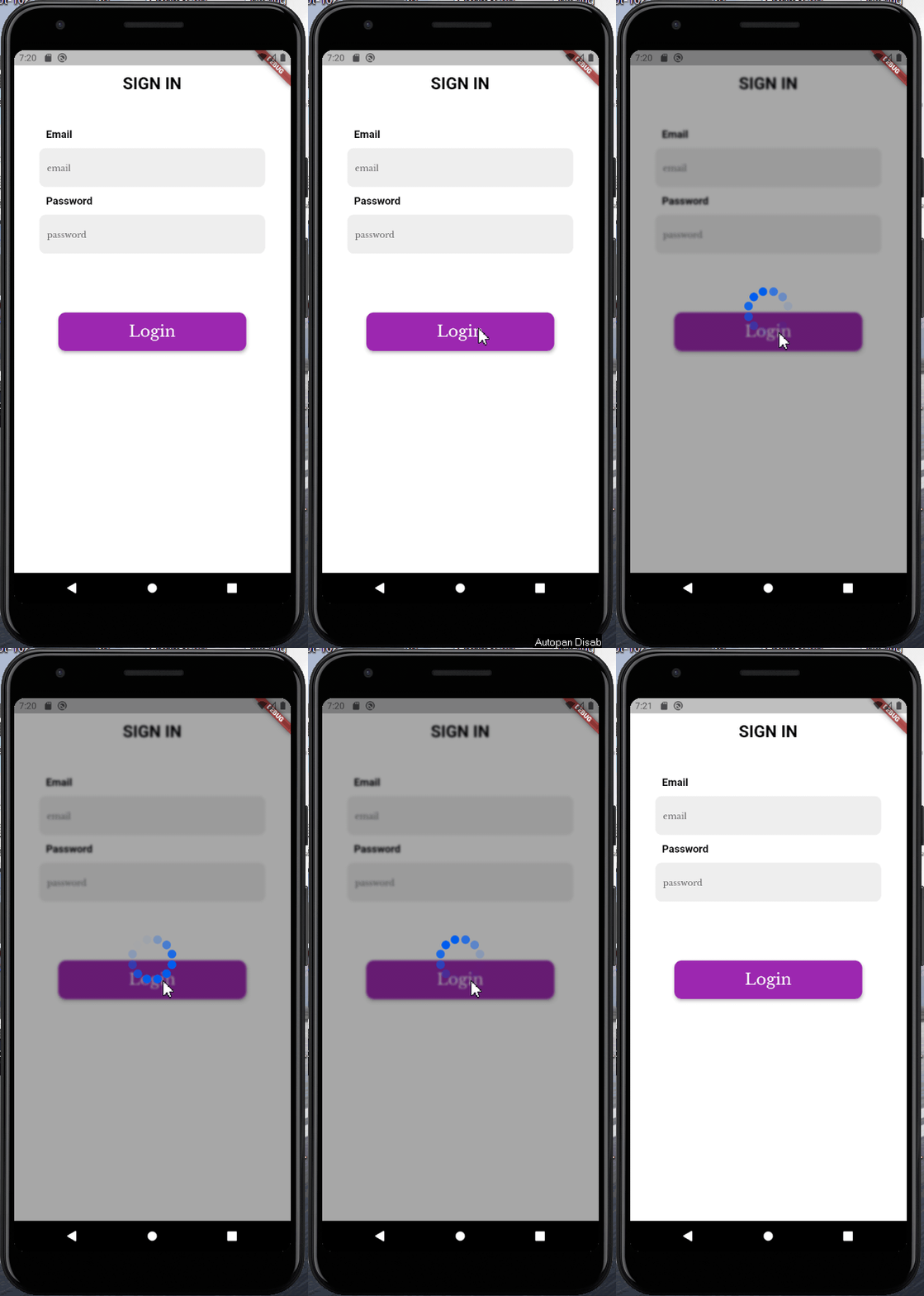
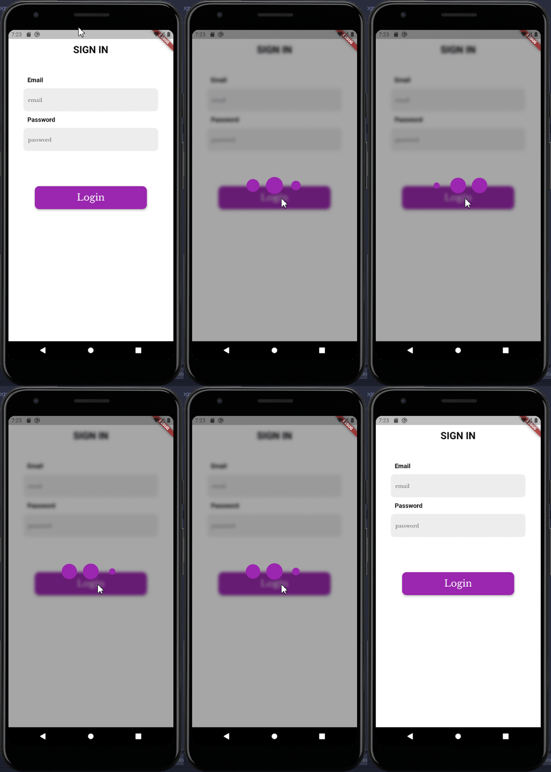
Just like modal_progress_hud this is a simple widget wrapper to enable modal progress hud (a modal progress indicator, hud = heads up display)

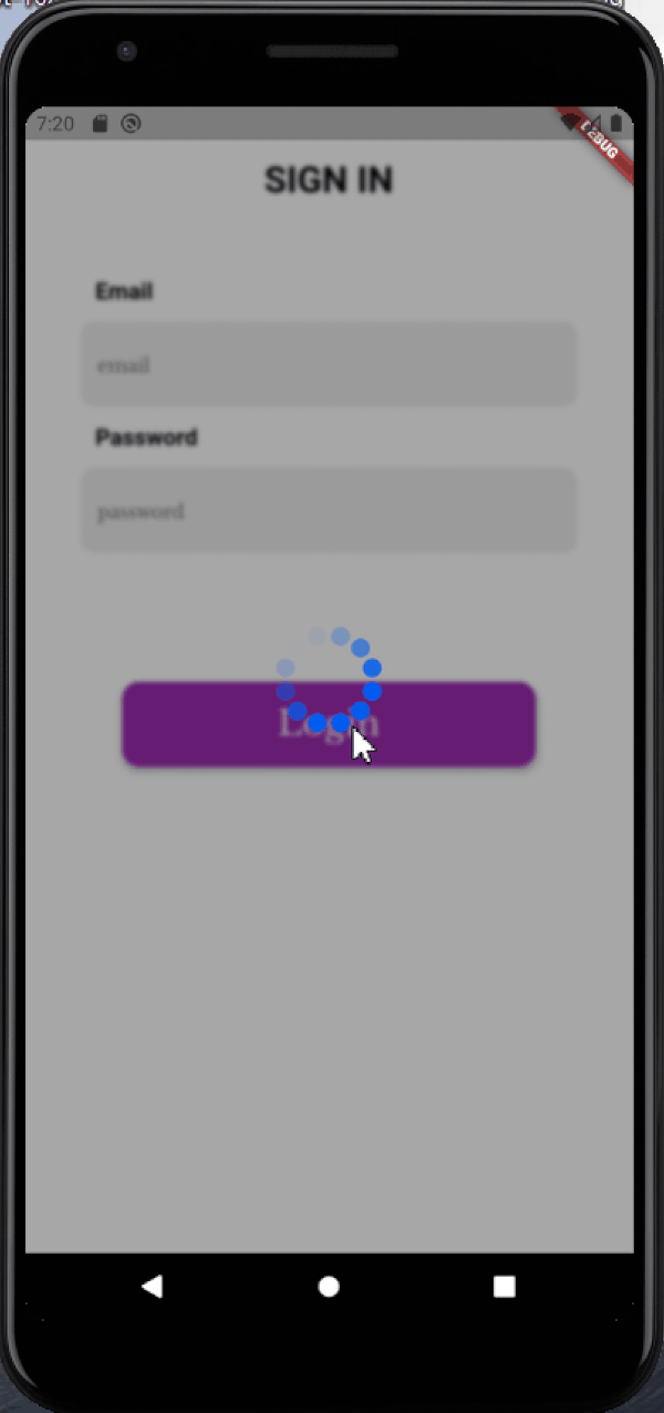
How it works

Image1

Image2

See example for details

Installation

Add the blurry_modal_progress_hud package to your pubspec.yml file.

dependencies:
  blurry_modal_progress_hud: ^1.1.1

Import the package into your dart file

import 'package:blurry_modal_progress_hud/blurry_modal_progress_hud.dart';

Usage

/// Wrap around any widget that makes an async call to show a modal progress
/// indicator while the async call is in progress.

/// The progress indicator can be turned on or off using [inAsyncCall]

/// The blurry effect's intensity can be be controlled using [blurEffectIntensity]

/// The progress indicator defaults to a [CircularProgressIndicator] but can be
/// any kind of widget. For this example the SpinKitFadingCircle package is used

/// The modal barrier can be dismissed using [dismissible]

/// The opacity of the modal barrier can be set using [opacity]

/// The color of the modal barrier can be set using [color]

/// The progress indicator can be positioned using [offset] otherwise it is
/// centered

BlurryModalProgressHUD(
    inAsyncCall: isLoading,  
    blurEffectIntensity: 4,
    progressIndicator: SpinKitFadingCircle(
    color: purpleColor,
    size: 90.0,
    ),
    dismissible: false,
    opacity: 0.4,
    color: black97Color,
    child: Scaffold(),
);

Options

Most of the parameters can be customized via the constructor

  BlurryModalProgressHUD({
    Key? key,
    required this.inAsyncCall,
    this.opacity = 0.3,
    this.color = Colors.grey,
    this.blurEffectIntensity = 1.0,
    this.progressIndicator = const CircularProgressIndicator(),
    this.offset,
    this.dismissible = false,
    required this.child,
  });

Example

See the example for a complete sample app using the blurry_modal_progress_hud

Contact

Contact me via email edinjoey@gmail.com

카테고리

소스 저장소

이 패키지를 사용하는 프로젝트

아직 데이터가 없습니다.