연결된 소스 저장소의 README 원문 스냅샷입니다. 최신 내용은 저장소에서 확인하세요.
Button Animations
The button_animations is a package to make highly customizable Flutter widgets with 3d animations.
Getting Started
To use this plugin, add the latest version of button_animations as a dependency in your pubspec.yaml file .
Platform Support
Android
iOS
Web
MacOS
Linux
Windows
✅
✅
✅
✅
✅
✅
Screenshots
Parameters and their Description
Datatype
Parameter
Description
Default Value
Required
function onTap
The function that is called whenever the widget is tapped
--
Yes
widgetchild
The child widget
--
Yes
PredefinedThemestype
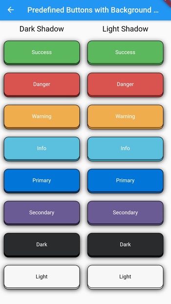
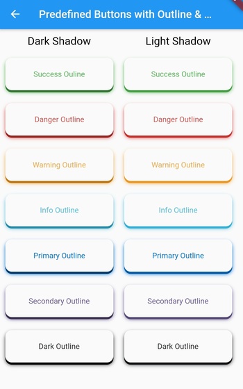
There are 16 predefined themes that you can choose from if you dont want to customize the widget yourself
PredefinedThemes.primary
No
CurveanimationCurve
The curve that the animation will follow
Curves.easeIn
No
boolenabled
To check whether the button is enabled or not
true
No
boolisMultiColor
To check whether the button has multiple color gradient or not
false
No
boolisOutline
To check whether the button has an outline or not
false
No
bool darkshadow
To check whether the button has dark or light shadow
true
No
intduration
The time that the animation takes in milliseconds
70
No
doubleheight
The height of the widget
64
No
doublewidth
The width of the widget
200
No
double blurRadius
The radius of the blur effect of the widget
0
No
double borderRadius
The radius of the borders of the widget
12
No
double shadowHeightBottom
The height of the shadow and the animation of the widget from the bottom of the child widget
4
No
double shadowHeightLeft
The height of the shadow and the animation of the widget from the left of the child widget
0
No
doubleborderWidth
The width of the border of the widget
1
No
ColorborderColor
The color of the border of the widget (if type is not null, this will not work & isOutline should be true for this to work)
Colors.black
No
ColorblurColor
The color of the blur of the widget(if type is not null, this will not work)
Colors.black
No
Colorcolor
The color of the widget(if type is not null, this will not work)
Colors.blue
No
ColorshadowColor
The color of the shadow of the widget(if type is not null, this will not work)
Colors.black
No
List<Color>colors
The list of colors for the gradient for the background of the widget(isMulticolor should be true for this to work)
[]
No
PredefinedThemes
Theme Name
Example
success
successOutline
danger
dangerOutline
warning
warningOutline
info
infoOutline
primary
primaryOutline
secondary
secondaryOutline
dark
darkOutline
light
Example
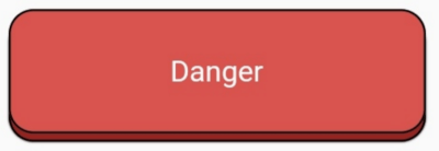
For any of the predefined themes you just have to add the child widget, type, and the onTap function.
1. Add borderRadius and, isOutline to add more customization.
AnimatedButton(
  child: Text(
    'Danger', // add your text here
    style: TextStyle(
      color: Colors.white,
    ),
  ),
  type: PredefinedTheme.danger,
  isOutline: true,
  borderWidth: 1,
  onTap: () {},
),
AnimatedButton(
  child: Text(
    'Danger', // add your text here
    style: TextStyle(
      color: Colors.white,
    ),
  ),
  type: PredefinedTheme.danger,
  darkshadow: false,
  isOutline: true,
  borderWidth: 1,

  onTap: () {},
),
2. Use blurRadius and blurColor
AnimatedButton(
  child: Text(
    'Dark', // add your text here
    style: TextStyle(
      color: Colors.white,
    ),
  ),
  type: PredefinedTheme.dark,
  blurRadius: 10,
  onTap: () {},
),
AnimatedButton(
  child: Text(
    'Danger', // add your text here
    style: TextStyle(
      color: Colors.white,
    ),
  ),
  type: PredefinedTheme.danger,
  darkshadow: false,
  blurRadius: 10,
  onTap: () {},
),
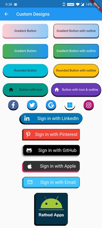
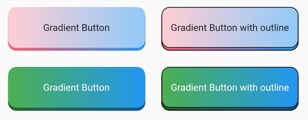
3. Use all other parameters to make custom buttons
Row(
  children: [
    Padding(
      padding: const EdgeInsets.all(12.0),
      child: AnimatedButton(
        child: Text("Gradient Button"),
        onTap: () {},
        isMultiColor: true,
        colors: [
          Colors.red[100],
          Colors.blue[200],
        ],
      ),
    ),
    Padding(
      padding: const EdgeInsets.all(12.0),
      child: AnimatedButton(
        child: Text("Gradient Button with outline"),
        onTap: () {},
        isMultiColor: true,
        isOutline: true,
        colors: [
          Colors.red[100],
          Colors.blue[200],
        ],
      ),
    ),
  ],
),
Row(
  children: [
    Padding(
      padding: const EdgeInsets.all(12.0),
      child: AnimatedButton(
        child: Text(
          "Gradient Button",
          style: TextStyle(
            color: Colors.white,
          ),
        ),
        onTap: () {},
        isMultiColor: true,
        colors: [
          Colors.green,
          Colors.blue,
        ],
      ),
    ),
    Padding(
      padding: const EdgeInsets.all(12.0),
      child: AnimatedButton(
        child: Text(
          "Gradient Button with outline",
          style: TextStyle(
            color: Colors.white,
          ),
        ),
        onTap: () {},
        isMultiColor: true,
        isOutline: true,
        colors: [
          Colors.green,
          Colors.blue,
        ],
      ),
    ),
  ],
),
Row(
  children: [
    Padding(
      padding: const EdgeInsets.all(12.0),
      child: AnimatedButton(
        child: Text("Rounded Button"),
        onTap: () {},
        height: 60,
        type: null,
        borderRadius: 30,
        color: Colors.cyan,
      ),
    ),
    Padding(
      padding: const EdgeInsets.all(12.0),
      child: AnimatedButton(
        child: Text("Rounded Button with outline"),
        onTap: () {},
        height: 60,
        type: null,
        borderRadius: 30,
        isOutline: true,
        color: Colors.amber,
      ),
    ),
  ],
),
Rounded Buttons with Icons
Row(
  children: [
    Padding(
      padding: const EdgeInsets.all(12.0),
      child: AnimatedButton(
        child: Row(
          mainAxisAlignment: MainAxisAlignment.spaceEvenly,
          children: [
            Icon(Icons.home),
            Text("Button with Icon"),
          ],
        ),
        onTap: () {},
        type: null,
        height: 60,
        borderRadius: 30,
        color: Colors.teal,
      ),
    ),
    Padding(
      padding: const EdgeInsets.all(2.0),
      child: AnimatedButton(
        child: Row(
          mainAxisAlignment: MainAxisAlignment.spaceEvenly,
          children: [
            Icon(Icons.home, color: Colors.white),
            Text("Button with Icon & outline",
                style: TextStyle(color: Colors.white)),
          ],
        ),
        onTap: () {},
        type: null,
        height: 60,
        width: 220,
        borderRadius: 30,
        isOutline: true,
        color: Colors.deepPurple,
      ),
    ),
  ],
),
Row(
  mainAxisAlignment: MainAxisAlignment.spaceEvenly,
  children: [
    Padding(
      padding: const EdgeInsets.all(2),
      child: AnimatedButton(
        child: Icon(
          FontAwesomeIcons.facebookF,
          color: Colors.white,
          size: 25,
        ),
        onTap: () {},
        type: null,
        height: 45,
        width: 45,
        borderRadius: 22.5,
        color: Color(0xFF49659F),
      ),
    ),
    Padding(
      padding: const EdgeInsets.all(2),
      child: AnimatedButton(
        child: Icon(
          FontAwesomeIcons.twitter,
          color: Colors.white,
          size: 25,
        ),
        onTap: () {},
        type: null,
        height: 45,
        width: 45,
        borderRadius: 22.5,
        color: Color(0xFF1DA1F2),
      ),
    ),
    Padding(
      padding: const EdgeInsets.all(2),
      child: AnimatedButton(
        child: Icon(
          FontAwesomeIcons.google,
          color: Colors.white,
          size: 25,
        ),
        onTap: () {},
        type: null,
        height: 45,
        width: 45,
        borderRadius: 22.5,
        color: Colors.blue,
      ),
    ),
    Padding(
      padding: const EdgeInsets.all(2),
      child: AnimatedButton(
        child: Icon(
          FontAwesomeIcons.microsoft,
          color: Colors.lightBlue,
          size: 25,
        ),
        onTap: () {},
        type: null,
        height: 45,
        width: 45,
        borderRadius: 22.5,
        color: Colors.white,
      ),
    ),
    Padding(
      padding: const EdgeInsets.all(2),
      child: AnimatedButton(
        child: Icon(
          FontAwesomeIcons.instagram,
          color: Colors.white,
          size: 25,
        ),
        onTap: () {},
        type: null,
        height: 45,
        width: 45,
        borderRadius: 22.5,
        color: Color(0xFFB81877),
      ),
    ),
  ],
),
Padding(
  padding: const EdgeInsets.all(10),
  child: AnimatedButton(
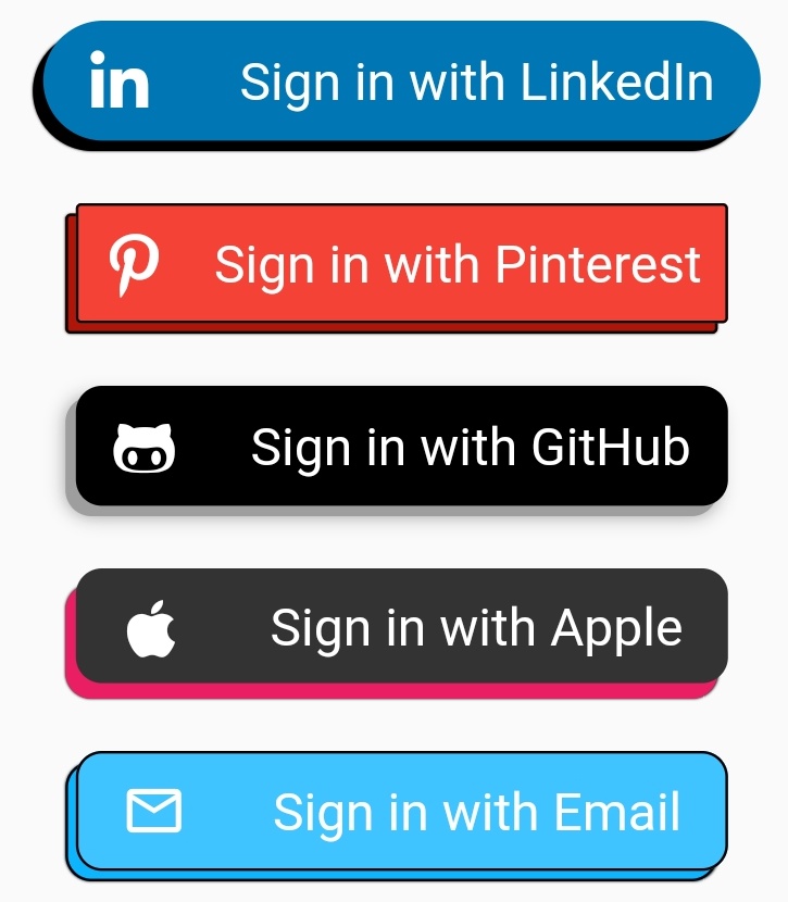
    child: Row(
      mainAxisAlignment: MainAxisAlignment.spaceAround,
      children: [
        Icon(
          FontAwesomeIcons.linkedinIn,
          color: Colors.white,
          size: 25,
        ),
        Text(
          "Sign in with LinkedIn",
          style: TextStyle(
            color: Colors.white,
            fontSize: 20.0,
          ),
        )
      ],
    ),
    onTap: () {},
    type: null,
    height: 50,
    shadowHeightBottom: 4,
    shadowHeightLeft: 4,
    width: 275,
    borderRadius: 25,
    color: Color(0xFF0077B5),
  ),
),
Padding(
  padding: const EdgeInsets.all(10),
  child: AnimatedButton(
    child: Row(
      mainAxisAlignment: MainAxisAlignment.spaceAround,
      children: [
        Icon(
          FontAwesomeIcons.pinterestP,
          color: Colors.white,
          size: 25,
        ),
        Text(
          "Sign in with Pinterest",
          style: TextStyle(
            color: Colors.white,
            fontSize: 20.0,
          ),
        )
      ],
    ),
    onTap: () {},
    type: null,
    height: 50,
    isOutline: true,
    shadowHeightBottom: 4,
    shadowHeightLeft: 4,
    width: 250,
    borderRadius: 2,
    color: Colors.red,
  ),
),
Padding(
  padding: const EdgeInsets.all(10),
  child: AnimatedButton(
    child: Row(
      mainAxisAlignment: MainAxisAlignment.spaceAround,
      children: [
        Icon(
          FontAwesomeIcons.githubAlt,
          color: Colors.white,
          size: 25,
        ),
        Text(
          "Sign in with GitHub",
          style: TextStyle(
            color: Colors.white,
            fontSize: 20.0,
          ),
        )
      ],
    ),
    onTap: () {},
    type: null,
    height: 50,
    shadowHeightBottom: 4,
    shadowHeightLeft: 4,
    width: 250,
    shadowColor: Colors.grey,
    blurColor: Colors.grey,
    blurRadius: 5,
    borderRadius: 10,
    color: Colors.black,
  ),
),
Padding(
  padding: const EdgeInsets.all(10),
  child: AnimatedButton(
    child: Row(
      mainAxisAlignment: MainAxisAlignment.spaceAround,
      children: [
        Icon(
          FontAwesomeIcons.apple,
          color: Colors.white,
          size: 25,
        ),
        Text(
          "Sign in with Apple",
          style: TextStyle(
            color: Colors.white,
            fontSize: 20.0,
          ),
        )
      ],
    ),
    onTap: () {},
    type: null,
    shadowColor: Colors.pink,
    height: 50,
    width: 250,
    shadowHeightBottom: 6,
    shadowHeightLeft: 4,
    borderRadius: 10,
    color: Color(0xFF333333),
  ),
),
Padding(
  padding: const EdgeInsets.all(10),
  child: AnimatedButton(
    child: Row(
      mainAxisAlignment: MainAxisAlignment.spaceAround,
      children: [
        Icon(
          Icons.mail_outline,
          color: Colors.white,
          size: 25,
        ),
        Text(
          "Sign in with Email",
          style: TextStyle(
            color: Colors.white,
            fontSize: 20.0,
          ),
        )
      ],
    ),
    onTap: () {},
    type: null,
    height: 50,
    width: 250,
    isOutline: true,
    darkShadow: false,
    shadowHeightBottom: 4,
    shadowHeightLeft: 4,
    borderRadius: 10,
    color: Colors.lightBlueAccent,
  ),
),
Padding(
  padding: const EdgeInsets.all(10),
  child: AnimatedButton(
    child: ClipRRect(
      borderRadius: BorderRadius.circular(10.0),
      child: Image.network(
        "my_logo_image_url",
        fit: BoxFit.fill,
      ),
    ),
    onTap: () {},
    type: null,
    height: 144,
    width: 144,
    isOutline: true,
    shadowHeightBottom: 4,
    shadowHeightLeft: 4,
    borderRadius: 10,
    color: Color(0xFF033249),
  ),
),