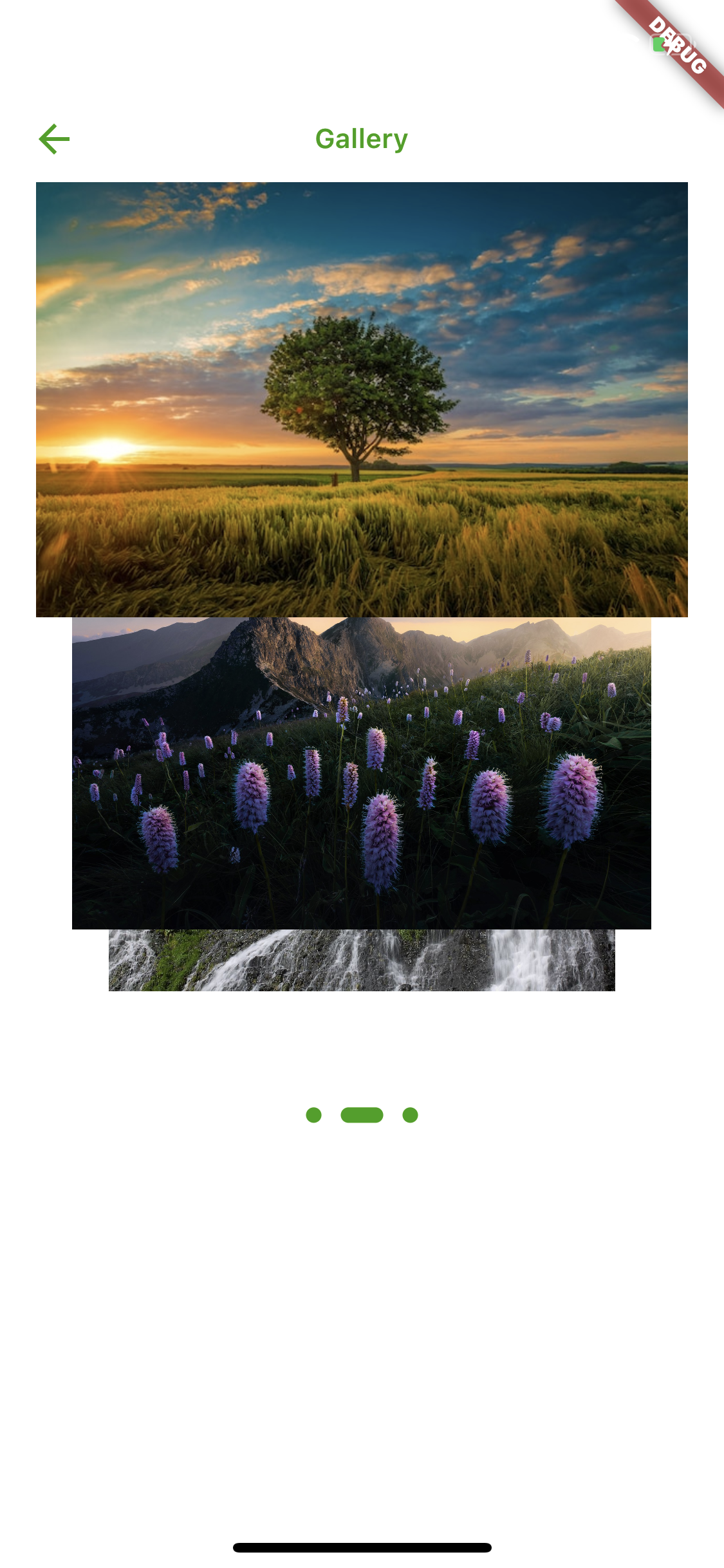
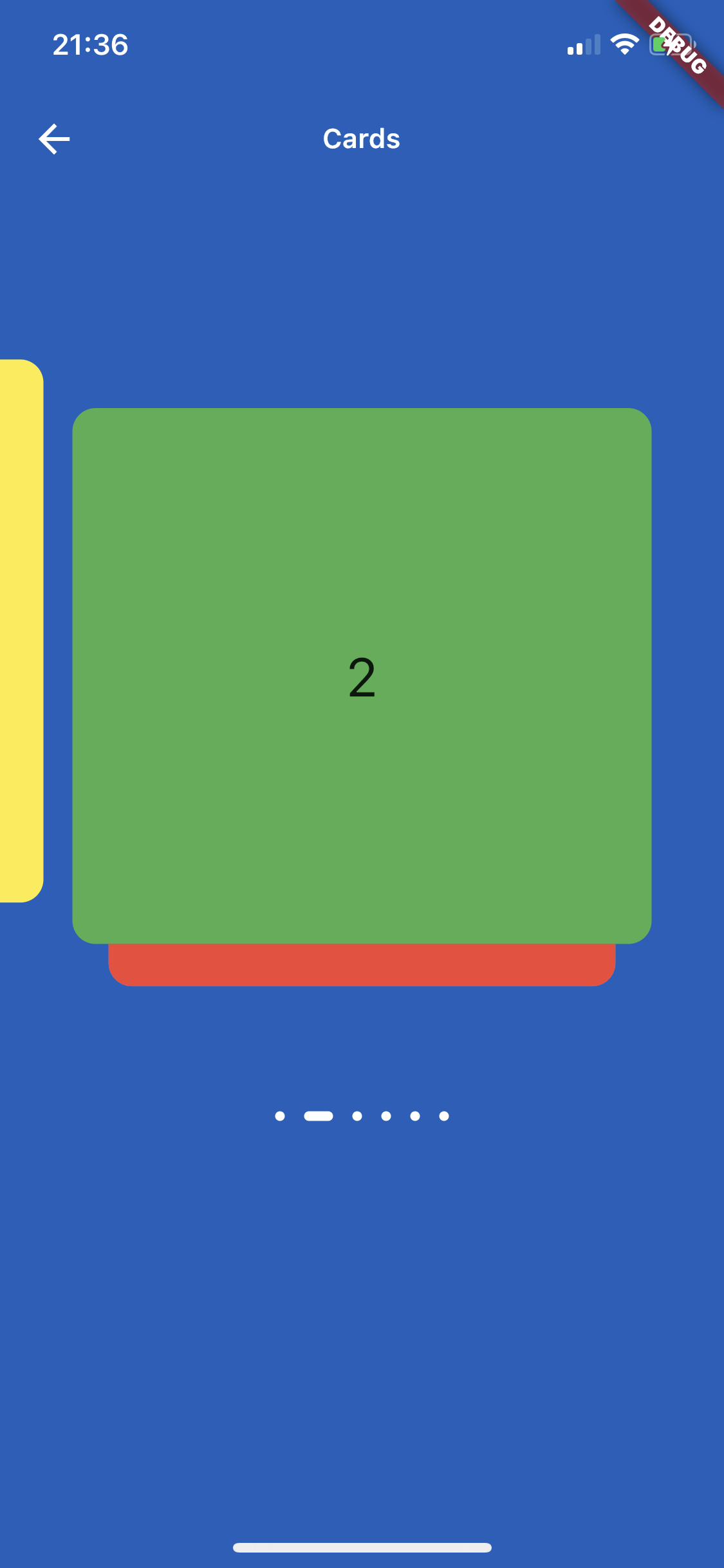
Card Slider는 사용자가 카드를 스와이프하거나 드래그하여 넘길 수 있는 드래그 가능한 이미지 캐러셀을 제공하는 Flutter 패키지입니다. 시각적으로 매력적인 방식으로 이미지, 제품 또는 콘텐츠를 전시하는 데 이상적입니다. 부드러운 전환과 여러 플랫폼에서 직관적인 제스처를 지원합니다. 성능과 사용 편의성을 고려해 설계되었으며, 인터랙티브한 카드 기반 탐색이 필요한 앱에 원활하게 통합됩니다. 갤러리, 제품 전시, 온보딩 화면에 적합합니다.
사용 사례
이미지 갤러리
제품 쇼케이스
온보딩 화면
인터랙티브 슬라이더
콘텐츠 캐러셀
주요 기능
드래그 가능한 제스처 지원
부드러운 슬라이드 전환
크로스 플랫폼 호환성
사용자 지정 가능한 카드 외관
내장 스와이프 애니메이션
적합한 대상
모바일 앱 개발자
UI/UX 디자이너
전자상거래 애플리케이션
포트폴리오 웹사이트
인터랙티브 프로토타입
고려 사항
제스처 처리 설정이 필요합니다
대규모 데이터 세트에 대한 최적화가 필요할 수 있습니다
제한된 내장 스타일링 옵션
이미지가 아닌 콘텐츠에는 적합하지 않습니다
성능은 카드 수에 따라 달라집니다
원본 README
연결된 소스 저장소의 README 원문 스냅샷입니다. 최신 내용은 저장소에서 확인하세요.
card_slider
A draggable Flutter image carousel slider on swipe or drag! Card slider for carousel images and widgets. This widget works on both Android & iOS.
Installing
Add the following to your pubspec.yaml file:
dependencies:card_slider:^1.0.5
Maintaining card_slider
Thank you everyone for the support surrounding this project! card_slider has grown far larger than I could have ever imagined, so parsing through all the feature requests and new issues has taken me more time than I'd like. If you're interested in helping maintain this project, please send me an email at asylzatwww@gmail.com. As a sidenote, I'll always try to make sure that this project is compatible with the latest version of Flutter.
Simple Usage
There are two ways which the CardSlider can easily be added to your project.
Using the CardSlider slides as widgets.
Using the CardSlider slides as images
Using the CardSlider slides as widgets inside scrollable Column.
CardSlider slides as widgets
This method uses widgets as a slide cards. For example:
CardSlider slides as widgets inside scrollable Column widget
This method uses widget as a slide cards inside scrollable column, instead of using SingleChildScrollView use the code below which uses ListView, otherwise GestureDetector won't work. For example:
bool _dragOverMap = false;
finalGlobalKey _pointerKey = GlobalKey();
_checkDrag(Offset position, bool up) {
if (!up) {
// find your widgetRenderBox box = _pointerKey.currentContext!.findRenderObject() asRenderBox;
//get offsetOffset boxOffset = box.localToGlobal(Offset.zero);
// check if your pointerdown event is inside the widget (you could do the same for the width, in this case I just used the height)if (position.dy > boxOffset.dy &&
position.dy < boxOffset.dy + box.size.height) {
setState(() {
_dragOverMap = true;
});
}
} else {
setState(() {
_dragOverMap = false;
});
}
}
@overrideWidgetbuild(BuildContext context) {
List<Color> valuesDataColors = [
Colors.purple,
Colors.yellow,
Colors.green,
Colors.red,
Colors.grey,
Colors.blue,
];
List<Widget> valuesWidget = [];
for (int i = 0; i < valuesDataColors.length; i++) {
valuesWidget.add(Container(
decoration: BoxDecoration(
borderRadius: BorderRadius.circular(12.0),
color: valuesDataColors[i],
),
child: Align(
alignment: Alignment.center,
child: Text(
i.toString(),
style: constTextStyle(
fontSize: 28,
),
),
)));
}
returnScaffold(
appBar: AppBar(
title: constText("Slide inside column widget"),
),
body: Listener(
onPointerUp: (ev) {
_checkDrag(ev.position, true);
},
onPointerDown: (ev) {
_checkDrag(ev.position, false);
},
child: ListView(
// if dragging over your widget, disable scroll, otherwise allow scrolling
physics:
_dragOverMap ? constNeverScrollableScrollPhysics() : constScrollPhysics(),
children: [
Column(
children: [
for (int i = 0; i < 3; i++)
constListTile(title: Text("Tile to scroll")),
constDivider(),
],
),
// Your widget that you want to prevent to scroll the ListviewContainer(
color: Colors.amberAccent,
key: _pointerKey, // key for finding the widget
height: 350,
width: double.infinity,
child:
CardSlider(
cards: valuesWidget,
bottomOffset: .0008,
cardHeight: 0.75,
containerHeight: MediaQuery.of(context).size.height - 100,
itemDotOffset: 0.55,
)
,
),
Column(
children: [
for (int i = 0; i < 3; i++)
constListTile(title: Text("Tile to scroll")),
constDivider(),
],
),
],
),
),
);
}
Screenshots
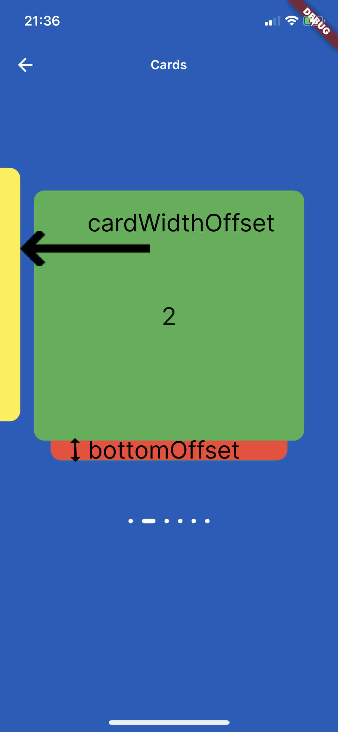
On the image below is shown how to use parameters cardWidthOffset, cardHeightOffset, bottomOffset :
Custom Usage
There are several options that allow for more control:
Properties
Description
cards
The List of Widgets for slider
slideChanged
Optional Event fired when ever slide is changed, (sliderIndex){ } sliderIndex has a value of a current slide.
blurValue
Optional blurValue used for blurring the slider
blurOnClick
Optional blurOnClick is method which listens if users clicks over blurred slider to be able to remove blurry
sliderBackGroundWidget
Optional widget which placed on the background of slider, can be placed logo or any other image or widget .
itemDotWidth
Optional is a width of dots under slider showing current location.
bottomOffset
Optional is a double value, the height of a bottom of previous slide
cardWidth
Optional is a width of a slides
cardHeight
Optional is a height of a slides
cardWidthOffset
Optional is a width which is used for how far slide must go on in horizontal distance when swiping or dragging
cardHeightOffset
Optional is a height which is used for how far slide must go on in vertical distance when swiping or dragging
itemDot
Optional is a widget by which can be changed the dots of th slider position
containerWidth
Optional is a width of main Container
containerHeight
Optional is a height of main Container
containerColor
Optional is a color of main Container
itemDotOffset
Optional is a distance to position itemDot under slides
🔢 Get Current Slide Index
You can listen to slide changes and get the current slide index using the slideChanged callback.