패키지, 저장소 및 앱 카테고리 검색

clean_calendar 표지
패키지 상세v2.0.0

clean_calendar

간단하고 아름답고 사용자 정의 가능한 캘린더를 만들 수 있는 완전히 새로운 Flutter 캘린더 패키지입니다.

AndroidiOSWebmacOSWindowsLinux
30일 다운로드
724
좋아요
77
Pub 점수
150

패키지 설치

flutter pub add clean_calendar

패키지 개요

공개 정보를 바탕으로 생성한 선택 가이드입니다.

Clean Calendar는 간결하고 간편한 캘린더를 쉽게 만들 수 있도록 설계된 현대적이고 사용자 정의 가능한 Flutter 패키지입니다. Android, iOS, Web, macOS, Windows, Linux 등 여러 플랫폼에서 상호작용 가능한 캘린더 뷰를 구축하기 위한 명확한 API를 제공합니다. 날짜, 스타일링 및 이벤트 통합에 대한 커스터마이징을 지원하며, 직관적인 날짜 선택 또는 스케줄링 기능이 필요한 앱에 적합합니다. 패키지는 단순성과 성능을 중시하면서도 개발자에게 매우 유연성을 제공합니다.

사용 사례

  • 양식 내 날짜 선택
  • 이벤트 스케줄링 인터페이스
  • 일일 계획 앱
  • 캘린더 기반의 데이터 필터링
  • 사용자 생일 또는 예약 추적

주요 기능

  • 높은 사용자 정의 가능한 UI
  • 크로스 플랫폼 호환성
  • 간단한 날짜 처리
  • 이벤트 마커 지원
  • 경량이고 빠른 렌더링

적합한 대상

  • 캘린더 기능을 개발하는 개발자
  • 날짜 선택기 필요 앱
  • 클린한 UI 디자인에 중점을 둔 프로젝트
  • Flutter 초보자가 위젯 탐색 중
  • 사용자 정의 가능한 날짜 인터페이스

고려 사항

  • 제한된 내장 이벤트 관리
  • 복잡한 상호작용을 위해 수동 구현이 필요합니다
  • 내장 반복 이벤트 지원 없음
  • 기본 사용법을 넘어서는 최소 문서
  • 동적 데이터를 위해 외부 상태 관리에 의존합니다

원본 README

연결된 소스 저장소의 README 원문 스냅샷입니다. 최신 내용은 저장소에서 확인하세요.

pub package wakatime

Word from creator

Hello👋, Clean Calendar is in the early stages of development and can have many breaking changes. If you have any questions or suggestions, contact me via GitHub issues, email, discord, or any of the ways listed on my GitHub profile.

Yes, giving the package a 👍(Pub) or ⭐(Github) will encourage me to work on it more.

Package description

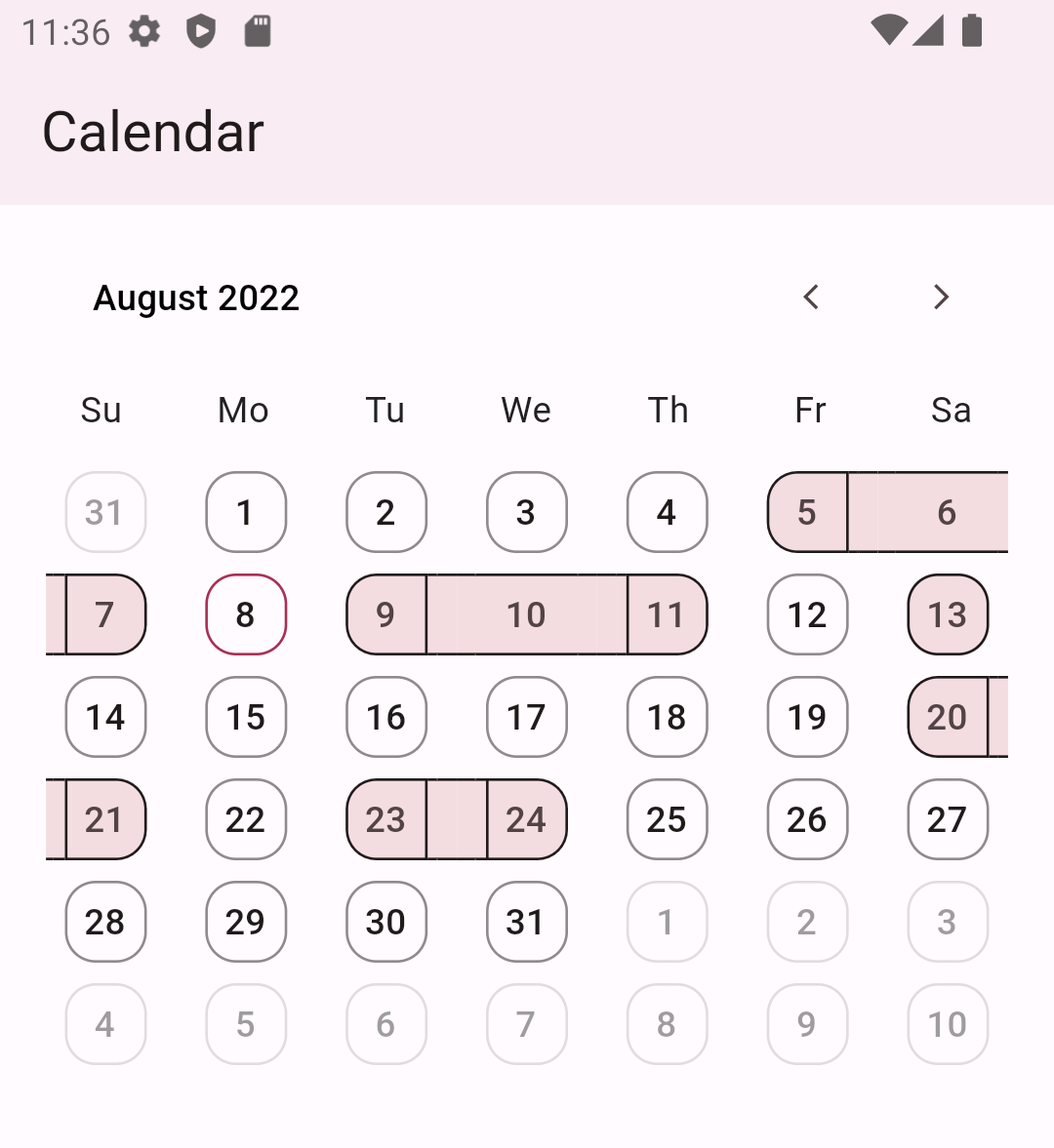
Get ready to enhance your Flutter app with this fantastic calendar package! With its simple yet elegant design, you can create a fully customized calendar that suits your needs. It provides a customizable month view and the ability to highlight dates with streaks. It is just the beginning, and we will add more features.

Features

  • Display dates as streaks
  • Monthly calendar
Dark mode Light mode
  • Weekly calendar
Dark mode Light mode

Getting started

  • In pubspec.yaml, add this dependency:
clean_calendar: 
  • Add this package to your project:
import 'package:clean_calendar/clean_calendar.dart';

Basic Usage

class Home extends StatelessWidget {
  const Home({Key? key}) : super(key: key);

  @override
  Widget build(BuildContext context) {
    return Scaffold(
      appBar: AppBar(
        elevation: 2,
        title: const Text("Calendar"),
      ),
      body: CleanCalendar(
        datesForStreaks: [
          DateTime(2022, 8, 5),
          DateTime(2022, 8, 6),
          DateTime(2022, 8, 7),
          DateTime(2022, 8, 9),
          DateTime(2022, 8, 10),
          DateTime(2022, 8, 11),
          DateTime(2022, 8, 13),
          DateTime(2022, 8, 20),
          DateTime(2022, 8, 21),
          DateTime(2022, 8, 23),
          DateTime(2022, 8, 24),
        ],
      ),
    );
  }
}

Customisations

  • Customise date boundary behaviour and tap behaviour
CleanCalendar(                           
)
CleanCalendar(
// To allow date boundary to shrink.
enableDenseViewForDates: true,

// To allow date tap splash to shrink.
enableDenseSplashForDates: true,
)

Note: This dense mode could lead to overflow if the available width to calendar is smaller than 280px so it is advised to disable them in smaller space than 280px.

  • Disable and hide different types of dates
CleanCalendar(                                      
)
CleanCalendar(
leadingTrailingDatesProperties: DatesProperties(

// To disable taps on leading and trailing dates.
disable: true,

// To hide leading and trailing dates.
hide: true,
),
)

Also, Available for other types of dates : -

Selected Dates Visible Month Dates Current Date Streak Dates
CleanCalendar(
selectedDatesProperties: DatesProperties(

// To disable taps on selected dates.
disable: true,

// To hide selected dates.
hide: true,
),
)
CleanCalendar(
generalDatesProperties: DatesProperties(

// To disable taps on leading and trailing dates.
disable: true,

// To hide leading and trailing dates.
hide: true,
),
)
CleanCalendar(
currentDateProperties: DatesProperties(

// To disable taps on current date.
disable: true,

// To hide current date.
hide: true,
),
)
CleanCalendar(
streakDatesProperties: DatesProperties(

// To disable taps on streak dates.
disable: true,

// To hide streak dates.
hide: true,
),
)
  • Customise dates look by changing its properties
CleanCalendar(                                         
);
CleanCalendar(
datesForStreaks: [
DateTime(2022, 8, 5),
DateTime(2022, 8, 6),
...
],
currentDateProperties: DatesProperties(
datesDecoration: DatesDecoration(
datesBorderRadius: 1000,
datesBackgroundColor: Colors.lightGreen.shade100,
datesBorderColor: Colors.green,
datesTextColor: Colors.black,
),
),
generalDatesProperties: DatesProperties(
datesDecoration: DatesDecoration(
datesBorderRadius: 1000,
datesBackgroundColor: Colors.lightGreen.shade100,
datesBorderColor: Colors.blue.shade100,
datesTextColor: Colors.black,
),
),
streakDatesProperties: DatesProperties(
datesDecoration: DatesDecoration(
datesBorderRadius: 1000,
datesBackgroundColor: Colors.green,
datesBorderColor: Colors.blue,
datesTextColor: Colors.white,
),
),
leadingTrailingDatesProperties: DatesProperties(
datesDecoration: DatesDecoration(
datesBorderRadius: 1000,
),
),
)
CleanCalendar(
enableDenseViewForDates: true,
datesForStreaks: [
DateTime(2022, 8, 5),
DateTime(2022, 8, 6),
...
],
currentDateProperties: DatesProperties(
datesDecoration: DatesDecoration(
datesBorderRadius: 1000,
datesBackgroundColor: Colors.lightGreen.shade100,
datesBorderColor: Colors.green,
datesTextColor: Colors.black,
),
),
generalDatesProperties: DatesProperties(
datesDecoration: DatesDecoration(
datesBorderRadius: 1000,
datesBackgroundColor: Colors.lightGreen.shade100,
datesBorderColor: Colors.blue.shade100,
datesTextColor: Colors.black,
),
),
streakDatesProperties: DatesProperties(
datesDecoration: DatesDecoration(
datesBorderRadius: 1000,
datesBackgroundColor: Colors.green,
datesBorderColor: Colors.blue,
datesTextColor: Colors.white,
),
),
leadingTrailingDatesProperties: DatesProperties(
datesDecoration: DatesDecoration(
datesBorderRadius: 1000,
),
),
)
  • Customise weekdays header by changing its properties
CleanCalendar(
weekdaysProperties: WeekdaysProperties(
generalWeekdaysDecoration:
WeekdaysDecoration(weekdayTextColor: Colors.red),
sundayDecoration: WeekdaysDecoration(
weekdayTextColor: Colors.green,
weekdayTextStyle:
Theme.of(context).textTheme.headlineMedium),
saturdayDecoration: WeekdaysDecoration(
weekdayTextColor: Colors.green,
weekdayTextStyle:
Theme.of(context).textTheme.headlineMedium),
),
)
  • Customise navigator header by changing its properties
CleanCalendar(
headerProperties: HeaderProperties(
monthYearDecoration: MonthYearDecoration(
monthYearTextColor: Colors.amber,
monthYearTextStyle: Theme.of(context).textTheme.labelMedium,
),
navigatorDecoration: NavigatorDecoration(
navigatorResetButtonIcon: const Icon(
Icons.restart_alt,
color: Colors.amber,
),
navigateLeftButtonIcon: const Icon(
Icons.arrow_circle_left,
color: Colors.amber,
),
navigateRightButtonIcon: const Icon(
Icons.arrow_circle_right,
color: Colors.amber,
),
),
),
)

Date Selection

  • Multiple date selection with customization
CleanCalendar(
enableDenseViewForDates: true,
enableDenseSplashForDates: true,
datesForStreaks: [
DateTime(2022, 8, 5),
DateTime(2022, 8, 6),
...
],

// Enabling selecting single or multiple dates. Defaults to disable selection.
dateSelectionMode: DatePickerSelectionMode.singleOrMultiple,

// Listening to selected dates.
onSelectedDates: (List<DateTime> value) {
// If selected date picked again then removing it from selected dates.
if (selectedDates.contains(value.first)) {
selectedDates.remove(value.first);
} else {
// If unselected date picked then adding it to selected dates.
selectedDates.add(value.first);
}
// setState to update the calendar with new selected dates.
setState(() {});
},

// Providing calendar the dates to select in ui.
selectedDates: selectedDates,

// Customizing selected date.
selectedDatesProperties: DatesProperties(
datesDecoration: DatesDecoration(
datesBorderRadius: 1000,
),
),
)
  • Single date selection

    For single date selection modify the above example code onSelectedDates logic to store only single latest date as selected.

  • Range, multiple ranges (coming soon)

Changing calendar view type

Currently mothly and weekly views are added. You can change them as shown below:

CleanCalendar(
  // Setting DatePickerCalendarView.weekView for weekly view
  datePickerCalendarView: DatePickerCalendarView.weekView,
)

Note: datePickerCalendarView defaults to DatePickerCalendarView.monthView.

Changing calendar start weekday

You can change the claendar start weekday as shown below:

CleanCalendar(
  // Setting start weekday
  startWeekday: WeekDay.monday,
)

Note: startWeekday defaults to WeekDay.sunday.

Changing weekday and month symbols

You can change the claendar months and weekdays symbols as shown below:

CleanCalendar(
  // Setting custom weekday symbols
  weekdaysSymbol: const Weekdays(sunday: "s", monday: "m", tuesday: "t", wednesday: "w", thursday: "t", friday: "f", saturday: "s"),
  // Setting custom month symbols
  monthsSymbol: const Months(january: "Jan", february: "Feb", march: "Mar", april: "Apr", may: "May", june: "Jun", july: "Jul", august: "Aug", september: "Sep", october: "Oct", november: "Nov", december: "Dec"),
)

Note: weekdaysSymbol defaults to Mo, Tu, We, Th, Fr, Sa, Su from monday to sunday and monthsSymbol defaults to January, February, March, April, May, June, July, August, September, October, November, December.

Accessing selected dates

To access selected dates use the onSelectedDates callback but keep in mind that this callback always provides a list of dates as shown below:

CleanCalendar(
  ...
  onSelectedDates: (List<DateTime> selectedDates) {
    // Called every time dates are selected or deselected.
    print(selectedDates);
  },
)

Note: Even for single selection mode it provides a list with just one date and for multiple selection it provides a list with multiple dates.

Providing pre-selected dates

You can provide pre-selected dates by providing a list of dates to selectedDates as shown below:

CleanCalendar(
  ...
  selectedDates: [
    DateTime(2022, 8, 6),
    DateTime(2022, 8, 9),
    DateTime(2022, 8, 11),
  ],
)

Note: Even with selection mode set to single or disable it will still show the provided pre-selected dates as selected. And I think is the correct behavious as sometimes we might want to show selected dates while also preventing users from interacting with them.

Providing start and end dates

You can provide start and end dates for calendar view as shown below:

CleanCalendar(
  ...
  // Setting start date of calendar.
  startDateOfCalendar: DateTime(2022,6,5),

  // Setting end date of calendar.
  endDateOfCalendar: DateTime(2022,10,15),
)

Note: startDateOfCalendar defaults to DateTime.utc(0000, 1, 1) and endDateOfCalendar defaults to DateTime.utc(9999, 1, 1).

Providing initial month view for calendar

You can provide initial month view for calendar by providing date of that month as shown below:

CleanCalendar(
  ...
  // Setting initial month view of calendar.
  initialViewMonthDateTime: DateTime(2022,9,5),
)

Note: initialViewMonthDateTime defaults to current date and if current is not between startDateOfCalendar and endDateOfCalendar then defaults to start date..

Providing current date for calendar

You can provide current date for calendar as shown below:

CleanCalendar(
  ...
  // Setting current date of calendar.
  currentDateOfCalendar: DateTime(2022,9,5),
)

Note: currentDateOfCalendar defaults to DateTime.now().

Listening for calendar view week or month change

You can listen and get the current calendar view date on calendar view change. Useful in case you want to change your ui acording to the dates visible to user.

CleanCalendar(
  ...
  onCalendarViewDate: (DateTime calendarViewDate) {
    // Called every time view is changed like scrolled etc.
    print(calendarViewDate);
  },
)

Note: For now onCalendarViewDate will only provide the view starting date. Later I may can add an option to get all dates of current view depending on users request. Also, onCalendarViewDate is called only on change of view like scroll, etc and will not be called on the creation of calendar as at thst time we already know the date.

Additional information

Support is surely planned for these:

  • Complete documentation.

  • Option to disable user interactions on whole view, past dates, and dates after-before end-start date. (🐇)

  • More customization and premade templates for calendar. (🐢)

  • More calendar view types. (🐢)

  • Date selection options such as range, and multiple range selections. (🐢)

  • A calendar option for choosing a view by year, month, or day. (🐢)

  • Support for dates to be displayed in events style. (🐢)

  • Dry mode, which optimizes performance for low-end devices by removing or substituting heavy animations and widgets. (🐢)

And, if I'm forgetting something crucial/important/necessary then please let me know.

카테고리

소스 저장소

이 패키지를 사용하는 프로젝트

아직 데이터가 없습니다.