패키지, 저장소 및 앱 카테고리 검색

control_style 표지
패키지 상세v0.1.2

control_style

Flutter 기반의 텍스트 필드, 버튼 및 기타 컨트롤에 추가적인 장식을 적용합니다. 이를 통해 인터페이스 사용자 정의가 더 나아집니다.

AndroidiOSWebmacOSWindowsLinux
30일 다운로드
1.7만
좋아요
25
Pub 점수
160

패키지 설치

flutter pub add control_style

패키지 개요

공개 정보를 바탕으로 생성한 선택 가이드입니다.

ControlStyle은 텍스트 필드와 버튼과 같은 UI 컨트롤의 시각적 외관을 사용자 정의 가능한 장식을 적용하여 개선하는 Flutter 패키지입니다. 개발자가 반복적인 스타일 코드를 작성하지 않고도 표준 위젯의 외관과 느낌을 쉽게 맞춤 설정할 수 있도록 합니다. 모든 주요 플랫폼을 지원하며 일관되고 세련된 디자인을 위한 인터페이스 커스터마이징을 간소화합니다. 이 패키지는 간단한 pub add 명령어를 통해 기존 Flutter 프로젝트에 원활하게 통합될 수 있습니다.

사용 사례

  • 텍스트 필드 테두리 맞춤 설정
  • 버튼 미적 요소 향상
  • 통합 UI 테마 만들기
  • 폼 입력 시각적 요소 개선
  • 디자인 일관성 개선
  • 컨트롤에 장식 효과 추가

주요 기능

  • Flutter 위젯과의 간편한 통합
  • 크로스 플랫폼 호환성
  • 확장 가능한 장식 시스템
  • 필요한 보일러플레이트 최소화
  • 반응형 디자인을 지원합니다
  • 테마 인식 스타일링

적합한 대상

  • 시각적 완성도를 추구하는 UI 디자이너
  • 양식을 개발하는 개발자
  • 일관된 디자인 시스템을 유지하는 팀
  • 사용자 정의 컨트롤 표시를 필요로 하는 앱
  • 엄격한 UI 마감일이 있는 프로젝트
  • Flutter 초보자가 위젯 스타일링 탐색 중

고려 사항

  • 복잡한 레이아웃의 경우 추가 구성이 필요할 수 있습니다
  • 시각적 개선에 국한됨(기능 변경 없음)
  • Flutter의 렌더링 파이프라인에 의존합니다
  • 많은 장식된 컨트롤로 인한 성능 영향 가능성
  • 시각적 사용자 정의 외의 요구 사항에는 적합하지 않습니다
  • Flutter 위젯 트리에 대한 이해가 필요합니다

원본 README

연결된 소스 저장소의 README 원문 스냅샷입니다. 최신 내용은 저장소에서 확인하세요.

Applies additional appearance settings to Flutter text fields, buttons and other controls. Currently supports: outer shadow, inner shadow, border, inner gradient.

Try it out: example

Intro

The Flutter library provides limited opportunities to set up the appearance of controls. You usually make this customisation by wrapping the components into a Container widget and configuring it using the decoration parameter. Such an approach has limitations as it leads to increasing the volume of work and complicating the code. Especially time consuming in this case is creating animations for switching between different appearances depending on a state of a control.

In addition, this approach works incorrectly when you are adding shadows to text fields in combination with errorText and helperText:

Container issue

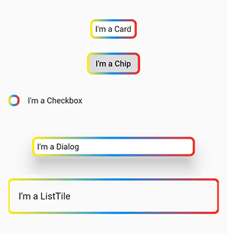
This package helps to solve the aforementioned problem. It provides the most common customisation features for control elements which have shape field such as buttons, text fields, Card, Chip, Checkbox, Dialog, Drawer, inks, ListTile, Material, NavigationBar.

The package provides the same customisation parameters to all controls, which allows for identically decorating any of the controls.

final outlinedShape = DecoratedOutlinedBorder(
  borderGradient: const GradientBorderSide(
    gradient: LinearGradient(colors: [Colors.yellow, Colors.blue, Colors.red]),
    width: 2,
  ),
  child: RoundedRectangleBorder(borderRadius: BorderRadius.circular(8)),
);

...
  Column(children: [
    const SizedBox(height: 16),
    Card(child: const Padding(padding: EdgeInsets.all(8.0), child: Text("I'm a Card")), shape: outlinedShape),
    const SizedBox(height: 16),
    Chip(label: const Text("I'm a Chip"), shape: outlinedShape),
    const SizedBox(height: 16),
    Row(children: [Checkbox(value: false, onChanged: (value) {}, shape: outlinedShape), const Text("I'm a Checkbox")]),
    const SizedBox(height: 16),
    Dialog(child: const Padding(padding: EdgeInsets.all(8.0), child: Text("I'm a Dialog")), shape: outlinedShape),
    const SizedBox(height: 16),
    ListTile(title: const Text("I'm a ListTile"), shape: outlinedShape),
    const SizedBox(height: 16),
  ]);
...

Control examples

Features

Demo

The package enables outer shadow, inner shadow, border and inner gradient styles for Flutter’s standard controls. These can be applied without using external control widgets.

Usage

You can customize all your controls at once via the theme setting of MaterialApp, or separate controls through changing their own styles.

To use the plugin with inputs, you need to wrap InputBorder with DecoratedInputBorder and configure its parameters.

For example, the code:

    MaterialApp(
      theme: ThemeData(
        inputDecorationTheme: InputDecorationTheme(
          border: OutlineInputBorder(
            borderRadius: BorderRadius.circular(8),
          ),
        ),
      ),
    );

should be updated to:

    MaterialApp(
      theme: ThemeData(
        inputDecorationTheme: InputDecorationTheme(
          border: DecoratedInputBorder(
            shadow: const [
              BoxShadow(
                color: Colors.blue,
                blurRadius: 12,
              )
            ],
            child: OutlineInputBorder(
              borderRadius: BorderRadius.circular(8),
            ),
          ),
        ),
      ),
    );

For buttons, you need to wrap OutlinedBorder with DecoratedOutlinedBorder and configure its parameters.

Hence, this code:

    MaterialApp(
      theme: ThemeData(
        primarySwatch: Colors.blue,
        outlinedButtonTheme: OutlinedButtonThemeData(
            style: ElevatedButton.styleFrom(
          shape: RoundedRectangleBorder(
            borderRadius: BorderRadius.circular(8),
          ),
        )),
      ),
    );

should be updated to:

    MaterialApp(
      theme: ThemeData(
        primarySwatch: Colors.blue,
        outlinedButtonTheme: OutlinedButtonThemeData(
            style: ElevatedButton.styleFrom(
          shape: DecoratedOutlinedBorder(
            shadow: const [
              BoxShadow(
                color: Colors.blue,
                blurRadius: 12,
              )
            ],
            child: RoundedRectangleBorder(
              borderRadius: BorderRadius.circular(8),
            ),
          ),
        )),
      ),
    );

The examples above show how to decorate all the controls at once.

In case you need to decorate separate element, you need to configure its styles:

    TextField(
      decoration: InputDecoration(
          border: DecoratedInputBorder(
        shadow: const [
          BoxShadow(
            color: Colors.blue,
            blurRadius: 12,
          )
        ],
        child: OutlineInputBorder(
          borderRadius: BorderRadius.circular(8),
        ),

      )),
    );

    ...

    ElevatedButton(
      onPressed: () {},
      child: const Text("Button"),
      style: ElevatedButton.styleFrom(
          shape: DecoratedOutlinedBorder(
        shadow: const [
          BoxShadow(
            color: Colors.blue,
            blurRadius: 12,
          )
        ],
        child: RoundedRectangleBorder(
          borderRadius: BorderRadius.circular(8),
        ),
      )),
    );
Animation

To configure element state change animations, use the usual Flutter’s approach.

TextButton(
  onPressed: () {},
  child: const Text("Text button"),
  style: ButtonStyle(
    shape: MaterialStateProperty.resolveWith((states) {
      return DecoratedOutlinedBorder(
        shadow: [
          GradientShadow(
            gradient: states.contains(MaterialState.pressed)
                ? const LinearGradient(colors: [Colors.red, Colors.green, Colors.cyan])
                : const LinearGradient(colors: [Colors.blue, Colors.blue]),
            blurRadius: 12,
          )
        ],
        child: RoundedRectangleBorder(borderRadius: BorderRadius.circular(8)),
      );
    }),
  ),
)

Animation

Outer shadow

Add the shadow parameter to DecoratedInputBorder or DecoratedOutlinedBorder.

For adding a single-colour shadow, use BoxShadow.

TextButton(
  onPressed: () {},
  child: const Text("Text button"),
  style: TextButton.styleFrom(
      shape: DecoratedOutlinedBorder(
    shadow: const [
      BoxShadow(
        color: Colors.blue,
        blurRadius: 12,
      )
    ],
    child: RoundedRectangleBorder(borderRadius: BorderRadius.circular(8)),
  )),
);

Color shadow

For applying a gradient-shadow, use GradientShadow. It is different from BoxShadow only in that instead of color it uses the gradient parameter.

TextButton(
  onPressed: () {},
  child: const Text("Text button"),
  style: TextButton.styleFrom(
      shape: DecoratedOutlinedBorder(
    shadow: const [
      GradientShadow(
        gradient: LinearGradient(colors: [Colors.red, Colors.green, Colors.cyan]),
        blurRadius: 12,
      )
    ],
    child: RoundedRectangleBorder(borderRadius: BorderRadius.circular(8)),
  )),
)

Gradient shadow

Inner shadow

Add innerShadow for DecoratedInputBorder or DecoratedOutlinedBorder.

For adding a single-colour shadow, use BoxShadow.

TextButton(
  onPressed: () {},
  child: const Text("Text button"),
  style: TextButton.styleFrom(
      shape: DecoratedOutlinedBorder(
    innerShadow: const [
      BoxShadow(
        color: Colors.blue,
        blurRadius: 12,
      )
    ],
    child: RoundedRectangleBorder(borderRadius: BorderRadius.circular(8)),
  )),
)

Inner shadow

For applying a gradient-shadow, use GradientShadow. It is different from BoxShadow only in that instead of color it uses the gradient parameter.

TextButton(
  onPressed: () {},
  child: const Text("Text button"),
  style: TextButton.styleFrom(
      shape: DecoratedOutlinedBorder(
    innerShadow: const [
      GradientShadow(
        gradient: LinearGradient(colors: [Colors.red, Colors.green, Colors.cyan]),
        blurRadius: 12,
      )
    ],
    child: RoundedRectangleBorder(borderRadius: BorderRadius.circular(8)),
  )),
)

Inner gradient shadow

Background

Add the backgroundGradient parameter of the Gradient type to DecoratedInputBorder or DecoratedOutlinedBorder.

TextButton(
  onPressed: () {},
  child: const Text("Text button"),
  style: ButtonStyle(
    shape: MaterialStateProperty.resolveWith((states) {
      return DecoratedOutlinedBorder(
        backgroundGradient: LinearGradient(colors: [Colors.blue.withOpacity(0.5), Colors.blue.withOpacity(0.2)]),
        child: RoundedRectangleBorder(borderRadius: BorderRadius.circular(8)),
      );
    }),
  ),
)

Background gradient

Border

Add the borderGradient or GradientBorderSide parameter to DecoratedInputBorder or DecoratedOutlinedBorder. This parameters differ from the Flutter’ BorderSide in that they use gradient parameter instead of color.

TextButton(
  onPressed: () {},
  child: const Text("Text button"),
  style: ButtonStyle(
    shape: MaterialStateProperty.resolveWith((states) {
      return DecoratedOutlinedBorder(
        borderGradient: const GradientBorderSide(
          gradient: LinearGradient(colors: [Colors.red, Colors.green, Colors.blue]),
          width: 3,
        ),
        child: RoundedRectangleBorder(borderRadius: BorderRadius.circular(8)),
      );
    }),
  ),
)

Gradient border

BorderShadow in Detail

The wrappers DecoratedInputBorder and DecoratedOutlinedBorder reach an element’s border through the child parameter and apply stylization above the default border of this element. In case of an outer shadow, the shadow’s part above the control then gets cut off in order to create an illusion of the shadow being located behind the control.

how it works

Decorative styles are applied above the layer that contains an element’s border. Hence, when it comes to buttons, such stylisation overlaps the inner area of an element. Using transparent colours hence used to address this issue. This limitation is due to Flutter itself.

Background overlap issue

Compatibility

The following borders have been tested.

Inputs:

  • UnderlineInputBorder
  • OutlineInputBorder

Buttons:

  • BeveledRectangleBorder
  • CircleBorder
  • ContinuousRectangleBorder
  • RoundedRectangleBorder
  • StadiumBorder

Issues

  • Shadows may overlap nearby elements.

Shadow overlap issue

  • The decoration of the inner area of the button overlaps the button itself.

Background overlap issue

카테고리

소스 저장소

이 패키지를 사용하는 프로젝트

아직 데이터가 없습니다.