패키지, 저장소 및 앱 카테고리 검색

create_date_picker 표지
패키지 상세v1.0.2

create_date_picker

99% 사용자 정의 가능한 달력

AndroidiOSWebmacOSWindowsLinux
30일 다운로드
193
좋아요
7
Pub 점수
150

패키지 설치

flutter pub add create_date_picker

패키지 개요

공개 정보를 바탕으로 생성한 선택 가이드입니다.

Flutter 애플리케이션을 위한 매우 사용자 정의 가능한 날짜 선택기로, 광범위한 스타일링 및 구성 옵션을 제공합니다. 여러 플랫폼에서 날짜 선택 인터페이스의 외관과 동작을 완전히 제어해야 하는 개발자를 위해 설계되었습니다. 이 패키지는 Android, iOS, Web, macOS, Windows, Linux를 지원하여 장치에 관계없이 일관된 사용자 경험을 보장합니다. 유연성과 통합 용이성을 중시하여 개발자가 앱 디자인에 정확하게 맞춰 피커의 외관과 느낌을 조정할 수 있도록 합니다.

사용 사례

  • 양식 내 사용자 정의 날짜 선택
  • 모바일 및 웹 앱용 맞춤형 UI
  • 크로스 플랫폼 날짜 선택기
  • 유일무이한 스타일로 사용자 경험 향상
  • 복잡한 입력 워크플로에의 통합

주요 기능

  • 99% 사용자 지정 가능한 디자인
  • 모든 주요 플랫폼을 지원합니다
  • 풍부한 스타일 옵션
  • Flutter와의 간편한 통합
  • 사용자 지정 가능한 날짜 범위 및 형식
  • 반응형 레이아웃 적응

적합한 대상

  • 완전한 UI 제어가 필요한 개발자
  • 독특한 날짜 선택기 미학을 필요로 하는 앱
  • 다중 플랫폼 Flutter 프로젝트
  • 디자인 중심 애플리케이션
  • 기기 간 일관성을 우선시하는 팀

고려 사항

  • 고도의 사용자 정의를 위해 수동 스타일링이 필요합니다
  • 초보자에게 학습 곡선이 있을 수 있습니다
  • 표준 피커에 비해 내장 테마가 제한적
  • 강력한 사용자 정의로 인한 성능 영향
  • 업데이트를 위해 외부 GitHub 저장소에 의존합니다

원본 README

연결된 소스 저장소의 README 원문 스냅샷입니다. 최신 내용은 저장소에서 확인하세요.

CreateDatePicker Package

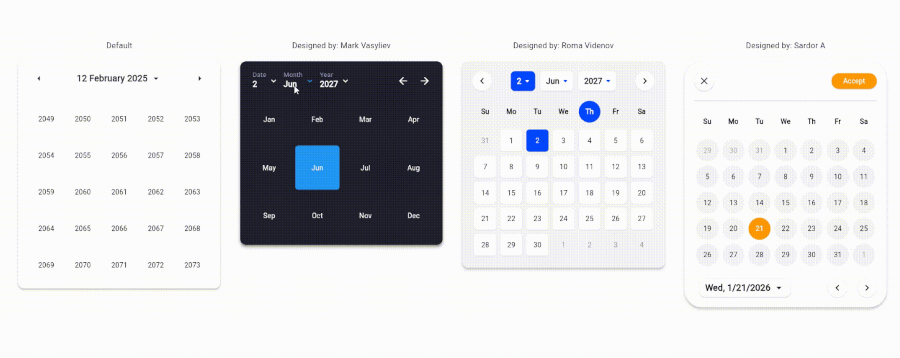
The CreateDatePicker package enables you to create a fully customizable date picker. You can create your own component without worrying about the functionality and place it anywhere to match your design

The example app running in Browser

Table of Contents

Integration Steps

To integrate the package into your Flutter application is very easy, you just need to add the Widget and customize every component and place it anywhere with the builder property:

    CreateDatePicker(
            width: 450,
            initialViewState: ViewState.date,
            initialDate: DateTime(2027, 6, 2),
            minDateTime: DateTime(2024, 5, 1),
            maxDateTime: DateTime(2029, 5, 1),
            restrictedDates: restrictedDates,
            weekLabels: weekLabels,
            monthLabels: monthLabels,
            leftArrowBuilder: _leftArrowBuilder,
            rightArrowBuilder: _rightArrowBuilder,
            dateViewButtonBuilder: _dateViewButtonBuilder,
            monthViewButtonBuilder: _monthViewButtonBuilder,
            yearViewButtonBuilder: _yearViewButtonBuilder,
            weekdayCellBuilder: _weekdayCellBuilder,
            dateCellBuilder: _dateCellBuilder,
            monthCellBuilder: _monthCellBuilder,
            yearCellBuilder: _yearCellBuilder,
            onViewStateChanged: _changeViewState,
            onSelectedDateChanged: _onSelectedDateChanged,
            builder: _createDatePickerBuilder,
        ),

NOTE: To place all the component together and anywhere, use builder property.

Available Parameters in CreateDatePicker
  • initialViewState: The initial view state of the picker (date, month, or year).

  • initialDate: The initially selected date.

  • minDateTime: The minimum selectable date.

  • maxDateTime: The maximum selectable date.

  • restrictedDates: A list of dates that cannot be selected.

  • weekLabels: Labels for the days of the week (e.g., Sunday, Monday). Must contain exactly 7 items.

  • monthLabels: Labels for the months of the year (e.g., January, February). Must contain exactly 12 items.

  • width: The width of the picker.

  • elevation: Sets the default elevation of the date picker.

  • popupMenuOffset: Offset for the popup menu.

  • popupMenuPosition: Position of the popup menu (above or below the trigger).

  • builder: Custom builder for the entire picker. Allows placing and customizing components using individual builders.

  • leftArrowBuilder: Custom builder for the left navigation arrow.

  • rightArrowBuilder: Custom builder for the right navigation arrow.

  • popupSelectedDateBuilder: Custom builder for the popup displaying the selected date.

  • dateViewButtonBuilder: Custom builder for the button to switch to the date view.

  • monthViewButtonBuilder: Custom builder for the button to switch to the month view.

  • yearViewButtonBuilder: Custom builder for the button to switch to the year view.

  • weekdayCellBuilder: Custom builder for the weekday cells.

  • dateCellBuilder: Custom builder for the date cells.

  • monthCellBuilder: Custom builder for the month cells.

  • yearCellBuilder: Custom builder for the year cells.

  • onViewStateChanged: Callback triggered when the view state changes.

  • onSelectedDateChanged: Callback triggered when the selected date changes.

Upcoming Updates

Currently, the package is only for a single datetime picker. Support for multiple pickers will be coming soon.

Contributing

Contributions are welcome! Please open an issue or submit a pull request if you have any improvements or bug fixes.

License

This project is licensed under the MIT License. See the LICENSE file for details.

Support Me

If you find this package helpful and want to support its development, consider making a donation. Thank you for your support!

Support via PayPal

카테고리

소스 저장소

이 패키지를 사용하는 프로젝트

아직 데이터가 없습니다.