패키지, 저장소 및 앱 카테고리 검색

crystal_navigation_bar 표지
패키지 상세v2.0.0

crystal_navigation_bar

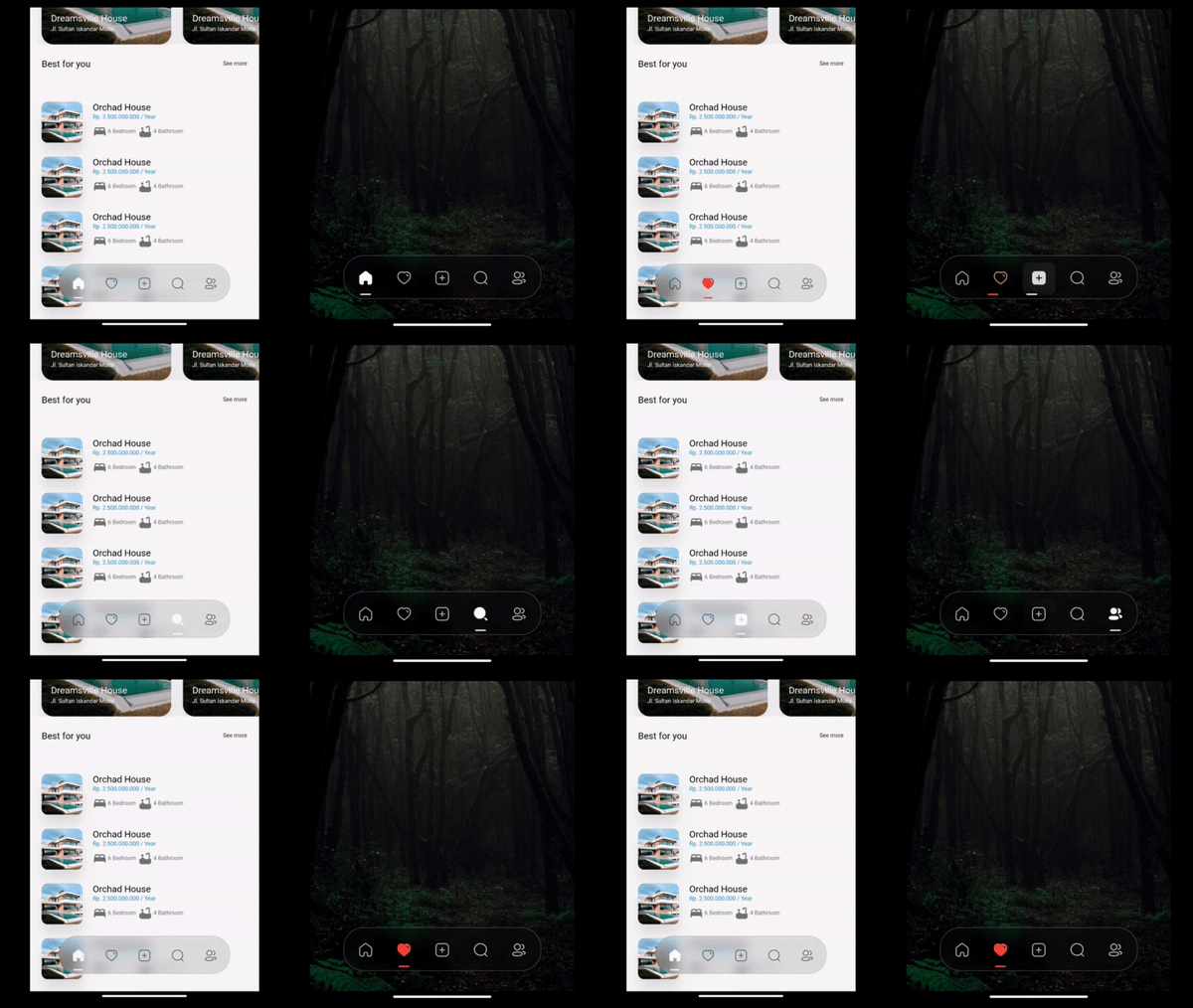
세련되고 투명한 블러링 하단 네비게이션 바와 동적 인디케이터로 원활한 앱 탐색을 제공합니다.

AndroidiOSWebmacOSWindowsLinux
30일 다운로드
2.5천
좋아요
137
Pub 점수
160

패키지 설치

flutter pub add crystal_navigation_bar

패키지 개요

공개 정보를 바탕으로 생성한 선택 가이드입니다.

크리스탈 네비게이션 바는 시각적으로 인상적인 플러터 앱용 하단 네비게이션 바로, 세련된 크리스탈 클리어 블러 효과와 사용자 경험을 향상시키는 동적 인디케이터를 특징으로 합니다. 다양한 플랫폼에서 원활한 앱 탐색을 위해 설계되었으며, 부드러운 애니메이션과 현대적인 미학을 제공합니다. 이 패키지는 안드로이드, iOS, 웹, macOS, 윈도우, 리눅스를 지원하여 크로스플랫폼 개발에 이상적입니다. `flutter pub add`를 통해 최소한의 설정으로 기존 프로젝트에 쉽게 통합할 수 있습니다. 시각적 명확성과 부드러운 전환에 중점을 두고 있어 디자인과 사용성을 우선시하는 앱에 적합합니다.

사용 사례

  • 크로스플랫폼 모바일 및 웹 앱
  • 블러 효과를 가진 현대적인 UI 디자인
  • 직관적인 하단 탐색이 필요한 앱
  • 고급 사용자 인터페이스
  • 동적 지표 기반 탐색

주요 기능

  • 명확한 블러 효과
  • 다이나믹 인디케이터 애니메이션
  • 크로스 플랫폼 호환성
  • Minimal setup with pub add
  • 부드러운 전환 애니메이션
  • 사용자 정의 가능한 외관

적합한 대상

  • 디자인 중심의 Flutter 개발자
  • 프리미엄 UI/UX 요구 사항을 가진 앱
  • 다중 플랫폼을 대상으로 하는 개발자
  • 시각적 완성도에 중점을 둔 프로젝트
  • 현대적인 탐색 패턴을 찾는 사용자

고려 사항

  • 저사양 기기에서 성능에 영향을 줄 수 있습니다
  • 블러 효과는 GPU 가속이 필요합니다
  • 핵심 기능을 넘어서는 사용자 정의 제한
  • 빛나는 테마 인터페이스에 가장 적합
  • 오래된 OS 버전에서 렌더링 불일치가 발생할 수 있음

원본 README

연결된 소스 저장소의 README 원문 스냅샷입니다. 최신 내용은 저장소에서 확인하세요.

Crystal Bottom Navigation Bar


undefined undefined
undefined undefined undefined undefined undefined
undefined undefined

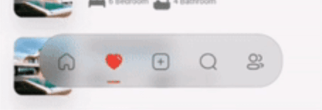
A highly flexible bottom navigation bar that allows you to tailor it to your specific needs without any constraints. Elevate your UI/UX with seamless animations, customizable appearance—including the option to incorporate blur effects—and the ability to fully personalize the interface.

Styles

Screenshot 1

Simple BottomBar

With Border

Screenshot 2

Simple BottomBar

With Badge


CRYSTAL BOTTOM NAVIGATION BAR


  • Blur navigation bar
  • Frosted navigation bar
  • Floating navigation bar
  • Rounded navigation bar
  • Modern navigation bar

Getting Started

To install, add it to your pubspec.yaml file:

dependencies:
    crystal_navigation_bar:

import 'package:crystal_navigation_bar/crystal_navigation_bar.dart';

How to use it

Use CrystalNavigationBar constructor in Your app with in Scaffold's bottomNavigationBar:

Make sure extendBody in Scaffold should be true to use Floating behavior

      extendBody: true,

if you do not want to make round navigation bar with show body behind the navbar you have to make that

      extendBody: false,
Widget build(BuildContext context) {
  return Scaffold(
    body: Center(),
    extendBody: true,//<------like this 
    bottomNavigationBar:  CrystalNavigationBar(
          currentIndex: _SelectedTab.values.indexOf(_selectedTab),
          onTap: _handleIndexChanged,
          indicatorColor: Colors.white,
          // enableFloatingNavBar: false
          items: [
            
            
          ],
        ),
  );
}

basic implementation

Widget build(BuildContext context) {
    return Scaffold(
      extendBody: true,
      body: SizedBox(
        height: MediaQuery.of(context).size.height,
        child: Image.network(
          "https://images.pexels.com/photos/1671325/pexels-photo-1671325.jpeg?auto=compress&cs=tinysrgb&w=1260&h=750&dpr=2",
          fit: BoxFit.fitHeight,
        ),
      ),
      bottomNavigationBar: Padding(
        padding: const EdgeInsets.only(bottom: 10),
        child: CrystalNavigationBar(
          currentIndex: _SelectedTab.values.indexOf(_selectedTab),
          // indicatorColor: Colors.white,
          unselectedItemColor: Colors.white70,
          backgroundColor: Colors.black.withOpacity(0.1),
          // outlineBorderColor: Colors.black.withOpacity(0.1),
          borderWidth: 2,
          outlineBorderColor: Colors.white,
          onTap: _handleIndexChanged,
          items: [
            /// Home
            CrystalNavigationBarItem(
              icon: IconlyBold.home,
              unselectedIcon: IconlyLight.home,
              selectedColor: Colors.white,
              badge: Badge(
                label: Text(
                  "9+",
                  style: TextStyle(color: Colors.white),
                ),
              ),
            ),

            /// Favourite
            CrystalNavigationBarItem(
              icon: IconlyBold.heart,
              unselectedIcon: IconlyLight.heart,
              selectedColor: Colors.red,
            ),

            /// Add
            CrystalNavigationBarItem(
              icon: IconlyBold.plus,
              unselectedIcon: IconlyLight.plus,
              selectedColor: Colors.white,
            ),

            /// Search
            CrystalNavigationBarItem(
                icon: IconlyBold.search,
                unselectedIcon: IconlyLight.search,
                selectedColor: Colors.white),

            /// Profile
            CrystalNavigationBarItem(
              icon: IconlyBold.user_2,
              unselectedIcon: IconlyLight.user,
              selectedColor: Colors.white,
            ),
          ],
        ),
      ),
    );
  }

The constructor has 19 attributes related to the Widget:

  • items: A list of tabs to display, example Home, Profile,Search, etc
  • height: The height of CrystalNavigationBar, [Default] & [Minimum] height is 105,
  • currentIndex: The tab to display.
  • onTap:Returns the index of the tab that was tapped.
  • outlineBorderColor : Border Color of the Bottom bar.
  • borderWidth : Border Width of the Bottom bar.
  • badge : Badge to display. (to display notification count etc).
  • selectedItemColor:The color of the icon and text when the item is selected.
  • unselectedItemColor: The color of the icon and text when the item is not selected.
  • margin:A convenience field for the margin surrounding the entire widget.
  • itemPadding:The padding of each item.
  • duration: The transition duration.
  • curve: The transition curve.
  • indicatorColor:The color of the tab indicator.
  • marginR:margin for the bar to give some radius .
  • paddingR:padding for the bar to give some radius.
  • borderRadius:border radius for nav bar.
  • backgroundColor:background colors for the nav bar.
  • boxShadow: floating nav bar shadow ,it takes List of BoxShadow
  • enableFloatingNavBar: make Floating nav bar enabled.
  • enablePaddingAnimation: enable the animation on item during item change.
  • splashColor: Color of the item's Splash Color. To disable, use Colors.transparent.

iconly package is used for Icons in the demo/example

Adjust Colors of background, unselectedItemColor, selectedItemColor according to your UI for better Design.

Example Usage

See Example Code for more info.

Contributing

Every pull request is welcome.

Contributors

Imtiaz Ahmad

  • Twitter
  • GitHub
  • LinkedIn

카테고리

의존성

의존성 목록 1 개

소스 저장소

이 패키지를 사용하는 프로젝트