패키지, 저장소 및 앱 카테고리 검색

cupertino_tabbar 표지
패키지 상세v2.0.0

cupertino_tabbar

iOS 13 스타일의 탭 바를 위한 고도로 사용자 정의 가능한 간단한 위젯입니다.

AndroidiOSWebmacOSWindowsLinux
30일 다운로드
2.5천
좋아요
72
Pub 점수
140

패키지 설치

flutter pub add cupertino_tabbar

패키지 개요

공개 정보를 바탕으로 생성한 선택 가이드입니다.

iOS 13 스타일의 탭 바를 복제하는 사용자 정의가 가능하고 간단한 Flutter 위젯으로, 다양한 플랫폼에서 네이티브와 유사한 경험을 제공합니다. 부드러운 애니메이션, 사용자 지정 아이콘, 레이블 및 스타일링 옵션을 지원하여 현대적인 iOS 디자인 원칙에 맞춥니다. 가볍고 쉽게 통합할 수 있어 Android 및 기타 플랫폼에서 일관된 iOS 미학을 추구하는 앱에 이상적입니다. 특히 깔끔하고 최소한의 탭 인터페이스를 필요로 하는 네비게이션 중심 애플리케이션에 특히 유용합니다.

사용 사례

  • 크로스 플랫폼 앱에서 iOS 스타일의 탐색
  • 애니메이션 전환을 갖춘 사용자 정의 탭 바
  • 간단하지만 우아한 하단 탐색
  • iOS 사용자 경험 일관성에 초점을 맞춘 앱
  • 기본 탭바를 향상된 시각 효과로 교체

주요 기능

  • iOS 13 디자인 모방
  • 매우 사용자 정의 가능한 외관
  • 부드러운 애니메이션 지원
  • 아이콘과 레이블을 지원합니다
  • 크로스 플랫폼 호환성
  • 기존 Flutter 프로젝트와의 간편한 통합

적합한 대상

  • iOS 네이티브 UI 컴포넌트를 찾는 개발자
  • 최소한의 탭 탐색이 필요한 프로젝트
  • iOS 디자인을 중시한 크로스 플랫폼 앱
  • 시각적 일관성을 우선시하는 팀
  • Flutter 초보자가 탭 바 사용자 지정을 탐색하고 있습니다

고려 사항

  • iOS 13 미학 스타일에 제한됨
  • 비-iOS 플랫폼에 대해 추가 스타일링이 필요할 수 있습니다
  • 복잡한 탭 레이아웃에 적합하지 않습니다
  • CupertinoTheme와 함께 사용할 때 가장 좋습니다
  • 많은 탭 사용 시 성능에 영향을 줄 수 있음

원본 README

연결된 소스 저장소의 README 원문 스냅샷입니다. 최신 내용은 저장소에서 확인하세요.

cupertino_tabbar

Cosmos Software

Pub License

A highly customisable and simple widget for having iOS 13 style tab bars.

It is highly recommended to read the documentation and run the example project on a real device to fully understand and inspect the full range of capabilities.

Media | Description | Installation | How-to-Use

Recent

  • [useShadow] is added. If set to true, a shadow will be displayed under the indicator that is much more similar to the actual iOS version. See Media for examples.

  • [allowScrollable], [fittedWhenScrollable], [animateWhenScrollable], [animateUntilScrolled], [outerHorizontalPadding] and [outerVerticalPadding] are added. These all work towards making an easy-to-use scrollable tab bar. Please refer to the documentation and the examples for instructions and see Media for examples.


Warning

  • Variables previously named as [horizontalPadding], [verticalPadding] and [expand] are now named [innerHorizontalPadding], [innerVerticalPadding] and [allowExpand].

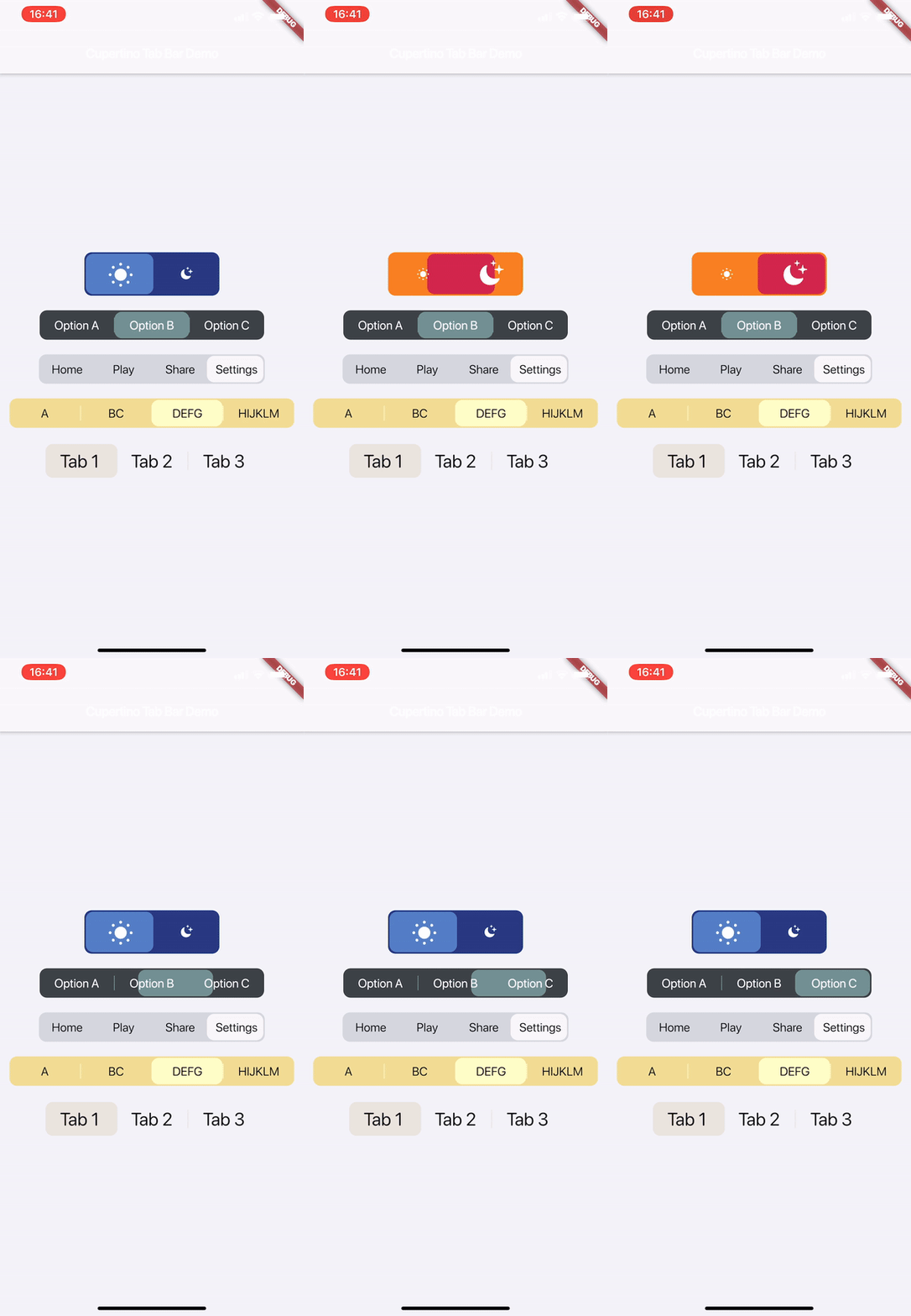
Media

Watch on Youtube:

v1.1.0

v1.0.0


Description

This is a highly customisable and simple widget for having iOS 13 style tab bars.

How-to-Use

Simply create a CupertinoTabBar as shown in the example:

CupertinoTabBar(
  Colors.black                  //_backgroundColor
  Colors.white                  //_foregroundColor
  [...],                        //_widgets
  cupertinoTabBarValueGetter,   //_valueGetter
  (int index) {                 //_onTap
    setState(() {
      cupertinoTabBarValue = index;
    });
  },
  {Key key,
  useSeparators             : false,
  innerHorizontalPadding    : 10.0,
  innerVerticalPadding      : 10.0,
  borderRadius              : const BorderRadius.all(const Radius.circular(10.0)),
  curve                     : Curves.linearToEaseOut,
  duration                  : const Duration(milliseconds: 350),
  allowExpand               : false,
  allowScrollable           : false,
  fittedWhenScrollable      : false,
  animateWhenScrollable     : false,
  animateUntilScrolled      : false,
  outerHorizontalPadding    : 10.0,,
  outerVerticalPadding      : 0})
)

int cupertinoTabBarValue = 0;
int cupertinoTabBarValueGetter() => cupertinoTabBarValue;

Further Explanations:

For a complete set of descriptions for all parameters and methods, see the documentation.

  • Do not set both [allowExpand] and [allowScrollable] to true.

Notes

Any help, suggestion or criticism is appreciated!

Cheers.


카테고리

소스 저장소

이 패키지를 사용하는 프로젝트

아직 데이터가 없습니다.
