분류, 패키지 및 저장소 검색

curved_carousel 표지
패키지 상세v0.0.8

curved_carousel

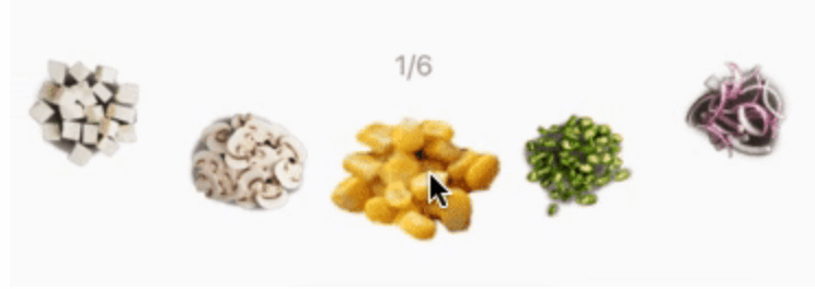
커브드 캐러셀은 수평 및 수직 방향으로 위젯 목록을 곡선 모양으로 표시합니다.

AndroidiOSWebmacOSWindowsLinux
30일 다운로드
122
좋아요
67
Pub 점수
150

패키지 설치

flutter pub add curved_carousel

패키지 개요

공개 정보를 바탕으로 생성한 선택 가이드입니다.

Curved Carousel는 수평 및 수직 방향을 모두 지원하는 곡선으로 시각적으로 매력적인 레이아웃에서 위젯 목록을 표시하는 Flutter 패키지입니다. 커버 플로우 효과를 연상시키는 동적이고 흐르는 방식으로 콘텐츠를 제시함으로써 사용자 경험을 향상시킵니다. 현대적인 미학을 가진 이미지, 카드 또는 기타 UI 요소를 전시하기에 이상적입니다. 이 패키지는 Android, iOS, Web, macOS, Windows, Linux 등 모든 주요 플랫폼과 호환되어 크로스플랫폼 애플리케이션에 매우 유연합니다. Flutter의 위젯 시스템과 원활하게 통합되며 pub add를 통해 최소한의 설정만으로 쉽게 사용할 수 있습니다.

사용 사례

  • 전자상거래 앱에서 제품 이미지 전시
  • 미디어 갤러리에서 추천 콘텐츠 표시
  • 시각적 깊이를 가진 상호작용 슬라이더 만들기
  • 동적 레이아웃을 활용한 온보딩 화면 개선
  • 독특한 형식으로 포트폴리오 또는 컬렉션을 제시하기

주요 기능

  • 수평 및 수직 곡선 레이아웃을 지원
  • 부드러운 애니메이션과 반응성 있는 상호작용
  • 크로스 플랫폼 호환성
  • Flutter 위젯 시스템과의 간편한 통합
  • 사용자 정의 가능한 곡선 반경 및 간격
  • 내장된 제스처 지원을 통한 탐색

적합한 대상

  • 현대적인 카루셀 디자인을 찾는 개발자
  • 시각적으로 매력적인 콘텐츠 표시가 필요한 앱
  • 상호작용 가능한 사용자 인터페이스를 목표로 하는 프로젝트
  • 풍부한 미디어를 갖춘 디자인 중심 애플리케이션
  • 크로스플랫폼 모바일 및 웹 앱

고려 사항

  • 대규모 데이터 세트와 함께 성능에 영향을 줄 수 있음
  • 최적의 시각 효과를 위해 곡선 매개변수를 신중하게 조정해야 합니다
  • 기본 스타일링 외에 제한된 사용자 지정 옵션
  • 간단한 선형 목록에는 적합하지 않음
  • 중간 규모의 콘텐츠 컬렉션에 가장 적합

원본 README

연결된 소스 저장소의 README 원문 스냅샷입니다. 최신 내용은 저장소에서 확인하세요.

Curved Carousel

curved_carousel version MIT License MIT License

A Flutter package for easy implementation of curved carousel.

Easy to use
CurvedCarousel(
      itemBuilder: (context, i) {
        return Item(img: listItem[i].img, selectionChange: (bool){
          print('onTap:: ${listItem[i].name}')
        }, selected: listItem[i].selected,key: ValueKey(listItem[i].selected),);
      },
      itemCount: listItem.length,
      middleItemScaleRatio: 1.5,
)
Attributes

itemBuilder : builder function returns widget of given index
itemCount : total widgets
viewPortSize : how much size a single item will have, the fractional value lies between 0 and 1, 1 means full size
curveScale : it specifies curviness
disableInfiniteScrolling : by default, infinite scrolling is enable, but if you want to disable it make it true
scaleMiddleItem : scales middle item of carousel, by default it is true
middleItemScaleRatio : it is scaling parameter for middle item
tiltItemWithcurve : does the items angle need to be follow to curve, by default this is true
horizontalPadding : a padding to apply horizontally to the carousel, the default is no padding
animationDuration : a duration of the item change animation in milliseconds, the default value is 300
onChangeEnd : a function to trigger when the item change animation is done
onChangeStart : a function to trigger when the item change animation is start
moveAutomatically : allow to change the current selected item automatically, default is set to false.
automaticMoveDelay : the delay between automatic movements, default is 5000
reverseAutomaticMovement : reverse the direction of the automatic movement, default is false

카테고리

소스 저장소

이 패키지를 사용하는 프로젝트

아직 데이터가 없습니다.