패키지, 저장소 및 앱 카테고리 검색

curved_labeled_navigation_bar 표지
패키지 상세v2.0.6

curved_labeled_navigation_bar

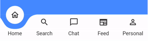
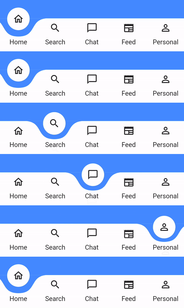
아름다운 애니메이션 곡선 모양 네비게이션 바. 색상, 배경색, 애니메이션 곡선, 애니메이션 지속 시간 조절 가능.

AndroidiOSmacOSWindowsLinux
30일 다운로드
2.3천
좋아요
145
Pub 점수
160

패키지 설치

flutter pub add curved_labeled_navigation_bar

패키지 개요

공개 정보를 바탕으로 생성한 선택 가이드입니다.

Flutter 앱용으로 시각적으로 인상적인 애니메이션 곡선 네비게이션 바입니다. 사용자 정의 가능한 색상, 배경 톤, 애니메이션 곡선 및 지속 시간 설정을 갖춘 부드러운 전환 효과를 제공합니다. 미적 매력과 사용자 참여를 중시하는 현대적인 UI에 이상적입니다. 이 패키지는 Android, iOS, macOS, Windows, Linux 등 여러 플랫폼을 지원하여 기기 간 일관된 디자인을 보장합니다. 동적 애니메이션은 사용자 경험을 향상시키면서도 구현의 단순성을 유지합니다.

사용 사례

  • 현대적인 앱 인터페이스
  • 모바일 및 데스크톱 애플리케이션
  • 인터랙티브 UI 컴포넌트
  • 사용자 지정 하단 탐색 바
  • 개선된 사용자 경험

주요 기능

  • 애니메이션 가능한 곡선 모양
  • 사용자 지정 색상
  • 조정 가능한 애니메이션 곡선
  • 사용자 정의 애니메이션 지속 시간
  • 크로스 플랫폼 지원
  • 레이블이 지정된 탐색 항목

적합한 대상

  • 디자인 중심 개발자
  • 시각적인 매력이 필요한 앱
  • UI/UX 디자이너
  • 초보자들이 고급 위젯을 찾는 플러터
  • 사용자 정의 탐색이 필요한 프로젝트

고려 사항

  • 저사양 기기에서 성능에 영향을 줄 수 있습니다
  • 접근성에 대한 주의 깊은 색 대비가 필요합니다
  • 애니메이션 설정은 다양한 기기에서 테스트해야 합니다
  • 하단 탐색 사용 사례에 제한됨
  • 미니멀리스트 디자인에 적합하지 않습니다

원본 README

연결된 소스 저장소의 README 원문 스냅샷입니다. 최신 내용은 저장소에서 확인하세요.

curved_labeled_navigation_bar

pub package

A Flutter package for easy implementation of curved navigation bar. This package is a fork of the original curved_navigation_bar from https://github.com/rafalbednarczuk/curved_navigation_bar with label for CurvedNavigationBarItem.

Label No Label
Gif Gif
Add dependency
dependencies:
  curved_labeled_navigation_bar: ^2.0.6 #latest version
Easy to use
Scaffold(
  bottomNavigationBar: CurvedNavigationBar(
    backgroundColor: Colors.blueAccent,
    items: [
      CurvedNavigationBarItem(
        child: Icon(Icons.home_outlined),
        label: 'Home',
      ),
      CurvedNavigationBarItem(
        child: Icon(Icons.search),
        label: 'Search',
      ),
      CurvedNavigationBarItem(
        child: Icon(Icons.chat_bubble_outline),
        label: 'Chat',
      ),
      CurvedNavigationBarItem(
        child: Icon(Icons.newspaper),
        label: 'Feed',
      ),
      CurvedNavigationBarItem(
        child: Icon(Icons.perm_identity),
        label: 'Personal',
      ),
    ],
    onTap: (index) {
      // Handle button tap
    },
  ),
  body: Container(color: Colors.blueAccent),
)
Attributes
CurvedNavigationBar
Attribute Description
items List of CurvedNavigationBarItem
index Index of NavigationBar, can be used to change current index or to set initial index
color Color of NavigationBar, default Colors.white
buttonBackgroundColor Background color of floating button, default same as color attribute
backgroundColor Color of NavigationBar's background, default Colors.blueAccent
onTap Function handling taps on items
letIndexChange Function which takes page index as argument and returns bool. If function returns false then page is not changed on button tap. It returns true by default
animationCurve Curves interpolating button change animation, default Curves.easeOut
animationDuration Duration of button change animation, default Duration(milliseconds: 600)
height Height of NavigationBar
maxWidth Allows to set the width of the navigation bar lower than the entire screen width by default
iconPadding Padding of icon in floating button
CurvedNavigationBarItem
Attribute Description
child Icon of CurvedNavigationBarItem
label Text of CurvedNavigationBarItem
labelStyle TextStyle for label
Change page programmatically
 // State class
  int _page = 0;
  GlobalKey<CurvedNavigationBarState> _bottomNavigationKey = GlobalKey();

  @override
  Widget build(BuildContext context) {
    return Scaffold(
        bottomNavigationBar: CurvedNavigationBar(
          key: _bottomNavigationKey,
          items: [
            CurvedNavigationBarItem(
              child: Icon(Icons.home_outlined),
              label: 'Home',
            ),
            CurvedNavigationBarItem(
              child: Icon(Icons.search),
              label: 'Search',
            ),
            CurvedNavigationBarItem(
              child: Icon(Icons.chat_bubble_outline),
              label: 'Chat',
            ),
            CurvedNavigationBarItem(
              child: Icon(Icons.newspaper),
              label: 'Feed',
            ),
            CurvedNavigationBarItem(
              child: Icon(Icons.perm_identity),
              label: 'Personal',
            ),
          ],
          onTap: (index) {
            setState(() {
              _page = index;
            });
          },
        ),
        body: Container(
          color: Colors.blueAccent,
          child: Center(
            child: Column(
              children: <Widget>[
                Text(_page.toString(), textScaler: TextScaler.linear(10.0)),
                ElevatedButton(
                  child: Text('Go To Page of index 1'),
                  onPressed: () {
                    // Page change using state does the same as clicking index 1 navigation button
                    final CurvedNavigationBarState? navBarState =
                        _bottomNavigationKey.currentState;
                    navBarState?.setPage(1);
                  },
                )
              ],
            ),
          ),
        ),
    );
  }

카테고리

의존성

의존성 목록 2 개

소스 저장소

이 패키지를 사용하는 프로젝트

아직 데이터가 없습니다.