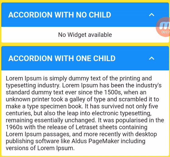
커스텀 액코디언 패키지는 플러터용으로 유연하고 사용자 정의 가능한 확장 가능한 위젯을 제공하여 사용자가 간단한 헤더 클릭으로 접을 수 있는 섹션을 만들 수 있도록 합니다. 각 항목 또는 항목 그룹은 동적으로 전개하거나 접을 수 있으며, 깔끔하고 상호작용적인 방식으로 콘텐츠를 구성하는 데 이상적입니다. 이 패키지는 Android, iOS, 웹, macOS, Windows, Linux 등 여러 플랫폼을 지원하며, 크로스플랫폼 애플리케이션에 적합합니다. 패키지는 가볍고 쉽게 통합할 수 있으며, 사용자 정의 가능한 속성을 통해 개발자가 스타일과 동작에 대한 완전한 제어권을 갖습니다.
사용 사례
접을 수 있는 자주 묻는 질문 섹션
인터랙티브 폼 마법사
동적 콘텐츠 탐색
중첩 가능한 확장 목록
모바일 친화적인 데이터 조직
주요 기능
헤더 트리거 확장
다중 항목 지원
사용자 정의 애니메이션
크로스 플랫폼 호환성
기존 위젯과의 간편한 통합
적합한 대상
인터랙티브 UI를 구축하는 개발자
접을 수 있는 콘텐츠가 필요한 앱
반응형 디자인을 필요로 하는 프로젝트
다중 플랫폼 앱을 위한 Flutter 사용 팀
재사용 가능한 컴포넌트를 찾는 UI 디자이너
고려 사항
상태 관리를 수동으로 처리해야 합니다
제한된 내장 테마 옵션
복잡한 레이아웃의 경우 추가 스타일링이 필요할 수 있습니다
매우 큰 데이터 세트에 최적화되어 있지 않음
고급 기능을 위해 외부 종속성에 의존합니다
원본 README
연결된 소스 저장소의 README 원문 스냅샷입니다. 최신 내용은 저장소에서 확인하세요.
Custom Accordion
Create dynamic, interactive, and visually appealing accordions in your Flutter app with ease using the "Custom Accordion" package. This powerful library simplifies the process of adding collapsible sections to your UI, making it a breeze to manage and customize accordions to suit your design and functionality needs.
CustomAccordion(
title: 'Accordion with one child',
subTitle: 'Accordion Sub Title',
headerBackgroundColor: Colors.blue,
titleStyle: constTextStyle(
fontSize: 18,
fontWeight: FontWeight.bold,
color: Colors.white,
),
subTitleStyle: constTextStyle(
fontSize: 16,
fontWeight: FontWeight.normal,
color: Colors.white,
),
toggleIconOpen: Icons.keyboard_arrow_down_sharp,
toggleIconClose: Icons.keyboard_arrow_up_sharp,
headerIconColor: Colors.white,
accordionElevation: 0,
widgetItems: constText(
'Lorem Ipsum is simply dummy text of the printing and typesetting industry. Lorem Ipsum has been the industry\'s standard dummy text ever since the 1500s, when an unknown printer took a galley of type and scrambled it to make a type specimen book. It has survived not only five centuries, but also the leap into electronic typesetting, remaining essentially unchanged. It was popularised in the 1960s with the release of Letraset sheets containing Lorem Ipsum passages, and more recently with desktop publishing software like Aldus PageMaker including versions of Lorem Ipsum.',
),
),
The following properties can be set for the widget.
Property
Description
Type
Required
Default value
title
Title of Accordion
String
Yes
subTitle
Sub Title of Accordion
String
No
headerBackgroundColor
Header background color
Color
No
Theme.of(context).splashColor
titleStyle
Header text style
TextStyle
No
Theme.of(context).textTheme.titleLarge
subTitleStyle
Sub Title text style
TextStyle
No
Theme.of(context).textTheme.titleSmall
toggleIconOpen
Toggle icon to expand/open widgets
IconData
No
Icons.arrow_drop_down
toggleIconClose
Toggle icon to collapse/close widgets
IconData
No
Icons.arrow_drop_up
headerIconColor
Icon Color
Color
No
Theme.of(context).iconTheme.color
backgroundColor
Background color of widget
Color
No
Theme.of(context).cardColor
accordionElevation
Elevation of accordion widget
double
No
Theme.of(context).cardTheme.elevation
widgetItems
Child Widget(s) of accordion
Widget
No
Text()
widgetItemsPadding
Padding arround children of accordion
EdgeInsetsGeometry
No
EdgeInsets.all(10)
showContent
Make default behaviour of accordion children visible or hidden
bool
No
false
disableToggle
Make default behaviour of accordion toggle
bool
No
false
Contribution
🚀 We believe in the power of collaboration and welcome contributions from our amazing community to make Custom Accordion even more awesome!
Whether you're a developer, designer, or just an enthusiast, you can contribute in various ways:
💡 Feature Ideas: Have a cool feature in mind? Share your ideas with us. We love fresh perspectives!
🐛 Bug Reports: Spotted a bug? Let us know! Help us squash those pesky little critters.
📖 Documentation: Improve our documentation. Clear and concise docs make a world of difference.
🛠 Code Contributions: If you're a developer, dive into the codebase. Tackle open issues or implement new features.
💬 Community Support: Share your knowledge! Help others by answering questions and engaging in discussions.
✏️ Design: If you have design skills, contribute by enhancing our UI/UX.
Dig into CONTRIBUTING.MD, which covers submitting bugs, requesting new features, preparing your code for a pull request, etc.
Please don't forget to like, follow, and star our repo!.
Support the package (optional)
If you find this package useful, you can support it for free by giving it a thumbs up at the top of this page.
Bugs or Requests
If you encounter any problems feel free to open an issue. If you feel the library is missing a feature, please raise a ticket. Pull request are also welcome.