패키지, 저장소 및 앱 카테고리 검색

day_picker 표지
패키지 상세v2.3.0

day_picker

주간 날짜 선택을 도와주는 Flutter 위젯 라이브러리입니다.

AndroidiOSWebmacOSWindowsLinux
30일 다운로드
705
좋아요
42
Pub 점수
160

패키지 설치

flutter pub add day_picker

패키지 개요

공개 정보를 바탕으로 생성한 선택 가이드입니다.

day_picker 패키지는 주간 날짜 선택을 간소화하기 위해 설계된 Flutter 라이브러리입니다. 사용자가 특정 평일을 선택할 수 있도록 깔끔하고 사용자 정의 가능한 위젯을 제공하여 스케줄링, 계획 또는 반복 이벤트 설정에 이상적입니다. 이 패키지는 Android, iOS, Web, macOS, Windows, Linux 등 다양한 플랫폼을 지원하며 장치 간 일관된 동작을 보장합니다. 직관적인 UI 컴포넌트와 pub를 통한 간편한 통합으로 Flutter 앱에서 날짜 관련 상호작용을 향상시킵니다.

사용 사례

  • 반복 이벤트 예약
  • 주간 일정 계획
  • 예약 캘린더 설정
  • 사용자 선호 사항 구성
  • 작업 관리 도구 구축

주요 기능

  • 요일 선택 인터페이스
  • 크로스 플랫폼 호환성
  • 사용자 지정 가능한 UI
  • pub와의 간편한 통합
  • 모든 주요 Flutter 플랫폼을 지원합니다

적합한 대상

  • 캘린더 기능을 구축하는 앱 개발자
  • 생산성 또는 기획 앱을 만드는 팀
  • 간단한 주중 선택기 필요 개발자
  • Flutter 초보자가 날짜 선택기 탐색 중

고려 사항

  • 평일 선택만 가능
  • 날짜 범위 지원 없음
  • 월/년 탐색을 포함하지 않습니다
  • 주간 중심 워크플로우에 가장 적합
  • 선택된 날짜 로직을 수동으로 처리해야 합니다

원본 README

연결된 소스 저장소의 README 원문 스냅샷입니다. 최신 내용은 저장소에서 확인하세요.

Day Picker

A Flutter widget library which helps us to select days in a week.

Test, Build and deploy Build Status likes popularity pub points

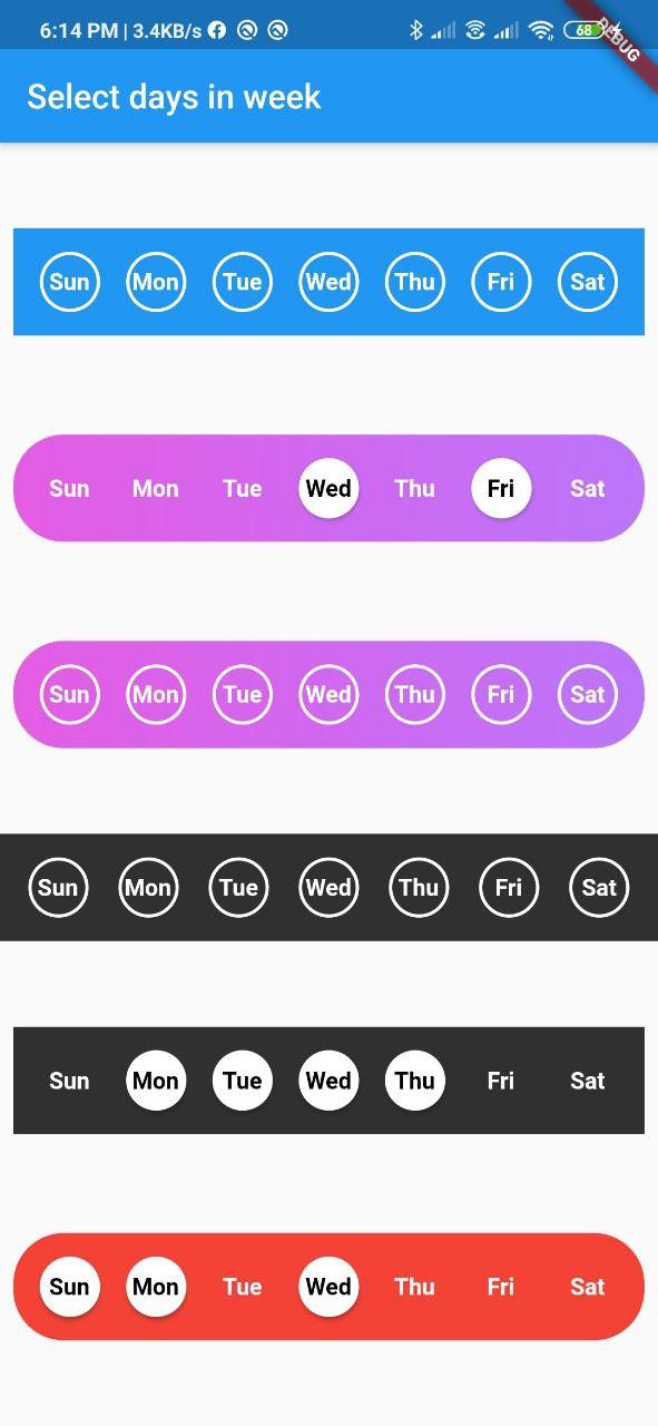
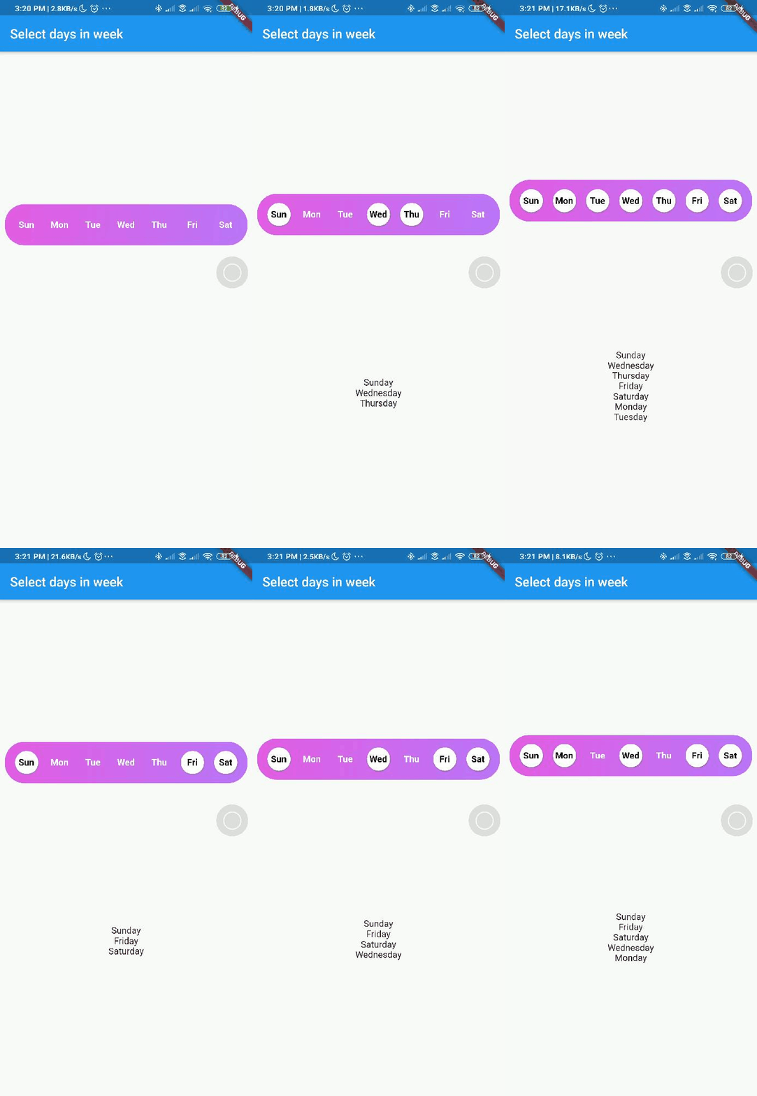
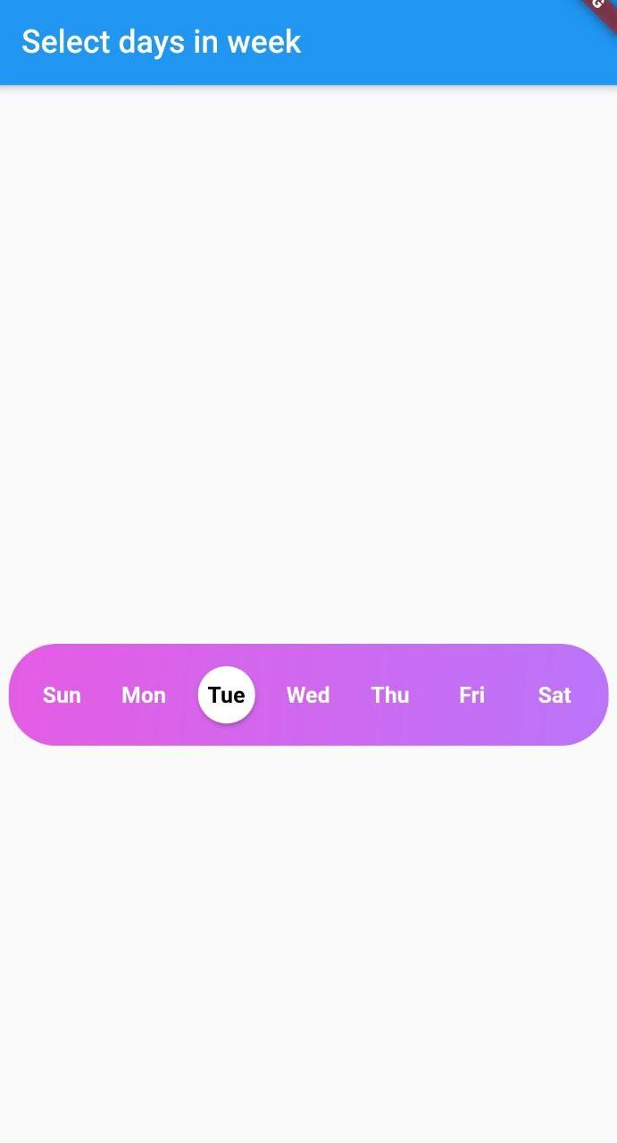
Screenshot

Screenshot week day picker Screenshot week day picker

Usage

Add day_picker to your pubspec.yaml file.

    flutter:
      sdk: flutter
    day_picker: 2.3.0

import the package:

import 'package:day_picker/day_picker.dart';

Constructor for the day_picker is given below.

      const SelectWeekDays({
        required this.onSelect,
        required this.days,
        this.backgroundColor,
        this.fontWeight,
        this.fontSize,
        this.selectedDaysFillColor,
        this.unselectedDaysFillColor,
        this.selectedDaysBorderColor,
        this.unselectedDaysBorderColor,
        this.selectedDayTextColor,
        this.unSelectedDayTextColor,
        this.border = true,
        this.boxDecoration,
        this.padding = 8.0,
        this.width,
        this.borderWidth,
        this.elevation = 2.0,
        super.key,
      });

Example here creates a day_picker with below style [with Gradient and no borders].

Screenshot week day picker

  final List<DayInWeek> _days = [
    DayInWeek("Zo", dayKey: "monday"),
    DayInWeek("Ma", dayKey: "tuesday"),
    DayInWeek("Di", dayKey: "wednesday"),
    DayInWeek("Wo", dayKey: "thursday"),
    DayInWeek("Do", dayKey: "friday"),
    DayInWeek("Vr", dayKey: "saturday", isSelected: true),
    DayInWeek("Za", dayKey: "sunday", isSelected: true),
  ];

  @override
  Widget build(BuildContext context) {
    return Scaffold(
      appBar: AppBar(
        title: Text("Select days in week"),
      ),
      body: Center(
        child: Padding(
          padding: const EdgeInsets.all(8.0),
          child: SelectWeekDays(
            key: customWidgetKey,
            fontSize: 14,
            fontWeight: FontWeight.w500,
            days: _days,
            border: false,
            width: MediaQuery.of(context).size.width / 1.4,
            boxDecoration: BoxDecoration(
              color: Colors.red,
              borderRadius: BorderRadius.circular(30.0),
            ),
            onSelect: (values) {
              print(values);
            },
          ),
        ),
      ),
    );
  }

Pass a callback to the onSelect property with parameter of type List<String>.


Pass a list of days of type DayInWeek into days property

class DayInWeek {
  DayInWeek(
      this.dayName, {
        required this.dayKey,
        this.isSelected = false,
      });

  String dayName;
  String dayKey;
  bool isSelected = false;
}

DayInWeek consist of three Properties [dayName], [dayKey] and [isSelected]. By default [isSelected] value will be false


Example:

void handleOnSelect(List<String> days){
    //TODO: Manipulate the List of days selected
    print(days);
}

Customization

Property Type Description
onSelect List<String> Callback invoked when days are selected
days List<DayInWeek> List of days that need to be passed
padding double Padding between container and the buttons [by default it is 8.0]
boxdecoration BoxDecoration provides variety of ways to style the background container[gradient, color, border radius]
backgroundColor Color Property to change the color of the container
fontSize double Property to change size of font
fontWeight FontWeight Property to change the font weight of text
daysFillColor Color Property to change the color of rounded buttons when the days are selected
daysBorderColor Color Property to change the border color of rounded button
selectedDayTextColor Color property to change the text color of the selected days
unSelectedDayTextColor Color property to change the text color when the days are not selected
border bool Set this property to false if border is not needed around the rounded buttons[by default this property will be true]

With the implementation of the setDaysState method, developers can dynamically modify which days are selected within their application's code, even after the SelectWeekDays widget has already been constructed. By utilizing the Global Key that is passed into the widget, one can easily update the selected dates as desired.

Contributions

Contributions of any kind are more than welcome😊! Feel free to fork and improve day_picker or open an issue.

카테고리

소스 저장소

이 패키지를 사용하는 프로젝트