패키지, 저장소 및 앱 카테고리 검색

emoji_alert 표지
패키지 상세v1.1.0

emoji_alert

Flutter Emoji Alert는 아름답고 간단한 경고 대화 상자와 바텀 시트 모달을 만들 수 있는 가능성을 제공합니다

AndroidiOSWebmacOSWindowsLinux
30일 다운로드
150
좋아요
23
Pub 점수
150

패키지 설치

flutter pub add emoji_alert

패키지 개요

공개 정보를 바탕으로 생성한 선택 가이드입니다.

Emoji Alert는 이모지 지원 기능을 갖춘 시각적으로 매력적이고 간단한 경고 대화상자와 하단 시트 모달을 생성할 수 있도록 해주는 Flutter 패키지입니다. 표준 UI 구성 요소에 표현력 있고 색다른 요소를 추가함으로써 사용자 경험을 향상시킵니다. 친근하고 몰입감 있는 피드백을 제공하려는 앱에 적합하며, Android, iOS, Web, macOS, Windows, Linux 등 모든 주요 플랫폼에서 작동합니다. 가볍고 쉽게 통합 가능하며, pub를 통해 단일 명령어로 추가할 수 있습니다. 기능성을 희생하지 않으면서도 단순성과 미학에 중점을 둡니다.

사용 사례

  • 사용자 알림 표시
  • 앱 상태 업데이트 표시
  • 온보딩 경험 향상
  • 작업 후 피드백 제공
  • 재미있는 오류 메시지 만들기

주요 기능

  • 내장된 이모지 지원
  • 사용자 정의 가능한 경고 스타일
  • 크로스 플랫폼 호환성
  • Flutter와의 간단한 통합
  • 하단 시트 모달 지원
  • 경량이고 빠름

적합한 대상

  • 모바일 및 웹 애플리케이션
  • 젊은 청중을 겨냥한 앱
  • 온보딩 흐름
  • 피드백 기반 인터페이스
  • 간단한 알림 시스템

고려 사항

  • 기본 알림 및 하단 시트 유형에 한정
  • 고급 사용 사례를 위해 맞춤형 스타일링이 필요할 수 있습니다
  • 업데이트를 위해 외부 GitHub 저장소에 의존합니다
  • 복잡한 대화 워크플로우에 적합하지 않습니다

원본 README

연결된 소스 저장소의 README 원문 스냅샷입니다. 최신 내용은 저장소에서 확인하세요.

Flutter Emoji Alert

enter image description here

A new Stylish Emoji Alert with a wide variety of emojis, simple to implement and full customizable.

Features

  • Single line basic alert with default emoji

  • Add dynamic widgets not only text any widget you want

  • Add buttons with their onPress handlers

  • Choose the alert display behavior : Normal Alert or Bottom Sheet dialog

  • Choose an emoji from a variety of emojis

  • Animations when displaying the alert popup


Getting Started

To add emoji_alert to your project add this line to your pubspec.yaml


dependencies:
	emoji_alert:  1.1.0

Or you can reference the github repository directly

	dependencies:
		emoji_alert:
			git: https://github.com/koukibadr/Emoji_Alert.git

Parameters

Attribute Type Default Required Description
description Widget N/A True The alert body content
alertTitle Widget N/A False The alert top content
enableMainButton bool False False Display or not the popup's main button
enableSecondaryButton bool False False Whether display or not the secondary button
onSecondaryButtonPressed Function null False The function that will be invoked on pressing the secondary button
onMainButtonPressed Function null False The function that will be invoked on pressing the main button
emojiType EMOJI_TYPE HAPPY False the emoji that will be displayed possible values: [ANGRY, CONFUSED, COOL, HAPPY, JOYFUL, LAUGHING, SAD, SCARED, SHOCKED, SMILE, WINK]
height double 200 False the height of the popup
emojiSize double 80 False the size of the emoji
background Color White False the popup background color
mainButtonColor Color Blue False The main button background color
secondaryButtonColor Color Blue False the secondary button color, PS: an opacity value will be added to this color
mainButtonText Text Text("Confirm") False the main button text
secondaryButtonText Text Text("Cancel") False the secondary button text
buttonSize double 200 False buttons width size
cancelButtonColorOpacity double 0.2 False an opacity will be added to the secondary button background color
cancelable bool True False Whether the popup can be dismissed on pressing outside it or not
cornerRadiusType CORNER_RADIUS_TYPES BOTTOM_ONLY False the border radius type, possible values: [BOTTOM_ONLY, TOP_ONLY, ALL_CORNERS, NONE]
width double null False the popup width by default it's null
animationType ANIMATION_TYPE ANIMATION_TYPE.NONE False the animation type that will be applied on the emoji [NONE, FADEIN, TRANSITION, ROTATION]

Examples

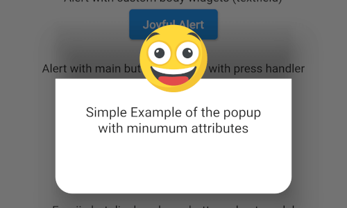
Simple alert with just a text in the body content


EmojiAlert(

description:  Column(

children: [

Text("Simple Example of the popup"),

Text("with minumum attributes"),

],

)).displayAlert(context);

first_example_alert.png

Example with custom widget in the popup content body


EmojiAlert(
	alertTitle:  Text("Joyful Alert", style:  TextStyle(fontWeight:  FontWeight.bold)),
	description:  Column(
		children: [
		Text("You can add also any widget"),
		Container(
			width:  200,
			child:  TextField(
				decoration:  InputDecoration(hintText:  "Input field example"),
			)),
	]
	),
	cancelable:  true,
	emojiType:  EMOJI_TYPE.JOYFUL,
	height:  300,
).displayAlert(context);

second_example_alert.png


EmojiAlert(
	alertTitle:  Text("Angry Alert", style:  TextStyle(fontWeight:  FontWeight.bold)),
	description:  Column(
		children: [
			Text("You can add a main button"),
		],
	),
	enableMainButton:  true,
	mainButtonColor:  Colors.red,
	onMainButtonPressed: () {
		print("Hello");
		Navigator.pop(context);
	},
	cancelable:  false,
	emojiType:  EMOJI_TYPE.ANGRY,
	height:  300,
).displayAlert(context);

third_example_alert.png

Bottom Sheet Modal

to display it as bottom sheet modal you need to use displayBottomSheet function

And you can display it as a bottom sheet modal, the code below is an example


EmojiAlert(
	alertTitle:  Text("Bottom Sheet Modal",
	style:  TextStyle(fontWeight:  FontWeight.bold)),
	description:  Column(
		children: [
			Text("And this is a bottom sheet modal with different Radius",
				style:  TextStyle(color:  Colors.blue),
				textAlign:  TextAlign.center,
			),
		],
	),
	enableMainButton:  true,
	cornerRadiusType:  CORNER_RADIUS_TYPES.TOP_ONLY,
	mainButtonColor:  Colors.green,
	mainButtonText:  Text("Save"),
	onMainButtonPressed: () {
		Navigator.pop(context);
	},
	cancelable:  true,
	emojiType:  EMOJI_TYPE.SMILE,
	width:  300,
	height:  300,
).displayBottomSheet(context);

fifth_example_alert.png

With Animation

in this example we used TRANSITION animation but you can choose any other built-in animations (see attributes description above)

EmojiAlert(
	description:  Column(
		children: [
			Text("Simple Example with animation"),
			Text("This is a transition animation"),
		],
	),
	animationType:  ANIMATION_TYPE.TRANSITION
).displayAlert(context);

the result:

animation_example.gif

Contribution

Of course the project is open source, and you can contribute to it repository link

  • If you found a bug, open an issue.

  • If you have a feature request, open an issue.

  • If you want to contribute, submit a pull request.

카테고리

소스 저장소

이 패키지를 사용하는 프로젝트

아직 데이터가 없습니다.