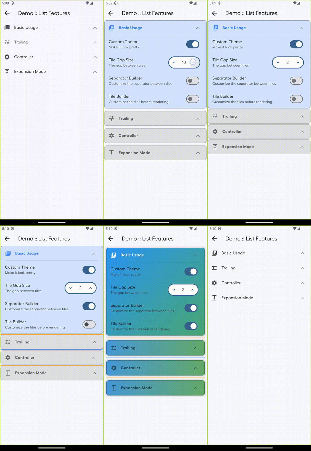
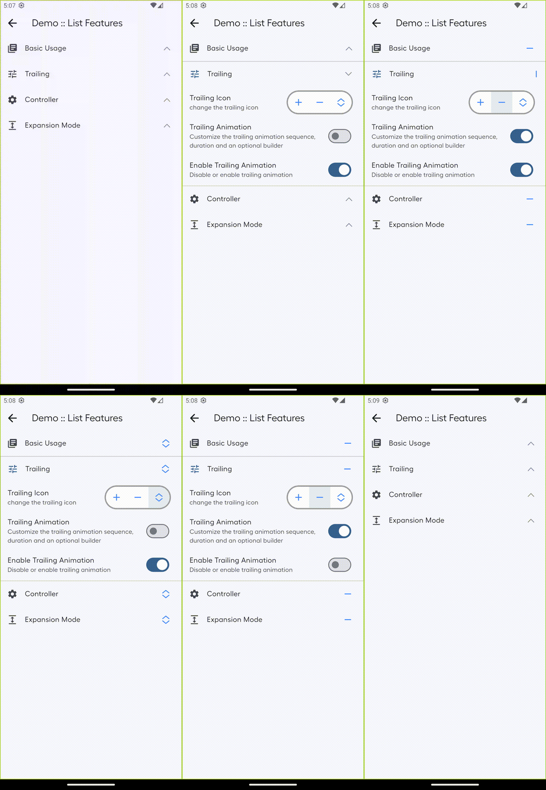
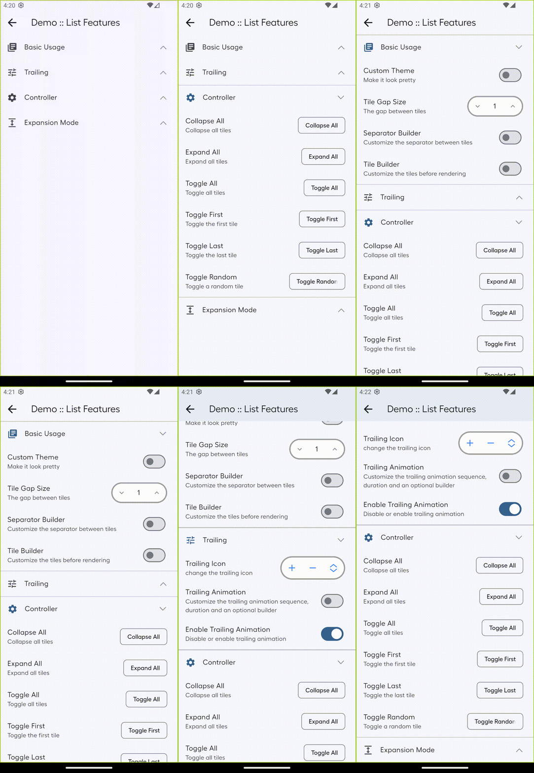
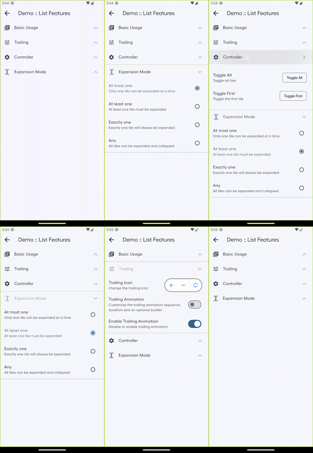
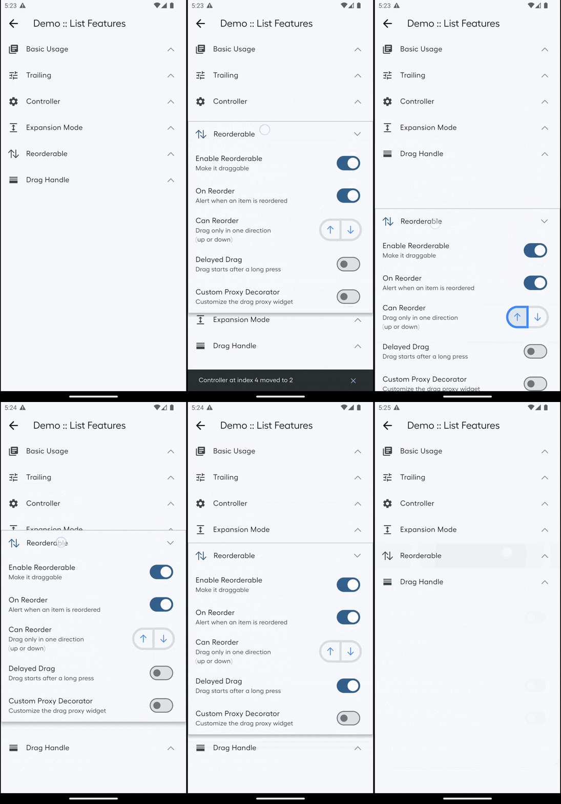
ExpansionTileList는 고급 스타일링, 부드러운 애니메이션 및 전개 동작에 대한 유연한 제어를 지원하는 사용자 정의 가능한 확장 타일 모음 제공하는 Flutter 패키지입니다. 간단함과 유연성을 위해 설계되어 접을 수 있는 섹션, 자주 묻는 질문, 상세 콘텐츠 패널과 같은 일반적인 사용 사례를 간소화합니다. 이 패키지는 모든 주요 플랫폼에서 원활하게 통합되며 일관된 성능과 외관을 제공합니다. 개발자는 앱의 디자인 언어에 맞게 각 타일의 외관과 상호작용을 쉽게 조정할 수 있습니다.
사용 사례
자주 묻는 질문 섹션 만들기
접을 수 있는 탐색 메뉴 만들기
상세 항목 정보 표시
설정 패널 구현
그룹화된 콘텐츠 정리
사용자 인터페이스 상호작용 향상
주요 기능
사용자 지정 가능한 타일 스타일
부드러운 전개/접기 애니메이션
유연한 확장 제어
크로스 플랫폼 호환성
간단한 API 통합
중첩 또는 그룹화된 타일 지원
적합한 대상
재사용 가능한 확장 구성 요소를 찾는 개발자
동적 콘텐츠 섹션을 가진 앱
상호작용 요소를 필요로 하는 UI 중심 애플리케이션
일관된 크로스 플랫폼 동작을 우선시하는 팀
확장 가능한 목록에 최소한의 보일러플레이트가 필요한 프로젝트
고려 사항
복잡한 레이아웃을 위해 추가 스타일링이 필요할 수 있습니다
매우 큰 목록과 함께하는 성능 영향
제한된 내장 접근성 기능
고급 상호작용을 위한 사용자 정의 로직 필요
매우 높은 빈도의 업데이트에 최적화되지 않음
원본 README
연결된 소스 저장소의 README 원문 스냅샷입니다. 최신 내용은 저장소에서 확인하세요.
Expansion Tile List
The ExpansionTileList serves as a container for the ExpansionTile widget, enabling the creation of a list of
ExpansionTile items. It offers additional features that allow you to customize the appearance of the tiles and control
their expansion programmatically.
The expansion_tile_list package offers a highly customizable list of expansion_tile items for Flutter applications.
It enables developers to create expandable tile lists with extensive options for appearance, animations, and control
over the expansion behaviour. The package includes features such as a global trailing widget, trailing animation, and
various expansion modes to accommodate different use cases.
Features
Compatible with ExpansionTile widgets.
Includes additional features when using ExpansionTileItem widget instead of ExpansionTile
Supports hot reload.🔥
Accordion like expansion mode and many more.
Customizable trailing widget and trailing animation.
Customize the appearance of the tiles using itemBuilder, separatorBuilder and itemGapSize.
Programmatically control the expansion of the tiles with ExpansionTileListController.
Listen to the expansion changes of the tiles.
Drag and reorder the items in the list.
Checkout the Demo to explore the latest features and
experience the features firsthand!
List Features
All the features affects all the tiles in the ExpansionTileList.
itemGapSize allows you to specify the size of the gap between each tile in the ExpansionTileList.
trailing allows you to specify the trailing widget for all tiles, can be overridden byExpansionTile
trailing property.
trailingAnimation allows you to specify a custom animation for the trailing widget.
enableTrailingAnimation allows you to enable or disable the trailing animation.
itemBuilder allows the customization of the creation and appearance of the tiles in the ExpansionTileList.
separatorBuilder allows the customization of the creation and appearance of the separators between the tiles in the
ExpansionTileList.
initialExpandedIndexes allows you to specify the indexes of the tiles that are initially expanded.
controller allows you to programmatically control the expansion of the tiles.
onExpansionChanged allows you to listen to the expansion changes of the tiles.
ExpansionMode allows you to specify the expansion mode for the
ExpansionTileList.
ExpansionMode.atMostOne allows you to expand at most one tile at a time. (i.e. zero or one )
ExpansionMode.atLeastOne ensures that at least one tile is always expanded (i.e. one or more )
ExpansionMode.exactlyOne allows you to expand exactly one tile at a time. (i.e. one )
ExpansionMode.any allows you to expand any number of tiles. (i.e. zero or more )
separatorAlignment allows you to specify the alignment of the separator against the space itemGapSize between
the tiles in the ExpansionTileList
header allows you to specify a widget displayed at the beginning of the list.
footer allows you to specify a widget displayed at the end of the list.
ExpansionTileList.reorderable enable the list to be reorderable
by dragging the items.
Reorderable callbacks e.g canReorderonReorder allows you to
specify a callback to control the behavior of the list item reordering.
dragHandleBuilder allows you to customize the appearance of the
drag handle for the reorderable list.
Item Features
By default ExpansionTileList supports ExpansionTile widget as children to create tiles. But you can also use
ExpansionTileItem widget when more control is required. All the properties overrides the that of ExpansionTileList.
trailing allows you to specify the trailing widget for the tile.
trailingAnimation allows you to specify a custom animation for the trailing widget.
enableTrailingAnimation allows you to enable or disable the trailing animation.
Using separatorAlignment: This property allows you to specify the alignment of the separator against the space
itemGapSize between the tiles in the list.
var expansionTileList = ExpansionTileList(
  separatorAlignment: Alignment.topCenter, // defaults to Alignment.bottomCenter if not specified
  children: <ExpansionTile>[
    ExpansionTile(
      title: Text('Tile 1'),
      children: <Widget>[Text('Child 1')],
    ),
    ExpansionTile(
      title: Text('Tile 2'),
      children: <Widget>[Text('Child 2')],
    ),
  ],
);
Header And Footer
Using header and footer: Use the header and footer properties to add widgets before and after the list items.
Using ExpansionMode: Use ExpansionMode property of the ExpansionTileList widget to control the expansion of the
tiles. The initialExpandedIndexes property allows you to specify the indexes of the tiles that are initially
expanded. ExpansionMode that enforces a single tile expansions at a time expects a single index in the array
initialExpandedIndexes i.e. ExpansionMode.atMostOne and ExpansionMode.exactlyOne, if multiple indexes are
specified then only the first index at 0 is considered. If the initialExpandedIndexes is not specified then the
first tile is expanded by default.
/// Use ExpansionMode property/// length of `initialExpandedIndexes` for enforces at least one tile always expanded [`ExpansionMode.atLeastOne`, `ExpansionMode.exactlyOne`] should be 1 or 0.var expansionTileList = ExpansionTileList(
initialExpandedIndexes: [0, 1], // defaults to [] if not specified
expansionMode: ExpansionMode.any, // defaults to ExpansionMode.any if not specified
children: <ExpansionTile>[
ExpansionTile(
title: Text('Tile 1'),
children: <Widget>[Text('Child 1')],
),
ExpansionTile(
title: Text('Tile 2'),
children: <Widget>[Text('Child 2')],
),
],
);
// Use named constructorvar expansionTileList = ExpansionTileList(
expansionMode: ExpansionMode.atMostOne,
initialExpandedIndexes: [0], // defaults to [] if not specified
children: <ExpansionTile>[
ExpansionTile(
title: Text('Tile 1'),
children: <Widget>[Text('Child 1')],
),
ExpansionTile(
title: Text('Tile 2'),
children: <Widget>[Text('Child 2')],
),
],
);
var expansionTileList = ExpansionTileList(
expansionMode: ExpansionMode.atLeastOne,
initialExpandedIndexes: [1],
// defaults to [0] if not specified and cannot be resolved by first initialExpandedIndex of children
children: <ExpansionTile>[
ExpansionTile(
title: Text('Tile 1'),
children: <Widget>[Text('Child 1')],
),
ExpansionTile(
title: Text('Tile 2'),
children: <Widget>[Text('Child 2')],
),
],
);
var expansionTileList = ExpansionTileList(
expansionMode: ExpansionMode.exactlyOne,
initialExpandedIndexes: [0], // defaults to [0] if not specified
children: <ExpansionTile>[
ExpansionTile(
title: Text('Tile 1'),
children: <Widget>[Text('Child 1')],
),
ExpansionTile(
title: Text('Tile 2'),
children: <Widget>[Text('Child 2')],
),
],
);
ExpansionTileItem
ExpansionTileItem is an alternative to the default ExpansionTile, it intend to provide more fine grained control over
the default where necessary.
Using ExpansionTileItem: Use the ExpansionTileItem widget to customize the trailing widget
of the tiles.
Using ExpansionTileItem with trailingAnimation: Use the ExpansionTileItem widget with
the trailingAnimation property to customize the trailing widget of the tiles.
Using ExpansionTileItem with trailingAnimationBuilder: Use the ExpansionTileItem widget with the
trailingAnimationBuilder property to customize the trailing widget of the tiles.
Using callbacks with reorderable : Use the callbacks to listen to the reordering of the items in the list.
// Use the canReorder and onReorder callbackvar expansionTileList = ExpansionTileList.reorderable(
canReorder: (oldIndex, newIndex) { // allow reordering only if the new index is greater than the old index (drag down)return newIndex > oldIndex;
},
onReorder: (oldIndex, newIndex) {
print('Reordered from $oldIndex to $newIndex');
},
children: <ExpansionTile>[
ExpansionTile(
title: Text('Tile 1'),
children: <Widget>[Text('Child 1')],
),
ExpansionTile(
title: Text('Tile 2'),
children: <Widget>[Text('Child 2')],
),
],
);
// Use the onReorderStart and onReorderEnd callbackvar expansionTileList = ExpansionTileList.reorderable(
onReorderStart: (index) { // called when the reordering starts at the indexprint('Reorder started at $index');
},
onReorderEnd: (index) { // called when the reordering ends at the indexprint('Reorder ended at $index');
},
children: <ExpansionTile>[
ExpansionTile(
title: Text('Tile 1'),
children: <Widget>[Text('Child 1')],
),
ExpansionTile(
title: Text('Tile 2'),
children: <Widget>[Text('Child 2')],
),
],
);
Using useDelayedDrag: Use the useDelayedDrag property to enable delayed drag (long press) to start reordering the
items in
the list.
Using proxyDecorator: Use the proxyDecorator property to customize the appearance of the proxy item that is
displayed while reordering the items in the list.
var expansionTileList = ExpansionTileList.reorderable(
proxyDecorator: (Widget child, int index,
Animation<double> animation) { // customize the appearance of the proxy item during reordering (dragging)returnMaterial(
elevation: 4.0,
child: SizeTransition(
sizeFactor: animation,
child: child,
),
);
},
children: <ExpansionTile>[
ExpansionTile(
title: Text('Tile 1'),
children: <Widget>[Text('Child 1')],
),
ExpansionTile(
title: Text('Tile 2'),
children: <Widget>[Text('Child 2')],
),
]
,
);
Drag Handle
NOTE: The drag handle is a widget used to reorder the items in the list by dragging.
Using enableDefaultDragHandles : Use the enableDefaultDragHandles property to enable the default drag handles for
the reorderable list and useDelayedDrag for a long press to trigger reordering. The default drag handles makes the
whole ExpansionTile item draggable. This can be set to false when a custom drag handle is required.
// Use default drag handles with delayed dragvar expansionTileList = ExpansionTileList.reorderable(
enableDefaultDragHandles: true, // defaults to true if not specified
useDelayedDrag: true, // enable delayed drag (long press) to start reordering
children: <ExpansionTile>[
ExpansionTile(
title: Text('Tile 1'),
children: <Widget>[Text('Child 1')],
),
ExpansionTile(
title: Text('Tile 2'),
children: <Widget>[Text('Child 2')],
),
],
);
Using DragHandlePlacement: Use the dragHandlePlacement property to specify the placement of the drag handle for the
reorderable list.
var expansionTileList = ExpansionTileList.reorderable(
  dragHandlePlacement: DragHandlePlacement.trailing, // defaults to DragHandlePlacement.none if not specified
  children: <ExpansionTile>[
    ExpansionTile(
      title: Text('Tile 1'),
      children: <Widget>[Text('Child 1')],
    ),
    ExpansionTile(
      title: Text('Tile 2'),
      children: <Widget>[Text('Child 2')],
    ),
  ],
);
Using dragHandleAlignment: Use the dragHandleAlignment property to specify the horizontal alignment of the drag
handle relative to its placement for the reorderable list.
var expansionTileList = ExpansionTileList.reorderable(
  dragHandleAlignment: HorizontalAlignment.centerRight, // defaults to HorizontalAlignment.centerLeft if not specified
  children: <ExpansionTile>[
    ExpansionTile(
      title: Text('Tile 1'),
      children: <Widget>[Text('Child 1')],
    ),
    ExpansionTile(
      title: Text('Tile 2'),
      children: <Widget>[Text('Child 2')],
    ),
  ],
);
Using dragHandleBuilder: Use the dragHandleBuilder property to customize the appearance of the drag handle for the
reorderable list based on the DragHandlePlacement value. NOTE: DragHandlePlacement.none does not call the
dragHandleBuilder. The dragHandleBuilder can be used as a custom drag handle when the enableDefaultDragHandles is set
to false.
// decorate the drag handle based on DragHandlePlacement (child is the drag handle placement widget (leading , trailing or title))// DragHandlePlacement.none does not call the dragHandleBuildervar expansionTileList = ExpansionTileList.reorderable(
dragHandlerPlacement: DragHandlePlacement.leading,
// important for dragHandleBuilder to know the placement of the drag handle
dragHandleBuilder: (context, index, child) { // customize the appearance of the drag handlereturn child == null ? constIcon(Icons.drag_handle) : Row(
mainAxisSize: MainAxisSize.min, //give it a min size to avoid overflow
children: <Widget>[
constIcon(Icons.drag_handle),
!child,
],
);
},
children: <ExpansionTile>[
ExpansionTile(
title: Text('Tile 1'),
children: <Widget>[Text('Child 1')],
),
ExpansionTile(
title: Text('Tile 2'),
children: <Widget>[Text('Child 2')],
),
],
);
// use as a custom drag handle (only a specific widget is used as the handle)// disable the default drag handles (enableDefaultDragHandles = false) and use either the ReorderableDragStartListener or ReorderableDelayedDragStartListener to create a custom drag handle for the reorderable list.var expansionTileList = ExpansionTileList.reorderable(
enableDefaultDragHandles: false,
// disable the default drag handles
dragHandlerPlacement: DragHandlePlacement.leading,
// important for dragHandleBuilder to know the placement of the drag handle
dragHandleBuilder: (context, index, child) { // customize the appearance of the drag handlefinal dragHandle = ReorderableDragStartListener(
key: PageStorageKey(index),
index: index,
child: constIcon(Icons.drag_handle),
);
return child == null ? dragHandle : Row(
mainAxisSize: MainAxisSize.min, //give it a min size to avoid overflow
children: <Widget>[
dragHandle,
!child,
],
);
},
children: <ExpansionTile>[
ExpansionTile(
title: Text('Tile 1'),
children: <Widget>[Text('Child 1')],
),
ExpansionTile(
title: Text('Tile 2'),
children: <Widget>[Text('Child 2')],
),
],
);
Using Custom Drag Handle: Disable the default drag handles and use either the ReorderableDragStartListener or
ReorderableDelayedDragStartListener to create a custom drag handle for the reorderable list.
create a custom drag handle (e.g Icon)
set enableDefaultDragHandles to false
create an ExpansionTileController to programmatically control the tiles and access the position of the tiles
wrap the drag handle with ReorderableDragStartListener or ReorderableDelayedDragStartListener
wrap the ReorderableDragStartListener or ReorderableDelayedDragStartListener with a ValueListenableBuilder to
update the index property of the drag handle
update the index property of the drag handle ReorderableDragStartListener or ReorderableDelayedDragStartListener
to the current position of th ExpansionTile every time the list is reordered by using the onReorder callback.
NOTE:dragHandleBuilder is a simpler way to create a custom drag handle for the reorderable list.
finalValueNotifier<(int, int)> _reorderNotifier = ValueNotifier((-1, -1)); // remember to dispose the ValueNotifierfinalExpansionTileListController _controller = ExpansionTileListController();
var expansionTileList = ExpansionTileList.reorderable(
enableDefaultDragHandles: false, // defaults to true if not specified
controller: _controller, // controller to programmatically control tiles and access the position of the tiles
onReorder: (oldIndex, newIndex) {
_reorderNotifier.value = (oldIndex, newIndex); // notify the custom drag handle of the reorder
},
children: <ExpansionTile>[
...List.generate(10, (index) {
returnExpansionTile(
leading: _buildCustomDragHandle(index),
title: Text('Tile $index'),
children: <Widget>[Text('Child $index')],
);
}),
],
);
Widget_buildCustomDragHandle(int itemIndex) {
returnValueListenableBuilder<(int, int)>(
valueListenable: _reorderNotifier,
builder: (context, (int, int) value, child) {
returnReorderableDragStartListener(
key: PageStorageKey(itemIndex),
index: _controller.currentPosition(itemIndex),
child: constIcon(Icons.drag_handle),
);
});
}
// for large items in a list, to improve performance a custom drag handle can be created as below// Note: _reorderNotifier should be reset to (-1, -1) in the didUpdateWidget lifecycle method when setState is called to rebuild the list.@OverridevoiddidUpdateWidget() {
_reorderNotifier.value = (-1, -1);
}
Widget_buildCustomDragHandle(int itemIndex) {
WidgetdragHandle(int index) {
returnReorderableDragStartListener(
key: PageStorageKey(index),
index: index,
child: constIcon(Icons.drag_handle),
);
}
Widget? currentDragHandle;
returnValueListenableBuilder<(int, int)>(
valueListenable: _reorderNotifier,
child: currentDragHandle,
builder: (context, (int, int) value, child) {
var minIndex = min(value.$1, value.$2);
var maxIndex = max(value.$1, value.$2);
var index = _controller.currentPosition(itemIndex);
if (minIndex < 0 || (index >= minIndex &&
index <= maxIndex)) { //only update when reorder index is within the range of oldIndex and newIndex or is -1
currentDragHandle =
(index == itemIndex ? child : null) ?? dragHandle(index);
}
return currentDragHandle ?? dragHandle(index);
},
);
}
How Drag Handle works
By default the whole widget is draggable for a reorderable expansion list.
To create use a widget as a drag handle, use dragHandleBuilder to customize the appearance of the drag handle and use
dragHandlePlacement and dragHandleAlignment to specify the placement and alignment of the drag handle respectively.
For a custom drag handle, disable the default drag handles by setting enableDefaultDragHandles to false.
enableDefaultDragHandles is used to enable the default drag handles for the reorderable list. Only set false if you
intend to build custom drag handles.
useDelayedDrag is used to enable the delayed drag (long press) to start reordering.
dragHandlePlacement is used to specify the placement of the drag handle. This works for both the default drag
handles
and the custom drag handles (i.e enableDefaultDragHandles is false).
dragHandleAlignment is used to specify the alignment of the drag handle in relation to the space between the tiles.
dragHandleBuilder is used only when dragHandlePlacement has a value other than DragHandlePlacement.none to
customize the appearance of the drag handle based on the DragHandlePlacement widget.
How initialExpandedIndexes with ExpansionMode works
ExpansionMode.atMostOne
considers initialExpandedIndexes first valid index.
considers first ExpansionTile child widget withinitiallyExpanded true.
collapses all tiles.
ExpansionMode.exactlyOne
considers initialExpandedIndexes first valid index.
considers first ExpansionTile child widget withinitiallyExpanded true.
considers first ExpansionTile child widget at index 0.
ExpansionMode.atLeastOne
considers initialExpandedIndexes all indexes if not empty.
considers all ExpansionTile children widget withinitiallyExpanded true.
considers first ExpansionTile child widget at index 0.
ExpansionMode.any
considers initialExpandedIndexes all indexes if not empty.
considers all ExpansionTile children widget withinitiallyExpanded true.
collapses all tiles.
How itemGapSize and separatorBuilder layout works
itemGapSize is the size of the gap between the tiles in the list.
separatorBuilder is the builder which returns a separator widget rendered between the ExpansionTile items in the
list.
separatorAlignment is the alignment of the separator widget in relation to the space itemGapSize between items.
NOTE: The separatorAlignment can be used to specify the alignment of the separator against the space
Layout as follows:
Alignment.topLeft Alignment.topCenter Alignment.topRight
[ExpansionTile1] [ExpansionTile1] [ExpansionTile1]
[ Gap ] [ Gap ] [ Gap ]
[Divider] [Divider] [Divider]
[ExpansionTile2] [ExpansionTile2] [ExpansionTile2]
[ Gap ] [ Gap ] [ Gap ]
[Divider] [Divider] [Divider]
[ExpansionTile3] [ExpansionTile3] [ExpansionTile3]
Alignment.bottomLeft Alignment.bottomCenter Alignment.bottonRight
[ExpansionTile1] [ExpansionTile1] [ExpansionTile1]
[Divider] [Divider] [Divider]
[ Gap ] [ Gap ] [ Gap ]
[ExpansionTile2] [ExpansionTile2] [ExpansionTile2]
[Divider] [Divider] [Divider]
[ Gap ] [ Gap ] [ Gap ]
[ExpansionTile3] [ExpansionTile3] [ExpansionTile3]
How ExpansionTileList current position and initial position works
The ExpansionTileList item initial position is the index of the ExpansionTile in the children list of the
ExpansionTileList on creation and before reordering.
For a non-reorderable ExpansionTileList, an item current position will always be the same as the initial position.
For a reorderable ExpansionTileList, the current position is the index of the ExpansionTile in the items of the
ExpansionTileList after reordering.
Before reordering, the current position is the same as the initial position.
After reordering, the current position is updated to the new index of the ExpansionTile in the items of the
ExpansionTileList.
Both the initial position and current position are zero-based indexes.
All ExpansionTileList callbacks and methods that require a position or index use the current position.
Method : initialPosition
Returns the initial position(index) of the tile at the given current position(index).
The initial position is the original position of the tile in the list.
For example, A tile at the initial index 0 will be assigned a position 0,
if the tile is moved to the position 2, the initial position of the tile at the position 2 will still be 0.
Therefore, initial position is the position of the tile in the list before any reordering and it remains the same
after reordering.
var controller = ExpansionTileListController();
_() {
// before reordering
controller.initialPosition(0); // returns 0// after reordering
controller.initialPosition(2); // returns 0
}
Method : currentPosition
Returns the current position(index) of the tile at the given initial position(index).
The current position is the updated position of the tile in the list after reordering.
For example, A tile at the initial index 0 will be assigned a position 0,
if the tile is moved to the position 2, the current position of the tile at the position 0 will be 2.
Therefore, current position is the position of the tile in the list after reordering.
var controller = ExpansionTileListController();
_() {
// before reordering
controller.currentPosition(0); // returns 0// after reordering
controller.currentPosition(0); // returns 2
}
List Properties
Property
Description
Default Value
key
The widget key.
null
children
The list of ExpansionTile widgets that are managed by this widget.
required
onExpansionChanged
Called whenever a tile is expanded or collapsed.
null
itemGapSize
The size of the gap between the tiles in the list. (renamed to itemGapSize from next major release)
0.0
separatorBuilder
The builder for the separator between the tiles in the list.
null
itemBuilder
A builder that can be used to customize the appearance of the tiles. (renamed to itemBuilder from next major release)
null
controller
A controller that can be used to programmatically control the expansion of the tiles.
null
trailing
The widget that is displayed at the end of each tile header. Can be overridden by trailing property of ExpansionTile
null
trailingAnimation
The animation for the trailing widget of the tiles. Can be overridden by trailingAnimation property of ExpansionTile
null
enableTrailingAnimation
Enable or disable the trailing animation.
true
initialExpandedIndexes
The indexes of the tiles that are initially expanded.
const <int>[]
expansionMode
The expansion mode of the ExpansionTileList.
ExpansionMode.any
separatorAlignment
The alignment of the separator widget in relation to the space itemGapSize between items
Alignment.bottomCenter
header
The widget displayed at the beginning of the items in the list.
null
footer
The widget displayed at the end of the items in the list.
null
Scrollable Properties
Property
Description
Default Value
scrollDirection
The direction in which the list scrolls
Axis.vertical
reverse
Whether the list scrolls in reverse
false
scrollController
An object that can be used to control the position to which this scroll view is scrolled.
null
primary
Whether this is the primary scroll view associated with the parent PrimaryScrollController.
true
physics
How the scroll view should respond to user input.
AlwaysScrollableScrollPhysics()
shrinkWrap
Whether the extent of the scroll view in the scroll direction should be determined by the contents being viewed.
false
padding
The amount of space by which to inset the list contents.
EdgeInsets.zero
restorationId
An identifier that will be used to save the scroll position in the restoration data.
null
keyboardDismissBehavior
How the scroll view should respond to keyboard events.
ScrollViewKeyboardDismissBehavior.manual
dragStartBehavior
Determines the way that drag start behavior is handled.
DragStartBehavior.start
clipBehavior
Determines how to clip the content of the scroll view.
Clip.hardEdge
Reorderable Properties
Property
Description
Default Value
reorderable
Readonly bool property indicating if the ExpansionTileList can be reordered
false
canReorder
A callback that returns whether the item at the given index can be reordered.
null
onReorder
A callback invoked when an item has been reordered.
null
onReorderStart
A callback invoked when the user starts reordering an item
null
onReorderEnd
A callback invoked when the user stops reordering an item
null
proxyDecorator
A builder that can be used to customize the appearance of the proxy item that is displayed while reordering.
null
enableDefaultDragHandles
A bool property indicating if the default drag handles should be used for the reorderable list.
true
useDelayedDrag
A bool property indicating if delayed (long press) drag start should trigger item reordering.
false
dragHandlePlacement
The placement of the drag handle in the ExpansionTile.
DragHandlePlacement.none
dragHandleAlignment
The alignment of the drag handle in the ExpansionTile.
HorizontalAlignment.centerLeft
dragHandleBuilder
A builder that can be used to customize the appearance of the drag handle for the reorderable list.
null
anchor
Determines the relative position of the zero scroll offset within the viewport. (values: 0.0 to 1.0)
0.0
autoScrollerVelocityScalar
Enables you to adjust the speed of the auto-scroll behavior during drag-and-drop operations
50
Item Properties
Property
Description
Default Value
controller
Programmatically control the expansion using ExpansionTileController or ExpansionTileItemController.
null
trailing
The widget that is displayed at the end of each tile header.
null
trailingAnimation
The animation for the trailing widget of the tiles.
expansion_tile_extension_test.dart
To run the tests, use the following command:
flutter test
Troubleshooting
If you encounter any issues while using the package, please check
the GitHub issues page to see if the issue has already been
reported.
If you are unable to find a solution, please create a new issue with a detailed description of the problem, including
the steps to reproduce it.
If you have any questions or need help with the package, please feel free to reach out to the package maintainer.
If you would like to contribute to the package, please refer to the Contributing section for more
information.
If you have any feedback or suggestions for the package, please share them with the package maintainer.
Known Issues & Fixes
State Management issues with ExpansionTile children:
Set maintainState to true for the
ExpansionTile children to maintain the state of the children when the parent ExpansionTileList is rebuilt.
Expansion state issues: The expansion state of the ExpansionTile may not be maintained when the parent of
ExpansionTileList is rebuilt due to the change of the widget tree. To maintain the expansion state, use a GlobalKey
on the ExpansionTile.
ExpansionTileList itemBuilder issues: If the itemBuilder modifies the widget tree during a rebuild, it may disrupt
the maintenance of the expansion state of the ExpansionTile. To address this, use a GlobalKey on the
ExpansionTile.
ExpansionTileController controller issues: The controller property may not function as expected when the
ExpansionTile modifies the widget tree during a rebuild. To resolve this, use a GlobalKey or delegate
the management of the controller to ExpansionTileList by using ExpansionTileItemController type as a controller.
Failed assertion: line 607 pos 12: 'widget.controller?._state == null': is not true.
ExpansionTileController controller methods may throw an assertion error when the widget is not yet mounted or
initialized, mostly due to item not visible in scroll viewport. To resolve this, always check for init state
controller.isInitialized before calling the controller methods.
Using a ListView or ScrollView within the ExpansionTile children may cause layout issues. To resolve this, use a
Column or Container with a fixed height as parent to the ListView and use a PageStorageKey(index) on the
ListView.
The following _TypeError was thrown building ListView(scrollDirection: vertical, dependencies: [MediaQuery]): type 'bool' is not a subtype of type 'double?' in type cast
These issues are due to the ExpansionTile widget limitations and not the package. We have ensured that the package
works as expected with the Flutter framework and made sure to take a safe decision to mitigate these issues.
This means no issues should be encountered when using the package as intended.
Contributing
Contributions are welcome! If you find a bug or want a feature, please fill an issue. If you want to contribute code,
please submit a pull request.
We welcome contributions from everyone. Before you start:
Fork the repository to your own GitHub account.
Clone the project to your machine.
Create a branch locally with a descriptive name.
Commit changes to the branch.
Push changes to your fork.
Create a new pull request in GitHub and link the issue you are fixing.
Visitors
License
This project is licensed under the BSD-style license. See
the
file for details.