연결된 소스 저장소의 README 원문 스냅샷입니다. 최신 내용은 저장소에서 확인하세요.

ffloat
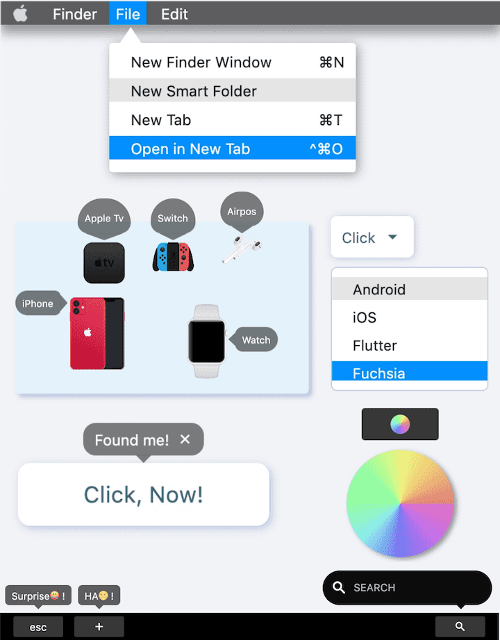
FFloat, although simple and easy to use, can satisfy all your imagination of the floating layer.
Born and elegant, supporting precise position control. Triangles with rounded corners, borders, gradients, shadows? Everything you need 😃.️
Author:Newton


English | 简体中文
Like it? Please cast your Star 🥰 !
✨ Features
-
Supports floating layer position control based on anchor elements
-
Convenient floating layer show / hide control
-
Comes with elegant interactive effects
-
Flexible and beautiful decorative triangle
-
Support precise control of round corners
-
Wonderful gradient effect support
-
Simple but powerful border support
-
Support absolute position Dual mode
🛠 Guide
⚙️ Parameters
🔩 Basic parameters
| Param |
Type |
Necessary |
Default |
desc |
| builder |
FloatBuilder |
true |
null |
[FloatBuilder] returns the content component of [FFloat]. If only the content area is updated, proceed with setter (() {}) |
| color |
Color |
false |
Color(0x7F000000) |
[FFloat] colors |
| gradient |
Gradient |
false |
null |
Gradient. Will overwrite color |
| anchor |
Widget |
false |
null |
Anchor element |
| location |
Offset |
false |
null |
position. After specifying the location of [FFloat] through [location], all configurations that determine the location based on the anchor point will be invalid |
| alignment |
FFloatAlignment |
false |
FFloatAlignment.topCenter |
[FFloat] Based on the relative position of the [anchor] anchor element. |
| margin |
EdgeInsets |
false |
EdgeInsets.zero |
[FFloat] Determine the distance between anchor points based on relative |
| padding |
EdgeInsets |
false |
null |
[FFloat] Internal spacing |
| canTouchOutside |
bool |
false |
false |
Click [FFloat] to hide the area outside the range. |
| backgroundColor |
Color |
false |
Colors.transparent |
[FFloat] The color of the background area when floating |
| autoDismissDuration |
Duration |
false |
null |
Duration of automatic disappearance. If it is null, it will not disappear automatically |
| controller |
FFloatController |
false |
null |
[FFloatController] can control the show/hide of [FFloat]. See [FFloatController] for details |
| animDuration |
Duration |
false |
Duration(milliseconds: 100) |
Show/hide animation duration |
🔺 Triangle
| Param |
Type |
Necessary |
Default |
desc |
| triangleWidth |
double |
false |
12 |
The width of the triangle |
| triangleHeight |
double |
false |
6 |
The height of the triangle |
| triangleAlignment |
TriangleAlignment |
false |
TriangleAlignment.center |
Relative position of triangle |
| triangleOffset |
Offset |
false |
Offset.zero |
Triangle position offset |
| hideTriangle |
bool |
false |
false |
Whether to hide the decorative triangle |
🔆 Corner & Border
| Param |
Type |
Necessary |
Default |
desc |
| corner |
FFloatCorner |
false |
null |
corner |
| cornerStyle |
FFloatCornerStyle |
false |
FFloatCornerStyle.round |
corner style |
| strokeColor |
Color |
false |
null |
Stroke color |
| strokeWidth |
double |
false |
null |
Stroke width |
🔳 Shadow parameters
| Param |
Type |
Necessary |
Default |
desc |
| shadowColor |
Color |
false |
null |
Shadow color |
| shadowOffset |
Offset |
false |
null |
Shadow offset |
| shadowBlur |
double |
false |
null |
The larger the value, the greater the shadow |
📺 Demo
🔩 Basic Demo

FFloat(
  (_) => createContent(),
  controller: controller1,
  padding: EdgeInsets.only(left: 9, right: 9, top: 6, bottom: 6),
  corner: FFloatCorner.all(10),
  alignment: floatAlignment1,
  canTouchOutside: false,
  anchor: buildAnchor1(),
)
FFloat can wrap a normal component (that is, assign the normal component to the anchor parameter of FFloat), so that the component has the ability to click to pop up the floating layer.
And FFloat will not have any adverse effect on the original components, which is amazing!
Alternatively, you can control the display of the floating layer through FFloatController. Of course, the premise is that you need to create a FFloatController, and then assign it to the FFloat controller property.
FFloatController controller = FFloatController();
FFloat(
controller: controller,
)
controller.show();
controller.dismiss();
FFloat is smart enough to automatically determine where it should appear based on the position of anchor. With alignment and margin, you can adjust the position of the floating layer in an incredibly simple way until you think it is ok.
This is an unprecedented change 👍!
In the past, if you wanted to display a floating layer based on the position of an element, then you had to go through a series of tedious operations to get the position of the element. Then coordinate conversion is performed, and the position is calculated according to the size of the floating layer.
God, it's complicated enough just to think about it. Not to mention when you encounter a scene that needs to be centered and left aligned, it is a nightmare 👿.
As for the content of the floating layer, just pass the buidler parameter and return a Widget in the FloatBuilder function.
If your floating layer content needs to be refreshed, the FloatBuilder function provides a StateSetter parameter, through which you can refresh only the content in the floating layer without affecting the content outside the floating layer. It's really efficient.
FFloat(
(setter){
return GestureDetector(
onTap:(){
setter((){
});
}
anchor: buildWidgte());
},
anchor: buildAnchor()
)
💫 Background & Animation

FFloat(
  (_) => FSuper(
    text: "Surprise😃 !",
    textColor: Colors.white,
  ),
  controller: controller2_1,
  color: Color(0xff5D5D5E),
  corner: FFloatCorner.all(6),
  margin: EdgeInsets.only(bottom: 10),
  padding: EdgeInsets.only(left: 9, right: 9, top: 3, bottom: 3),
  anchor: buildAnchor(),
  canTouchOutside: false,
  autoDismissDuration: Duration(milliseconds: 2000),
),

FFloat(
  (_) => buildSearch(),
    child2Alignment: Alignment.centerLeft,
    child2Margin: EdgeInsets.only(left: (9.0 + 18.0 + 9.0)),
  ),
  controller: controller2_2,
  color: Colors.black.withOpacity(0.95),
  backgroundColor: Colors.black26,
  corner: FFloatCorner.all(20),
  margin: EdgeInsets.only(bottom: 10, left: 10),
  anchor: buildAnchor(),
  alignment: FFloatAlignment.topRight,
  triangleAlignment: TriangleAlignment.end,
  triangleOffset: Offset(-39, 0),
)
When the floating layer of FFloat appears, you can choose whether you want a background color, by configuring backgroundColor.
And through the canTouchOutside property, you set whether your floating layer can be closed by clicking the area outside the floating layer.
When set to canTouchOutside = false, it often means that you need to control the hiding of the floating layer through a FFloatController.
By default, FFloat comes with the Scale show/hide animation.
According to the orientation of the floating layer you set, FFloat can intelligently determine the starting anchor point of the animation. This makes everything more natural.
If you don't need the animation effect, just pass null through the animDuration parameter to cancel the animation effect and return to the more abrupt show/hide.
When you configure the autoDismissDuration parameter, FFloat will enter auto-disappear mode. This means that after the floating layer pops up, it will automatically disappear at the time you expect. You don't need to intervene too much.
🔺 Decorative triangle
FFloat(
  (setter) => buildContent(),
  shadowColor: Colors.black38,
  shadowBlur: 8.0,
  shadowOffset: Offset(2.0, 2.0),
  color: Colors.white,
  corner: FFloatCorner.all(3),
  controller: controller3_1,
  alignment: FFloatAlignment.bottomLeft,
  hideTriangle: true,
  anchor: buildAnchor(),
),

FFloat(
  (setter) => buildContent(),
  controller: controller3_2,
  alignment: FFloatAlignment.bottomLeft,
  margin: EdgeInsets.only(top: 2),
  shadowColor: Colors.black38,
  shadowBlur: 8.0,
  shadowOffset: Offset(2.0, 2.0),
  corner: FFloatCorner.all(3),
  color: Colors.white,
  triangleAlignment: TriangleAlignment.start,
  triangleOffset: Offset(10, 10),
  triangleWidth: 20,
  triangleHeight: 15,
  anchor: buildAnchor(),
),
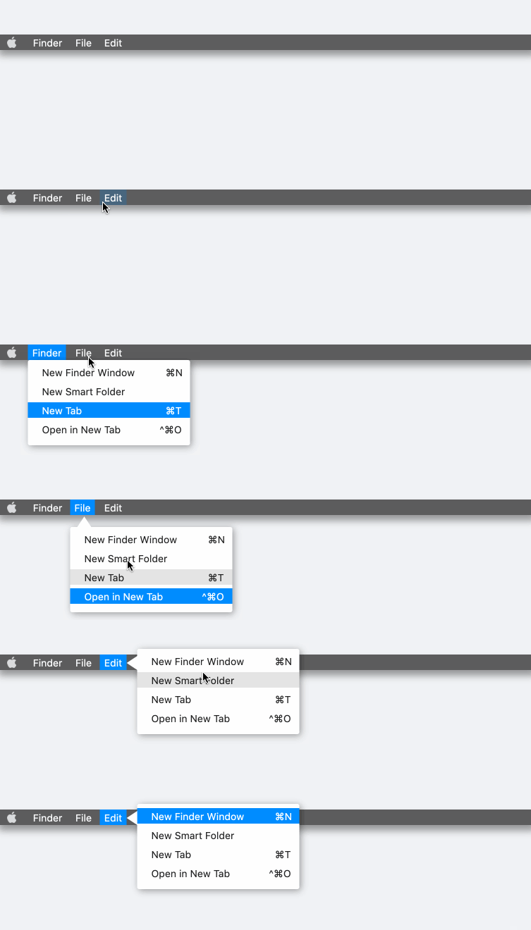
FFloat Intimately built-in decorative triangle. You can see it by default. If you don't want to get a floating layer with a decorative triangle, you can control its show/hide through the hideTriangle property.
Again, FFloat is really smart. The decorative triangle can automatically determine where it should appear based on the relative position of the floating layer and the anchor element. It looks delicate enough.
The theme styles of decorative triangles and floating layers are perfectly natural. In terms of color, FFloat completely saves you trouble. Whether it is solid color, border, gradient color, everything does not need additional processing.
triangleAlignment provides an easy way to adjust the position of the decorative triangle.
If you are still not satisfied, triangleOffset will allow you to further offset based on the relative position. For FFloat, nothing is impossible.
Of course, FFloat will definitely prepare you to control the size of the decorative triangle, just like the problems to be solved by triangleWidth and triangleHeight
🔆 Corner & Stroke
FFloat(
  (setter) {
    return buildContent();
  },
  anchor: buildAnchor(),
  controller: controller4,
  color: Colors.white,
  corner: FFloatCorner.all(6),
  strokeColor: mainShadowColor,
  strokeWidth: 1.0,
  alignment: FFloatAlignment.bottomLeft,
  hideTriangle: true,
  margin: EdgeInsets.only(top: 9),
  padding: EdgeInsets.only(top: 9, bottom: 9),
)
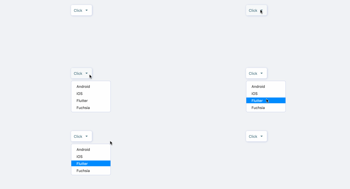
As you can see, a beautiful rounded floating layer with a border is so simple to build.
FFloat provides the FWidget series of components in the same vein, a simple way to set the rounded corners, you can flexibly configure the rounded corners through a simple corner attribute.
The cornerStyle property that comes with corner allows you to switch the style of rounded corners (rounded corners or beveled corners) at any time.
If you are already a user of FWidget, I believe you already know, we configure the border effect for the component, only need to pass two simple properties strokeWidth and strokeColor.
Our original intention was to help developer build beautiful applications more quickly.
🔳 Gradient & Shadow

FFloat(
  (setter) => buildContent(),
  anchor: buildAnchor(),
  controller: controller5,
  gradient: SweepGradient(
    colors: [
      Color(0xffE271C0),
      Color(0xffC671EB),
      Color(0xff7673F3),
      Color(0xff8BEBEF),
      Color(0xff93FCA8),
      Color(0xff94FC9D),
      Color(0xffEDF980),
      Color(0xffF0C479),
      Color(0xffE07E77),
    ],
  ),
  corner: FFloatCorner.all(100),
  hideTriangle: true,
  margin: EdgeInsets.only(top: 9),
  alignment: FFloatAlignment.bottomCenter,
  shadowColor: Colors.black38,
  shadowBlur: 3,
  shadowOffset: Offset(3, 2),
)
Yes, FFloat still has support for gradients after combining many capabilities.
Of course, just through a simple gradient attribute, you can get a beautiful gradient effect.
In addition, as a modern component, FFloat will of course support shadows.
You only need to get a basic shadow effect through the shadowColor property. If you want to further adjust the shadow, you can use the shadowBlur and shadowOffset properties.
📌 Absolute position Float

GestureDetector(
onPanDown: (details) {
FFloat(
(setter) => createContent(),
autoDismissDuration: Duration(milliseconds: 2000),
alignment: _alignment,
canTouchOutside: false,
location: Offset(details.globalPosition.dx, details.globalPosition.dy),
).show(context);
},
child: FSuper(...),
)
In some cases, our floating element does not need to appear based on an anchor point, but hopes that it appears in a certain position.
If the developer knows such a location, use the location parameter to set the location of FFloat.
At this time, the developer does not need to put FFloat in the view tree to wrap any elements. This means that developer can create a floating element in any callback or function anytime, anywhere.
Through FFloat.show (context) and FFloat.dismiss (), developer can easily control show / hide of floating elements at any time.
All other configurations of FFloat are still valid.
👏 More exciting
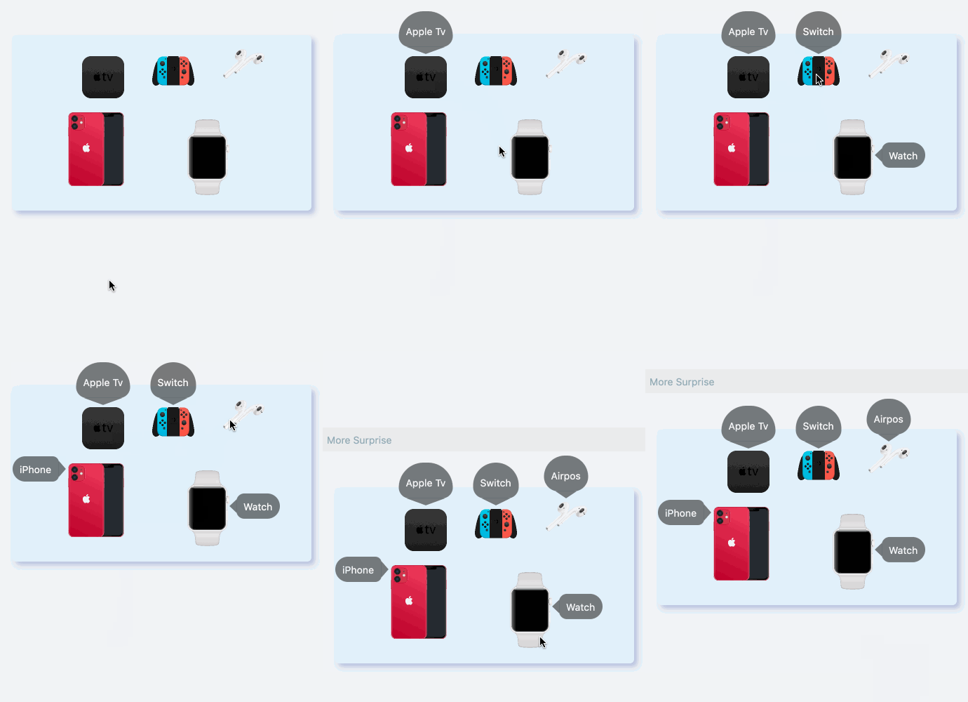
In FFloat, the floating layer can automatically follow the movement of the anchor element, and you do n’t need to pay attention to the series of calculations caused by the position change.
FFloat has handled it for you well enough!
Let FFloat solve all your floating layer problems, you only need to beautify your application.
😃 How to use?
Add dependencies in the project pubspec.yaml file:
🌐 pub dependency
dependencies:
  ffloat: ^<version number>
⚠️ Attention,please go to [pub] (https://pub.dev/packages/ffloat) to get the latest version number of FFloat
🖥 git dependencies
dependencies:
  ffloat:
    git:
      url: 'git@github.com:Fliggy-Mobile/ffloat.git'
      ref: '<Branch number or tag number>'
⚠️ Attention,please refer to [FFloat] (https://github.com/Fliggy-Mobile/ffloat) official project for branch number or tag.
💡 License
Copyright 2020-present Fliggy Android Team.
Licensed under the Apache License, Version 2.0 (the "License");
you may not use this file except in compliance with the License.
You may obtain a copy of the License at following link.
https:
Unless required by applicable law or agreed to in writing, software
distributed under the License is distributed on an "AS IS" BASIS,
WITHOUT WARRANTIES OR CONDITIONS OF ANY KIND, either express or implied.
See the License for the specific language governing permissions and
limitations under the License.
Like it? Please cast your Star 🥰 !
How to run Demo project?
-
clone project to local
-
Enter the project example directory and run the following command
flutter create .
- Run the demo in
example
