Figma의 레이아웃 그리드 시스템을 시각적 보조 도구로 구현한 플러터 패키지로, 개발자가 디자인 사양과 일관되게 UI 요소를 정렬하는 데 도움을 줍니다. 열 수, 간격 크기, 오프셋 등 Figma의 그리드 기능을 지원하여 디자인과 구현 사이의 정확한 레이아웃 매칭을 가능하게 합니다. 그리드는 화면 위에 오버레이 형태로 렌더링되어 프로토타이핑 및 개발에 적합합니다. 모든 주요 플랫폼에서 호환되며, Figma 디자인과 실시간 플러터 앱 사이의 격차를 메우면서 디자이너와 개발자 간 협업을 향상시킵니다.
사용 사례
Flutter 앱에서 Figma 디자인 일치시키기
시각적 격자 정렬을 통한 프로토타이핑
디자이너와 개발자 간의 협업
UI 레이아웃에서 일관된 간격 유지
레이아웃 제약 조건의 시각적 디버깅
주요 기능
Figma 스타일의 그리드 시스템
실시간 시각적 격자 오버레이
열, 간격 및 오프셋을 지원합니다
크로스 플랫폼 호환성
pub add를 통한 간편한 통합
사용자 정의 가능한 그리드 표시
적합한 대상
Flutter로 작업하는 디자이너
Figma 디자인을 따르는 Flutter 개발자
UI/UX 워크플로우에 Figma를 사용하는 팀
픽셀 단위 정확한 레이아웃 정렬을 요구하는 프로젝트
디자인 일관성에 중점을 둔 프론트엔드 팀
고려 사항
그리드는 시각적 보조용이며 레이아웃 로직에는 사용되지 않습니다
생산용 UI 렌더링을 위한 것이 아님
과도하게 사용할 경우 성능에 영향을 줄 수 있습니다
릴리스 빌드에서는 비활성화되어야 합니다
다른 화면에 대해 수동 구성이 필요합니다
원본 README
연결된 소스 저장소의 README 원문 스냅샷입니다. 최신 내용은 저장소에서 확인하세요.
Figma layout grid
figma_layout_grid is a Flutter package which imitates Figma's layout grid and all its functionalities. It helps you determine whether your UI components match the design file and align properly.
Basic usage
Wrap a widget with LayoutGrid in order to render a layout grid on top of it.
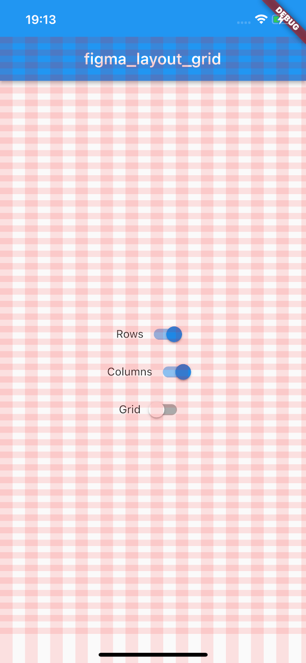
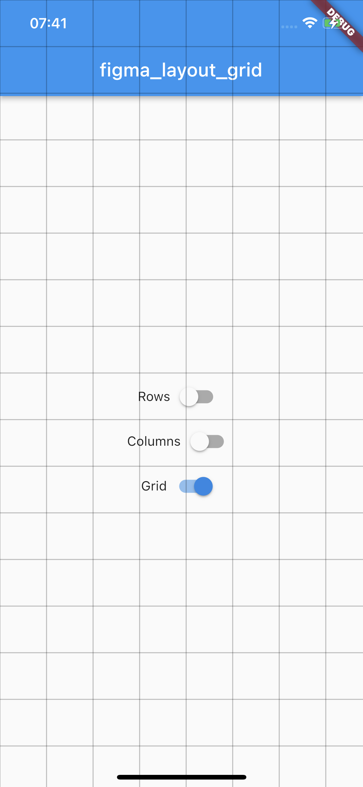
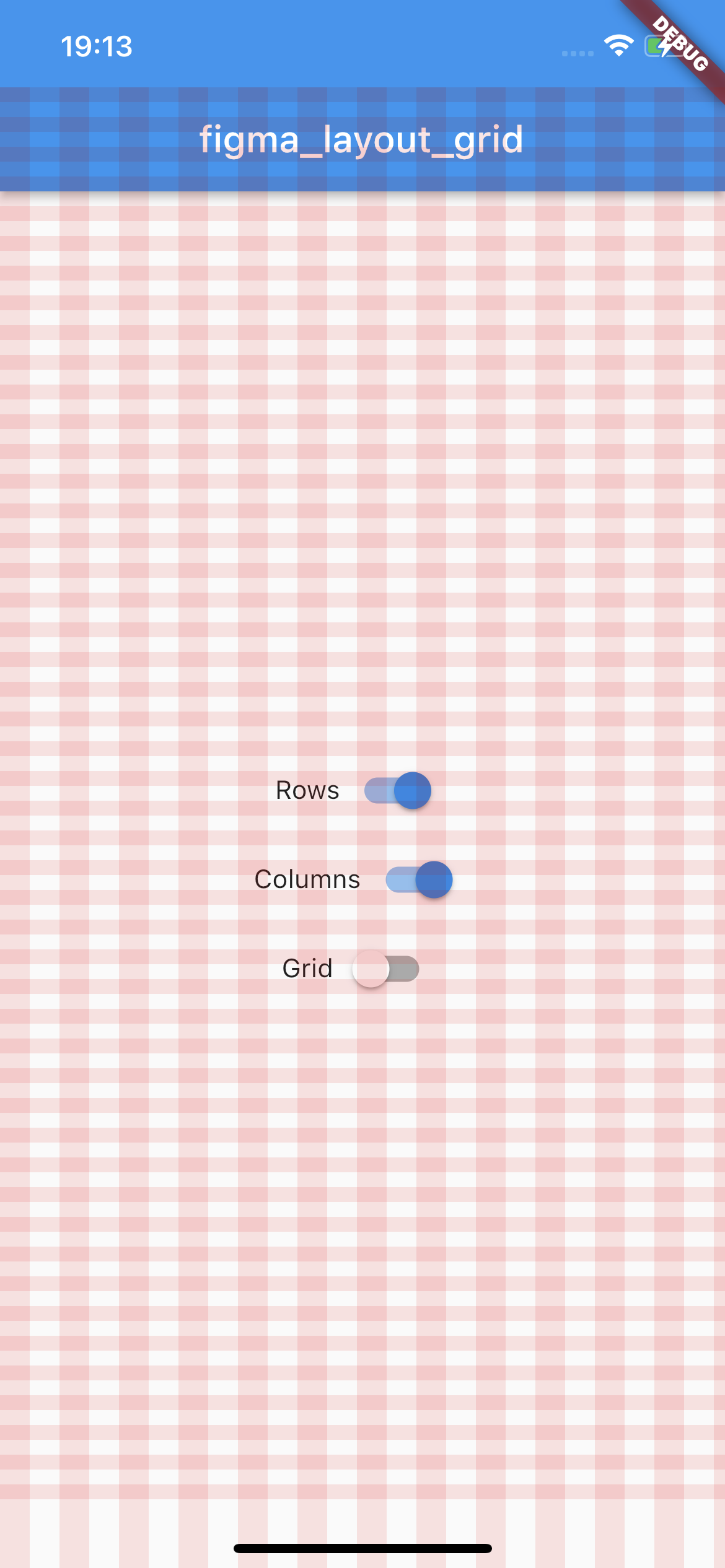
This package supports three types of layout overlays - rows, columns and pixel grid.
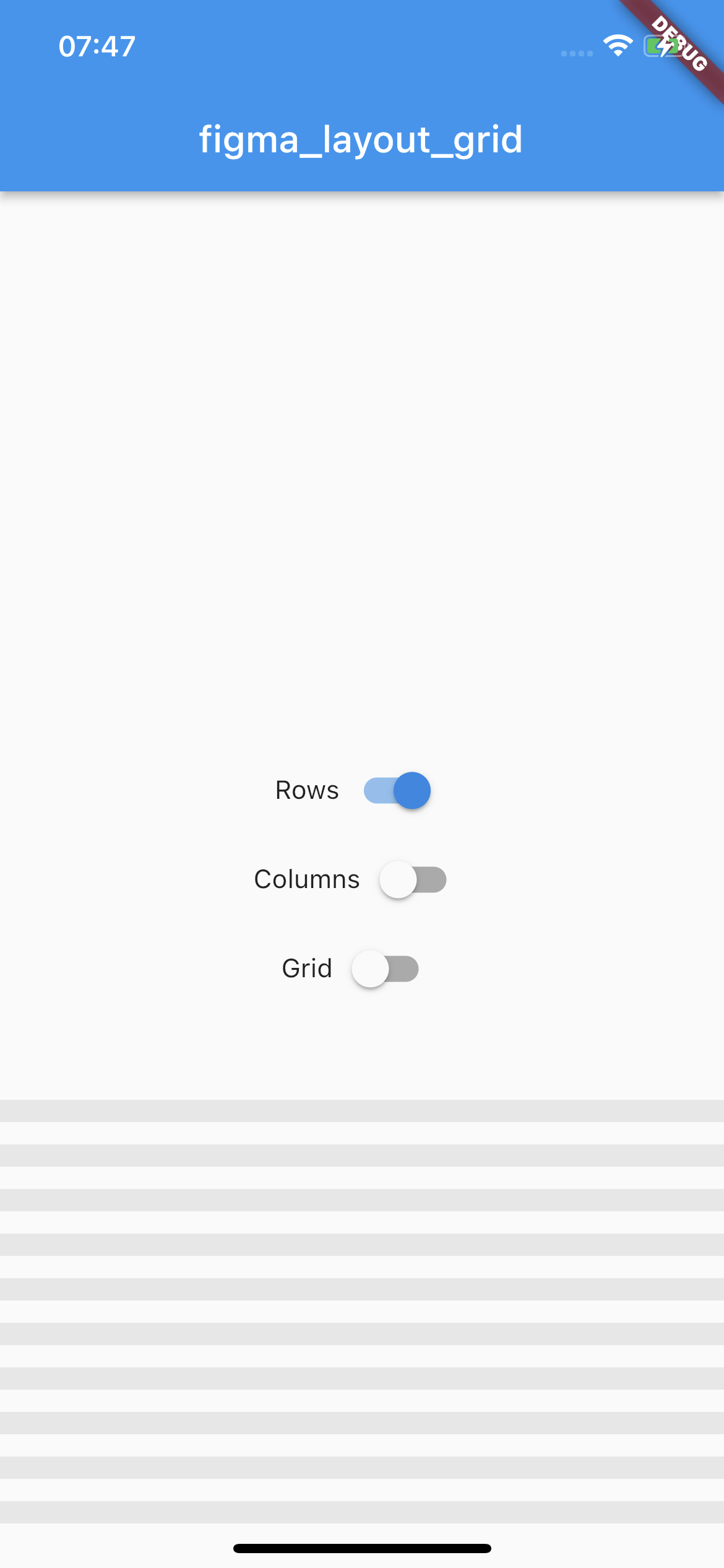
Rows
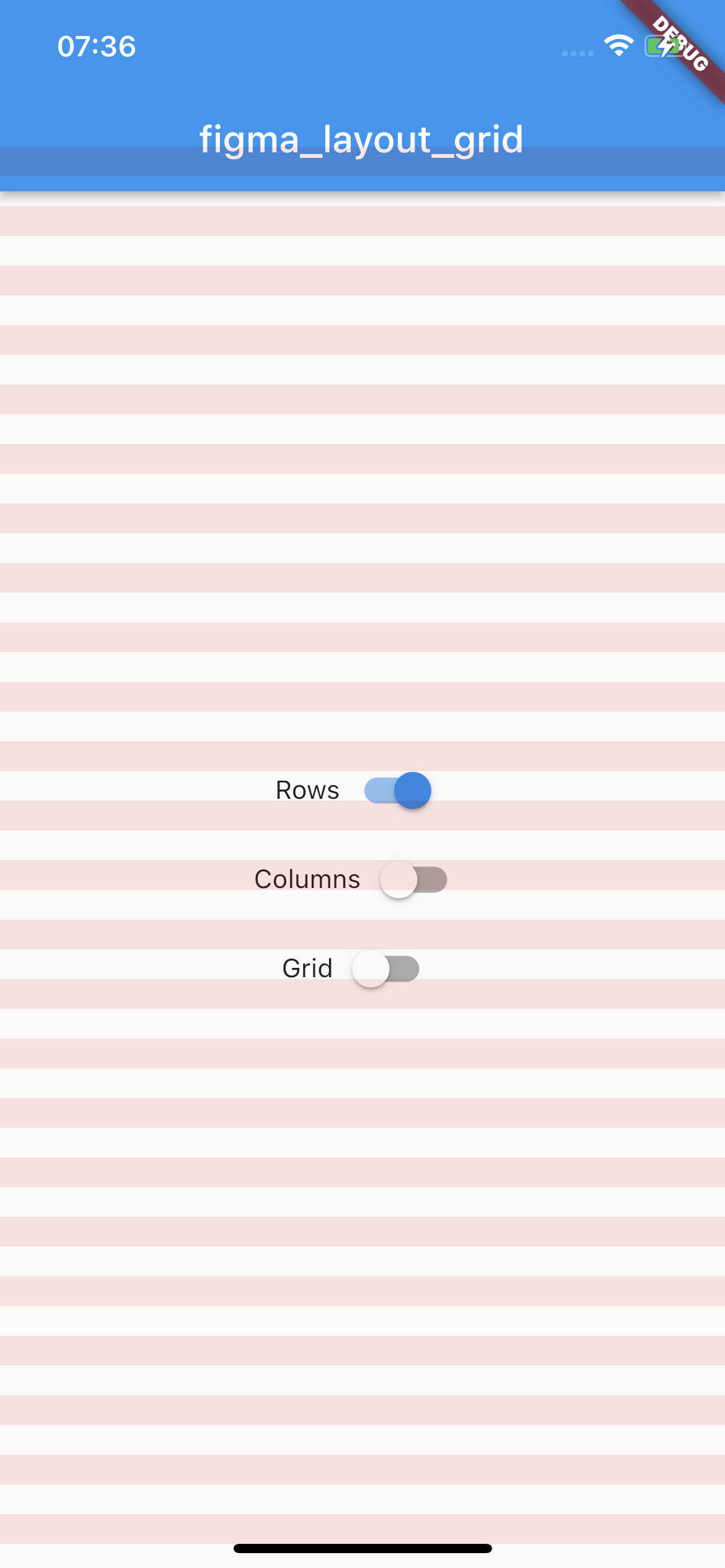
Horizontal stripes with specified height, gutter, margin, offset, arrangement and color.
There is a possibility for fixed rows count with passing desired number in a count parameter, otherwise rows are rendered dynamically due to the screen limits.
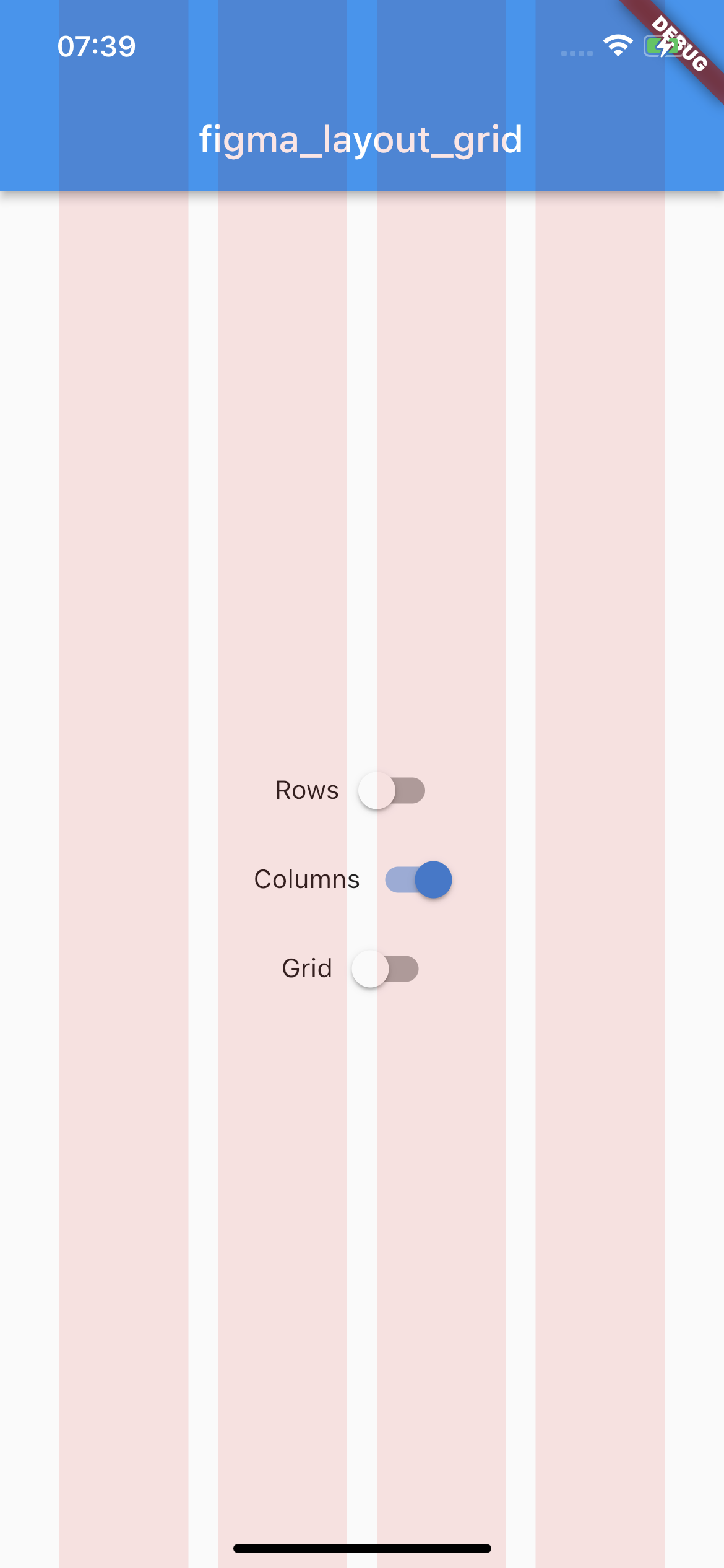
Vertical stripes with specified height, gutter, margin, offset, arrangement and color.
There is a possibility for fixed columns count with passing desired number in a count parameter, otherwise columns are rendered dynamically due to the screen limits.
By default all of the layouts are disabled. In order to manage layout grid state you may use LayoutGrid methods which are accessible via builder context.
bool LayoutGrid.of(context).visibleGrid - returns current grid layout visibility state
Parametrization
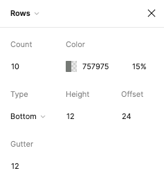
As this package mimics Figma's layout grid features you can directly transfer desired outcome into corresponding parameters. The following example shows columns grid set with count = 10, height = 12, gutter = 12, offset = 24, bottom alignment and some custom color.
There is also a possibility to enable SafeArea for a specific layout.
Each of the three layers has optional SafeAreaParams within you can pass what SafeArea parts should be handled.
The available options are top, bottom, left and right which correspond to SafeArea's parameters with the same names.