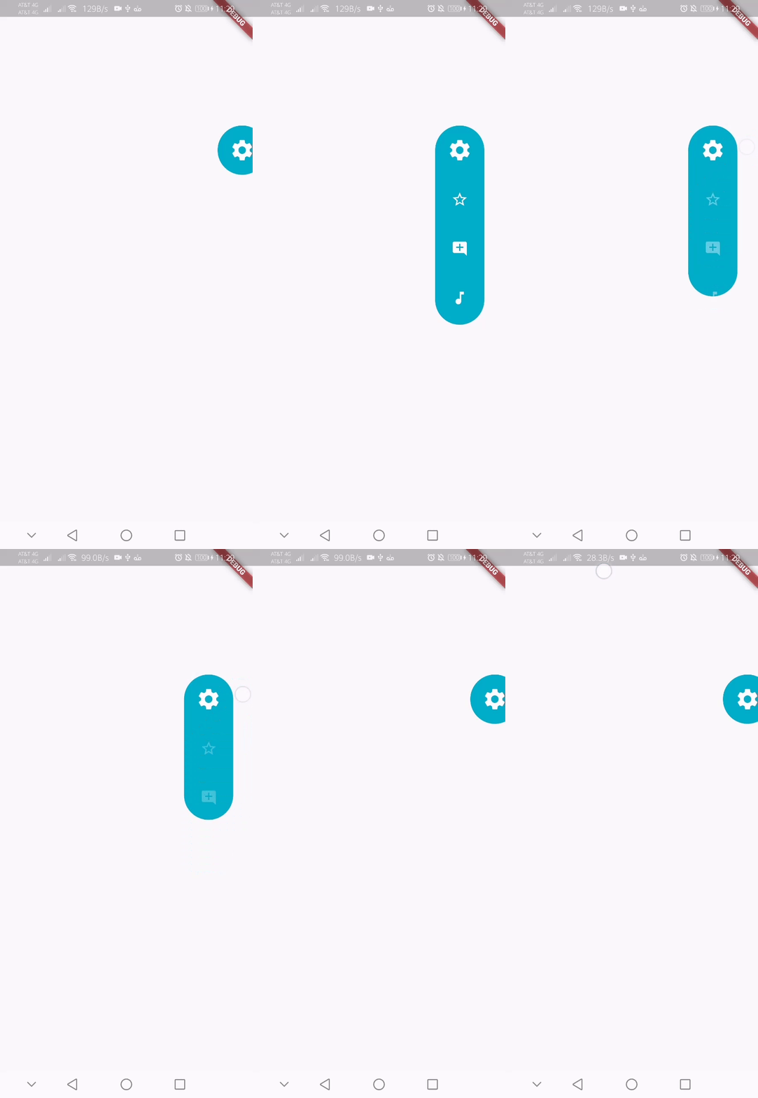
인터랙티브하고 사용자 정의 가능한 플로팅 액션 인터페이스를 제공하는 플러터 패키지입니다. 컴팩트하고 애니메이션 효과가 있는 패널을 통해 여러 작업에 접근할 수 있으며, 확장하거나 축소할 수 있습니다. UI를 혼잡하게 하지 않고 일반적인 기능에 빠르게 접근해야 하는 앱에 적합합니다. 패널은 위치, 애니메이션 및 사용자 정의 자식 위젯 등 다양한 구성 옵션을 지원합니다. 모든 주요 플랫폼에서 호환되며, 모바일 및 데스크톱 애플리케이션의 사용성을 향상시킵니다.
사용 사례
앱 작업에 대한 빠른 액세스
사용자 탐색 개선
UI 혼잡도 감소
사용자 정의 가능한 작업 패널
모바일 및 데스크톱 앱 통합
주요 기능
애니메이션 확장 및 축소
사용자 지정 가능한 위치 및 크기
여러 자식 위젯 지원
크로스 플랫폼 호환성
사용자 정의 가능한 애니메이션
기존 UI와의 간편한 통합
적합한 대상
모바일 및 데스크톱 애플리케이션
제스처 기반 메뉴가 필요한 앱
인터랙티브 요소를 찾는 UI 디자이너
경량 솔루션을 원하는 개발자
공간 제약이 있는 인터페이스를 가진 프로젝트
고려 사항
중복을 피하기 위해 정확한 위치 조정이 필요할 수 있습니다
저사양 기기에서의 애니메이션 성능
완전한 사용자 지정 위젯에 비해 맞춤 설정이 제한되어 있음
복잡한 중첩 메뉴에는 적합하지 않음
접근성 기준에 주의가 필요합니다
원본 README
연결된 소스 저장소의 README 원문 스냅샷입니다. 최신 내용은 저장소에서 확인하세요.
floating_menu_panel
Floating menu panel
Basic:
This is what you needs to get the widget working. Import Widget -> Add 'FloatingMenuPanel' at the bottom of your stack widget. Add icons inside the "buttons" list.
These are all the properties you can customize of the floating panel.
import'package:floating_menu_panel/floating_menu_panel.dart'; // Import Floating Menu PanelStack(
children: [
...
// Add Float Box Panel at the bottom of the 'stack' widget.FloatingMenuPanel(
positionTop: 0.0, // Initial Top Position
positionLeft: 0.0, // Initial Left Position
backgroundColor: Color(0xFFEDEDED), // Color of the panel
contentColor: Colors.black, // Color of the icons
panelShape: PanelShape.rectangle, // 'PanelShape.rectangle' or 'PanelShape.rounded', border radius property doesn't work in the rounded shape
borderRadius: BorderRadius.circular(8.0), // Border radius of the panel
dockType: DockType.inside, // 'DockType.inside' or 'DockType.outside', weather to dock the panel outside or inside the edge of the screen
dockOffset: 5.0, // Offset the dock from the edge depending on the 'dockType' property
panelAnimDuration: 300, // Duration for panel open and close animation
panelAnimCurve: Curves.easeOut, // Curve for panel open and close animation
dockAnimDuration: 300, // Auto dock to the edge of screen - animation duration
dockAnimCurve: Curves.easeOut, // Auto dock animation curve
panelOpenOffset: 20.0, // Offset from the edge of screen when panel is open
panelIcon: Icons.menu, // Panel open/close icon
size: 70.0, // Size of single button in the panel
iconSize: 24.0, // Size of icons
borderWidth: 1.0, // Width of panel border
borderColor: Colors.black, // Color of panel border
onPressed: (index) {
print("Clicked on item: $index");
}
buttons: [
// Add Icons to the buttons list.Icons.message,
Icons.photo_camera,
Icons.video_library
]
);
]
);