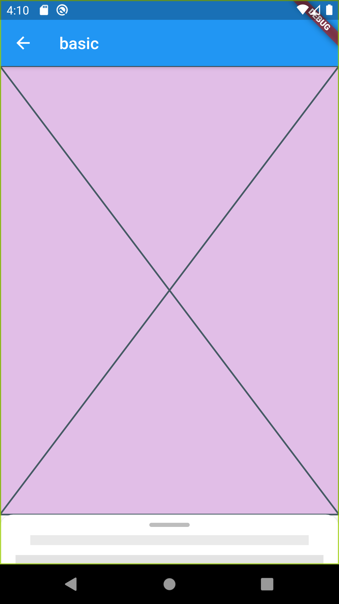
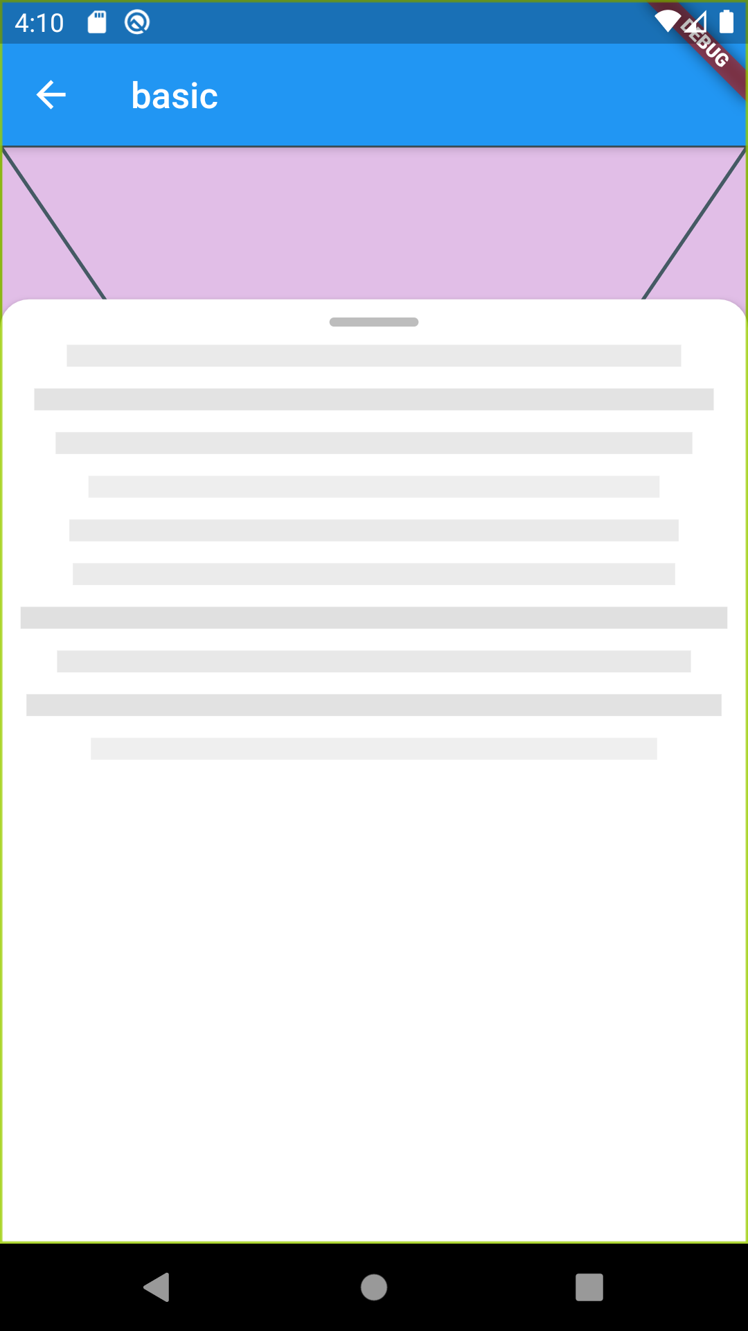
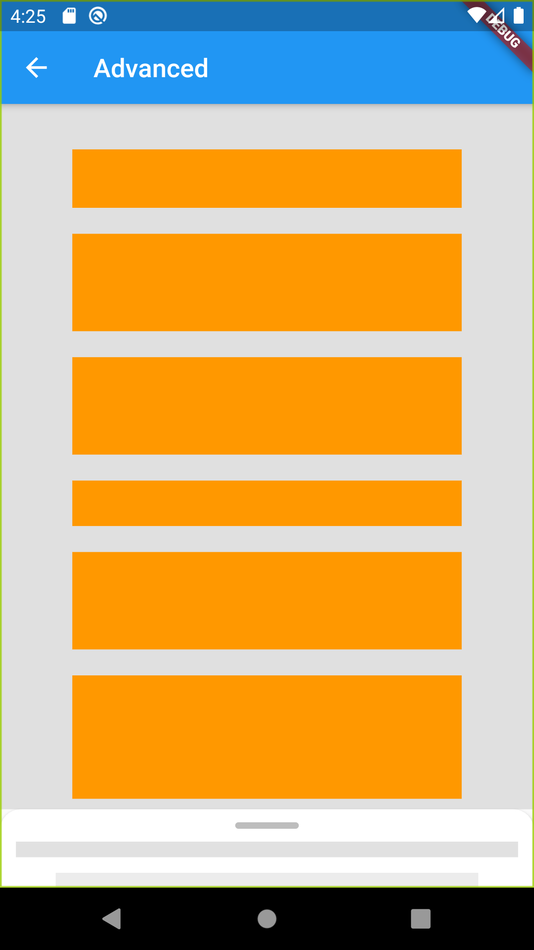
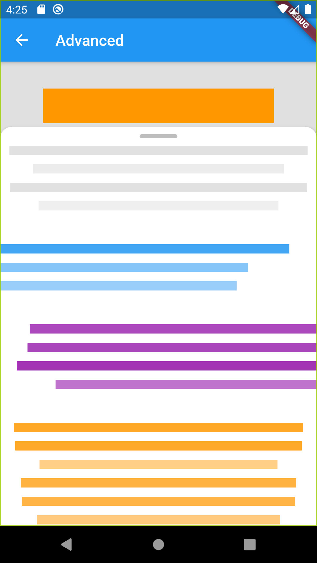
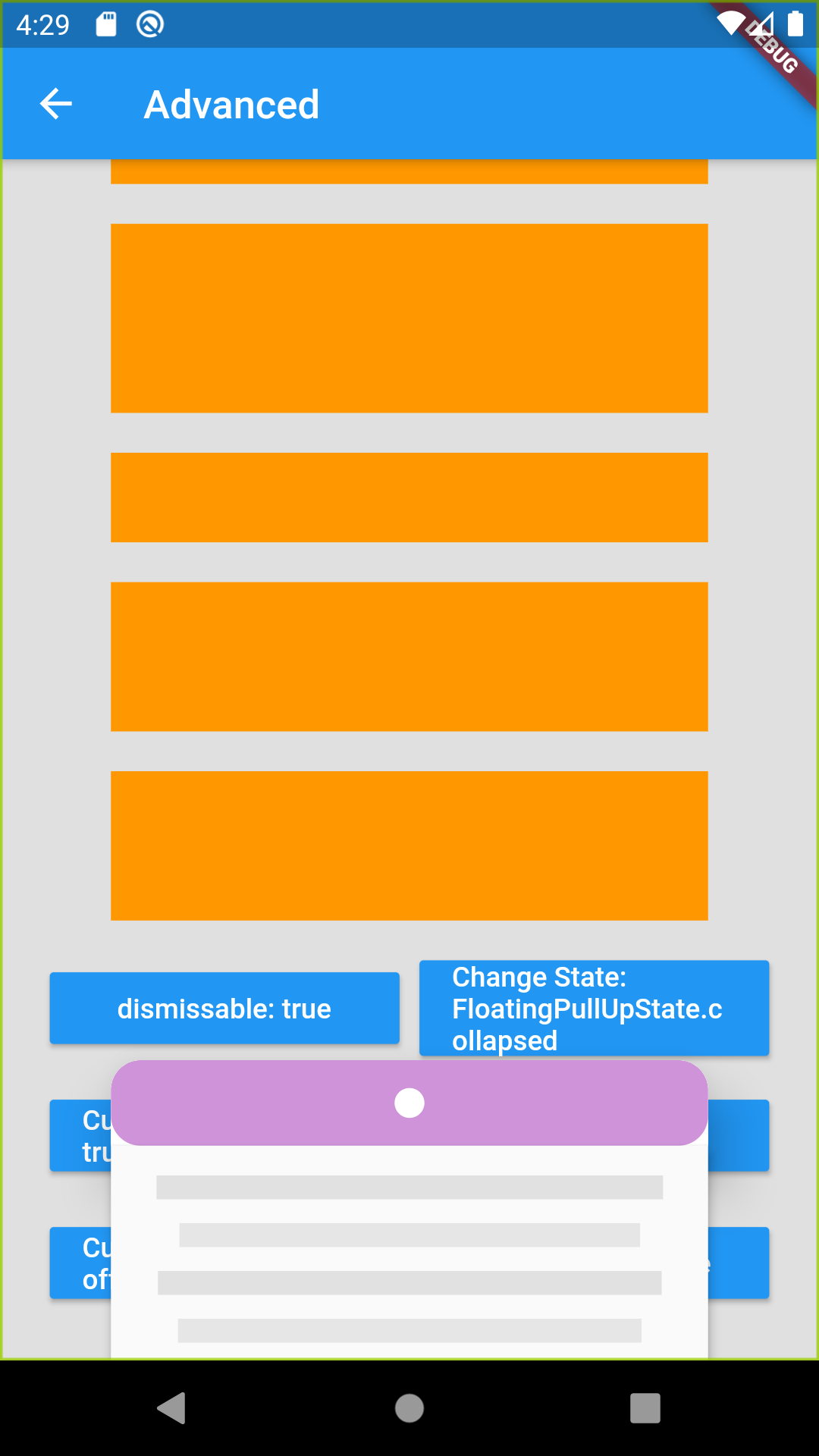
Flutter용 시각적으로 매력적이고 사용자 정의 가능한 플로팅 풀업 카드 위젯으로, 하단 패널 상호작용을 향상시키기 위해 설계되었습니다. 화면 하단에서 끌어올려 부유하는 드래그 가능한 카드의 동작을 모방하며, 부드러운 애니메이션과 반응성 있는 제스처를 제공합니다. 모달, 세부 보기 또는 인터랙티브 오버레이에 이상적입니다. Android, iOS, Web, macOS, Windows, Linux 등 여러 플랫폼을 지원하여 기기 간 일관된 동작을 보장합니다.
사용 사례
상호작용 가능한 하단 패널
모달 세부 보기
드래그 가능한 콘텐츠 오버레이
사용자 프로필 확장기
폼 위자드
주요 기능
부드러운 드래그 앤 풀 애니메이션
사용자 지정 가능한 높이 및 외관
크로스 플랫폼 호환성
제스처 반응형 디자인
사용자 정의 가능한 스냅 포인트
기존 UI와의 간편한 통합
적합한 대상
인터랙티브한 바텀 시트를 개발하는 개발자
우아한 UI 컴포넌트를 찾는 디자이너
확장 가능한 콘텐츠 카드가 필요한 앱
풍부한 사용자 상호작용을 갖춘 모바일 우선 애플리케이션
터치 친화적인 패널이 필요한 웹 및 데스크톱 앱
고려 사항
복잡한 레이아웃을 위해 추가 스타일링이 필요할 수 있습니다
무거운 콘텐츠를 가진 저사양 기기에서의 성능 영향
동적 콘텐츠에 대한 내장 검증이 제한되어 있음
전체 화면 전환에 적합하지 않음
중첩 스크롤 뷰를 주의 깊게 다뤄야 합니다
원본 README
연결된 소스 저장소의 README 원문 스냅샷입니다. 최신 내용은 저장소에서 확인하세요.
floating_pullup_card
A beautiful and custom floating pull up style Card for flutter
💻 Installation
In the dependencies: section of your pubspec.yaml, add the following line:
/// The [Widget] to be used as the content of the main layout, not the card contentfinalWidget child;
/// The [Widget] to be used as the content of the floating cardfinalWidget body;
/// Set a custom [height] for the floating card,/// defaults to `86%` of total height of parent container or screen height if no finite height can be assumedfinaldouble height;
/// Set a custom [width] for the floating card,/// defaults to `100%` of total width of parent container or screen width if no finite width can be assumedfinaldouble width;
/// Set a [cardElevation] for the material,/// defaults to `4`finaldouble cardElevation;
/// If true , the card can be dragged until it's hidden from screen/// defaults to [false]finalbool dismissable;
/// Sets the [state] of the floating card,/// See enum [FloatingPullUpState] for more details/// Defaults to [FloatingPullUpState.collapsed]finalFloatingPullUpState state;
/// Set a custom card [color] to the card background/// defaults to [Colors.white]////// This doesnt take any effect if using [cardBuilder] is definedfinalColor cardColor;
/// Called each time the [FloatingPullUpState] is changedfinalValueChanged<FloatingPullUpState> onStateChange;
/// Defines a custom [dragHandleBuilder]finalDragHandleBuilder dragHandleBuilder;
/// Defines a custom [cardBuilder]finalFloatingCardBuilder cardBuilder;
/// Set a custom [borderRadius] of the default Card material////// This doesnt take any effect if using [cardBuilder] is definedfinalBorderRadius borderRadius;
/// if true , this automatically adds padding to the [child] container,/// avoiding the card to float on top of [child] content/// defaults to [true]final autoPadding;
/// Sets a custom function that return a custom `Y Offset` for state [FloatingPullUpState.collapsed]/// Please take into account that offset start from top to bottomStateOffsetFunction collpsedStateOffset;
/// Sets a custom function that return a custom `Y Offset` for state [FloatingPullUpState.hidden]/// Please take into account that offset start from top to bottomStateOffsetFunction hiddenStateOffset;
/// Sets a custom function that return a custom `Y Offset` for state [FloatingPullUpState.uncollapsed]/// Please take into account that offset start from top to bottomStateOffsetFunction uncollpsedStateOffset;
/// Defines a callback to be called when a user taps outside the card/// If function returns [FloatingPullUpState] it will change state to the returned one/// Take into account that this is not getting called if a widget inside body is already handling a `Gesture`finalFloatingPullUpStateFunction() onOutsideTap;
/// If true, this will show an overlay behind the card tht obscures content behind/// Defaults to[false]finalbool withOverlay;
/// Defines the `color` of the overlay , this only takes effect of [withOverlayOption] is truefinalColor overlayColor;
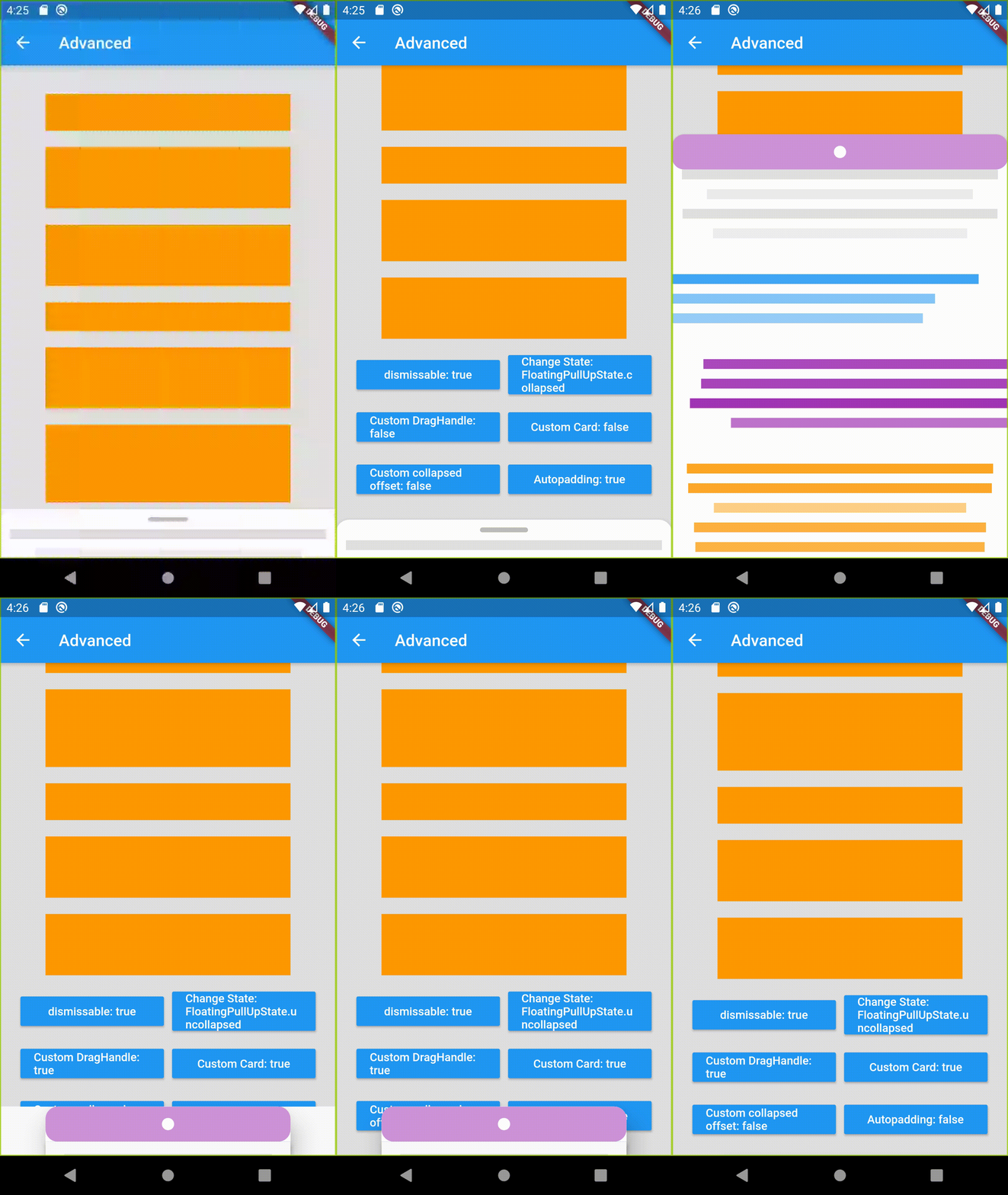
More Screenshots
Getting Started
This project is a starting point for a Dart
package,
a library module containing code that can be shared easily across
multiple Flutter or Dart projects.
For help getting started with Flutter, view our
online documentation, which offers tutorials,
samples, guidance on mobile development, and a full API reference.