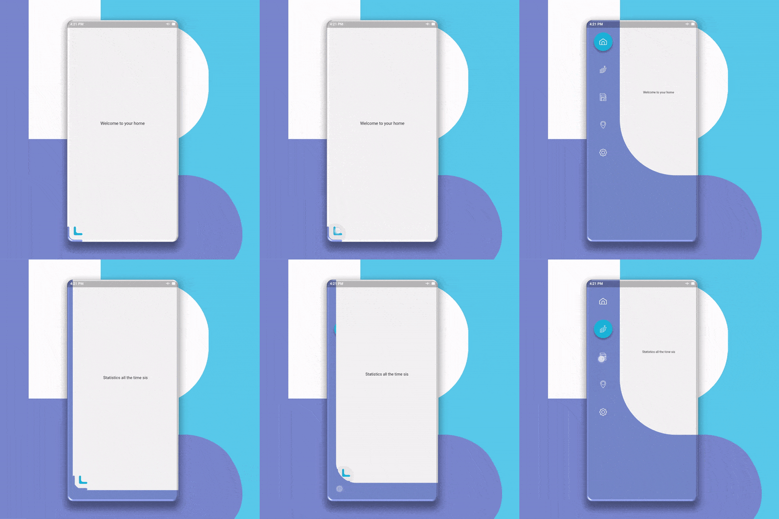
Flurry Navigation은 사용자 정의 가능한 색상, 형태 및 네비게이션 로직을 제공하는 부드럽고 애니메이션 기능이 있는 Flutter 패키지입니다. 메인 화면 콘텐츠에 영향을 주지 않으면서 사용자 경험을 향상시키기 위해 설계되었으며, 네비게이션에 깔끔하고 현대적인 접근 방식을 제공합니다. 우아한 전환과 유연한 레이아웃 제어가 필요한 앱에 적합하며, 기존의 Flutter 프로젝트에 원활하게 통합됩니다. 성능과 시각적 매력을 유지하면서도 사용자 맞춤 설정을 지원합니다.
사용 사례
사용자 정의 애니메이션 사이드 메뉴
부드러운 화면 전환
브랜드 네비게이션 드로어
인터랙티브 UI 컴포넌트
모바일 앱 네비게이션 바
동적 형태 기반 탐색
주요 기능
애니메이션 탐색 전환
조절 가능한 색상과 형태
비침습적 스크린 통합
사용자 정의 가능한 탐색 논리
가볍고 성능이 뛰어남
Flutter와의 간편한 통합
적합한 대상
애니메이션 탐색을 찾는 개발자
디자인 중심의 플러터 앱
브랜드 UI가 필요한 앱
원활한 UX를 필요로 하는 프로젝트
재사용 가능한 탐색 구성 요소를 원하는 팀
고려 사항
제한된 플랫폼 전용 기능
내장된 다크 모드 지원 없음
복잡한 흐름에 대해 수동 구성이 필요합니다
간단한부터 중간 정도의 탐색 구조에 가장 적합
대규모 탐색 계층에 최적화되지 않음
원본 README
연결된 소스 저장소의 README 원문 스냅샷입니다. 최신 내용은 저장소에서 확인하세요.
flurry_navigation
A Smooth and Animated navigation package for flutter that doesn’t interfere with the Screen with adjustable colors, shapes, and navigation logic.
Getting Started
First of all, Depend on the package.
dependencies:...flurry_navigation:^0.2.0#May not be the latest version
Changes to the Screens files
Add your code inside this variable below in every screen you want to navigate.
import'package:flurry_navigation/flurry_navigation.dart';
//The variable name must be uniquefinal firstscreen = newScreen(
);
Changes in the main file
First You should declare a variable called activeScreen.
var activeScreen;
Now add a Widget builder class that returns new FlurryNavigation.
Add values to these attributes to FlurryNavigation.
Widgetbuild(BuildContext context) {
newFlurryNavigation(
// The Icon data of the icon the BottomLeft
expandIcon: Image.asset("Put your path here"),
// The size of the icon on the BottomLeft
iconSize: 50.0,
// The content of the screen. leave it as it is
contentScreen: activeScreen,
)
}
Now add the menuScreen attribute FlurryNavigation and set it to the value below.
[If you want to use your own menu, contact me and I will provide you with the instructions].
Then add the "items" attribute to "Menu" and set it to the list of items you want in the menu "which usually matches the no. of screens", with "new MenuItem" like the example below.
Widgetbuild(BuildContext context) {
returnnewFlurryNavigation(
...
menuScreen: newMenuScreen(
menu: newMenu(
items: [
//You can add as many items as you want, it's scrollable!!newMenuItem(
id: 'hom',//Set this to whatever you want but do not duplicate it. !Required!
icon: 'assets/hom.png',//Set this to the path of the data for the icon of the button !Required!
isSelected: true ,//make sure the default item "isSelected" attribute is set to "true" !Required!
selectedBtnColor: Color.fromRGBO(38, 198, 218, 1//the color of the item if activated !Required!
btnShape: BoxShape.rectangle
//the shape of the item !Required!
#disabledBtnColor: Colors.transparent, //this have a default value of Colors.transparent
#selectedShadowColor: Colors.blueGrey, //this have a default value of Colors.blueGrey
#disabledShadowColor: Colors.transparent
), //this have a default value of Colors.transparent,newMenuItem(
id: 'sta',
icon: 'assets/sta.png',
isSelected: false,
selectedBtnColor: Color.fromRGBO(38, 198, 218, 1),
btnShape: BoxShape.rectangle
)
]
)
)
)
}
Now add the onMenuItemSelected attribute to "MenuScreen" to specify the logic for the navigation.
Widgetbuild(BuildContext context) {
newFlurryNavigation(
...
menuScreen: newMenuScreen(
...
//this is the logic behind the navigation. tailor the code below to fit your needs. If you want any help message me.
onMenuItemSelected: (String itemId) {
if (itemId == 'hom') {
setState(() => activeScreen = firstscreen);
} elseif (itemId == 'sta') {
setState(() => activeScreen = secondscreen);
}
},
),
);
}
Notice
This is my first markdown file so if you see any problems you're free to open an issue.
You can find a standalone full example in the example app or in the Github repo
Contributing
Pull requests are welcome. For major changes, please open an issue first to discuss what you would like to change.