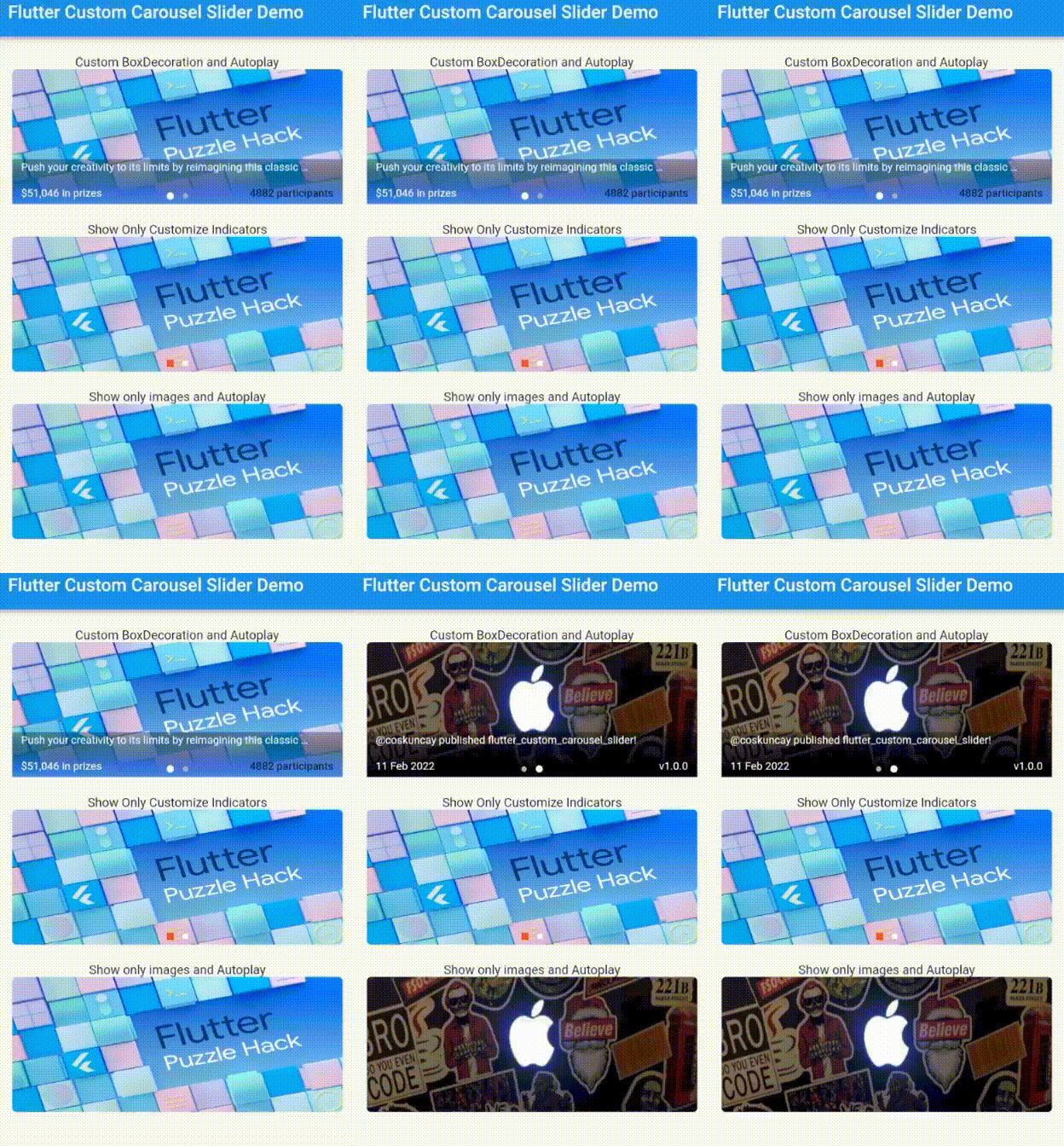
연결된 소스 저장소의 README 원문 스냅샷입니다. 최신 내용은 저장소에서 확인하세요.
flutter_custom_carousel_slider
A carousel slider Flutter widget, supports custom decoration suitable for news and blog.
Table of contents
Demo
Supported Platforms
Flutter Android
Flutter iOS
Flutter web
Flutter desktop
Installation
dependencies:
  flutter_custom_carousel_slider: ^1.0.0
Using
import 'package:flutter/material.dart' ;
import 'package:flutter_custom_carousel_slider/flutter_custom_carousel_slider.dart' ;
void main () {
runApp (const MyApp ());
}
class MyApp extends StatelessWidget const MyApp ({Key ? key}) : super (key: key);
@override
Widget build (BuildContext context) {
return MaterialApp (
title: 'Flutter Demo' ,
theme: ThemeData (
primarySwatch: Colors .blue,
),
home: const MyHomePage (title: 'Flutter Custom Carousel Slider Demo' ),
debugShowCheckedModeBanner: false ,
);
}
}
class MyHomePage extends StatefulWidget const MyHomePage ({Key ? key, required this .title}) : super (key: key);
final String title;
@override
State <MyHomePage > createState () => _MyHomePageState ();
}
class _MyHomePageState extends State <MyHomePage > List <CarouselItem > itemList = [
CarouselItem (
image: const NetworkImage (
'https://miro.medium.com/max/1400/1*RpaR1pTpRa0PUdNdfv4njA.png' ,
),
boxDecoration: BoxDecoration (
gradient: LinearGradient (
begin: FractionalOffset .bottomCenter,
end: FractionalOffset .topCenter,
colors: [
Colors .blueAccent.withOpacity (1 ),
Colors .black.withOpacity (.3 ),
],
stops: const [0.0 , 1.0 ],
),
),
title:
'Push your creativity to its limits by reimagining this classic puzzle!' ,
titleTextStyle: const TextStyle (
fontSize: 12 ,
color: Colors .white,
),
leftSubtitle: '\$51,046 in prizes' ,
rightSubtitle: '4882 participants' ,
rightSubtitleTextStyle: const TextStyle (
fontSize: 12 ,
color: Colors .black,
),
onImageTap: (i) {},
),
CarouselItem (
image: const NetworkImage (
'https://pbs.twimg.com/profile_banners/1444928438331224069/1633448972/600x200' ,
),
title: '@coskuncay published flutter_custom_carousel_slider!' ,
titleTextStyle: const TextStyle (
fontSize: 12 ,
color: Colors .white,
),
leftSubtitle: '11 Feb 2022' ,
rightSubtitle: 'v1.0.0' ,
onImageTap: (i) {},
),
];
@override
Widget build (BuildContext context) {
return Scaffold (
appBar: AppBar (
title: Text (widget.title),
),
body: SingleChildScrollView (
child: Center (
child: Column (
children: [
const SizedBox (height: 20 ),
Column (
children: [
const Text ('Custom BoxDecoration and Autoplay' ),
CustomCarouselSlider (
items: itemList,
height: 150 ,
subHeight: 50 ,
width: MediaQuery .of (context).size.width * .9 ,
autoplay: true ,
),
],
),
const SizedBox (height: 20 ),
Column (
children: [
const Text ('Show Only Customize Indicators' ),
CustomCarouselSlider (
items: itemList,
height: 150 ,
subHeight: 50 ,
width: MediaQuery .of (context).size.width * .9 ,
autoplay: false ,
showText: false ,
showSubBackground: false ,
indicatorShape: BoxShape .rectangle,
selectedDotColor: Colors .red,
unselectedDotColor: Colors .white,
),
],
),
const SizedBox (height: 20 ),
Column (
children: [
const Text ('Show only images and Autoplay' ),
CustomCarouselSlider (
items: itemList,
height: 150 ,
subHeight: 50 ,
width: MediaQuery .of (context).size.width * .9 ,
autoplay: true ,
showSubBackground: false ,
showIndicator: false ,
showText: false ,
),
],
),
],
),
),
),
);
}
}
CustomCarouselSlider
Name
Type
Default
items
List
*required
height
double
200.0
subHeight
double
height*.4
width
double
200.0
showIndicator
bool
true
showSubBackground
bool
true
showText
bool
true
autoplay
bool
true
animationCurve
Curve
Curves.ease
animationDuration
Duration
300ms
autoplayDuration
Duration
3s
indicatorShape
BoxShape
BoxShape.circle
dotSpacing
double
5.0
selectedDotColor
Color
Colors.white
selectedDotHeight
double
8.0
selectedDotWidth
double
8.0
unselectedDotColor
Color
Color(0XFFACAEBA)
unselectedDotHeight
double
6.0
unselectedDotWidth
double
6.0
boxPaddingHorizontal
double
10.0
boxPaddingVertical
double
2.0
CarouselItem
Name
Type
image
NetworkImage
title
String
titleTextStyle
TextStyle
leftSubtitle
String
leftSubtitleTextStyle
TextStyle
rightSubtitle
String
rightSubtitleTextStyle
TextStyle
onImageTap
Function(int)
boxDecoration
BoxDecoration
License
MIT Copyright (c) 2022, Emre Coşkunçay