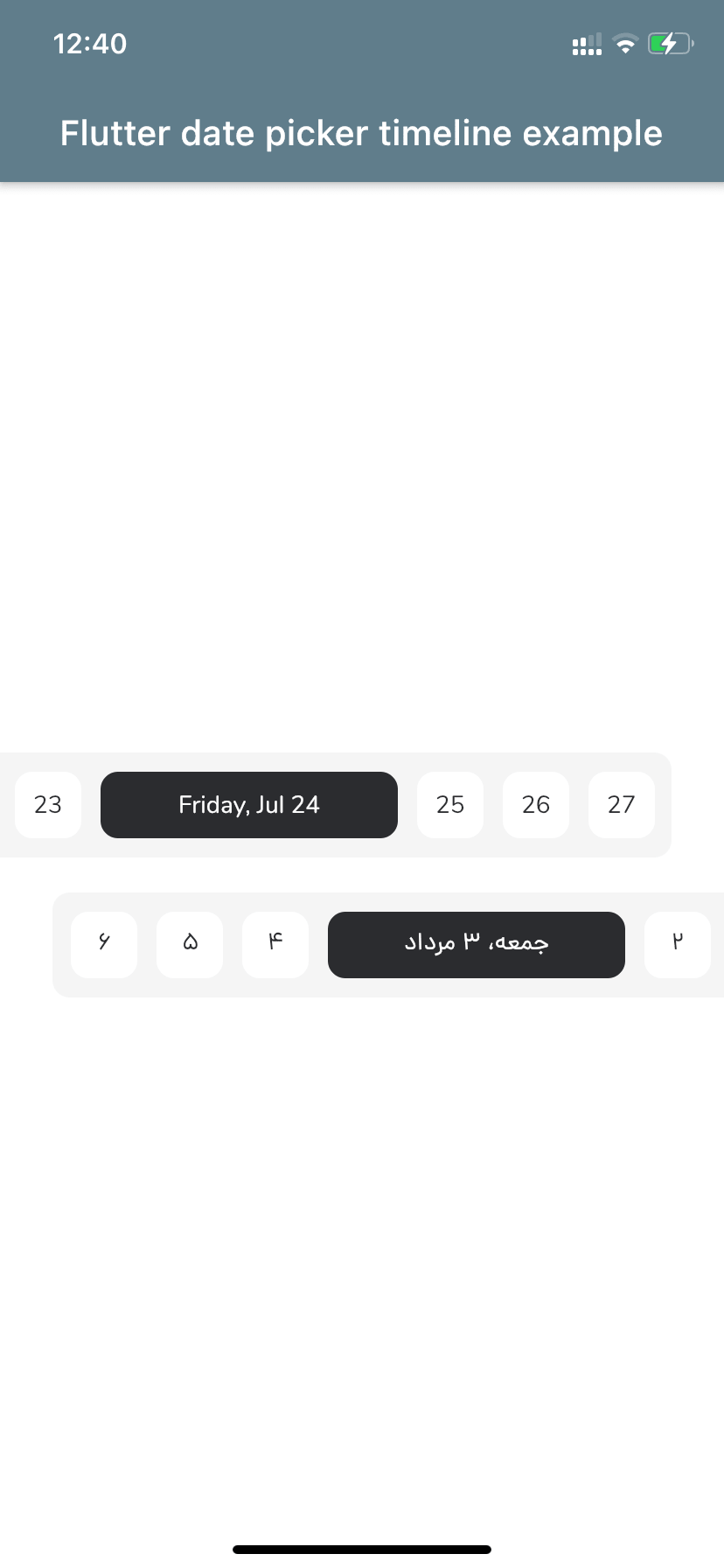
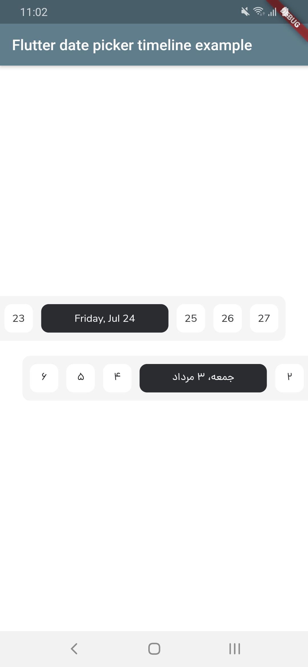
플러터용 사용자 정의 가능한 날짜 선택기로, 날짜를 수평적인 시간선으로 표시하며, 그레고리력과 자라리(페르시아) 역법을 모두 지원합니다. 부드러운 스크롤링과 시각적 피드백을 통해 사용자가 직관적으로 날짜를 선택할 수 있도록 합니다. 스케줄링, 계획, 캘린더 기반 워크플로우와 같이 장기간에 걸쳐 날짜 탐색이 필요한 앱을 위한 것입니다. 안드로이드, iOS, 웹, 맥OS, 윈도우, 리눅스 등 주요 모든 플랫폼에서 작동합니다.
사용 사례
스케줄링 애플리케이션
캘린더 기반 작업 계획자
이벤트 예약 인터페이스
여행 일정 관리
장기 프로젝트 일정
주요 기능
그레고리력 및 자라리력 지원
수평 스크롤 가능한 타임라인 인터페이스
사용자 정의 가능한 외관 및 스타일
크로스 플랫폼 호환성
스무스한 날짜 탐색
사용자 정의 가능한 날짜 범위 및 선택 모드
적합한 대상
장기간 날짜 선택이 필요한 앱
페르시아어 사용자들을 대상으로 하는 개발자
이중 캘린더 지원을 필요로 하는 프로젝트
UI 중심 캘린더 구현
다중 플랫폼 Flutter 애플리케이션
고려 사항
최적의 사용자 경험을 위해 추가 스타일링이 필요할 수 있습니다
매우 큰 날짜 범위와 함께 성능
날짜 선택 외에는 내장 검증 기능이 제한적
영어 이외의 로케일에 대해 외부 현지화에 의존합니다
원본 README
연결된 소스 저장소의 README 원문 스냅샷입니다. 최신 내용은 저장소에서 확인하세요.
Flutter Date Picker Timeline
💥 Gregorian and Jalali customizable date picker as a horizontal timeline 💥
FlutterDatePickerTimeline({
Key key,
// Determines the [FlutterDatePickerTimeline] mode.this.calendarMode = CalendarMode.gregorian,
// The first date of [FlutterDatePickerTimeline].@requiredthis.startDate,
// The last date of [FlutterDatePickerTimeline].@requiredthis.endDate,
// Initially selected date.this.initialSelectedDate,
// Initially focused date(If nothing is provided, a [initialSelectedDate] will be used).this.initialFocusedDate,
// Used for setting the textDirection of [FlutterDatePickerTimeline].this.textDirection,
// Used for setting the width of selected items.this.selectedItemWidth = 170,
// Used for setting the width of unselected items.this.unselectedItemWidth = 38,
// Used for setting the height of selected and unselected items.this.itemHeight = 38,
// Used for setting the radius of selected and unselected items background.this.itemRadius = 10,
// Used for setting the padding of [ListView].this.listViewPadding = constEdgeInsets.only(right: 5.5, left: 5.5),
// Used for setting the margin of selected items.this.selectedItemMargin = constEdgeInsets.only(right: 5.5, left: 5.5),
// Used for setting the margin of unselected items.this.unselectedItemMargin = constEdgeInsets.only(right: 5.5, left: 5.5),
// Used for setting the color of selected items background.this.selectedItemBackgroundColor = constColor(0xFF2B2C30),
// Used for setting the color of unselected items background.this.unselectedItemBackgroundColor = Colors.white,
// Used for setting the style of selected items [Text].this.selectedItemTextStyle,
// Used for setting the style of unselected items [Text].this.unselectedItemTextStyle,
// Called whenever any date gets selected.@requiredthis.onSelectedDateChange,
}) : super(key: key);
Props
props
types
defaultValues
calendarMode
CalendarMode
CalendarMode.gregorian
startDate
DateTime
endDate
DateTime
initialSelectedDate
DateTime?
initialFocusedDate
DateTime?
If nothing is provided, a [initialSelectedDate] will be used
textDirection
TextDirection?
If nothing is provided, a [calendarMode] will be used. (CalendarMode.gregorian -> TextDirection.ltr , CalendarMode.jalali -> TextDirection.rtl)