연결된 소스 저장소의 README 원문 스냅샷입니다. 최신 내용은 저장소에서 확인하세요.
Flutter Multiple Loaders
https://pub.dev/packages/flutter_multiple_loaders
A Flutter package providing a collection of customizable loading animations for your Flutter applications.
Define. Get. Set. Done.
🌐 Live Demo
Experience all the loaders in action: Flutter Multiple Loaders Demo
Requirements
Flutter SDK >= 1.17.0
Dart SDK >= 3.7.2
Features
This package includes multiple loading animation styles with customizable properties:
Standard Loaders
Spinner Loader : A classic spinning circular loaderPulse Loader : A circle that pulses in and outBounce Loader : Multiple dots that bounce up and downWave Loader : Multiple bars that animate in a wave-like patternCircle Loader : A circular progress indicator with customizable propertiesDots Loader : Multiple dots that fade in and out in sequenceRotating Square Loader : A square that rotates on its center axisFlipping Card Loader : A card that flips in 3DGlowing Loader : A circle with pulsing glow effects and gradient colorsTyping Loader : A typing indicator with animated dots, commonly used in chat applicationsBlinking Loader : A shape (circle, square, triangle, or star) that fades in and outRipple Loader : Concentric circles that expand outward like ripples on waterHeartbeat Loader : A realistic anatomical heart animation with authentic cardiac rhythm patternsHourglass Loader (new in 1.1.0) : A smooth hourglass with Bézier curves and animated sand flowClock Loader (new in 1.1.0) : An analog clock face with rotating hour and minute hands
Innovative Loaders
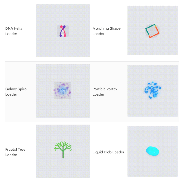
DNA Helix Loader : An animated double helix that rotates in 3D space with connecting "rungs" between the strandsMorphing Shape Loader : A shape that smoothly transitions between different geometric formsGalaxy Spiral Loader : A spiral galaxy with stars rotating around a glowing coreParticle Vortex Loader : Mesmerizing particles flowing in a vortex pattern with customizable flow speed and colorsFractal Tree Loader : A beautiful animated fractal tree that grows and branches organicallyLiquid Blob Loader : A morphing liquid-like blob with fluid motion and realistic highlightsPage Turning Loader : A book with smoothly turning pages that simulates a realistic reading animationHeartbeat Loader : A realistic anatomical heart animation with authentic cardiac rhythm patternsNeon Pulse Loader : Futuristic cyberpunk-style concentric neon rings with glow effects
🛠️ Developer Utilities (new in 1.1.0)
MultipleLoaders.showOverlayLoaderFutureBuilder<T>FutureBuilder wrapper that auto-shows a loader while waiting
All loaders feature:
Customizable sizes (extra small to extra large)
Custom colors (primary, secondary, tertiary, and quaternary)
Adjustable animation speed
Optional background colors
Animation control (start, stop, reset)
Screenshots
Standard Loaders
Loader
Preview
Loader
Preview
Spinner Loader Pulse Loader
Bounce Loader Wave Loader
Circle Loader Dots Loader
Rotating Square Loader Glowing Loader
Typing Loader Ripple Loader
HeartBeat Loader Hourglass Loader (screenshot coming soon)
Clock Loader (screenshot coming soon)
Innovative Loaders Gallery
Loader
Preview
Loader
Preview
DNA Helix Loader Morphing Shape Loader
Galaxy Spiral Loader Particle Vortex Loader
Fractal Tree Loader Liquid Blob Loader
Flipping Card Loader
Getting started
Add the dependency to your pubspec.yaml:
dependencies:
  flutter_multiple_loaders: ^1.1.0
Then run:
flutter pub get
Usage
Import the package:
import 'package:flutter_multiple_loaders/flutter_multiple_loaders.dart' ;
Basic Usage
Use any of the loaders with default options:
SpinnerLoader ();
PulseLoader ();
BounceLoader ();
WaveLoader ();
CircleLoader ();
BlinkingLoader ();
PageTurningLoader (
pageCount: 20 ,
options: LoaderOptions (
color: Colors .indigo,
secondaryColor: Colors .indigoAccent,
tertiaryColor: Colors .white,
durationMs: 3500 ,
),
);
HeartbeatLoader (
pulseIntensity: 0.4 ,
options: LoaderOptions (
color: Colors .red,
size: LoaderSize .large,
durationMs: 2000 ,
),
);
HourglassLoader (
options: LoaderOptions (
color: Colors .amber,
secondaryColor: Colors .amber.withOpacity (0.35 ),
size: LoaderSize .large,
strokeWidth: 3.0 ,
durationMs: 2400 ,
),
);
ClockLoader (
options: LoaderOptions (
color: Colors .deepPurple,
secondaryColor: Colors .deepPurpleAccent,
size: LoaderSize .large,
strokeWidth: 3.0 ,
durationMs: 3000 ,
),
);
🛠️ Developer Utilities (new in 1.1.0)
Loading Overlay Dialog
Display a full-screen loading barrier that blocks user interaction during async tasks:
MultipleLoaders .showOverlay (
context,
loader: const SpinnerLoader (
options: LoaderOptions (
color: Colors .white,
size: LoaderSize .large,
),
),
);
await myLongRunningTask ();
MultipleLoaders .hideOverlay (context);
LoaderFutureBuilder
A drop-in replacement for FutureBuilder that automatically shows a loader while the future is pending:
LoaderFutureBuilder <String >(
future: myNetworkRequest (),
loader: const CircleLoader (
options: LoaderOptions (
color: Colors .teal,
size: LoaderSize .large,
strokeWidth: 4.0 ,
),
),
builder: (context, data) {
return Text ('Loaded: $data ' );
},
)
Customizing Loaders
All loaders accept custom options through the LoaderOptions class:
SpinnerLoader (
options: LoaderOptions (
color: Colors .purple,
size: LoaderSize .large,
durationMs: 1000 ,
loop: true ,
),
);
WaveLoader (
barCount: 5 ,
options: LoaderOptions (
color: Colors .blue,
secondaryColor: Colors .green,
tertiaryColor: Colors .orange,
size: LoaderSize .medium,
),
);
Controlling Animation Programmatically
Use the LoaderController to control the animation:
class _MyWidgetState extends State <MyWidget > final LoaderController _controller = LoaderController ();
@override
Widget build (BuildContext context) {
return Column (
children: [
SpinnerLoader (controller: _controller),
ElevatedButton (
onPressed: () => _controller.start (),
child: Text ('Start' ),
),
ElevatedButton (
onPressed: () => _controller.stop (),
child: Text ('Stop' ),
),
ElevatedButton (
onPressed: () => _controller.reset (),
child: Text ('Reset' ),
),
],
);
}
}
Interactive Example
The package includes a complete example app that demonstrates all loaders with interactive controls for customization. The example app allows you to:
Switch between different loader types via category tabs (Standard / Innovative)
Change sizes, colors, and stroke widths via the control panel
Control animation duration
Start, stop, and reset animations
Try interactive Developer Utilities demos (Overlay & FutureBuilder)
Copy ready-to-use code snippets for every loader
Check the example folder for more detailed usage examples.
Additional information
Contributing
Contributions are welcome! Feel free to open an issue or submit a pull request.
License
This package is licensed under the MIT License - see the LICENSE file for details.