패키지, 저장소 및 앱 카테고리 검색

flutter_responsive 표지
패키지 상세v1.1.0

flutter_responsive

Flutter용 반응형 레이아웃 위젯. 이 플러그인은 부트스트랩 웹 프로젝트에서 영감을 받았습니다.

AndroidiOSWebmacOSWindowsLinux
30일 다운로드
2.1천
좋아요
30
Pub 점수
140

패키지 설치

flutter pub add flutter_responsive

패키지 개요

공개 정보를 바탕으로 생성한 선택 가이드입니다.

Flutter Responsive는 부트스트랩의 적응형 디자인 접근 방식을 영감으로 삼아 Flutter에서 반응형 사용자 인터페이스를 만들기 위해 설계된 레이아웃 위젯 세트를 제공합니다. 개발자는 다양한 화면 크기와 방향에 자동으로 조정되는 레이아웃을 구축할 수 있으며, 여러 플랫폼에서 작동합니다. 복잡한 사용자 정의 로직 없이도 유연한 그리드, 브레이크포인트 및 반응형 컴포넌트의 구현을 간소화합니다. 모바일, 태블릿, 웹, 데스크톱 장치에서 일관된 UI가 필요한 앱에 이상적입니다.

사용 사례

  • 크로스 플랫폼 반응형 대시보드 구축
  • 모바일 및 웹을 위한 적응형 레이아웃 만들기
  • 태블릿 및 데스크톱용 확장 가능한 UI 설계
  • 그리드 기반 반응형 디자인 구현
  • 장치 유형 간에 일관된 UX 보장

주요 기능

  • 브레이크포인트 기반 레이아웃 조정
  • 유연한 그리드 시스템
  • 크로스 플랫폼 호환성
  • 부트스트랩을 영감으로 한 디자인 패턴
  • 기존 Flutter 프로젝트와의 간편한 통합

적합한 대상

  • 다양한 플랫폼을 대상으로 하는 개발자
  • 반응형 관리 패널을 구축하는 팀
  • 적응형 UI가 필요한 프로젝트
  • 프론트엔드 중심의 플러터 애플리케이션
  • 다양한 화면 크기 요구 사항을 가진 앱

고려 사항

  • 새로운 위젯 규약을 배워야 할 수 있습니다
  • 수동 레이아웃 코드 작성에 비해 사용자 정의가 제한적입니다
  • 플랫폼 고유의 렌더링 동작에 따라 다릅니다
  • 일반 그리드 레이아웃에 가장 적합
  • 매우 동적 또는 그리드가 아닌 UI에는 적합하지 않음

원본 README

연결된 소스 저장소의 README 원문 스냅샷입니다. 최신 내용은 저장소에서 확인하세요.

About flutter_responsive plugin

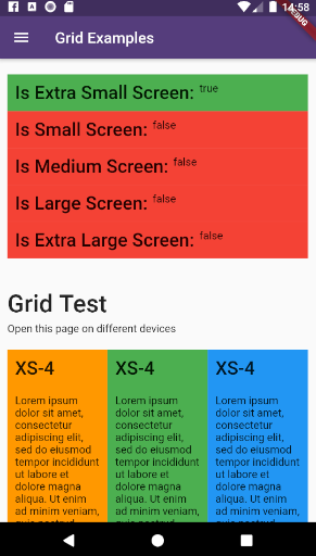
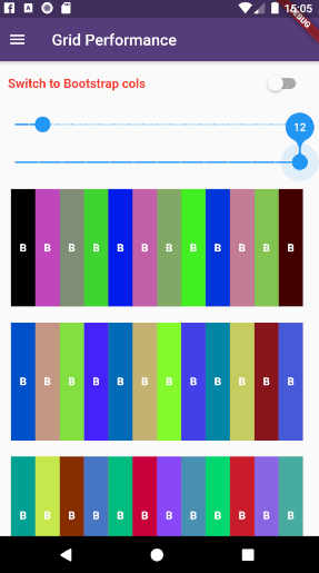
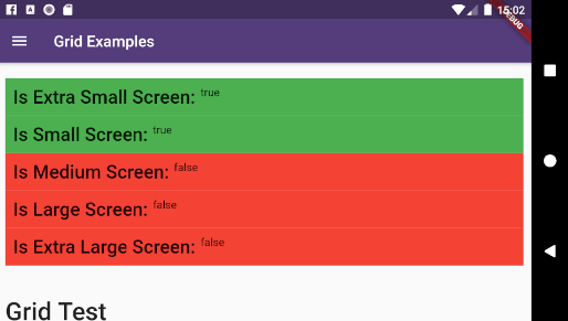
example_6 example_7

This plugin provides a easy and productive way to work with responsive layouts for Flutter Applications in mobile, desktop and web, allowing your layout to adapt and wrap widgets ( Container, Rows, Columns and RichText ) referent to the size of his parent element.

Made by Rafael Setragni to all Flutter's Community.

Licensing

This project follows the GNU General Public License V3, wich means you can change the entire project the way as you want to, but you need to share your improvements back to the community.

To share your improvements, please first do a Fork of this project, change what you need to and finally do a pull request. And don´t let to share your ideas and needs on "Issues" page, even before to start your changes.

IMPORTANT NOTES:

  • This plugin was based on Bootstrap Web Project, but do not implement all its features (not yet).
  • The column's layer responsiveness is based on the size of the global screen, such as Bootstrap does.
  • All the widgets contains margin, padding, width, height (maximum and minimum edges), such as div Html element.
  • Fell free to improve and change this project.

How to Use

Add the dependency bellow into your pubspec.yaml file.

dependencies:
  flutter_responsive: ^0.0.6 #Please, ensure to use the most updated version

Add the reference into your .dart files

import 'package:flutter_responsive/flutter_responsive.dart';

Use the Widgets ResponsiveContainer, ResponsiveRow, ResponsiveCol and JSX as the way you want to.

Screen Sizes

This plugin was based on Bootstrap web project and split the screen in 12 columns, considering 7 screen sizes:

  • US - Ultra Small Screens - 0px to 309px
  • XS - Extra Small Screens - 310px to 575px
  • SM - Small Screens - 576px to 767px
  • MD - Medium Screens - 768px to 991px
  • LG - Large Small Screens - 992px to 1199px
  • XL - Extra Large Screens - 1200px to 1999px
  • UL - Ultra Large Screens - 2000px and beyond

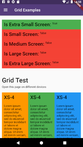
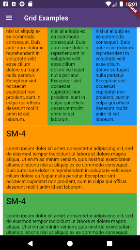
example_1 example_2 example_3 example_4

Personalizing limits (Optional)

All the limits could be personalized as you need, changing the limit Hashmap into ResponsiveScreen class.

/* Map<String, double> */
ResponsiveScreen.limits = {
    ScreenSize.us: 0.00,
    // Smart watches
    ScreenSize.xs: 310.00,
    // Small phones (5c)
    ScreenSize.sm: 576.00,
    // Medium phones
    ScreenSize.md: 768.00,
    // Large phones (iPhone X)
    ScreenSize.lg: 992.00,
    // Tablets
    ScreenSize.xl: 1200.00,
    // Laptops
    ScreenSize.ul: 2000.00,
    // Desktops and TVs 4K
  };

Grid Usage

This plugin have 3 major grid elements:

  • ResponsiveContainer: Container to all page elements, such as Rows and Columns, centralizing the content and beeing limited to a maximum width size
ResponsiveContainer(

  // Determines the container's limit size
  widthLimit: ResponsiveScreen.limits[ScreenSize.lg],
  margin: EdgeInsets.symmetric(horizontal: 10),
  
  children: <Widget>[
  
    ResponsiveRow(),
    ResponsiveRow(),
    ResponsiveRow(),
    
  ]
)
  • ResponsiveRow: Container wich contains many columns or even other widget. OBS: Its not necessary to wrap inner widgets into a ResponsiveCol object.
ResponsiveRow(

  margin: EdgeInsets.only(top: 20, bottom: 5),
  
  children: <Widget>[
  
    ResponsiveCol(),
    ResponsiveCol(),
    ResponsiveCol(),
    
    Text('It´s fine to use another widget directly inside a ResponsiveRow')
  ]
),
  • ResponsiveCol:
ResponsiveCol(
  margin: EdgeInsets.all(10),
  padding: EdgeInsets.all(10),
  backgroundColor: Colors.blue,
  gridSizes: {
      ScreenSize.xs : 4,
      ScreenSize.sm : 3,
      ScreenSize.lg : 2,
      ScreenSize.xl : 1,
  },
  children: [
      Text('Lorem ipsum dolor sit amet, consectetur adipiscing elit')
  ]
)

Full Example

import 'package:flutter/material.dart';
import 'package:flutter_responsive/flutter_responsive.dart';

class HomePage extends StatefulWidget {
  @override
  _HomePage createState() => _HomePage();
}

class _HomePage extends State<HomePage> {

  @override
  void initState() {
    super.initState();
  }

  @override
  Widget build(BuildContext context) {

    /*create 12 columns*/
    List<Widget> responsiveGridExample =

      /*repeat 12 times*/
      List<int>.generate(12, (index) => index).map((colIndex) =>
          ResponsiveCol(
              padding: EdgeInsets.all(10),
              backgroundColor: Colors.blue,
              gridSizes: {
                ScreenSize.xs : 4,
                ScreenSize.sm : 3,
                ScreenSize.lg : 2,
                ScreenSize.xl : 1,
              },
              children: [
                Text('Lorem ipsum dolor sit amet, consectetur adipiscing elit')
              ]
          )
      ).toList();

    MediaQueryData mediaQuery = MediaQuery.of(context);

    return Scaffold(
        appBar: AppBar(
          title: const Text('Home', overflow: TextOverflow.ellipsis),
        ),
        body: Container(
          color: Color(0xFFCCCCCC),
          child: ListView(
            children: <Widget>[
              ResponsiveContainer(
                margin: EdgeInsets.symmetric(vertical: 10),
                padding: EdgeInsets.symmetric(horizontal: 10),
                backgroundColor: Colors.white,
                widthLimit: mediaQuery.size.width * 0.95,
                children: <Widget>[
                  ResponsiveRow(
                    margin: EdgeInsets.symmetric(vertical: 10),
                    children: <Widget>[

                      ResponsiveCol(
                          padding: EdgeInsets.all(10),
                          margin: EdgeInsets.only(bottom: 20),
                          backgroundColor: Colors.blueGrey,
                          children: [
                            Text('Flutter Responsive Layout', style: JSXTypography.h4.merge(TextStyle(color: Colors.white)))
                          ]
                      ),
                    ]
                  ),
                  ResponsiveRow(
                    margin: EdgeInsets.symmetric(vertical: 10),
                    children: <Widget>[

                      // By default, the column occupies the entire row, always
                      ResponsiveCol(
                        children: [
                          JSX(
                            shrinkToFit: true,
                            padding: EdgeInsets.only(bottom: 20),
                            stylesheet: {
                              'h3': JSXStylesheet(
                                  textStyle: TextStyle(color: Theme.of(context).primaryColor),
                                  displayLine: DisplayLine.block
                              ),
                              'h6': JSXStylesheet(
                                  textStyle: TextStyle(color: Theme.of(context).primaryColor),
                                  displayLine: DisplayLine.block
                              )
                            },
                            margin: EdgeInsets.symmetric(horizontal: 10, vertical: 20),
                            text:
                            '<div>'
                                '<h3>Responsive Layouts</h3><h6>for <i>Flutter</i></h6>'
                                '<br><br>'
                                '<p>This <b>RichText</b> was easily produced and personalized using pure HTML</p>'
                                '<p>Bellow there is an example of 12 columns, wich changes the amount of each line depending of his father´s widget size.</p>'
                            '</div>',
                          )
                        ]
                      )

                    ]..addAll(
                        responsiveGridExample
                    )
                  )
                ],
              )
            ],
          ),
        )
    );
  }
}
Final result:

example_9

How to run the plugin example

This project is a starting point for a Flutter plug-in package, a specialized package that includes platform-specific implementation code for Android and/or iOS.

For help getting started with Flutter, view our online documentation, which offers tutorials, samples, guidance on mobile development, and a full API reference.

To run the full example App, wich contains performance and case tests, do the steps bellow:

  • Clone this project into your local machine using Github Desktop or any other git program of your preference.
  • Download Android Studio and the last Flutter SDK into your local machine. Configure they to works properly such as this article here
  • Run flutter pub get to update all the dependencies
  • Debug the file example/lib/main.dart or any of the unity case tests located on test folder on emulator or real device.
  • To run properly the performance tests, please run the app using flutter run --release

카테고리

소스 저장소

이 패키지를 사용하는 프로젝트

아직 데이터가 없습니다.