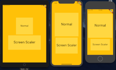
flutter_screen_scaler는 `50.h`, `30.w`, `16.sp`와 같은 퍼센트 기반 확장 기능을 사용하여 화면 크기에 따라 위젯과 글꼴 크기를 동적으로 조정할 수 있는 반응형 UI 패키지입니다. 화면 높이, 너비 및 폰트 스케일에 따라 자동으로 크기를 조정함으로써 다양한 기기에서 적응형 레이아웃을 쉽게 만들 수 있습니다. Flutter의 위젯 트리와 원활하게 통합되며 Android, iOS, Web, macOS, Windows, Linux 등 모든 주요 플랫폼을 지원합니다. 수동 계산 없이 다양한 화면 크기에서 일관된 디자인을 유지하고 싶은 개발자에게 이상적입니다.
사용 사례
다양한 화면 크기에 대응하는 반응형 레이아웃 만들기
장치 밀도에 따라 폰트를 동적으로 확대/축소하기
일관된 UI 크기로 크로스 플랫폼 앱 빌드하기
복잡한 UI에서 레이아웃 계산 간소화
장치 간에 일관된 간격과 크기 보장
주요 기능
백분율 기반 높이 및 너비 스케일링 (예: 50.h)
sp 단위(예: 16.sp)를 통한 글꼴 크기 조정
직관적인 구문을 위한 확장 메서드
크로스 플랫폼 지원
자동 화면 치수 감지
적합한 대상
반응형 Flutter 앱을 개발하는 개발자
여러 기기 유형을 대상으로 하는 팀
최소한의 수동 레이아웃 조정을 필요로 하는 프로젝트
일관성에 중점을 둔 UI 디자이너
확장 가능한 타이포그래피가 필요한 앱
고려 사항
최적의 스케일링을 위해 초기 설정이 필요할 수 있습니다
동작은 정확한 화면 메트릭에 따라 달라집니다
고정 크기 디자인에는 적합하지 않습니다
과도한 사용 시 성능에 영향을 줄 수 있음
반응형 디자인 원칙과 함께 사용하는 것이 가장 좋습니다
원본 README
연결된 소스 저장소의 README 원문 스냅샷입니다. 최신 내용은 저장소에서 확인하세요.
Flutter Screen Scaler
A Flutter package to effortlessly scale widget dimensions and font sizes based on screen percentages, now with convenient extension methods like 50.h, 30.w, and 16.sp.
This package helps you create responsive UIs that adapt to various screen sizes by simplifying the process of using screen-relative dimensions.
Static Initialization: Simple one-time setup with ScreenScaler.init(context).
Extension Methods: Intuitive syntax for scaling:
value.h: Percentage of screen height.
value.w: Percentage of screen width.
value.sp: Responsive font size, scales linearly with screen width.
Direct Percentage Scaling: getWidth() and getHeight() now provide straightforward percentage-based values.
Parent-Relative Scaling: Scale dimensions based on a percentage of an immediate parent widget's size using scaleWidthFrom(parentSize, percentage) and scaleHeightFrom(parentSize, percentage).
Utility Methods: Includes helpers for EdgeInsets (padding, margins) and BorderRadius.
Before using any screen-relative scaling methods or extension getters (.h, .w, .sp), you must initialize the ScreenScaler with a BuildContext. This is typically done once in your app, for example, in the build method of your main app widget or a root page.
@overrideWidgetbuild(BuildContext context) {
// Initialize the ScreenScalerScreenScaler.init(context);
returnMaterialApp(
// ... your app code
);
}
If ScreenScaler.init(context) is not called, a debug warning will be printed, and the scaler will operate with default (potentially incorrect) screen dimensions.
Usage Examples
Once initialized, you can use the extension methods or call methods on ScreenScaler.I.
1. Screen Percentage Scaling (Height and Width)
Use the .h and .w extension getters on any num (int or double) for concise scaling.
// In your widget's build method (after ScreenScaler.init has been called elsewhere)Container(
height: 50.h, // 50% of screen height
width: 80.w, // 80% of screen width
color: Colors.blue,
child: Center(child: Text('Scaled Container')),
);
2. Responsive Font Scaling
Use the .sp extension getter for font sizes that scale linearly with screen width.
Text(
  'Responsive Text',
  style: TextStyle(
    fontSize: 16.sp, // Font size 16, scaled for screen width
  ),
);
3. Direct Singleton Usage (Alternative)
You can also call methods directly on the ScreenScaler.I instance:
The package continues to provide utility methods for creating scaled EdgeInsets and BorderRadius values. These methods internally use the core screen scaling logic.
// Example using screen-relative scalingContainer(
padding: ScreenScaler.I.getPaddingAll(5.w), // Padding of 5% of screen width on all sides
margin: ScreenScaler.I.getMarginLTRB(2.w, 1.h, 2.w, 1.h),
decoration: BoxDecoration(
color: Colors.lightBlueAccent,
borderRadius: ScreenScaler.I.getBorderRadiusCircular(10.sp), // Radius scaled using .sp logic
),
child: Text('Styled Container'),
);
Note on getTextSize and getFullScreen
The methods getTextSize(percentage) (alias for getFullScreen(percentage)) are still available. However, please note that getFullScreen calculates its value using the formula (percentage / 100)^2 * (screenWidth + screenHeight). This results in a quadratic scaling for the percentage, which might not be intuitive for typical font size scaling. For standard linear font scaling, prefer using the .sp extension or ScreenScaler.I.getResponsiveFontSize().
Why Use This Package?
When developing Flutter applications, you often define widget sizes explicitly. While this works on your test device, these fixed sizes can lead to UI overflows or awkward layouts on devices with different screen dimensions.
flutter_screen_scaler solves this by allowing you to define sizes and font scales as percentages of the screen dimensions (or parent dimensions). This approach, similar to using percentages in web development, helps create UIs that are more adaptive and look consistent across a wider range of devices.
Example
Refer to the updated example/lib/main.dart for a comprehensive demonstration of the new API and features.