패키지, 저장소 및 앱 카테고리 검색

패키지 상세v1.0.5

flutter_sizer

Flutter Sizer는 보조 위젯과 확장 기능을 제공하여 반응형 레이아웃을 구현하는 데 도움을 줍니다.

AndroidiOSWebmacOSWindowsLinux
30일 다운로드
942
좋아요
24
Pub 점수
150

패키지 설치

flutter pub add flutter_sizer

패키지 개요

공개 정보를 바탕으로 생성한 선택 가이드입니다.

Flutter Sizer는 다양한 화면 크기와 방향에 맞춰 적응형 레이아웃을 가능하게 하는 반응형 UI 패키지입니다. 디바이스의 화면 치수를 기반으로 글꼴, 크기, 여백을 쉽게 조정할 수 있는 헬퍼 위젯과 확장 기능을 제공합니다. 화면의 너비와 높이를 활용하여 수동 계산 없이 다양한 기기에서 일관된 디자인 표시를 보장합니다. 최소한의 반복 코드로 유연하고 확장 가능한 인터페이스를 만들고자 하는 개발자에게 이상적입니다.

사용 사례

  • 다양한 화면 크기에 대응하는 반응형 레이아웃 만들기
  • 기기 간에 UI 요소를 비례적으로 확대/축소하기
  • 모바일 및 웹 앱에서 반응형 디자인 간소화
  • 일관된 간격과 타이포그래피 유지
  • 일관된 외관으로 크로스플랫폼 앱 빌드하기
  • UI 코드 내 수동 크기 계산 줄이기

주요 기능

  • 화면 크기에 따라 위젯의 자동 스케일링
  • 간편한 단위 변환을 위한 보조 확장
  • 세로 및 가로 모드 모두 지원
  • 몇 줄의 코드만으로 최소 설정
  • 크로스 플랫폼 호환성
  • Android, iOS, Web, macOS, Windows 및 Linux에 대한 내장 지원

적합한 대상

  • 반응형 Flutter 애플리케이션을 개발하는 개발자
  • 다양한 기기 간 일관된 UI를 우선시하는 팀
  • 빠른 반응형 레이아웃 구현이 필요한 프로젝트
  • 다양한 화면 크기를 가진 여러 플랫폼을 대상으로 하는 앱
  • 디자이너와 개발자가 픽셀 단위 정확한 레이아웃을 위해 밀접하게 협력하고 있습니다
  • 초보자가 반응형 플러터 패턴을 배우는 중

고려 사항

  • 사용자 정의 레이아웃 제약 조건을 사용할 때 조정이 필요할 수 있습니다
  • 매우 복잡하거나 비균일한 레이아웃에는 적합하지 않습니다
  • 과도한 위젯 중첩 시 성능에 미치는 영향
  • 다양한 화면 크기에서 신중한 테스트가 필요합니다
  • 일관된 디자인 시스템과 함께 사용하는 것이 가장 좋습니다
  • 고급 스케일링 로직에 대한 사용자 정의가 제한적입니다

원본 README

연결된 소스 저장소의 README 원문 스냅샷입니다. 최신 내용은 저장소에서 확인하세요.

Flutter Sizer

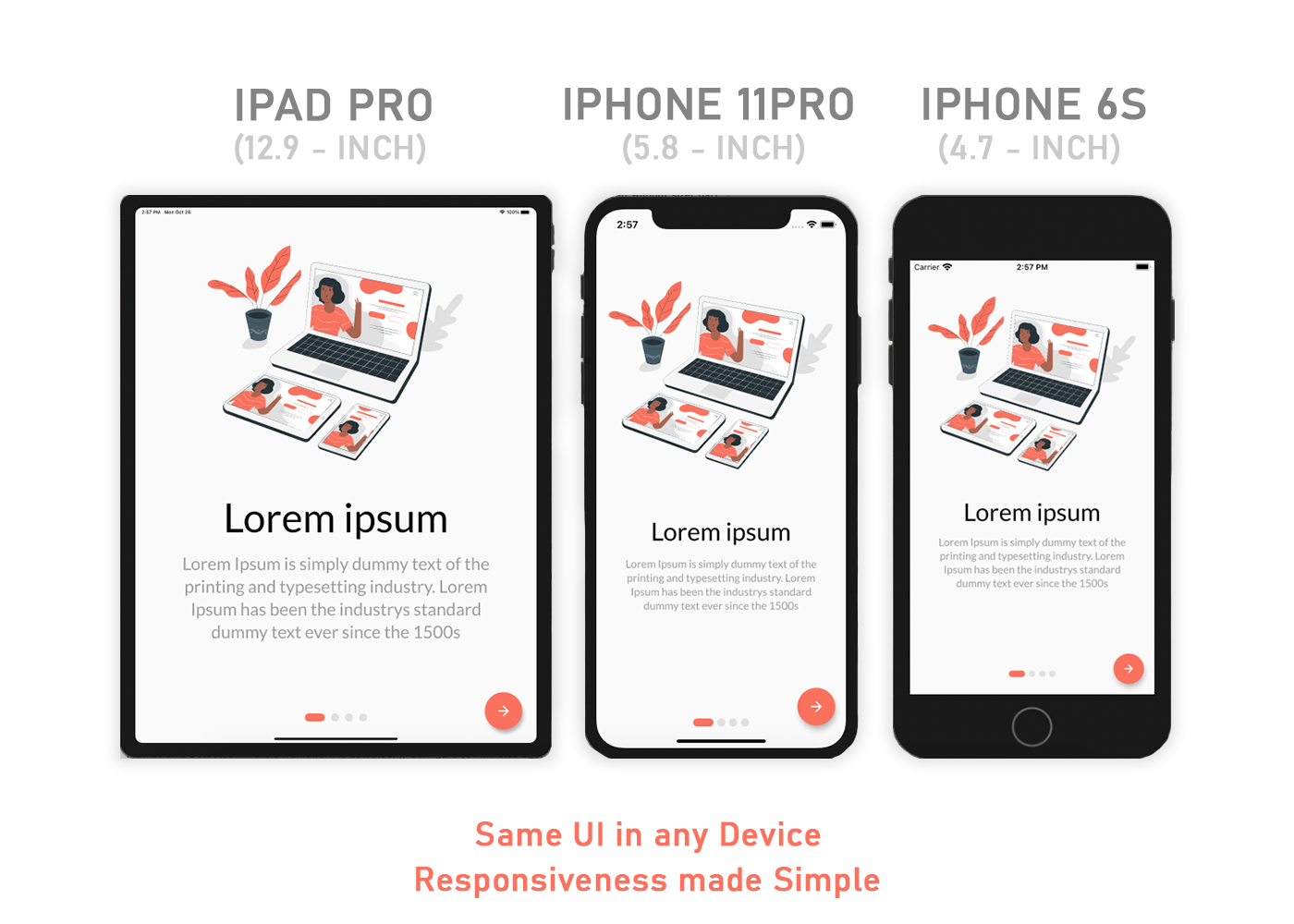
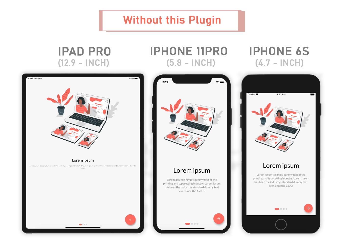
Flutter Sizer helps implement a responsive layout by providing helper widgets and extensions

Responsive Image

Responsive Image

Content

Installation

Add flutter_sizer to pubspec.yaml

dependencies:
  flutter_sizer: ^1.0.4

Parameters

  • Adaptive.h() - Returns a calculated height based on the device
  • Adaptive.w() - Returns a calculated width based on the device
  • Adaptive.sp() - Returns a calculated sp based on the device (deprecated)
  • Adaptive.dp() - Returns a calculated dp based on the device
  • .h - Returns a calculated height based on the device
  • .w - Returns a calculated width based on the device
  • .sp - Returns a calculated sp based on the device (deprecated)
  • .dp - Returns a calculated dp based on the device
  • Device.boxConstraints - Returns the Device's BoxConstraints
  • Device.orientation - Returns the Screen Orientation (portrait or landscape)
  • Device.screenType - Returns the Screen Type (mobile or tablet)
  • Device.devicePixelRatio - Returns the devicePixel Ratio or (1.0)

Usage

Import the Package

import 'package:flutter_sizer/flutter_sizer.dart';

Wrap MaterialApp with FlutterSizer widget

 FlutterSizer(
      builder: (context, orientation, screenType) {
        return MaterialApp();
      }
 )

Widget Size

Container(
  width: Adaptive.w(20),    // This will take 20% of the screen's width
  height: 30.5.h     // This will take 30.5% of the screen's height
)

Font size

Text(
  'Flutter Sizer', 
  style: TextStyle(fontSize: 15.dp),
)

Orientation

If you want to support both portrait and landscape orientations

Device.orientation == Orientation.portrait
  ? Container(   // Widget for Portrait
      width: 100.w,
      height: 20.5.h,
   )
  : Container(   // Widget for Landscape
      width: 100.w,
      height: 12.5.h,
   )

DeviceType

If you want the same layout to look different in tablet and mobile, use the Device.screenType method:

Device.screenType == ScreenType.tablet
  ? Container(   // Widget for Tablet
      width: 100.w,
      height: 20.5.h,
   )
  : Container(   // Widget for Mobile
      width: 100.w,
      height: 12.5.h,
   )

Take Note

You need to import flutter_sizer package in order to access number.h, number.w, and number.dp

Auto import in VSCode and Android Studio doesn't work for dart extension methods. Typing 10.h would not bring up auto import suggestion for this package

One workaround is to type Device so that the auto import suggestion would show up:

import 'package:flutter_sizer/flutter_sizer.dart';

Community Support

If you have any suggestions or issues, feel free to open an issue

If you would like to contribute, feel free to create a PR

카테고리

소스 저장소

이 패키지를 사용하는 프로젝트

아직 데이터가 없습니다.