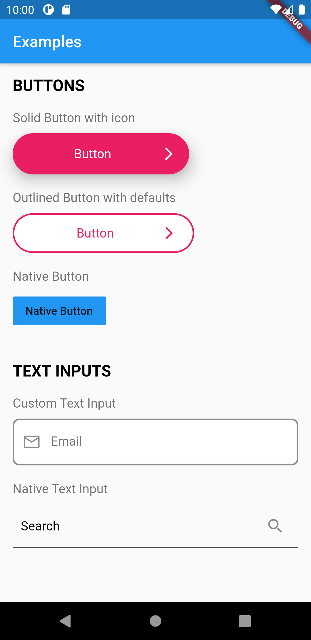
Flutter UI 툴킷은 앱 개발을 가속화하기 위해 사전에 구축된 재사용 가능한 위젯으로 구성된 포괄적인 라이브러리입니다. HTML과 CSS 클래스의 단순성에서 영감을 받아, 개발자들이 미리 준비된 컴포넌트를 사용하여 빠르게 인터페이스를 조립할 수 있도록 합니다. 이 툴킷은 일관성, 커스터마이징 및 사용 용이성을 강조하며, 반복 코드를 줄입니다. Android, iOS, macOS, Windows, Linux 등 여러 플랫폼을 지원하여 빠른 UI 반복이 필요한 크로스플랫폼 프로젝트에 이상적입니다.
사용 사례
빠른 프로토타이핑
크로스 플랫폼 앱 개발
일관된 UI 디자인
반복적인 위젯 코드 줄이기
UI 컴포넌트 재사용 간소화
주요 기능
사전 구축된 사용자 정의 가능한 위젯
스타일링을 위한 CSS 유사 클래스 시스템
다중 플랫폼 지원
최소한의 보일러플레이트
pub를 통한 간편한 통합
적합한 대상
프론트엔드 개발자
UI 중심 팀
빠르게 성장하는 스타트업
디자인 시스템 구현
초보자에서 중급자까지의 플러터 사용자
고려 사항
위젯 동작에 대한 세밀한 제어를 제한할 수 있음
외부 유지보수에 의존함
확장 없이 고도로 커스터마이즈된 UI에는 적합하지 않습니다
사용되지 않는 위젯이 포함되면 비대가 발생할 수 있음
클래스 기반 스타일링 접근법에 대한 학습 곡선
원본 README
연결된 소스 저장소의 README 원문 스냅샷입니다. 최신 내용은 저장소에서 확인하세요.
Flutter UI Toolkit
The development of this  package is still in progress. More widgets are to come.
However because the widgets are purely Flutter widgets, you can use it with no fear :)
Flutter UI Toolkit is a pre-built collection of the most used widgets to create apps,
the basic ones like: Buttons, Inputs, Headings, Dialogs, Action Sheets, etc..
The idea is that you can use these widgets the way you use classes in HTML and CSS and be a simple helper.
The widgets can receive an argument called as that will carry the widget's styles.
The advantage of this approach is that we don't need to repeat styling every time we create a new widget.
In addition to custom styles, this package also provides native look and feel to the widgets.
This is useful when you want to have one widget that displays the right look and feel based on the Platform.
We can also add custom styles to UIHeading as well
/// Use Google Fonts to set font family and extend stylyes

final articleTitleLato = UIHeadingDefaults(
    color: Colors.pink,
    style: GoogleFonts.lato(
      fontSize: 40.0,
    ),
);
Then use the headings anywhere in your application.
import'styles/headings.dart'// Use articleTitleUIHeading(
as: articleTitle,
text: 'Article Title',
),
// Use articleTitleLatoUIHeading(
as: articleTitleLato,
text: 'Big title using font Lato',
),
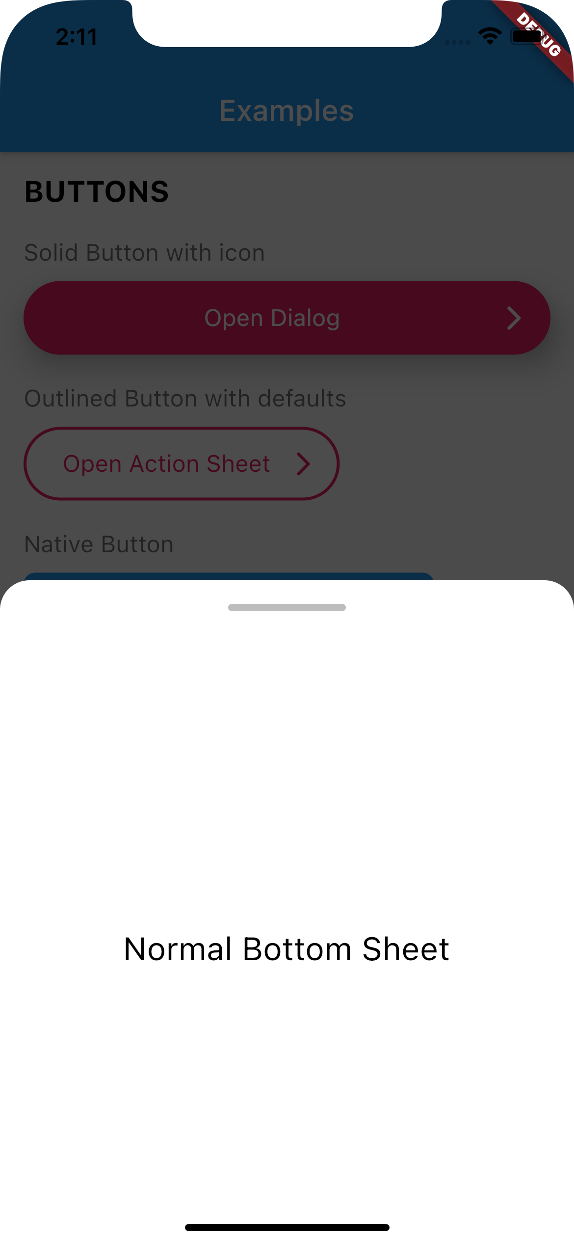
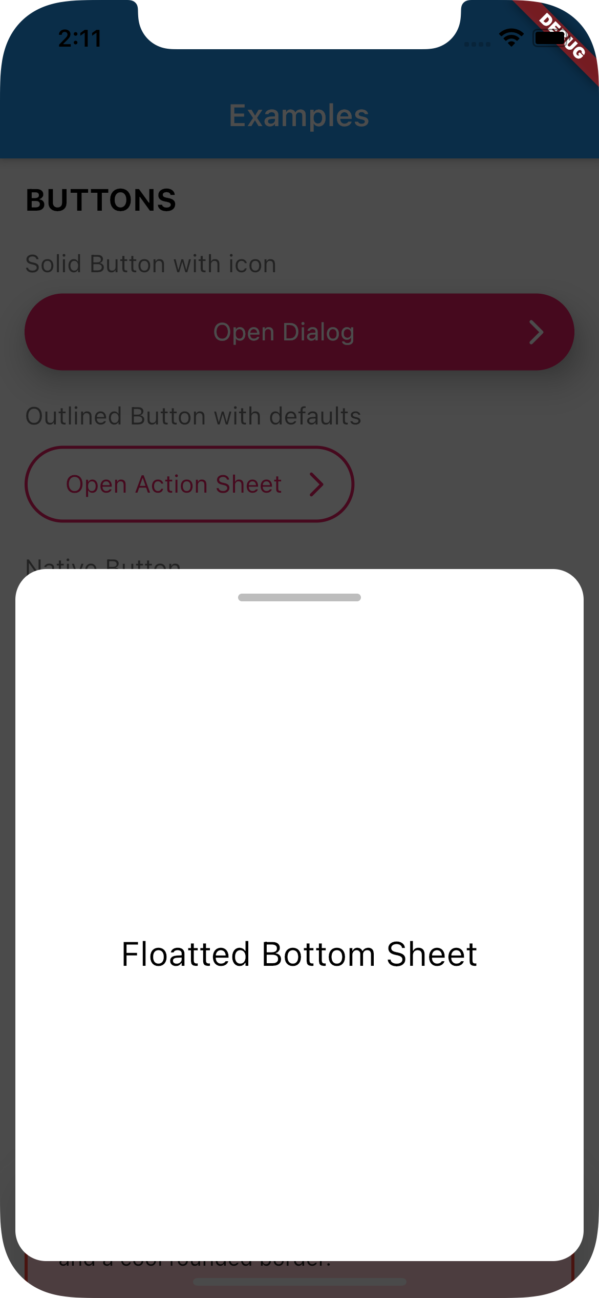
UIBottomSheet
Use UIBottomSheet when you want to display a bottomsheet.
Set floatted: true if you want the bottom sheet to be floatted (have margin all around it, like some iOS bottom sheets)
You can also have a trailing Widget that can be useful for a close button when you have enableDrag set to false.
Full Width
Floatted
How to use:
Create a function that calls UIBottomSheet.show().
Call the function when you need it (eg.: on tap on a button)
// Set up the bottom sheetFuture<void> _openBottomSheet(BuildContext context) async {
awaitUIBottomSheet.show(
context: context,
floatted: true,
hideHead: false,
content: Container(
alignment: Alignment.center,
height: 400,
child: UIHeading(
heading: 3,
text: 'Some cool content',
),
),
);
}
// Open the bottom sheet UIButton.native(
label: 'Open Bottom Sheet',
onPressed: () async {
// OPEN BOTTOM SHEET// and wait until it's closedawait_openBottomSheet(context);
// proceedprint('Bottom sheet closed');
},
),
UITextField
This widget renders a input text field.
There are two kind of text fields you can choose from:
UITextField(),
UITextField.native(),
To create default styles for the text field you need to create a class of type UITextFieldDefaults.
You can have a separated directory where you add all your default styles.
import'styles/containers.dart';
// Show container with error stylingUIContainer(
as: errorContainer,
child: Text('This is a box with a nice shadow\nand a cool rounded border.'),
),
UIActionSheet
This widget creates a Native Action Sheet.
Compared with the other classes in this package,UIActionSheet is a bit more verbose.
However you write once for all platforms.
How to use:
Create a function that calls UIActionSheet.show().
The actions need to be of type UIAction.
Call the function when you need it (eg.: on tap on a button)
See example below:
// Creates a Native Action Sheet Factoryvoid_openActionSheet(BuildContext context) {
UIActionSheet.show(
context,
/// TITLE
title: UIHeading(
text: 'Select you favorite color',
color: Colors.blue,
textAlign: TextAlign.center,
heading: 5,
),
/// CONTENT
content: Text('We will use the color on your profile.'),
/// ACTIONS
actions: [
UIAction(
child: Text('Red'),
onPressed: () => Navigator.of(context).pop(),
),
UIAction(
child: Text('Green'),
onPressed: () => Navigator.of(context).pop(),
),
UIAction(
child: Text('Bue'),
onPressed: () => Navigator.of(context).pop(),
),
UIAction(
child: Text('Pink'),
onPressed: () => Navigator.of(context).pop(),
),
],
/// CANCEL BUTTON
cancel: UIAction(
child: UIHeading(
text: 'Cancel',
color: Colors.red,
heading: 4,
),
onPressed: () => print('Cancel'),
),
);
}
// Will open action sheet based on the current OSUIButton.solid(
as: solidButtonStyles,
label: "Open Action SHeet",
onPressed: () => _openActionSheet(context),
),
UIDialog
This widget creates a Native Dialog.
Compared with the other classes in this package, UIDialog is a bit more verbose.
However you write once for all platforms.
How to use:
Create a function that calls UIDialog.show().
The actions need to be of type UIAction.
Call the function when you need it (eg.: on tap on a button)
See example below:
// Creates a Native Dialog Factoryvoid_openDialog(BuildContext context) {
UIDialog.show(
context,
/// TITLE
title: Text('Are you sure?'),
/// CONTENT
content: Text('You cannot reverse this action.'),
/// ACTIONS
actions: [
UIAction(
child: Text('YES'),
onPressed: () => print('YES'),
),
UIAction(
child: Text('NO'),
onPressed: () => Navigator.of(context).pop(),
),
],
);
}
// Will open a dialog based on the current OSUIButton.solid(
as: solidButtonStyles,
label: "Open Dialog",
onPressed: () => _openDialog(context),
),
If you find any bug or want to request a feature, feel free to open an issue on Github.