패키지, 저장소 및 앱 카테고리 검색

패키지 상세v4.0.1

flutter_widget_catalogue

Flutter의 시각적, 구조적, 플랫폼, UI 및 인터랙티브 위젯 컬렉션을 사용하여 매우 빠르게 멋진 앱을 만들 수 있습니다.

AndroidiOSmacOSWindowsLinux
30일 다운로드
151
좋아요
34
Pub 점수
160

패키지 설치

flutter pub add flutter_widget_catalogue

패키지 개요

공개 정보를 바탕으로 생성한 선택 가이드입니다.

Flutter Widget Catalogue는 앱 개발을 가속화하기 위해 사전에 구축되고 시각적으로 매력적인 위젯의 포괄적인 컬렉션입니다. 시각적 디자인, 구조적 레이아웃, 플랫폼별 동작 및 상호작용 요소를 위한 다양한 UI 컴포넌트를 제공합니다. Flutter 전용으로 제작되어 개발자가 처음부터 시작하지 않고도 정교하고 반응성이 뛰어난 애플리케이션을 빠르게 만들 수 있도록 합니다. Android, iOS, macOS, Windows, Linux 등 여러 플랫폼을 지원하여 크로스플랫폼 경험을 일관되게 보장합니다. 빠른 프로토타이핑과 생산 준비된 인터페이스에 이상적입니다.

사용 사례

  • 빠른 UI 프로토타이핑
  • 생산 앱을 더 빠르게 구축하기
  • 크로스 플랫폼 앱 개발
  • 일관된 UI 패턴 만들기
  • 개발자 생산성 향상

주요 기능

  • 사전 설계된 시각적 위젯
  • 플랫폼에 관계없는 구성 요소
  • 인터랙티브 UI 요소
  • 구조화된 레이아웃 도구
  • pub.dev를 통한 간편한 통합

적합한 대상

  • 초보자 플러터 개발자
  • 속도를 찾는 경력 있는 개발자
  • UI 일관성에 집중하는 팀
  • 빠른 시장 진입을 필요로 하는 스타트업
  • 디자이너가 개발자와 협업하고 있습니다

고려 사항

  • 독특한 디자인을 위해 맞춤 설정이 필요할 수 있습니다
  • 출판사의 유지보수에 따라 다릅니다
  • 일부 영역에서 문서가 제한적임
  • 매우 전문적인 사용자 인터페이스 요구 사항에는 적합하지 않습니다
  • 과도하게 사용할 경우 종속성 부풀어 오를 수 있음

원본 README

연결된 소스 저장소의 README 원문 스냅샷입니다. 최신 내용은 저장소에서 확인하세요.

🚀 Flutter Widget Catalogue

pub package GitHub stars License: MIT Flutter Compatible Platform


A collection of visual, structural, platform-adaptive, and interactive widgets to help you build beautiful and functional Flutter apps faster.
🎯 100% Dart | 💙 Flutter-ready | ✅ Easy to use | 🧩 Modular components


✨ Available Components

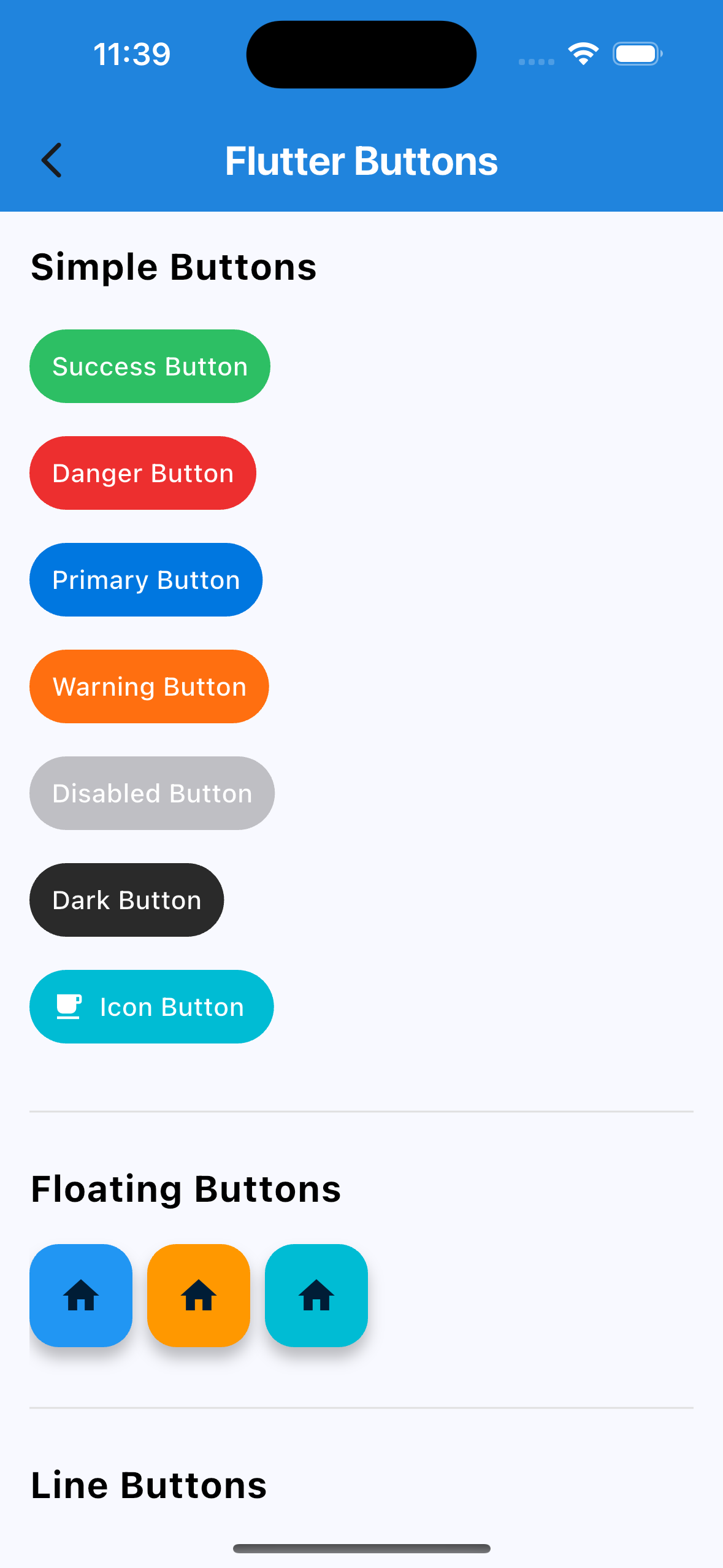
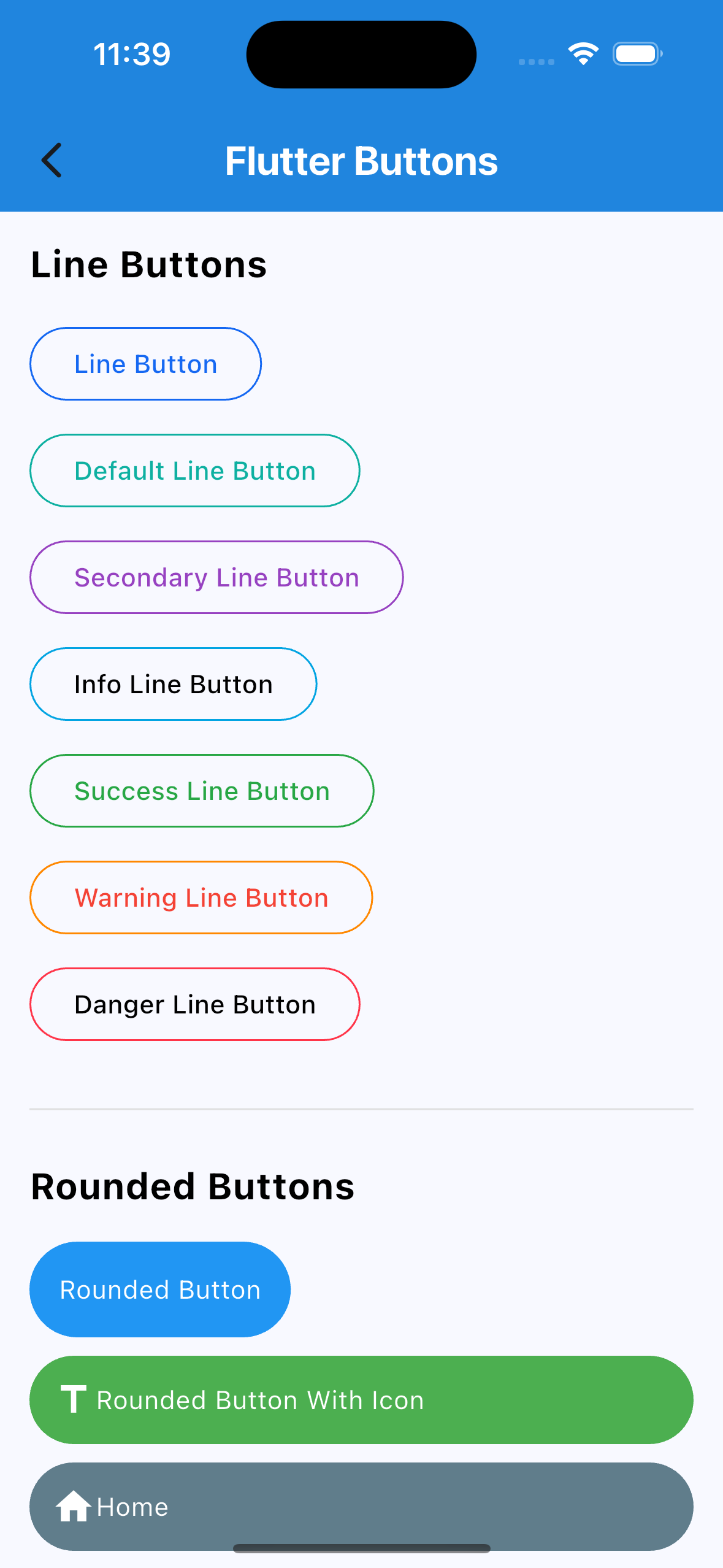
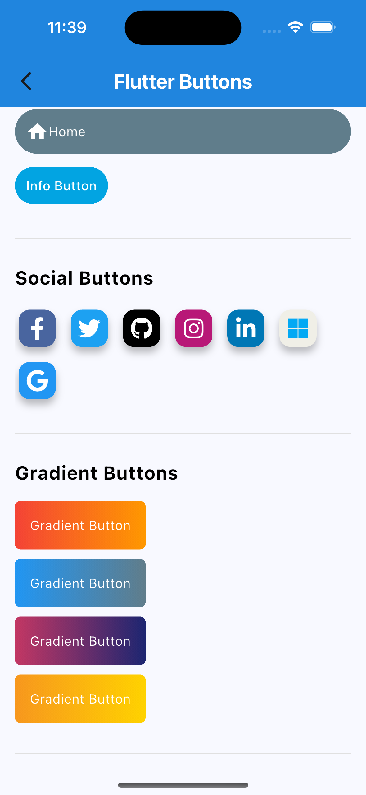
🔘 Buttons
  • Social Auth Buttons (Google, Facebook, Apple, etc.)
  • Rounded Buttons
  • Icon Buttons
  • Line Buttons
  • Gradient Buttons
  • Many more…
🔄 Custom Switch

Highly customizable Flutter switch widget:

  • Adjustable height, width, toggle size
  • Borders, colors, radius, icons, labels
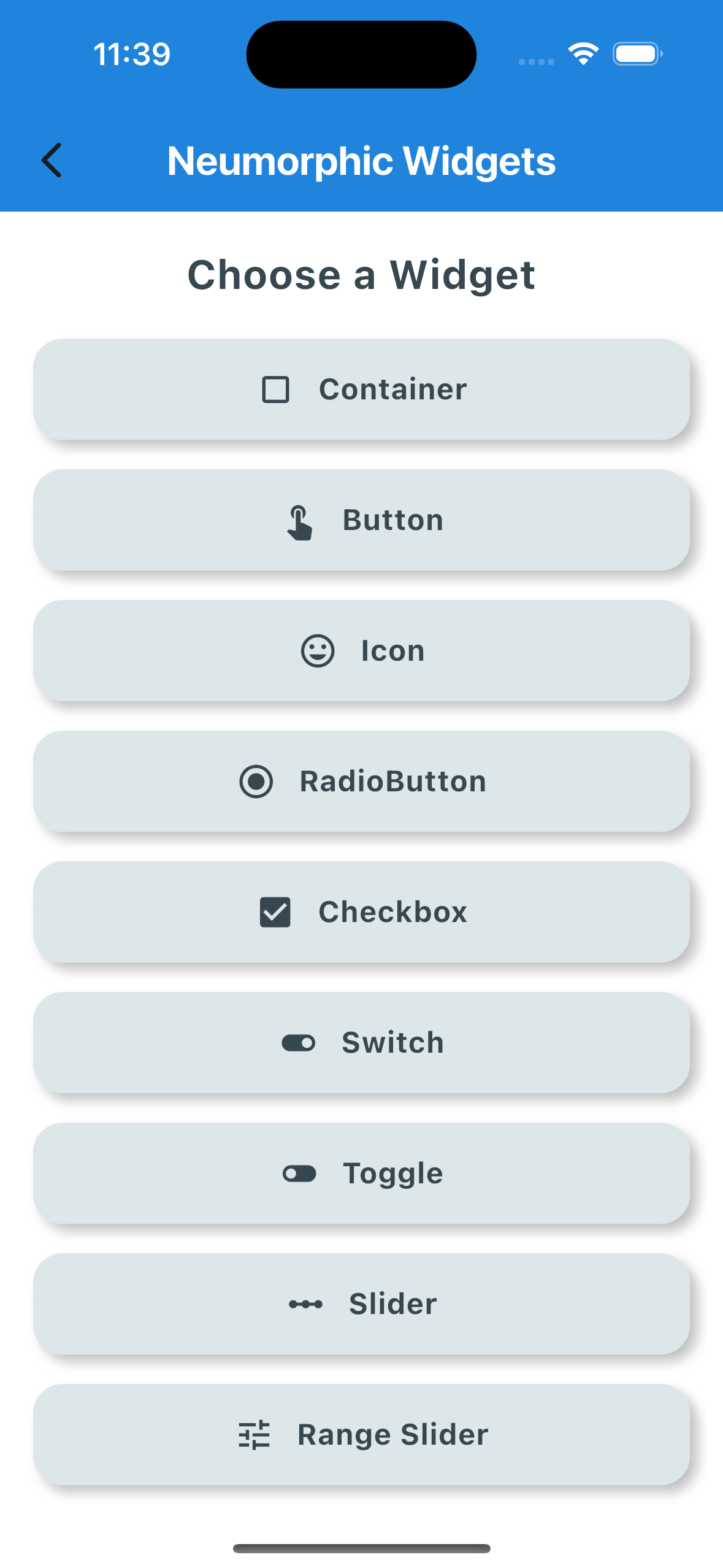
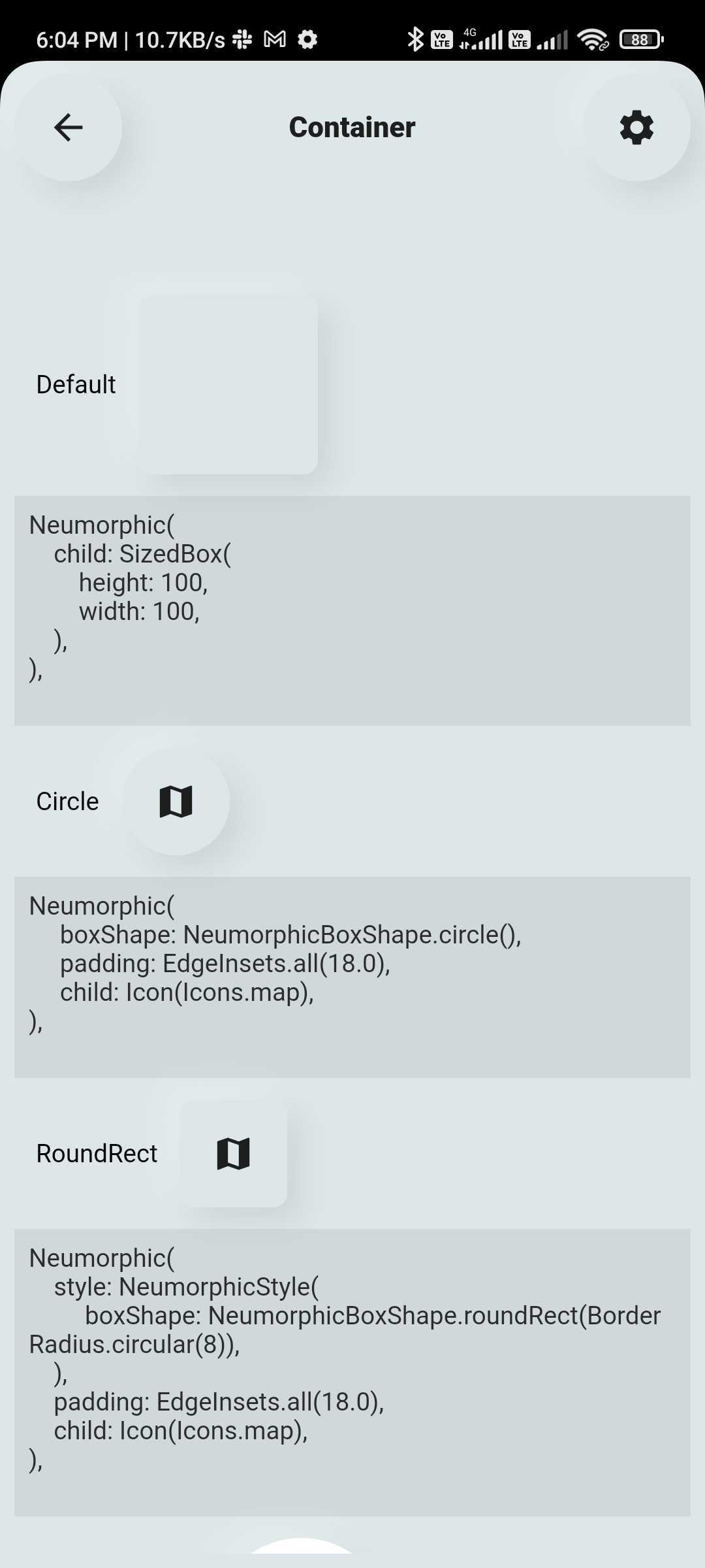
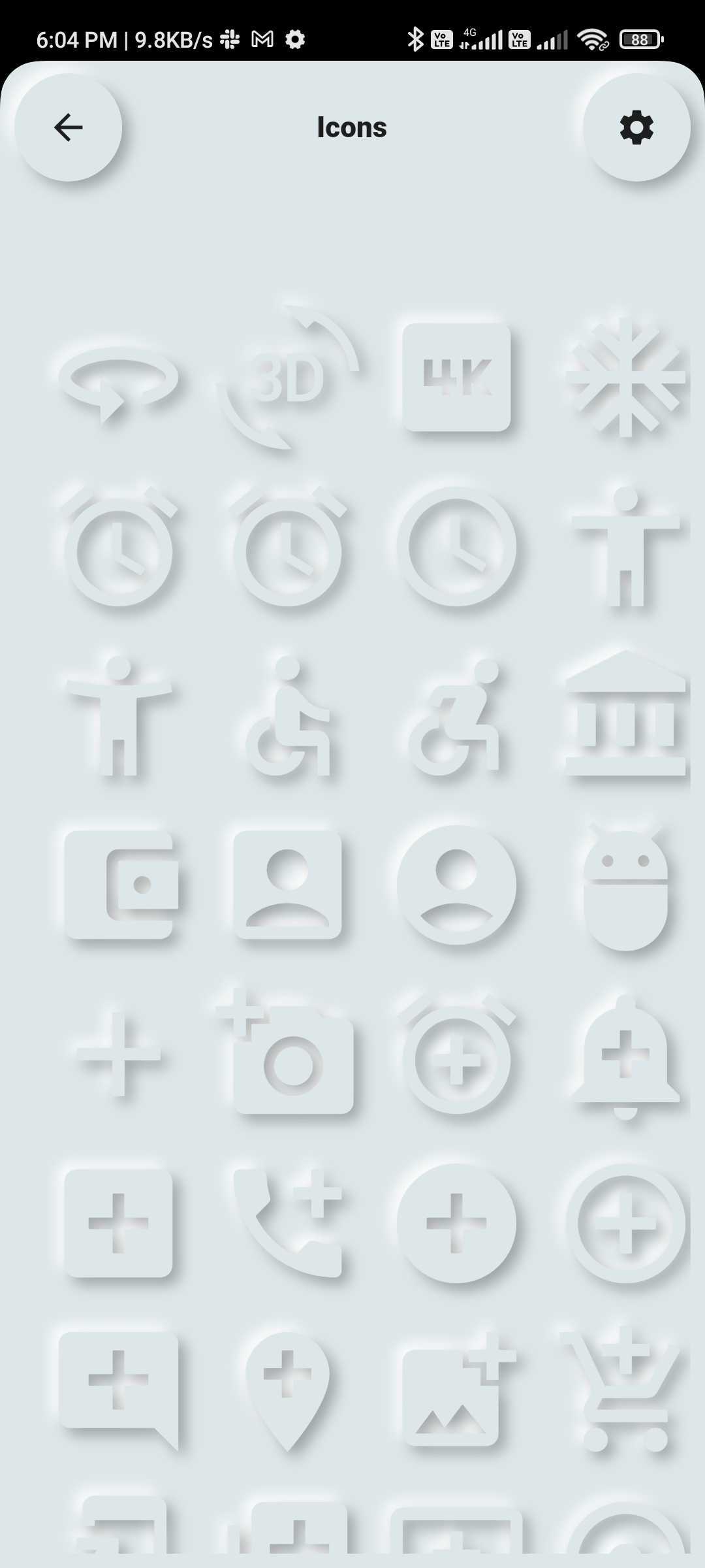
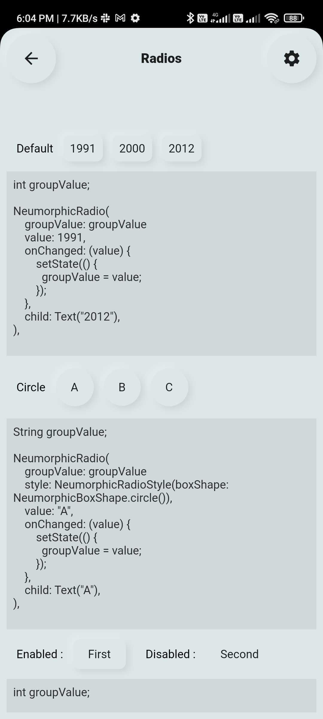
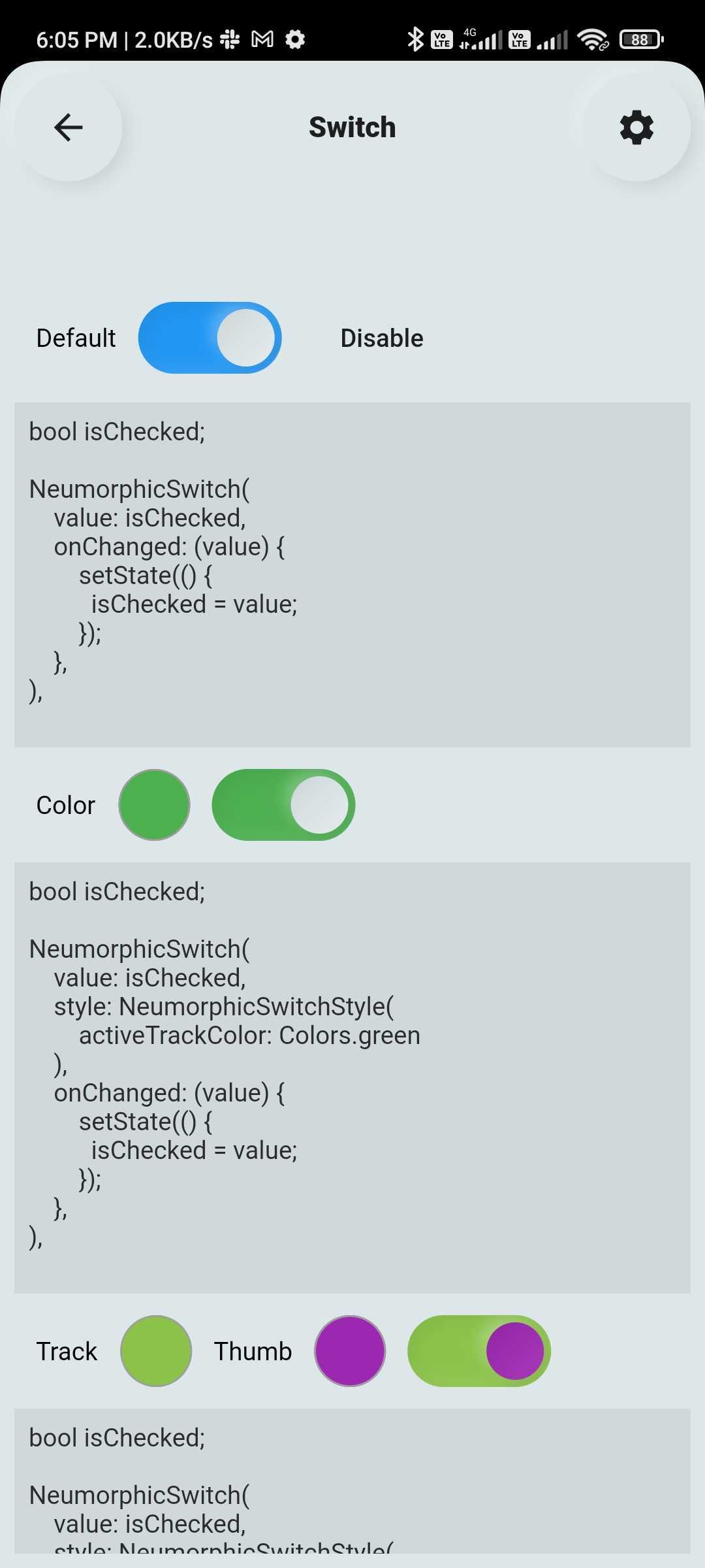
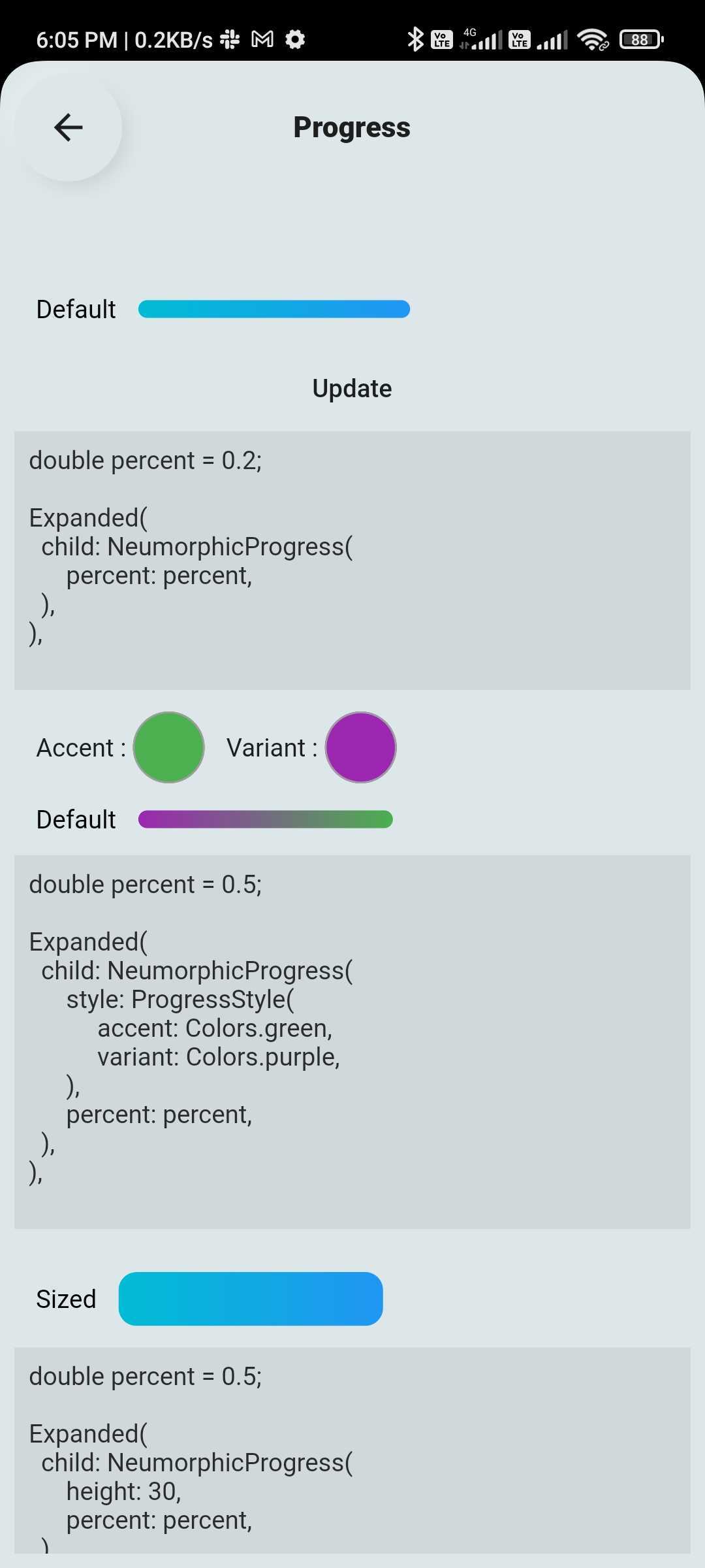
💠 Neumorphic UI Kit

Ready-to-use Neumorphic-styled widgets with glass mode:

  • Buttons, Switches, Containers, Sliders, Texts, Icons
  • Checkboxes, Toggles, Indicators, Range Sliders, AnimatedList and more
🔤 Text Fields

Fully customizable and themeable text input fields:

  • Outline, filled, underlined, or borderless styles
  • Support for icons, hint text, labels
  • Password visibility toggle, character counter, input formatter support
  • Focus, validation, and keyboard behavior control

🆕 New Features (Latest Update 🚀)

📊 Customizable & Animated Layouts
  • Animated ListView
  • Animated GridView
  • Masonry Layout support
  • Quilted Layout support
  • Smooth UI transitions & effects
💎 Glass Effect in Neumorphic UI
  • Added Glassmorphism (blur + transparency) support view
  • Works with existing Neumorphic components
🔽 Advanced Custom Dropdowns
  • Multi-select dropdown with chips
  • Scrollable chip-based selection
  • Hierarchical dropdown (tree structure)
  • Autocomplete dropdown (e.g., locations)
  • Custom item UI (user profile, icons, etc.)
  • Custom header & builder support

📦 Installation

Add the dependency to your pubspec.yaml:

dependencies:
  flutter_widget_catalogue: <latest-version>

Then import it:

import 'package:flutter_widget_catalogue/flutter_widget_catalogue.dart';

🖼️ Screenshots

Neumorphic Widgets
Buttons
DropDown
Components
Switch TextField List & Grid

🧪 Usage

Buttons Example
SuccessButton(title: "Success Button", onPressed: () {});
ButtonWithIcon(
  icon: Icons.local_cafe,
  title: "Icon Button",
  color: Colors.white,
  buttonColor: Colors.cyan,
  onPressed: () {},
);
GradientButton(
  onPressed: () {},
  splashColor: Colors.orange,
  colors: [Colors.red, Colors.orange],
  title: "Gradient Button",
);
Switch Example
FlutterSwitch(
  width: 90.0,
  height: 45.0,
  toggleSize: 38.0,
  value: status,
  borderRadius: 24.0,
  padding: 2.0,
  toggleColor: Colors.white,
  switchBorder: Border.all(color: Colors.blueAccent, width: 3.0),
  activeColor: Colors.cyan,
  inactiveColor: Colors.grey.shade400,
  onToggle: (val) {
    setState(() {
      status = val;
    });
  },
);
TextField Example
FlutterTextField(
  borderRadius: 50,
  hintText: "Fill Color",
  hintStyling: TextStyle(color: Colors.black),
  readOnly: false,
  fillColor: Colors.pink,
  borderColor: Colors.transparent,
  cursorColor: Colors.black,
);
FlutterTextField(
  iconBackgroundColor: Colors.black,
  borderRadius: 20,
  customTextFieldIcon: Icon(
  Icons.lock,
  color: Colors.black,),
  hintText: "Enter your password",
  isPasswordField: true,
  isIconShow: true,
  readOnly: false,
  fillColor: Colors.white,
  borderColor: Colors.black,
  cursorColor: Colors.black,
  leadingIconColor: Colors.black,
  labelName: "Password",
);
FlutterTextField(
  isIconShow: false,
  iconBackgroundColor: Colors.white10,
  borderRadius: 30,
  isNumber: true,
  hintText: "Enter your number",
  readOnly: false,
  borderColor: Colors.yellow,
  labelName: "Phone number",
  labelNameTextStyle: const TextStyle(color: Colors.black, fontSize: 20, fontWeight: FontWeight.w600),
);
Dropdown Example
HierarchySearchableDropdown(
  items: _kSampleData,
  hint: 'Select Multiple Items',
  isMultiline: true,
  isMultiSelect: true,
  onChanged: (label) => setState(() => selectedLabel = label),
  validator: (value) {
    if (value == null || value.isEmpty) {
      return 'Please select at least one item';
    }
    return null;
  },
  itemSpacing: 2,
  listPadding: const EdgeInsets.symmetric(vertical: 16),
  itemTextStyle: const TextStyle(
    color: Colors.black,
    fontSize: 15,
  ),
);
HierarchySearchableDropdown(
  items: _kFilterData,
  hint: 'Select Filters',
  isMultiSelect: true,
  showChips: true,
  isMultiline: false,
  onChanged: (label) => setState(() => selectedFilters = label),
),

✅ Platform Support

Platform Supported
Android ✅
iOS ✅
Web ✅

📌 Changelog

Please see the CHANGELOG.md for a list of recent changes.


👨‍💻 Contributors


📃 License

This project is licensed under the MIT License.

카테고리

의존성

의존성 목록 1 개

소스 저장소

이 패키지를 사용하는 프로젝트

아직 데이터가 없습니다.