패키지, 저장소 및 앱 카테고리 검색

gradient_elevated_button 표지
패키지 상세v1.2.0

gradient_elevated_button

시각적으로 매력적인 UI를 위한 그라데이션 배경이 있는 사용자 정의 Flutter 버튼.

AndroidiOSWebmacOSWindowsLinux
30일 다운로드
338
좋아요
15
Pub 점수
150

패키지 설치

flutter pub add gradient_elevated_button

패키지 개요

공개 정보를 바탕으로 생성한 선택 가이드입니다.

그라데이션 배경을 갖춘 사용자 정의 가능한 플러터 버튼으로 UI 미적 요소를 향상시키기 위해 설계되었습니다. 표준 ElevatedButton을 부드러운 그라데이션 채우기, 그림자 효과 및 반응형 피드백과 함께 확장합니다. 기능성을 희생하지 않고 시각적으로 매력적인 버튼이 필요한 현대 앱 인터페이스에 이상적입니다. 이 패키지는 Android, iOS, Web, macOS, Windows, Linux 등 모든 주요 플랫폼을 지원하여 장치 간 일관된 외관을 보장합니다.

사용 사례

  • 눈에 띄는 액션 버튼 만들기
  • 로그인 또는 가입 화면 개선
  • 현대적인 모바일 및 웹 인터페이스 설계
  • 양식과 대시보드에 시각적 매력 추가
  • 동적 시각 효과를 통한 사용자 참여도 향상

주요 기능

  • 그라디언트 배경 지원
  • 내장된 높이 및 그림자 효과
  • 사용자 정의 가능한 색상 및 정지 지점
  • 반응형 터치 피드백
  • 크로스 플랫폼 호환성
  • 기존 Flutter 코드와의 간편한 통합

적합한 대상

  • 시각적 완성도를 추구하는 UI 디자이너
  • 현대 앱을 개발하는 개발자
  • 미적 매력에 초점을 둔 프로젝트
  • 다중 플랫폼을 대상으로 하는 앱
  • 플러터를 통한 풀스택 개발을 사용하는 팀

고려 사항

  • 접근성에 대한 추가 스타일링이 필요할 수 있습니다
  • 복잡한 그라디언트의 성능 영향
  • 그라디언트와 높이 외에 사용자 지정 옵션이 제한적
  • 미니멀리즘 디자인 패턴에 적합하지 않습니다
  • 가독성을 위해 대비되는 텍스트와 함께 사용하는 것이 가장 좋습니다

원본 README

연결된 소스 저장소의 README 원문 스냅샷입니다. 최신 내용은 저장소에서 확인하세요.

GradientElevatedButton

Package Version License Likes Points Popularity

Git Issues

Buy Me a Coffee

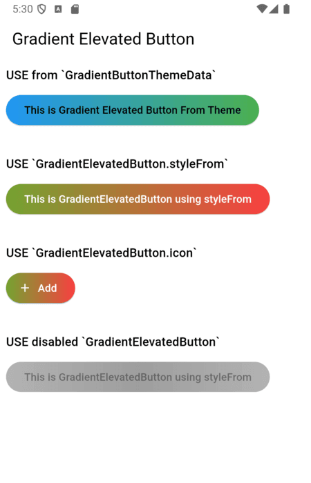
A customizable elevated button with gradient support for your Flutter applications. This package allows you to create buttons with gradient backgrounds, custom foreground colors, and various other customizable properties using the GradientElevatedButton widget.

Features

  • Gradient Background: Easily apply gradients to your button backgrounds.
  • Customizable Style: Customize text color, shape, padding, and more.
  • Integration with Theme: Use GradientButtonThemeExtension (via ThemeExtension) to apply a consistent style across your app. (Old: GradientButtonThemeData is deprecated)

Demo

Usage

1. Theming with ThemeExtension (Recommended)

The recommended way to theme all gradient buttons is to use GradientButtonThemeExtension with ThemeData.extensions:

MaterialApp(
  theme: ThemeData(
    extensions: <ThemeExtension<dynamic>>[
      GradientButtonThemeExtension(
        style: GradientElevatedButton.styleFrom(
          backgroundGradient: const LinearGradient(
            colors: [Colors.blue, Colors.green],
            begin: Alignment.centerLeft,
            end: Alignment.centerRight,
          ),
          foregroundColor: Colors.black,
        ),
      ),
    ],
  ),
  home: ...,
)

Then use GradientElevatedButton as usual:

GradientElevatedButton(
  onPressed: () {},
  child: Text('Themed Gradient Button'),
)
2. [DEPRECATED] Using GradientButtonThemeData

GradientButtonThemeData is deprecated and will be removed in a future release. Migrate to ThemeExtension as shown above.

// Deprecated usage:
GradientButtonThemeData(
  data: GradientElevatedButton.styleFrom(
    backgroundGradient: const LinearGradient(
      colors: [Colors.blue, Colors.green],
      begin: Alignment.centerLeft,
      end: Alignment.centerRight,
    ),
    foregroundColor: Colors.black,
  ),
  child: MaterialApp(
    // ...
  ),
)
3. Using GradientElevatedButton.styleFrom

Alternatively, you can style the GradientElevatedButton directly using GradientElevatedButton.styleFrom to define the button's gradient, shape, and other properties:

Widget gradientWidget = GradientElevatedButton(
  onPressed: () {

  },
  style: GradientElevatedButton.styleFrom(
    gradient: const LinearGradient(colors: [
      Color.fromARGB(255, 166, 206, 57),
      Color.fromARGB(255, 0, 175, 173),
    ],
      disabledGradient: const LinearGradient(colors: [
        Colors.grey.withAlpha(200),
        Colors.grey,
        Colors.grey.withAlpha(200),
      ],
        begin: Alignment.topCenter,
        end: Alignment.bottomCenter,
      ),
    ),
  ),
  child: const Text("This is Gradient Elevated Button"),
);

Customization

You can fully customize the GradientElevatedButton using the following properties:

  • backgroundGradient: A LinearGradient (or other types) that defines the background gradient.
  • foregroundColor: The color of the text and icon on the button.
  • disabledBackgroundGradient: A LinearGradient (or other types) that defines the disabled background gradient.
  • disabledForegroundColor: The color of the text and icon on the disabled button.
  • padding: Padding inside the button.
  • shape: Define the button’s shape with a ShapeBorder like RoundedRectangleBorder or StadiumBorder.
  • elevation: Controls the button's elevation (default: 2).
  • onPressed: The callback function that is called when the button is pressed.

Migration Guide

To migrate from GradientButtonThemeData to the new ThemeExtension approach:

  1. Remove GradientButtonThemeData from your widget tree.
  2. Add GradientButtonThemeExtension to your ThemeData.extensions.
  3. Use GradientButtonThemeExtension.of(context) to access the style if needed.
  4. All GradientElevatedButton widgets will now use the theme from the extension.

See the example and code comments for more details.

Example

click here for example

Issues and Feedback

Please file any issues or provide feedback by visiting the Issues and Feedback for this repository.

For suggestions or further feedback, feel free to send an email to chegz.dev@gmail.com, and we'd be happy to hear from you!

Contributors thanks

contributors

카테고리

소스 저장소

이 패키지를 사용하는 프로젝트

아직 데이터가 없습니다.