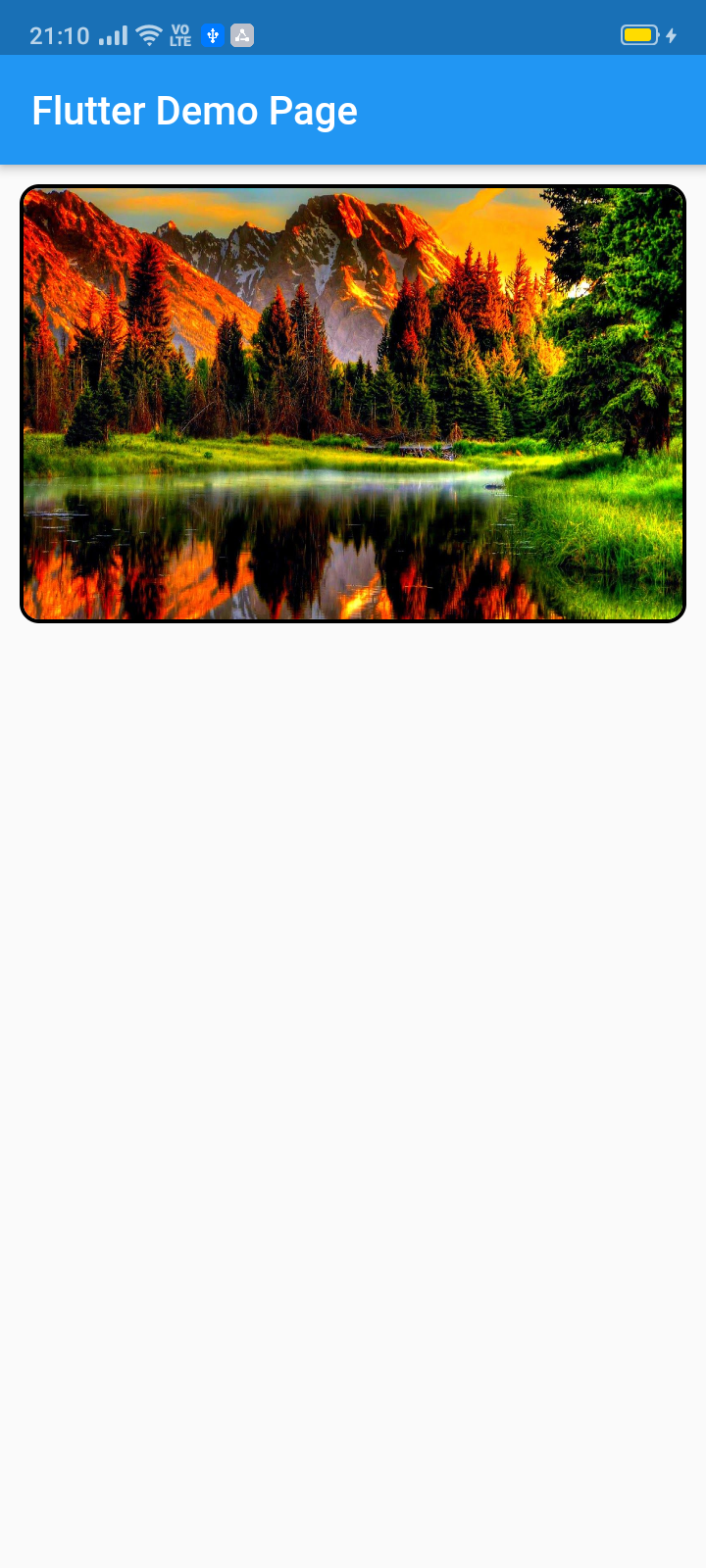
image_slider 패키지는 Flutter에서 사용자 정의 가능한 슬라이더를 생성할 수 있게 하며, 자동 및 수동 슬라이딩 전환을 지원합니다. 주로 이미지 표시를 위해 설계되었지만, 어떤 위젯 유형이든 지원하여 콘텐츠 표현의 유연성을 제공합니다. 완전한 커스터마이징 옵션을 통해 개발자는 다양한 디자인 요구에 맞게 슬라이더의 외관과 동작을 조정할 수 있습니다. 앱 내에서 갤러리, 제품 전시 또는 프로모션 콘텐츠를 보여주는 데 이상적입니다. 이 패키지는 오픈소스이며 GitHub에서 유지 관리되어 커뮤니티 기여와 수정이 가능합니다.
사용 사례
이미지 갤러리
제품 캐러셀
프로모션 배너
동적 콘텐츠 슬라이드
인터랙티브 UI 요소
주요 기능
자동 및 수동 슬라이드
완전한 위젯 사용자 정의
모든 위젯 유형 지원
오픈소스이며 커뮤니티 주도
pub add를 통한 간편한 통합
적합한 대상
모바일 앱 개발자
UI/UX 디자이너
전자상거래 애플리케이션
콘텐츠가 풍부한 애플리케이션
사용자 정의 카루셀 구현
고려 사항
제한된 플랫폼별 최적화
내장된 페이지네이션 표시기 없음
고급 디자인을 위해서는 수동 스타일링이 필요합니다
외부 유지보수에 의존
애니메이션을 위해 추가 종속성이 필요할 수 있습니다
원본 README
연결된 소스 저장소의 README 원문 스냅샷입니다. 최신 내용은 저장소에서 확인하세요.
image_slider
This pub lets you make a widget slider (automatic/manual sliding) with full customization. Mainly intended for image slider, this also accepts all other widgets.
ImageSlider(
/// Shows the tab indicating circles at the bottom
showTabIndicator: false,
/// Cutomize tab's colors
tabIndicatorColor: Colors.lightBlue,
/// Customize selected tab's colors
tabIndicatorSelectedColor: Color.fromARGB(255, 0, 0, 255),
/// Height of the indicators from the bottom
tabIndicatorHeight: 16,
/// Size of the tab indicator circles
tabIndicatorSize: 16,
/// tabController for walkthrough or other implementations
tabController: tabController,
/// Animation curves of sliding
curve: Curves.fastOutSlowIn,
/// Width of the slider
width: MediaQuery.of(context).size.width,
/// Height of the slider
height: 220,
/// If automatic sliding is required
autoSlide: false,
/// Time for automatic sliding
duration: newDuration(seconds: 6),
/// If manual sliding is required
allowManualSlide: true,
/// Children in slideView to slide
children: links.map((String link) {
returnnewClipRRect(
borderRadius: BorderRadius.circular(8.0),
child: Image.network(
link,
width: MediaQuery.of(context).size.width,
height: 220,
fit: BoxFit.fill,
));
}).toList(),
),
License
Copyright 2020 Jay Mehta

Licensed under the Apache License, Version 2.0 (the "License");
you may not use this file except in compliance with the License.
You may obtain a copy of the License at

    http://www.apache.org/licenses/LICENSE-2.0

Unless required by applicable law or agreed to in writing, software
distributed under the License is distributed on an "AS IS" BASIS,
WITHOUT WARRANTIES OR CONDITIONS OF ANY KIND, either express or implied.
See the License for the specific language governing permissions and
limitations under the License.
Getting Started
This project is a starting point for a Dart
package,
a library module containing code that can be shared easily across
multiple Flutter or Dart projects.
For help getting started with Flutter, view our
online documentation, which offers tutorials,
samples, guidance on mobile development, and a full API reference.
Example
As time based...
import'package:flutter/material.dart';
import'package:image_slider/image_slider.dart';
voidmain() {
runApp(MyApp());
}
classMyAppextendsStatelessWidget{
@overrideWidgetbuild(BuildContext context) {
returnMaterialApp(
title: 'Flutter Demo',
debugShowCheckedModeBanner: false,
theme: ThemeData(
primarySwatch: Colors.blue,
visualDensity: VisualDensity.adaptivePlatformDensity,
),
home: MyHomePage(title: 'Flutter Image Slider Demo Page'),
);
}
}
classMyHomePageextendsStatefulWidget{
MyHomePage({Key key, this.title}) : super(key: key);
finalString title;
@override_MyHomePageStatecreateState() => _MyHomePageState();
}
class_MyHomePageStateextendsState<MyHomePage>
withSingleTickerProviderStateMixin{
/// This pub allows you to make image_slider widget and also multiple other useful widgets like walkthrough etc.@overridevoidinitState() {
super.initState();
tabController = TabController(length: 3, vsync: this);
}
TabController tabController;
staticList<String> links = [
"https://i.pinimg.com/originals/cc/18/8c/cc188c604e58cffd36e1d183c7198d21.jpg",
"https://www.kyoceradocumentsolutions.be/blog/wp-content/uploads/2019/03/iStock-881331810.jpg",
"https://resources.matcha-jp.com/resize/720x2000/2020/04/23-101958.jpeg"
];
@overrideWidgetbuild(BuildContext context) {
returnScaffold(
appBar: AppBar(
title: Text(widget.title),
),
body: Column(
children: [
Container(
margin: EdgeInsets.all(10),
decoration: BoxDecoration(
borderRadius: BorderRadius.circular(10),
border: Border.all(width: 2)),
child: ImageSlider(
/// Shows the tab indicating circles at the bottom
showTabIndicator: false,
/// Cutomize tab's colors
tabIndicatorColor: Colors.lightBlue,
/// Customize selected tab's colors
tabIndicatorSelectedColor: Color.fromARGB(255, 0, 0, 255),
/// Height of the indicators from the bottom
tabIndicatorHeight: 16,
/// Size of the tab indicator circles
tabIndicatorSize: 16,
/// tabController for walkthrough or other implementations
tabController: tabController,
/// Animation curves of sliding
curve: Curves.fastOutSlowIn,
/// Width of the slider
width: MediaQuery.of(context).size.width,
/// Height of the slider
height: 220,
/// If automatic sliding is required
autoSlide: false,
/// Time for automatic sliding
duration: newDuration(seconds: 6),
/// If manual sliding is required
allowManualSlide: true,
/// Children in slideView to slide
children: links.map((String link) {
returnnewClipRRect(
borderRadius: BorderRadius.circular(8.0),
child: Image.network(
link,
width: MediaQuery.of(context).size.width,
height: 220,
fit: BoxFit.fill,
));
}).toList(),
),
),
Row(
mainAxisAlignment: MainAxisAlignment.spaceEvenly,
children: [
tabController.index == 0
? Container(
width: 0,
height: 0,
)
: RaisedButton(
onPressed: () {
tabController.animateTo(tabController.index - 1);
setState(() {});
},
child: Text("Previous"),
),
tabController.index == 2
? Container(
width: 0,
height: 0,
)
: RaisedButton(
onPressed: () {
tabController.animateTo(2);
setState(() {});
},
child: Text("Skip"),
),
tabController.index == 2
? Container(
width: 0,
height: 0,
)
: RaisedButton(
onPressed: () {
tabController.animateTo(tabController.index + 1);
setState(() {});
},
child: Text("Next"),
),
],
)
],
));
}
}