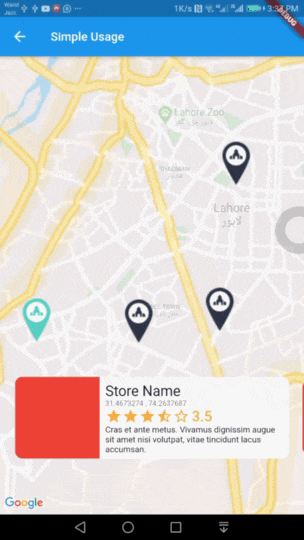
Interactive Maps Marker는 인터랙티브 세부 정보 카드를 갖춘 애니메이션 지도 마커를 제공하는 플러터 패키지입니다. 간단함을 위해 설계되어, 개발자가 매장 위치 검색 또는 관심사 표시와 같은 위치 기반 기능을 쉽게 통합할 수 있도록 합니다. 탭 시 마커가 애니메이션되며, 추가 정보를 포함한 사용자 정의 가능한 카드가 나타납니다. 직관적인 지리정보 시각화와 사용자 참여를 필요로 하는 앱에 이상적입니다. 복잡한 설정 없이 부드러운 전환과 반응형 디자인을 지원하여 사용자 경험을 향상시킵니다.
사용 사례
스토어 로케이터 애플리케이션
관심 지점 강조
이벤트 장소 찾기
관광 및 여행 가이드
실시간 위치 추적 인터페이스
주요 기능
애니메이션 마커 전환
사용자 정의 가능한 세부 정보 카드
Google 맵과의 간단한 통합
터치하여 표시하는 상호작용
반응형 UI 컴포넌트
경량이며 구성하기 쉬움
적합한 대상
위치 기반 앱을 개발하는 개발자
빠른 지도 기능 구현이 필요한 스타트업
사용자 친화적인 탐색에 중점을 둔 앱
지도 상호작용을 위해 최소한의 코드가 필요한 프로젝트
Flutter 초보자가 위치 정보 탐색 중
고려 사항
완전한 기능을 사용하려면 Google Maps API 키가 필요합니다
Android 및 iOS에 한정됨(웹 지원은 언급되지 않음)
사용자 정의 스타일링은 추가적인 Dart 지식이 필요할 수 있습니다
외부 지도 렌더링 라이브러리에 의존합니다
고밀도 마커 클러스터에 최적화되지 않음
원본 README
연결된 소스 저장소의 README 원문 스냅샷입니다. 최신 내용은 저장소에서 확인하세요.
interactive_maps_marker for Flutter
Easy to use Animated Maps Markers with detail card. Use it for store or any place locator.
Demo
Usage
Add this package to your pubspec.yaml in dependencies: section
dependencies:interactive_maps_marker:^0.0.2
This package depends upon google_maps_flutter so first setup this by following This Guide
Update dependencies
flutter pub get
You can now add a InteractiveMapsMarker widget to your widget tree.
Simple Usage
In your widget import the package and use InteractiveMapsMarker Widget
Use this widget inside a stateful widget and update the markers list state with new data. An example can be found in stateful_example.dart file in example project.
Customise with parameters
You can customise it by passing various parameter values. Details about all parameters is as follows.
Parameter
Type
Default Value
Description
items
List<MarkerItem>
none
List of Markers with type of MarkerItem. This parameter is required and cannot be null.
itemContent
IndexedWidgetBuilder
none
This is builder function which will receive context and index. You must return a Widget which will show on a pre designed container. This is exactly like you use ListView Builder. Not applicable when using itemBuilder
center
LatLng
LatLng(0.0, 0.0)
Center point for initial map display.
zoom
double
12.0
Default zoom value for initial map screen.
itemHeight
double
116.0
Height of your detail item. Not applicable when using itemBuilder
itemPadding
EdgeInsetsGeometry
EdgeInsets.only(bottom: 80.0)
Padding for item detail card. Mainly used for bottom padding.
itemPadding
Alignment
Alignment.bottomCenter
Alignment for content slider.
itemBuilder
IndexedWidgetBuilder
null
If you don't want default container and want to build the bottom widget yourself, you can use this builder instead of itemContent and have full control over UI. This is builder function which will receive context and index. You must return a Widget.
controller
InteractiveMapsController
null
A controller if you want to add the markers later and then call rebuild() or change the index of marker to animate with your action via setCurrentIndex(int index).